# Load libraries
library(Seurat) # single-cell and spatial analysis toolkit
library(sparseMatrixStats)
library(paletteer) # colour palettes
library(ggplot2) # plotting
library(patchwork) # combining plots

# Load the spatial transcriptomics data
visium <- Load10X_Spatial(
  "data/mouse_sagittal_visium_v1",
  filename = "V1_Mouse_Brain_Sagittal_Anterior_Section_2_filtered_feature_bc_matrix.h5"
)5 QC and Filtering
TipLearning Objectives
- Calculate library size, number of detected genes, and mitochondrial percentage as QC metrics for Visium data.
- Visualise QC metric distributions and their spatial patterns to identify low-quality spots.
- Define global filtering thresholds using hand-picked and quantile-based cutoffs.
- Interpret spatial QC plots to assess whether problematic spots reflect tissue damage or biological variation.
- Apply spot-level filters to the spatial object and save the result.
5.1 Data Exploration
Quality control of spatial transcriptomics data is essential for producing reliable results in downstream steps. In this chapter, we work with a Visium mouse brain dataset from 10x Genomics.
We start by loading the required libraries and reading the data into a Seurat object.
Before we start quality control, it helps to understand the tissue you are working with. Ask yourself what cell types or anatomical regions you expect to see in this slice.
10x describes this mouse brain dataset as:
Tissue sections of 10 µm thickness from a sagittal slice of the anterior
We can visualise the raw image to see which parts of the brain were captured:
# Make spots invisible and plot the histological image
SpatialPlot(
  visium,
  alpha = 0, # make spots invisible
  image.alpha = 1,
  crop = FALSE
) +
  theme(legend.position = "none")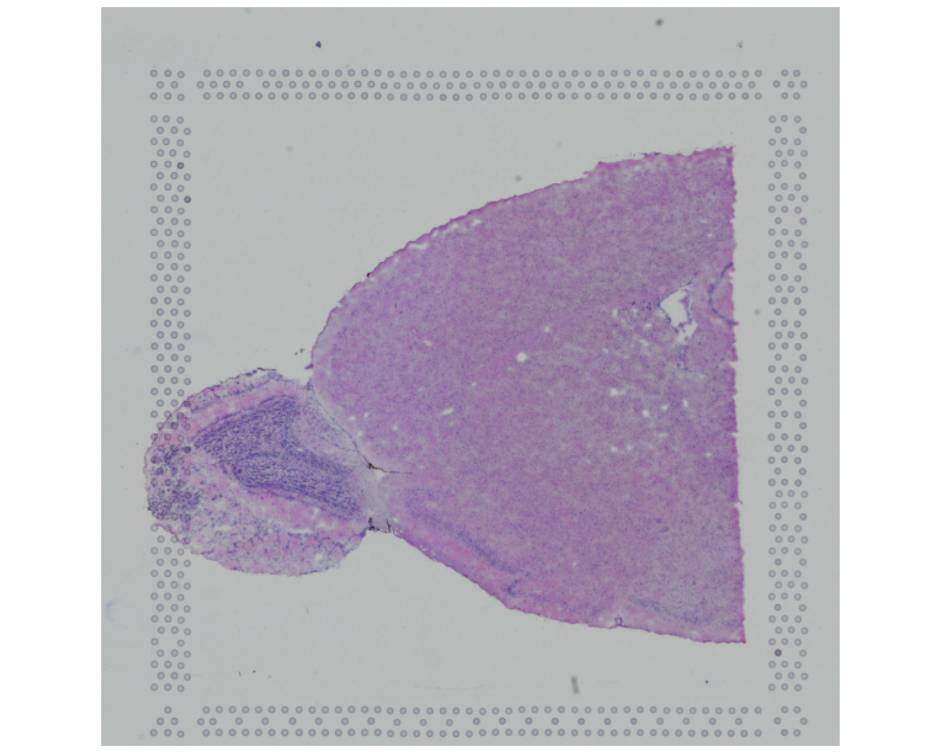
You can compare this image with a slice from the mouse brain atlas from the Allen Institute for Brain Science.
Alternatively, the diagram below shows a simplified sagittal view of the mouse brain:

If we compare our slice with this diagram or the atlas linked above, we can see that we are likely imaging:
- The main olfactory bulb, appearing as a distinct circular-looking “bulge” on the left
- The cerebral cortex
- The anterior olfactory nucleus
- The ventral striatum
- The caudate putamen
- The basal forebrain
- Maybe also some of the hippocampus
It is difficult (at least for a non-expert eye) to identify all of these regions directly from the histological image. Still, this sets the expectation for which cell types and clusters we may see later in the data.
This context also matters for quality control. If quality issues cluster in particular regions, those patterns may reflect tissue damage, capture artefacts, or genuine biological structure.
From the raw image, we can also look for signs of:
- Tissue tearing or folding
- Areas with low cell density
- Areas with high levels of debris or contamination
These aspects may correlate with low-quality spots that get removed removed during filtering.
5.2 QC Metrics
Common quality control metrics include:
- Library size: The total number of counts per spot.
- Detected genes: The number of unique genes per spot, that is, genes with at least one count.
- Mitochondrial percentage: The percentage of counts assigned to mitochondrial genes. A high fraction of mitochondrial counts may indicate tissue damage. When cells are damaged, cytoplasmic RNA can leak out more easily than mitochondrial RNA, which tends to remain enriched inside the remaining cellular material.
Space Ranger already calculates library size and the number of detected genes, so these values are present in the Seurat object metadata:
# Fetch the metadata and look at the first few rows
head(visium[[]])
orig.ident nCount_Spatial nFeature_Spatial
AAACAAGTATCTCCCA-1 SeuratProject 18286 4736
AAACACCAATAACTGC-1 SeuratProject 9311 3735
AAACAGAGCGACTCCT-1 SeuratProject 36450 7285
AAACAGCTTTCAGAAG-1 SeuratProject 30800 7298
AAACAGGGTCTATATT-1 SeuratProject 27617 6892
AAACATTTCCCGGATT-1 SeuratProject 38072 7476For completeness, the code below shows how to calculate these two metrics from the raw counts. This is useful if you work with a dataset that does not already include them.
# library size
visium[["nCount_Spatial"]] <- colSums(visium[["Spatial"]]$counts)

# number of detected genes
visium[["nFeature_Spatial"]] <- colSums(visium[["Spatial"]]$counts > 0)
You could use a stricter threshold for what counts as a detected gene. Here, we count any gene with at least one count (> 0), but you could require a higher count threshold if you prefer (e.g. > 2 for at least 3 counts).
To calculate the mitochondrial percentage, we need either a list of mitochondrial gene names or a pattern that matches those names. In this dataset, mitochondrial genes are prefixed with mt-, so we can identify them with PercentageFeatureSet().
# add mitochondrial percentage to metadata
visium[["percentMt_Spatial"]] <- PercentageFeatureSet(
  visium,
  assay = "Spatial",
  pattern = "^mt-" # the '^' indicates we want to match the start of the string
)
This function can calculate the percentage of any gene set, not just mitochondrial genes. For example, you could use it for ribosomal genes, chloroplast genes in plant datasets, or any other gene set that matters for your analysis.
We can confirm that the new QC metrics have been added to the metadata:
# Confirm that the new QC metrics have been added to metadata
head(visium[[]])
orig.ident nCount_Spatial nFeature_Spatial
AAACAAGTATCTCCCA-1 SeuratProject 18286 4736
AAACACCAATAACTGC-1 SeuratProject 9311 3735
AAACAGAGCGACTCCT-1 SeuratProject 36450 7285
AAACAGCTTTCAGAAG-1 SeuratProject 30800 7298
AAACAGGGTCTATATT-1 SeuratProject 27617 6892
AAACATTTCCCGGATT-1 SeuratProject 38072 7476
percentMt_Spatial
AAACAAGTATCTCCCA-1 15.432571
AAACACCAATAACTGC-1 14.391580
AAACAGAGCGACTCCT-1 13.242798
AAACAGCTTTCAGAAG-1 9.681818
AAACAGGGTCTATATT-1 11.721041
AAACATTTCCCGGATT-1 10.5326755.3 Visualising QC Metrics
Now that we have calculated the QC metrics, we can inspect their distributions to see the range of values in the data.
VlnPlot() provides a quick way to do this in Seurat:
# Visualise QC metrics
VlnPlot(
  visium,
  features = c("nCount_Spatial", "nFeature_Spatial", "percentMt_Spatial")
)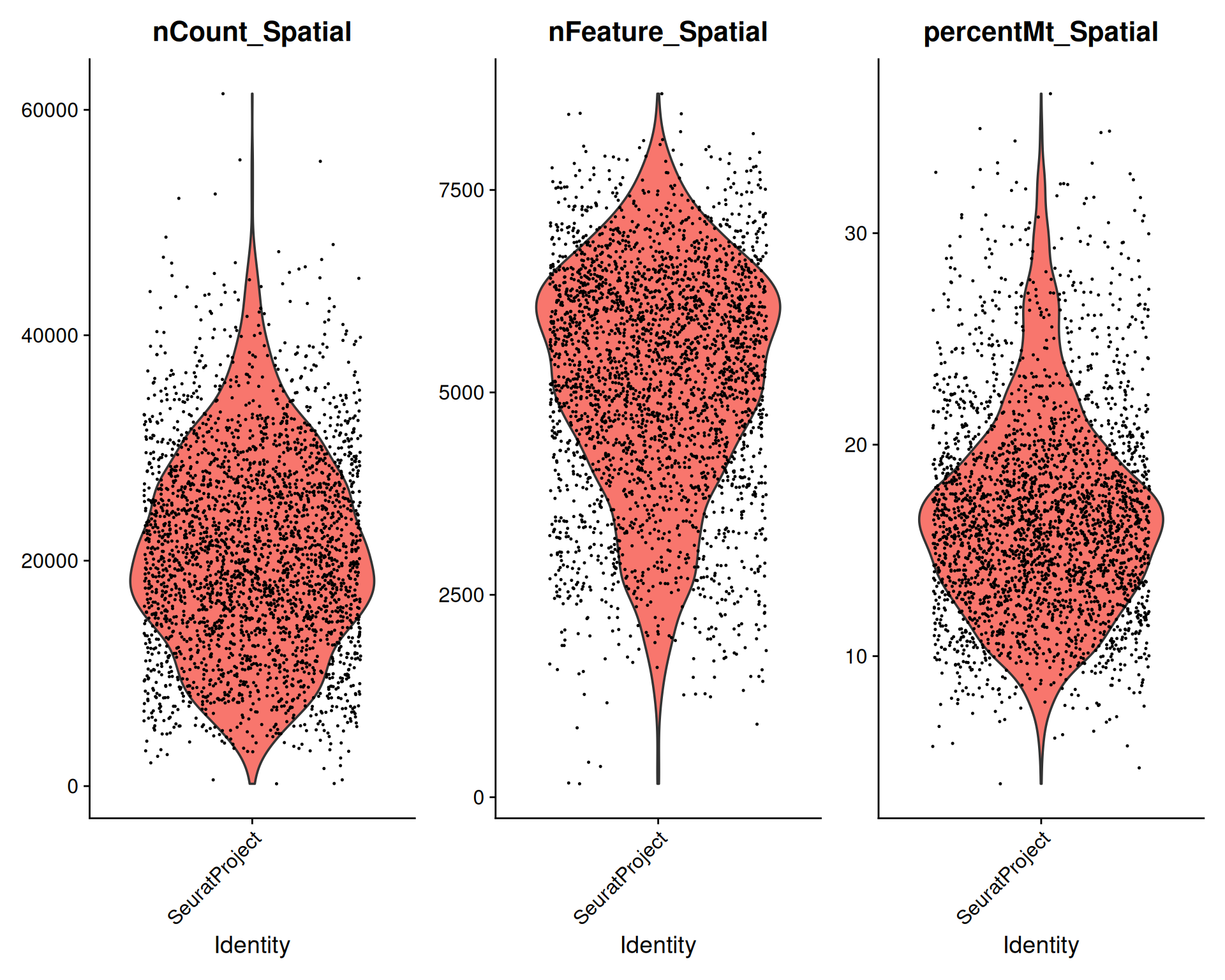
We can also summarise the averages and ranges:
# Summary of QC metrics
summary(visium[[c("nCount_Spatial", "nFeature_Spatial", "percentMt_Spatial")]])
nCount_Spatial nFeature_Spatial percentMt_Spatial
Min. : 207 Min. : 166 Min. : 3.964
1st Qu.:14381 1st Qu.:4270 1st Qu.:13.398
Median :20152 Median :5342 Median :16.231
Mean :20724 Mean :5173 Mean :16.693
3rd Qu.:26794 3rd Qu.:6231 3rd Qu.:19.208
Max. :61430 Max. :8689 Max. :36.596 From this quick exploration, we can see that:
- Some spots have very low total counts and detected genes relative to the rest of the dataset.
- Several spots have a high fraction of mitochondrial genes, which suggests possible tissue damage or poor-quality material.
Library size and the number of detected genes are often correlated. That pattern is expected because deeper sequencing usually increases the chance of detecting more genes:
# Visualise correlation between library size and detected genes
plot(visium$nCount_Spatial, visium$nFeature_Spatial)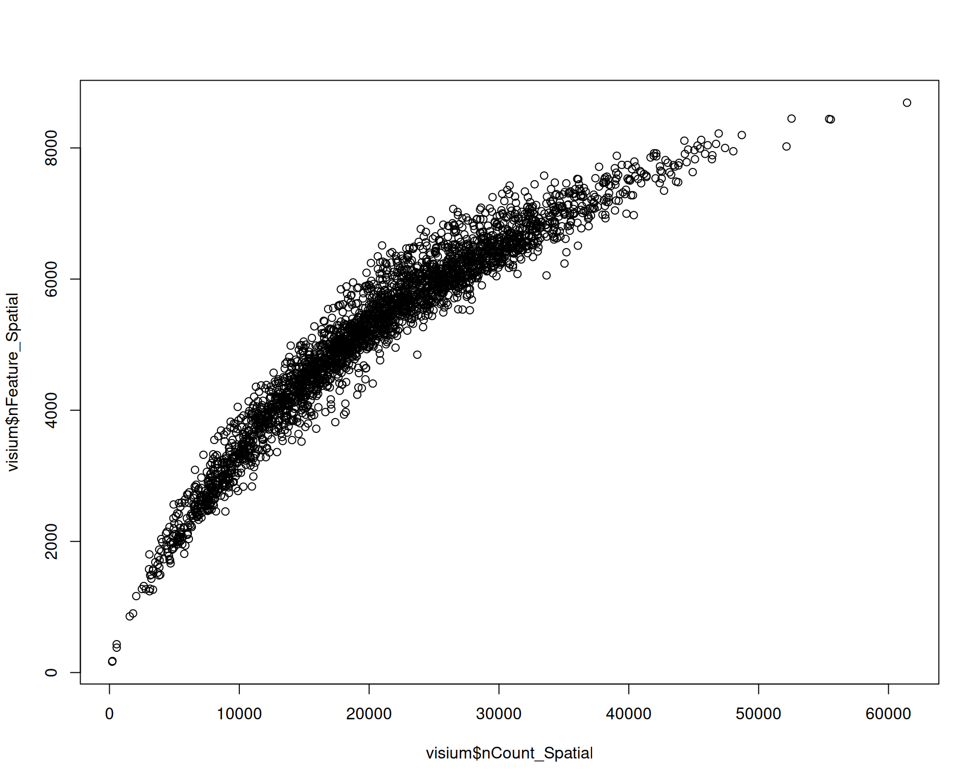
Spots with a low library size are also likely to have very few detected genes.
Spots with unusually high numbers of detected genes may indicate doublets or multiplets, which you may want to filter out. The expected range for detected genes also depends on the tissue, experimental conditions, species, and technology.
We can also visualise these metrics on the tissue image:
# Visualise QC metrics on spatial plot
SpatialPlot(
  visium,
  features = c("nCount_Spatial", "nFeature_Spatial", "percentMt_Spatial"),
  ncol = 2
)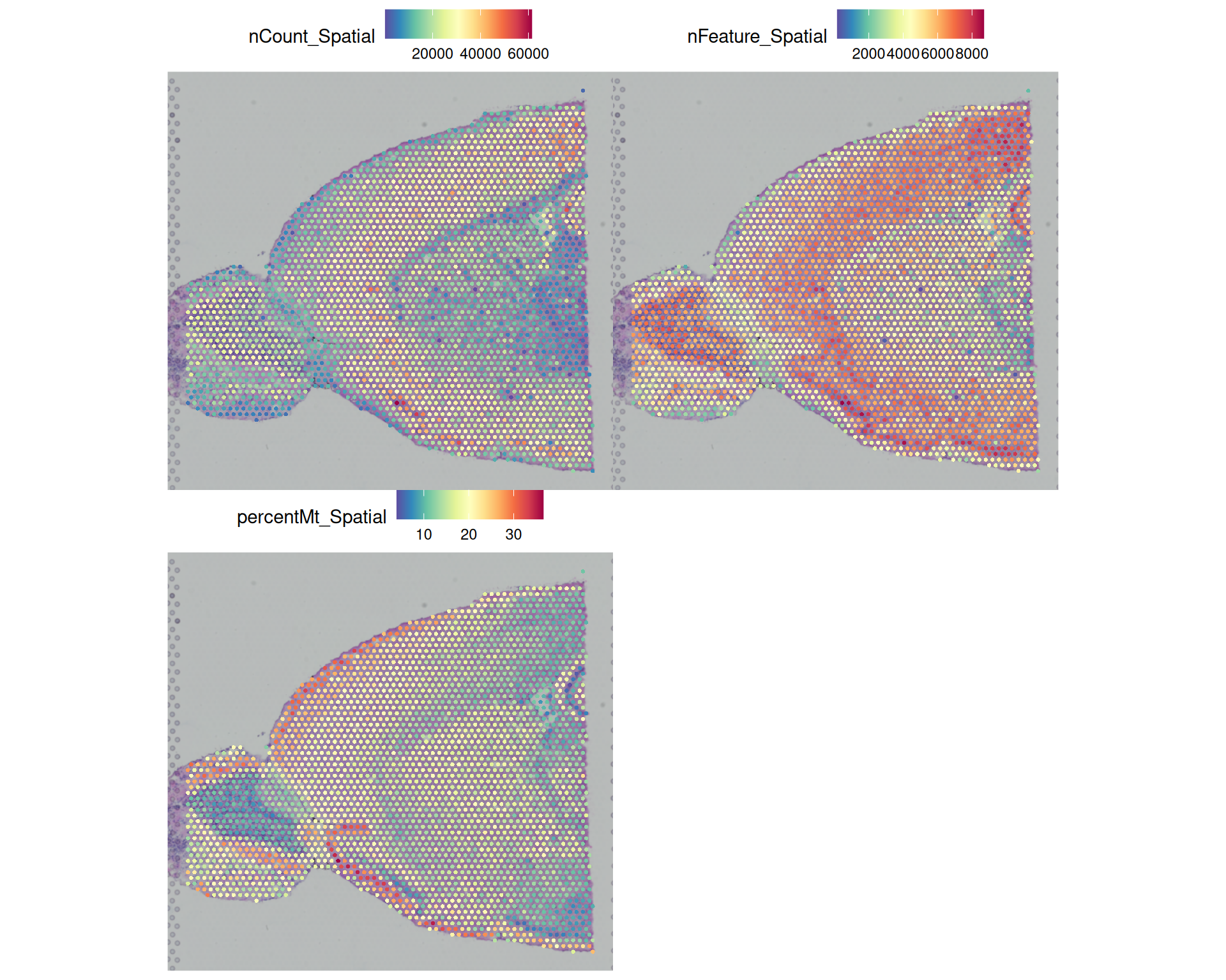
This reveals several patterns across the tissue:
- Some peripheral areas with high mitochondrial percentage also have low total counts, which suggests low-quality spots and possibly damaged tissue.
- Total counts and detected genes follow a similar pattern, which is expected because higher counts usually make more genes detectable.
- In the olfactory bulb, the centre of the tissue has higher counts and more detected genes than the outside. This could reflect a technical artefact, but it might also be biological. For example, the brain atlas suggests that fibre tracts may be present in this region.
- There is a clear anti-correlation between detected genes and mitochondrial percentage in the same olfactory bulb region. That pattern could be technical or biological.
We’re not experts in brain biology, and so we cannot tell from the QC plots alone whether these patterns are technical artefacts or true biology. But this uncertainty is exactly why spatial QC plots are useful: they show whether suspicious metrics cluster in particular tissue regions and help us decide how to apply our filters.
Filtering will also introduce spatial bias, because low-quality spots are often concentrated in specific parts of the tissue rather than spread evenly across the slide.
5.4 Defining Filtering Thresholds
Unfortunately, there are no fixed rules for defining filtering thresholds. In practice, two broad approaches are used:
- Global thresholds: Apply the same threshold across the entire dataset, regardless of spatial context. You can choose these thresholds from the distributions you explored earlier. For example:
- remove spots with fewer than 1,000 counts, fewer than 500 detected genes, or more than 30% mitochondrial genes;
- remove spots below the 1st percentile for total counts and detected genes, and above the 99th percentile for mitochondrial genes.
- Spatially aware thresholds: These methods calculate QC metrics while taking local variation in the tissue into account.
5.4.1 Global thresholds
When you choose a threshold, always visualise it alongside the respective distribution. That lets you see how many spots would be removed and where the filter falls.
You can either hand-pick a threshold or use a quantile of the distribution. The histograms below show example cutoffs based on hand-picked thresholds in red and quantile-based thresholds in blue.
# set up a 3x1 plotting area
par(mfrow = c(3, 1))

# total count thresholds
hist(
  visium$nCount_Spatial,
  breaks = 50,
  main = "Distribution of total counts",
  xlab = "Total counts"
)
abline(v = 1000, col = "red", lwd = 2)
abline(v = quantile(visium$nCount_Spatial, 0.01), col = "blue", lwd = 2)

# number of detected genes thresholds
hist(
  visium$nFeature_Spatial,
  breaks = 50,
  main = "Distribution of detected genes",
  xlab = "Number of detected genes"
)
abline(v = 500, col = "red", lwd = 2)
abline(v = quantile(visium$nFeature_Spatial, 0.01), col = "blue", lwd = 2)

# percentage of mitochondrial genes thresholds
hist(
  visium$percentMt_Spatial,
  breaks = 50,
  main = "Distribution of mitochondrial percentage",
  xlab = "Percentage of mitochondrial genes"
)
abline(v = 30, col = "red", lwd = 2)
abline(v = quantile(visium$percentMt_Spatial, 0.99), col = "blue", lwd = 2)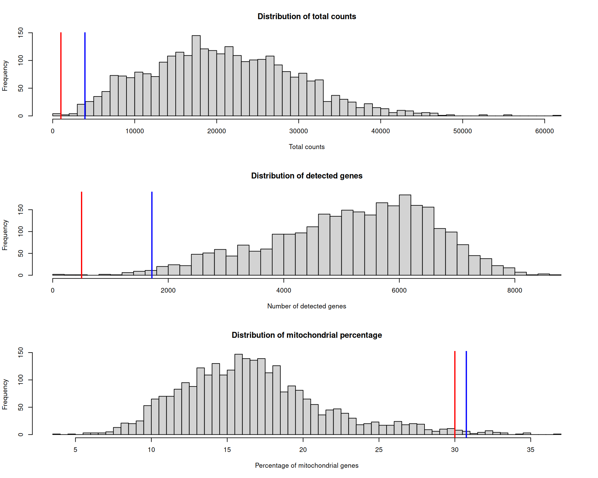
Which threshold is correct? There is no single right answer. Before applying any filter, we should visualise which spots would be removed and where they are located.
First, we add metadata columns that mark the spots removed by each threshold.
# add indicator columns for each filter
visium[["nCountFiltered"]] <- visium$nCount_Spatial <= 1000
visium[["percentMtFiltered"]] <- visium$percentMt_Spatial >= 30
visium[["nFeatureFiltered"]] <- visium$nFeature_Spatial <= 500

# also add a combined filter column
visium[["combinedFiltered"]] <- visium$nCountFiltered |
  visium$percentMtFiltered |
  visium$nFeatureFiltered

# this adds TRUE/FALSE columns to metadata
head(visium[[]])
orig.ident nCount_Spatial nFeature_Spatial
AAACAAGTATCTCCCA-1 SeuratProject 18286 4736
AAACACCAATAACTGC-1 SeuratProject 9311 3735
AAACAGAGCGACTCCT-1 SeuratProject 36450 7285
AAACAGCTTTCAGAAG-1 SeuratProject 30800 7298
AAACAGGGTCTATATT-1 SeuratProject 27617 6892
AAACATTTCCCGGATT-1 SeuratProject 38072 7476
percentMt_Spatial nCountFiltered percentMtFiltered
AAACAAGTATCTCCCA-1 15.432571 FALSE FALSE
AAACACCAATAACTGC-1 14.391580 FALSE FALSE
AAACAGAGCGACTCCT-1 13.242798 FALSE FALSE
AAACAGCTTTCAGAAG-1 9.681818 FALSE FALSE
AAACAGGGTCTATATT-1 11.721041 FALSE FALSE
AAACATTTCCCGGATT-1 10.532675 FALSE FALSE
nFeatureFiltered combinedFiltered
AAACAAGTATCTCCCA-1 FALSE FALSE
AAACACCAATAACTGC-1 FALSE FALSE
AAACAGAGCGACTCCT-1 FALSE FALSE
AAACAGCTTTCAGAAG-1 FALSE FALSE
AAACAGGGTCTATATT-1 FALSE FALSE
AAACATTTCCCGGATT-1 FALSE FALSEWe can now visualise each filter on the tissue image to see where low-quality spots are concentrated:
SpatialDimPlot(
  visium,
  group.by = c(
    "nCountFiltered",
    "percentMtFiltered",
    "nFeatureFiltered",
    "combinedFiltered"
  ),
  cols = c("lightgrey", "red"),
  ncol = 2
)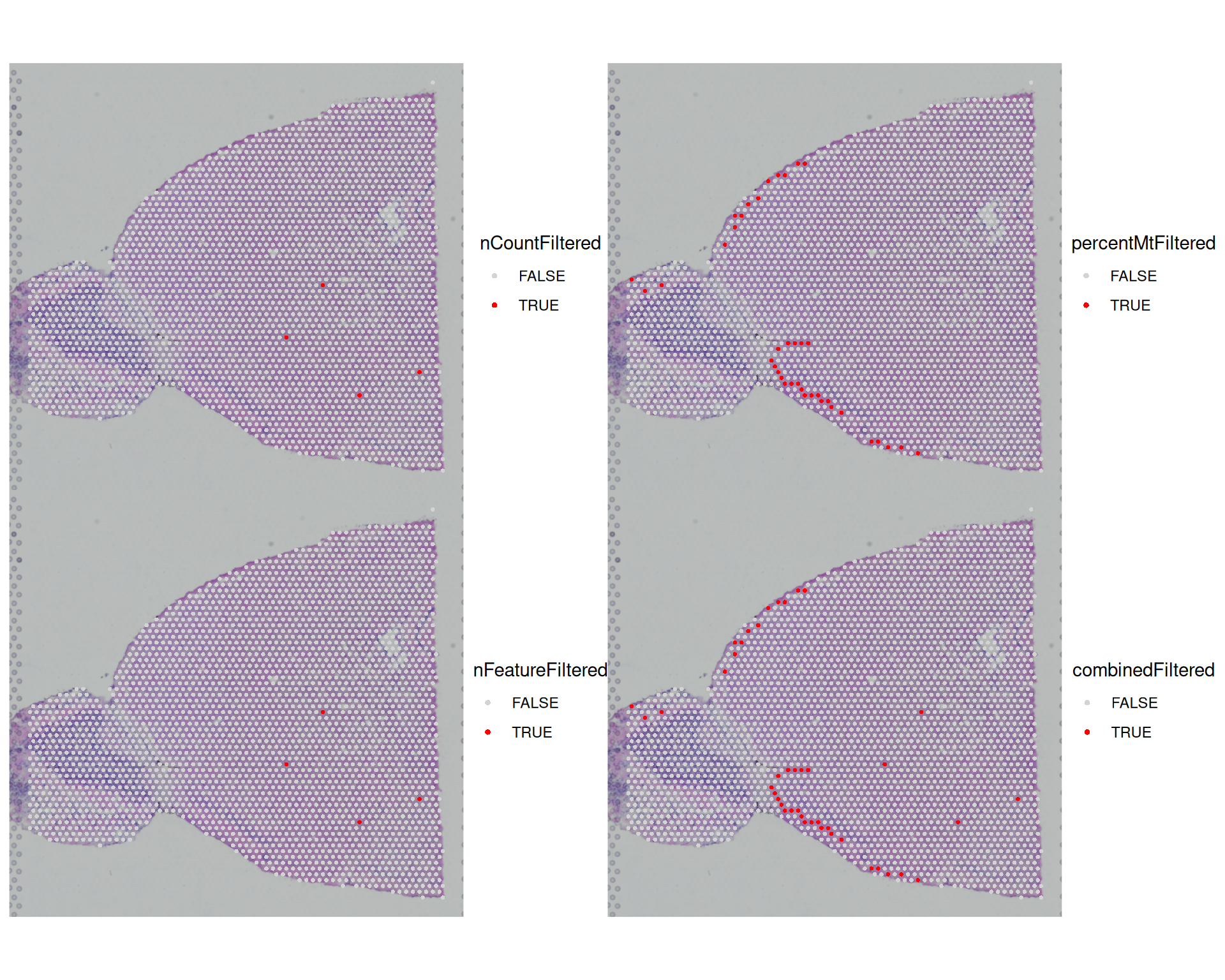
We can also tabulate how many spots each filter would remove:
# tabulate number of cells filtered by each metric
table(visium$nCountFiltered)
FALSE  TRUE
2819 4 table(visium$percentMtFiltered)
FALSE  TRUE
2784 39 table(visium$nFeatureFiltered)
FALSE  TRUE
 2819     4
Most spots are removed because of a high mitochondrial percentage, while only 4 are removed because of low total counts or few detected genes. The plots also show that low-quality spots cluster in particular regions, which matches the earlier exploratory analysis.
5.4.2 Spatially aware thresholds
There are not many spatially aware filtering methods yet, but one example is SpotSweeper.
This method is not yet compatible with Seurat objects, but it is worth keeping an eye on its development (see the current GitHub issue here).
We do not describe it further here, but we may add it to these materials in the future.
5.5 Applying Filters
Once you have defined your filtering thresholds, you can apply them to your Seurat object to remove low-quality spots.
We can use subset() with a logical condition to keep only the spots that meet our quality criteria.
# Apply combined filter to subset the Seurat object
visium <- subset(
  visium,
  subset = nCount_Spatial >= 1000 &
    nFeature_Spatial >= 500 &
    percentMt_Spatial <= 30
)
In the code above, we use the opposite of the filter columns we created earlier so that only high-quality spots remain.
We could also use the combinedFiltered column we created earlier, but that would require negating the condition because TRUE marks low-quality spots and FALSE marks good-quality spots. In R, you negate a logical vector with !, so the following code would retain the good-quality spots:
# Apply filter using the combinedFiltered column
visium <- subset(visium, subset = !combinedFiltered)
After this step, 2780 spots remain for downstream analyses.
5.6 Exporting Filtered Data
As usual, it is a good idea to save your Seurat object after each major step so that you can reload it later without repeating the filtering process:
# Save the filtered Seurat object
saveRDS(visium, file = "results/mouse_brain_filtered.rds")
5.7 Exercises
ExerciseExercise 1
Although library size and the number of unique genes are the standard QC metrics, you can also explore other measures.
For example, you could investigate whether any spots are outliers in variation of counts across genes.
Add three additional columns to your metadata:
countMeanwith the mean counts per spotcountSdwith the standard deviation of counts per spotcountCVwith the coefficient of variation per spot, calculated as standard deviation / mean
Then plot each metric on a spatial plot. What do you conclude?
AnswerAnswer
We can use colMeans() and colSds() to calculate the first two metrics. We then use the existing columns to calculate the third.
# Add new metrics to metadata
visium$countMean <- colMeans(visium[["Spatial"]]$counts)
visium$countSd <- colSds(visium[["Spatial"]]$counts)
visium$countCV <- visium$countSd / visium$countMean
We can then use SpatialFeaturePlot() to visualise these metrics:
SpatialFeaturePlot(visium, c("countMean", "countSd", "countCV"), ncol = 2)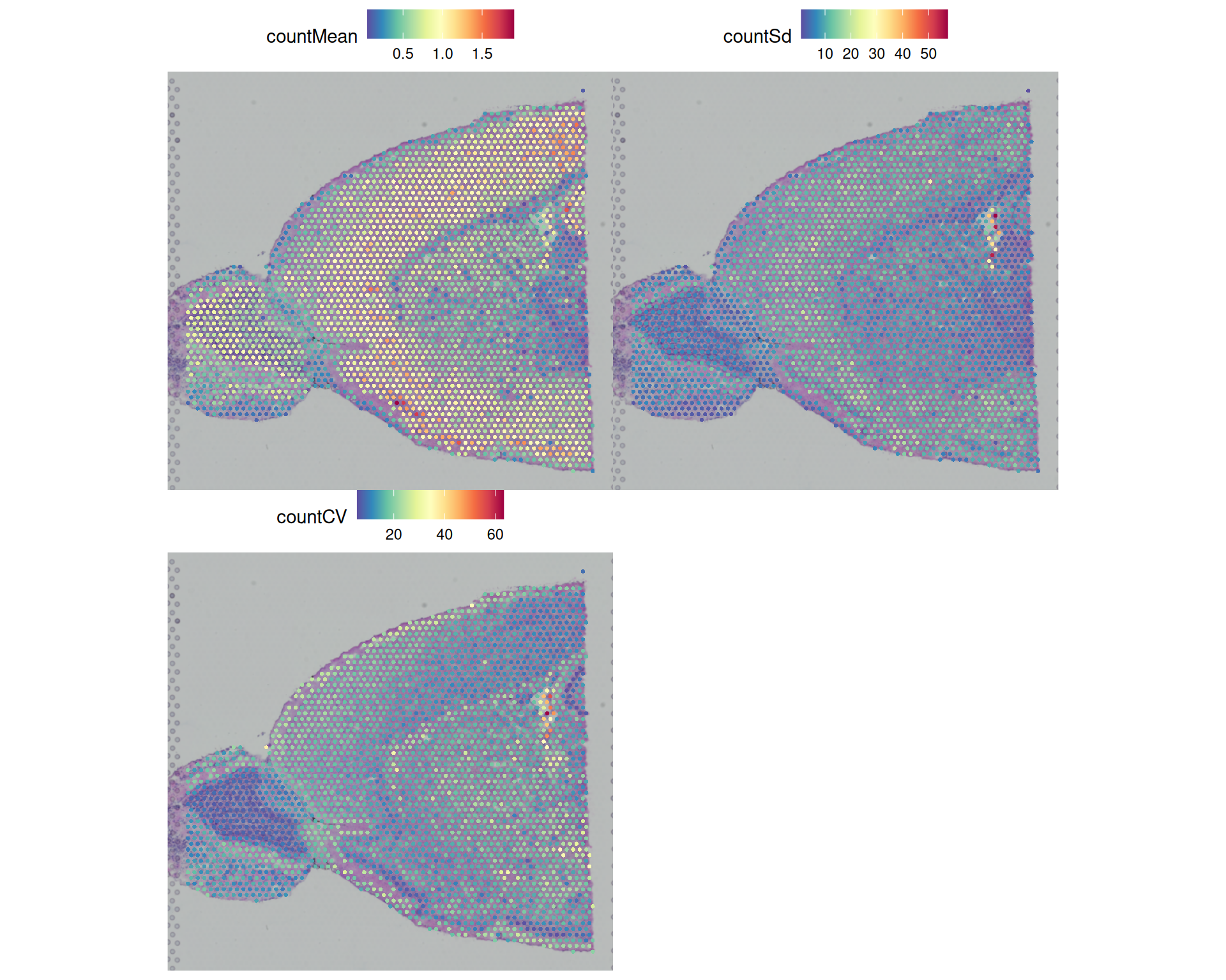
We conclude that:
- The mean is strongly correlated with library size, as expected, so the spatial pattern is very similar to
nCount_Spatial. - The standard deviation and CV highlight a few outlier spots that the earlier QC plots did not flag.
You could explore the coefficient of variation further by looking at its distribution and checking which spots would be removed by an outlier-based filter.
# 99th percentile of the coefficient of variation
quantile(visium$countCV, 0.99)
99%
28.89763 # histogram of the coefficient of variation with a vertical line at some potential thresholds
hist(
visium$countCV,
breaks = 50,
main = "Distribution of coefficient of variation",
xlab = "Coefficient of variation"
)
abline(v = quantile(visium$countCV, 0.99), col = "red", lwd = 2)
abline(v = 40, lwd = 2)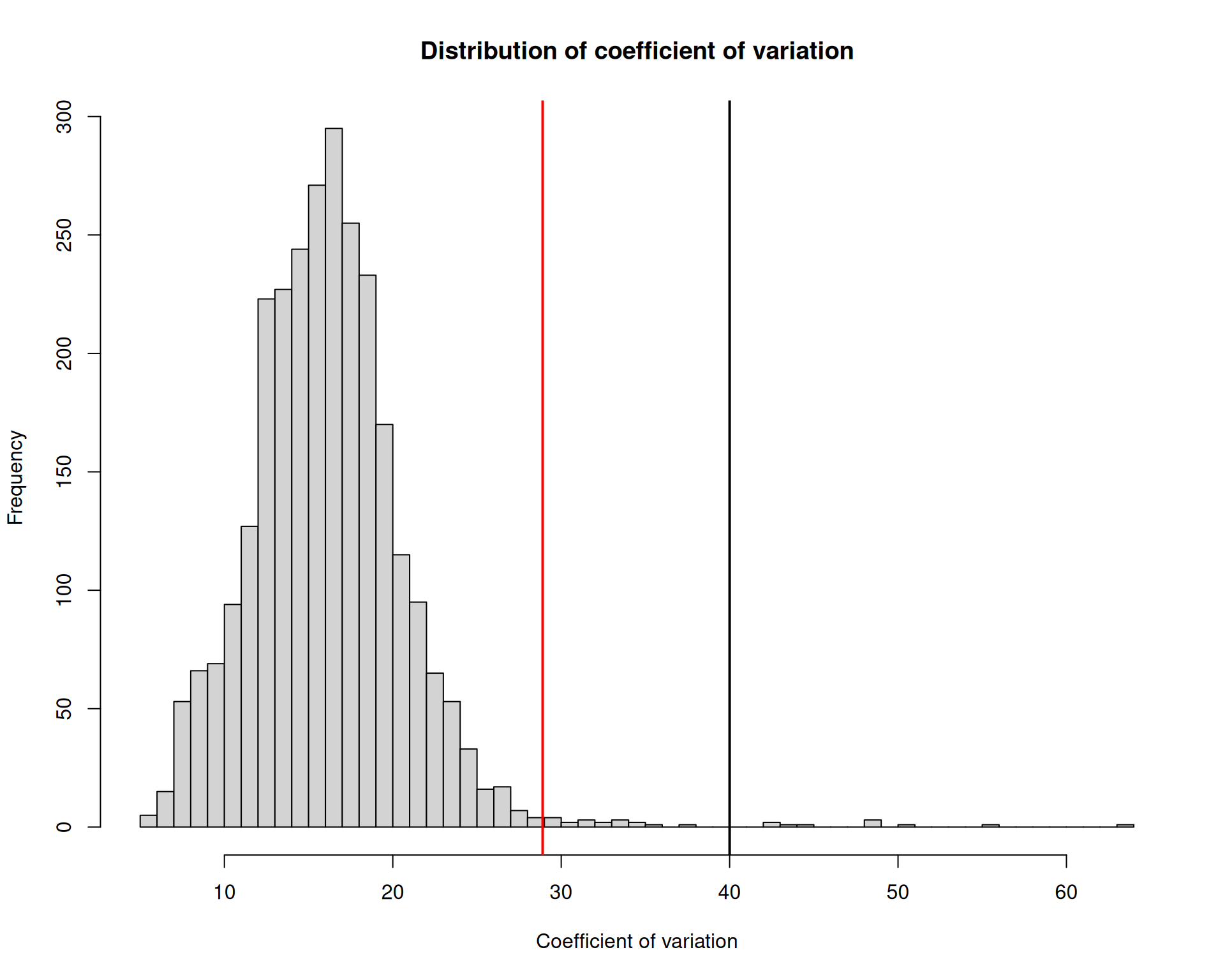
# highlight the outlier spots on a spatial plot
visium$cvFiltered <- visium$countCV >= 40
SpatialDimPlot(visium, group.by = "cvFiltered", cols = c("lightgrey", "red"))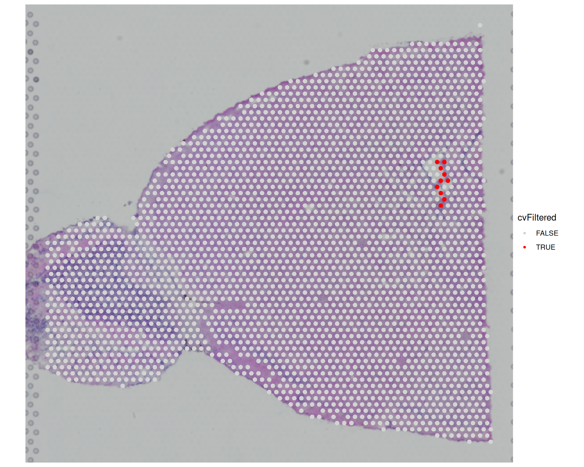
We can see that a few more spots would be filtered out if we used the coefficient of variation, compared with the earlier filters. In this example, we chose CV >= 40, which means the standard deviation in counts across genes is at least 40 times higher than the mean count for that spot. This represents a substantial fluctuation in expression across genes, which may indicate low-quality spots where some genes have very high expression levels while others have very low expression levels.
However, this pattern could reflect genuine biology, and as we’ve said several times, being familiar with your tissue will help making these filtering decisions.
5.8 Summary
TipKey Points
- Library size, detected genes, and mitochondrial percentage are the three core QC metrics for Visium data.
colSums()calculates library size and detected genes from the raw count matrix.PercentageFeatureSet()calculates the fraction of counts from any named gene set.- Mouse mitochondrial genes are prefixed with
mt-, but this prefix may differ between references.
VlnPlot()andSpatialPlot()together reveal both global distributions and the spatial context of QC metrics.- Violin plots show the range and spread of each metric across all spots.
- Spatial plots show whether low-quality spots concentrate in particular tissue regions.
- There are no fixed filtering thresholds, with hand-picked cutoffs and quantile-based cutoffs being common.
- Always visualise each threshold alongside the relevant distribution before applying it.
- Adding
TRUE/FALSEindicator columns to the metadata lets you see which spots would be removed.
- Spatial QC plots help distinguish technical artefacts from genuine biological variation.
- High mitochondrial percentage combined with low counts at the tissue periphery may indicate damaged tissue.
- Filtering non-randomly distributed spots introduces spatial bias into downstream analysis.
subset()applies logical filter conditions to a Seurat object to retain only high-quality spots.- Filter conditions reference metadata column names directly in the
subsetargument. - Save the filtered object with
saveRDS()before moving to downstream analysis.
- Filter conditions reference metadata column names directly in the