# load the libraries
library(tidyverse) # data manipulation
library(patchwork) # to compose plots
library(janitor)   # to clean column names
theme_set(theme_minimal()) # change default ggplot2 theme10 Visualising association results
Caution
These materials are still under development
TipLearning objectives
- Summarise what a Manhattan plot displays and why it is useful in the context of GWAS.
- Produce Manhattan plots using
ggplot2. - Identify the top variants associated with a trait.
- Calculate linkage disequilibrium statistics between a variant of interest and its neighbours.
- Produce a regional association plot that focuses on a region of interest.
10.1 Manhattan plots
The most iconic data visualisation related to GWAS is the so-called Manhattan plot, which displays each variant as a point, with its genome position along the x-axis and its associated -log₁₀(p-value) on the y-axis. Significant associations show as “peaks” passing through the genome-wide significance threshold, represented as a horizontal line. Additionally, each chromosome is shown a separate panel, giving a complete genome-wide view of the association results.
In this section we show how to produce this and other visualisations of our association test results in R.
ImportantSet up your R session
If you haven’t done so already, start an R session with the following packages loaded:
As an example, we will continue with the results for the “blood pressure” trait. Here is how to read it into R, if you haven’t done so already:
# read the association test results including PCA covariates
blood_covar <- read_tsv("results/1000G_subset_pca.blood.glm.linear") |>
  clean_names(replace = c("#" = ""))

# retain only the SNP test
blood_covar <- blood_covar |>
  filter(test == "ADD")
10.2 Visualise GWAS results with ggplot2
To make our Manhattan plot, we can use standard ggplot2 functionality. We use several features of this plotting library to make our plot more effective (see box below for details).
Note
ggplot2 code explanation
Here is the break down of our plotting code:
filter()is used to retain only p-values below 0.01 before plotting. This is done to reduce the number of points being plotted, to avoid crashing the plotting device. As we are not interested in high p-values, we retain only those below 0.01.ggplot()initiates the plot, with genome position as the x-axis and the -log₁₀(p-value) as our y-axis.geom_point()displays points on the plot.geom_hline()adds a horizontal line at the genome-wide significance threshold of \(5 \times 10^{-8}\), which is often used in human GWAS.facet_grid()splits the plot into panels, one per chromosome. We split the facets by “column”, and we make sure that both the scale and the space allocated to each facet is allowed to vary for each chromosome. Finally, we switch the facet labels to appear at the bottom of the plot, for aesthetic reasons. You can try removing those options to see what happens.labs()is used to edit the x-axis label and add a title to the plot.theme_minimal()andtheme()are used together to make the plot more aesthetically pleasing, by removing x-axis labels, tick marks and gridlines.
To save time, you can save some of this code in a variable, for example:
manhattan_theme <- theme_minimal() +
  theme(
    axis.text.x = element_blank(),
    axis.ticks.x = element_blank(),
    panel.grid = element_blank(),
    panel.spacing = unit(0.1, "lines"),
    strip.background = element_blank()
  )
blood_covar |>
filter(p < 0.01) |>
ggplot(aes(pos, -log10(p))) +
geom_point() +
geom_hline(yintercept = -log10(5e-8), linetype = "dashed") +
facet_grid(~ chrom,
scale = "free_x",
space = "free_x",
switch = "x") +
labs(x = "Chromosome",
title = "Manhattan plot") +
theme_minimal() +
theme(
axis.text.x = element_blank(),
axis.ticks.x = element_blank(),
panel.grid = element_blank(),
panel.spacing = unit(0.1, "lines"),
strip.background = element_blank()
)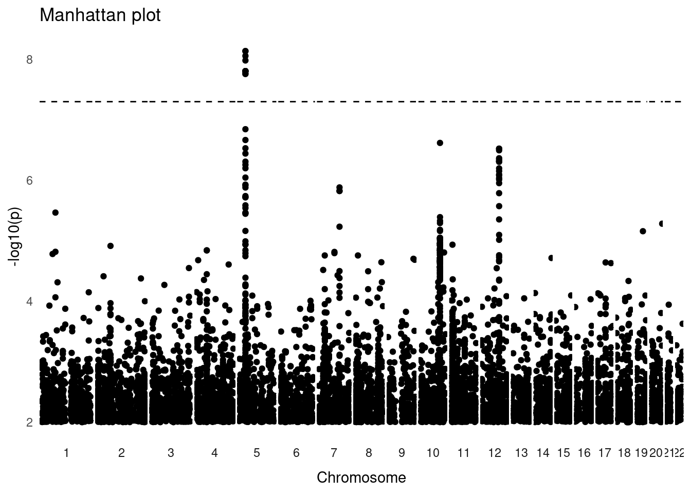
The plot shows a genome-wide significant association in chromosome 5. There are other regions that seem to contain peaks of association (e.g. on chromosomes 10 and 12), but these do not pass the genome-wide threshold.
10.3 Regional plots
Now that we have found an association with our trait, we may want to investigate it further. One common visalisation is to make a “regional plot”, where we zoom-in on a SNV of interest and make a Manhattan plot, colouring the points by the linkage coefficient to the target SNP.
First, let’s identify our top-most associated SNV:
blood_covar |>
  arrange(p) |>
  select(chrom, pos, id, beta, p)
# A tibble: 894,951 × 5
chrom pos id beta p
<chr> <dbl> <chr> <dbl> <dbl>
1 2 205946921 rs12478185 -1.52 0.000000563
2 2 205953670 rs2080568 -1.34 0.00000271
3 2 205951616 rs74833355 -1.34 0.00000295
4 11 130401752 rs747249 1.20 0.00000330
5 4 82532964 rs146781081 -3.70 0.00000333
6 2 205953651 rs2080567 -1.31 0.00000350
7 11 130410772 rs4936098 1.17 0.00000494
8 2 67699363 rs62155373 1.04 0.00000678
9 19 50295975 rs6509462 1.27 0.00000682
10 2 205955435 rs76136841 -1.28 0.00000730
# ℹ 894,941 more rowsWe can see at the top we have two SNPs with the same estimated β coefficient and p-value. These must be two SNVs that have the same genotype across all individuals (i.e. they are in perfect linkage). We arbitrarily choose “rs1158715” to proceed with our analysis.
We can calculate the linkage score for our target SNP using PLINK:
plink2 --pfile data/plink/1000G_subset --out results/1000G_subset_rs1158715 \
  --geno 0.05 --maf 0.01 --hwe 0.001 keep-fewhet \
  --mind 0.05 --keep results/1000G_subset.king.cutoff.in.id \
  --r2-unphased --ld-snp rs1158715 \
--ld-window-kb 500 --ld-window-r2 0.05--r2-unphasedcalculates the correlation between pairs of SNVs.--ld-snpindicates which is the target SNV we are interested in.--ld-window-kbrestricts the calculation to SNVs within 500 kbp of the target SNV.--ld-window-r2indicates what is the minimum r² we want reported. By default this is 0.2, here we lower this threshold for illustration purposes. In real analysis, it may be sensible to truncate the calculation at 0.2, to reduce the size of the output file.
The --r2-unphased option outputs a file with .vcor (variant correlation) extension. As usual, this is a tab-delimited file, which we can read into R:
rs1158715 <- read_tsv("results/1000G_subset_rs1158715.vcor") |>
  clean_names(replace = c("#" = ""))

head(rs1158715)
# A tibble: 6 × 7
chrom_a pos_a id_a chrom_b pos_b id_b unphased_r2
<dbl> <dbl> <chr> <dbl> <dbl> <chr> <dbl>
1 5 32788263 rs1158715 5 32499983 rs2594825 0.0697
2 5 32788263 rs1158715 5 32525916 rs10075706 0.0703
3 5 32788263 rs1158715 5 32584224 rs75601756 0.0622
4 5 32788263 rs1158715 5 32590736 rs144639299 0.0501
5 5 32788263 rs1158715 5 32592855 rs16889957 0.0501
6 5 32788263 rs1158715 5 32596810 rs11952873 0.0501The table contains the correlation between genotypes in our SNV of interest (id_a) and each other SNV (id_b) within 500 kbp of it. We can quickly look at the distribution of the correlation values:
rs1158715 |>
  ggplot(aes(unphased_r2)) +
  geom_histogram(breaks = seq(0, 1, 0.02))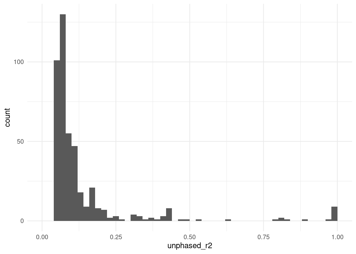
We can see that most SNVs have low correlation with our target SNP, but a few have very high correlation.
We can also see the expected decay in LD with distance from the target SNV:
rs1158715 |>
  # add column with distance to target variant
  mutate(dist = abs(pos_a - pos_b)) |>
  # plot with a trend line added
  ggplot(aes(dist, unphased_r2)) +
  geom_point() +
  geom_smooth(se = FALSE)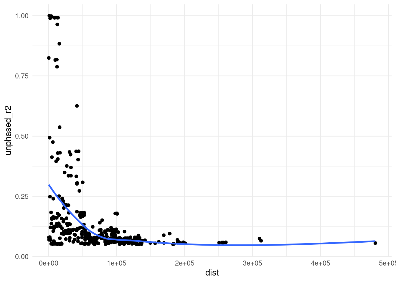
Finally, we can produce a regional association plot, which displays the strength of association as well as the correlation with the variants surrounding our peak variant. We do this by:
- Filtering our GLM results table to focus on the region of interest.
- Joining it with the correlation table (using the matching variant ids)
- Producing a plot with genomic position on the x-axis, -log₁₀(p-value) on the y-axis, and setting the points colour and size by their correlation value.
blood_covar |>
  # retain variants within 250kb each side of our target
  filter(chrom == 5 & pos > 32788263 - 250e3 & pos < 32788263 + 250e3) |>
  # join with our LD table
  left_join(rs1158715, by = c("id" = "id_b")) |>
  # for SNVs with no correlation value (below 0.05)
  # we set them to 0 for plotting purposes
  mutate(unphased_r2 = ifelse(is.na(unphased_r2), 0, unphased_r2)) |>
  # for the target variant itself, we set it to 1
  mutate(unphased_r2 = ifelse(id == "rs1158715", 1, unphased_r2)) |>
  # plot
  ggplot(aes(pos, -log10(p))) +
  geom_point(aes(colour = unphased_r2, size = unphased_r2)) +
  geom_hline(yintercept = -log10(5e-8), linetype = "dashed") +
  scale_colour_gradient2(low = "#313695",
                         mid = "#ffffbf",
                         high = "#a50026",
                         midpoint = 0.5)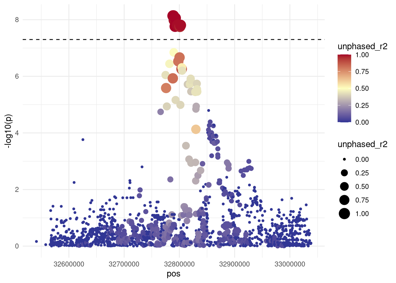
This visualisation clearly shows a cluster of variants in close proximity of the target variant and with high genotype correlation to it.
This visualisation is useful not only to display our results, but also to help us prioritise which variants to focus on in downstream analyses.
10.4 Summary
TipKey Points
- Manhattan plots display the results of the association tests for each variant:
- Each variant is displayed along the x-axis according to its genome position.
- The y-axis shows the strenght of association as -log₁₀(p-value).
- Manhattan plots can be produced using standard
ggplot2functionality, in particular taking advantage of thefacet_grid()function and custom themes. - Once a variant of interest is identified, its correlation with neighbouring variants can be calculated (a measure of LD between neighbouring variants).
- A combination of PLINK’s options can be used to calculate LD around a target variant:
--r2-unphased,--ld-snp,--ld-window-kband--ld-window-r2.
- A combination of PLINK’s options can be used to calculate LD around a target variant:
- Regional association plots are a zoomed-in version of a Manhattan plot, additionally displaying the LD with a target variant using a colour scale.