# load the libraries
library(tidyverse) # data manipulation
library(patchwork) # to compose plots
library(janitor)   # to clean column names
theme_set(theme_minimal()) # change default ggplot2 theme7 Population structure
Caution
These materials are still under development
TipLearning objectives
- Define what is meant by population structure and how it may confound GWAS results.
- Run Principal Components Analysis (PCA) on genetic data to investigate if individuals cluster based on genetic similarity.
- Visualise the PCA results together with sample metadata such as geographic region.
7.1 Population stratification
Populations from different geographic regions may genetically diverge from each other due to evolutionary processes such as drift, selection, migration, bottlenecks, etc. This creates patterns in the genetic background of the individuals from these populations, such that we can, for example, infer their ancestry from their genome sequences. This is what we refer to as population structure.
Intuitively, it’s easy to understand that human individuals from the same country are genetically more similar to each other compared to individuals from other countries. Much of this similarity is simply a consequence of their shared evolutionary history, and not directly related to traits that also differ between those populations. Thus, population structure may confound our trait association analysis and needs to be investigated and taken into account in downstream analyses.
ImportantSet up your R session
If you haven’t done so already, start an R session with the following packages loaded:
7.2 Principal components analysis
One popular way to assess the presence of population structure is to use principal components analysis (PCA) using the genetic data, to help cluster the individual samples based on their genotypes.
PLINK provides the --pca option to perform this task. In the following command we use this option, along with several filters based on our quality control exploration done in previous sections:
plink2 --pfile data/plink/1000G_subset --out results/1000G_subset \
  --extract results/1000G_subset.prune.in \
  --geno 0.05 --mind 0.05 --maf 0.01 --hwe 0.001 keep-fewhet \
  --king-cutoff 0.125 \
  --pca
To recap, our filters are:
--geno 0.05removes variants with > 5% missing data.--mind 0.05removes samples with > 5% missing data.--maf 0.01removes variants with < 1% minor allele frequency.--hwe 0.001 keep-fewhetremoves variants with p-value < 0.001 for the HWE test, but only those with high heterozygosity (as low heterozygosity variants may be due to population structure).--king-cutoff 0.125removes individuals with kinship coefficient greater than 1/8 (second-degree relatives).
The PCA option outputs two files:
.eigenveccontains the principal component scores (also known as eigen vectors), which are the coordinates of each sample on the new dimensionality space..eigenvalcontains the variance explained by each principal component (also know as eigen values), which can be used to calculate the fraction of variance explained.
We explore each of these in turn.
7.3 Variance explained
A standard practice when analysing a PCA is to consider what fraction of the variance in the original data (in our case genotypes) is explained by each of the principal components.
This is stored in the .eigenval file, which is a simple text file with one value of variance per line:
head -n 5 results/1000G_subset.eigenval79.3207
44.1399
6.95917
3.5593
3.55036We import this file into into R, making sure to specify a column name manually. We also add a new column to the table, specifying the principal component number. Finally, we add a column that calculates the fraction of variance explained by each PC.
# read table adding a column name manually
eigenval <- read_tsv("results/1000G_subset.eigenval",
                     col_names = "var")

# add columns with PC number and pct variance explained
eigenval <- eigenval |>
  mutate(pc = 1:n(),
         pct_var = var/sum(var)*100)

head(eigenval)
# A tibble: 6 × 3
var pc pct_var
<dbl> <int> <dbl>
1 90.5 1 60.1
2 28.1 2 18.7
3 9.74 3 6.47
4 7.69 4 5.11
5 3.42 5 2.27
6 2.93 6 1.94With this table we can now make a barplot of variance explained by each principal component, as well as the cumulative variance explained. This is known as a scree plot.
eigenval |>
  ggplot(aes(pc, pct_var)) +
  geom_col() +
  geom_line(aes(y = cumsum(pct_var))) +
  scale_x_continuous(breaks = 1:10) +
  scale_y_continuous(breaks = seq(0, 100, by = 20))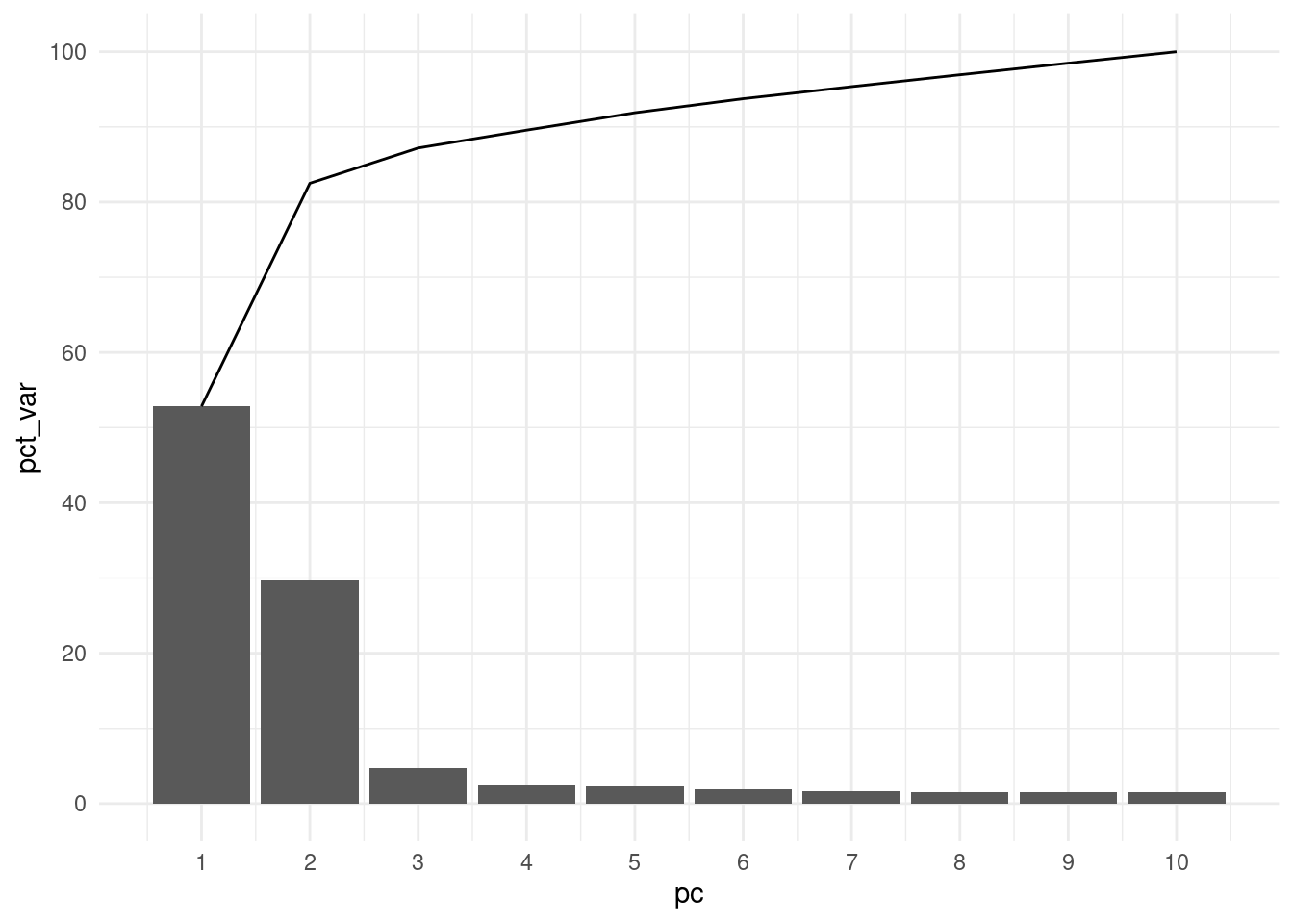
From this visualisation, we can see that most of the genetic variance in our samples is explained by the first two principal components (~80%). This is, by itself, already an indication that there is substantial population structure in our data.
This should not be surprising, as we know that our individuals come from different geographic regions.
7.4 PCA plot
We now read the eigen vectors, i.e. the principal component scores that represent our samples in the low-dimensionality space calculated by the PCA method.
This is stored in the .eigenvec file, which we can read into R as usual:
eigenvec <- read_tsv("results/1000G_subset.eigenvec") |>
  clean_names(replace = c("#" = ""))

head(eigenvec)
# A tibble: 6 × 11
iid pc1 pc2 pc3 pc4 pc5 pc6 pc7 pc8
<chr> <dbl> <dbl> <dbl> <dbl> <dbl> <dbl> <dbl> <dbl>
1 HG00097 -0.0182 0.0417 0.00781 -0.0312 -0.00315 0.00281 -0.000807 -0.000515
2 HG00107 -0.0186 0.0401 0.0118 -0.0336 -0.00128 0.00135 0.00413 0.00164
3 HG00108 -0.0182 0.0401 0.0105 -0.0322 -0.000855 0.00491 0.000789 -0.000235
4 HG00109 -0.0182 0.0407 0.00967 -0.0360 -0.000648 0.00386 0.00294 0.00440
5 HG00110 -0.0186 0.0397 0.00971 -0.0321 0.000463 0.00379 0.00173 -0.00215
6 HG00111 -0.0183 0.0404 0.00884 -0.0282 -0.00159 0.00382 -0.00155 -0.000881
# ℹ 2 more variables: pc9 <dbl>, pc10 <dbl>In addition to the family and individual IDs, we have 10 columns representing the coordinates of each sample on the principal component space.
ExerciseExercise 1 - PCA plot
Use ggplot to make a scatter plot of PC1 vs PC2.
What can you conclude about the extent of population structure in the data?
AnswerAnswer
The code to produce the plot is:
eigenvec |>
  ggplot(aes(pc1, pc2)) +
  geom_point()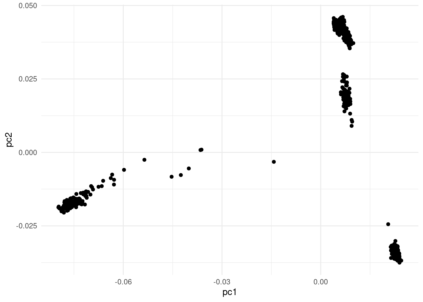
This very clearly shows population structure in our samples. We can see how groups of samples cluster together in our PCA, indicating their genetic similarity.
Tipically we focus on the first 2 PCs, as these explain the most variance, but you may sometimes want to explore further PCs, especially if they still explain a substantial percentage of the variation in the data.
7.4.1 Adding metadata
The visualisation created in the exercise above is useful, but we can improve it by joining the sample metadata and colouring our points by world region.
# read the sample metadata file
sample_info <- read_tsv("data/sample_info.tsv")

head(sample_info)
# A tibble: 6 × 18
family_id individual_id paternal_id maternal_id gender phenotype population
<chr> <chr> <dbl> <chr> <dbl> <dbl> <chr>
1 HG00096 HG00096 0 0 1 0 GBR
2 HG00097 HG00097 0 0 2 0 GBR
3 HG00099 HG00099 0 0 2 0 GBR
4 HG00100 HG00100 0 0 2 0 GBR
5 HG00101 HG00101 0 0 1 0 GBR
6 HG00102 HG00102 0 0 2 0 GBR
# ℹ 11 more variables: relationship <chr>, siblings <chr>, second_order <chr>,
# third_order <chr>, children <dbl>, other_comments <dbl>,
# phase_3_genotypes <dbl>, related_genotypes <dbl>, omni_genotypes <dbl>,
# affy_genotypes <dbl>, super_pop <chr># join the eigenvector table with the metadata table
eigenvec <- eigenvec |>
left_join(sample_info,
by = c("iid" = "individual_id"))
# confirm column names in the joined table
colnames(eigenvec) [1] "iid" "pc1" "pc2"
[4] "pc3" "pc4" "pc5"
[7] "pc6" "pc7" "pc8"
[10] "pc9" "pc10" "family_id"
[13] "paternal_id" "maternal_id" "gender"
[16] "phenotype" "population" "relationship"
[19] "siblings" "second_order" "third_order"
[22] "children" "other_comments" "phase_3_genotypes"
[25] "related_genotypes" "omni_genotypes" "affy_genotypes"
[28] "super_pop" As our table now contains the columns from the sample metadata, as well as the principal component scores, we can make a nicer visualisation of our PCA.
We colour points by the world region (super_pop column) and also add the percentage of variance explained to the x and y axis labels.
eigenvec |>
  ggplot(aes(pc1, pc2, colour = super_pop)) +
  geom_point() +
  labs(x = paste0("PC1 (", round(eigenval$pct_var[1]), "%)"),
       y = paste0("PC2 (", round(eigenval$pct_var[2]), "%)"),
       colour = "World Region")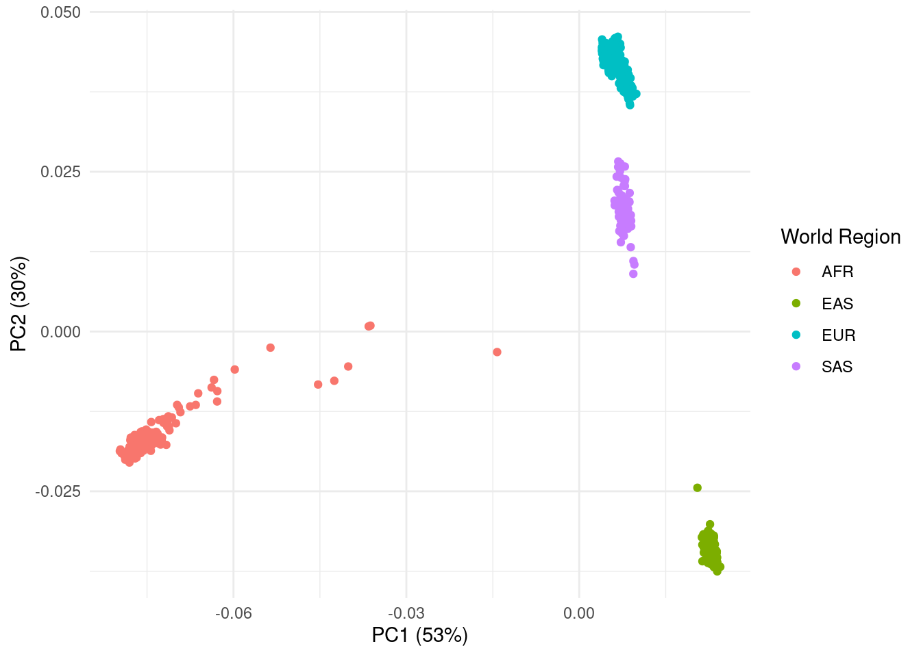
As we suspected, this very clearly shows individuals clustering by the world region they originate from.
We can also see some spread of points within each world region. This is likely due to even further population structure, as individuals within these regions also come from different countries.
Another way in which PCA can be used, is in detecting outlier individuals, i.e. individuals that cluster outside of their expected geographic region. It may be best to remove such individuals, as their metadata and/or genotype data may be innacurate.
Population stratification needs to be taken into account when we run our association analysis, which is the topic of the next chapter.
7.5 Summary
TipKey Points
- Population structure refers to the presence of genetic subgroups within a population, which may be caused by evolutionary (e.g. drift and selection) and demographic events (e.g. migration and bottlenecks).
- Population structure may confound GWAS results as false-positive associations may be found for traits that differ across those sub-populations.
- A common way to assess the presence of population structure is to run Principal Components Analysis on the genetic data, and assess the clustering of individuals on a PCA plot.
- Together with metadata, PCA can also be used to assess if an individual is an outlier from its assigned population (e.g. if an individual labelled as European clusters with individuals from East Asia).