# load the libraries
library(tidyverse) # data manipulation
library(patchwork) # to compose plots
library(janitor) # to clean column names
theme_set(theme_minimal()) # change default ggplot2 theme9 Running GWAS
Caution
These materials are still under development
TipLearning objectives
- Fit a GLM model to trait data using PLINK both with and without covariates.
- Generate Q-Q plots for the p-values from the association test, to assess over- or under-inflation issues.
- Recognise and adjust for population structure in the GLM model.
9.1 Fitting an association model
Fitting a genotypic linear model to our traits with PLINK can be done using the --glm option (for “generalised linear model”). We also need to provide a phenotype file, which is tab-delimited with the first two columns being the family and sample IDs, and remaining columns the traits. PLINK will automatically detect whether the traits are continous or binary and fit a model accordingly.
As before, we apply the quality filters discussed in previous sections. Here is the full command:
plink2 --pfile data/plink/1000G_subset --out results/1000G_subset_nocovar \
  --geno 0.05 --maf 0.01 --hwe 0.001 keep-fewhet \
  --mind 0.05 --keep results/1000G_subset.king.cutoff.in.id \
  --pheno data/phenotypes.tsv \
  --glm allow-no-covars
We added a modifier to the --glm option called allow-no-covars. This is because, by default, PLINK expects most standard GWAS to use covariates in the model to account for population structure, which is standard practice. However, we want to explore first what happens if we ignore this aspect when running the association tests.
The --glm option generates one file for each trait. The file extensions are .glm.linear for quantitative traits and .glm.logistic.hybrid for binary traits.
ImportantSet up your R session
If you haven’t done so already, start an R session with the following packages loaded:
9.2 Q-Q plots
The results files from --glm are tab-delimited, which we can read into R as usual. We start with one of our quantiative traits, blood pressure:
blood_nocovar <- read_tsv("results/1000G_subset_nocovar.blood.glm.linear") |>
  clean_names(replace = c("#" = ""))

head(blood_nocovar)
# A tibble: 6 × 16
chrom pos id ref alt provisional_ref a1 omitted a1_freq test
<chr> <dbl> <chr> <chr> <chr> <chr> <chr> <chr> <dbl> <chr>
1 1 14470 rs1385614… G A N A G 0.0402 ADD
2 1 49157 rs1999980… G A N A G 0.0300 ADD
3 1 64025 rs1366827… T C N C T 0.0618 ADD
4 1 95978 rs1441941… A C N C A 0.0196 ADD
5 1 97960 rs62642103 A G N G A 0.0142 ADD
6 1 98974 rs12184307 A G N G A 0.0882 ADD
# ℹ 6 more variables: obs_ct <dbl>, beta <dbl>, se <dbl>, t_stat <dbl>,
# p <dbl>, errcode <chr>As explained in the previous chapter, we start by looking at the distribution of our p-values using a histogram:
blood_nocovar |>
  ggplot(aes(p)) +
  geom_histogram(binwidth = 0.01)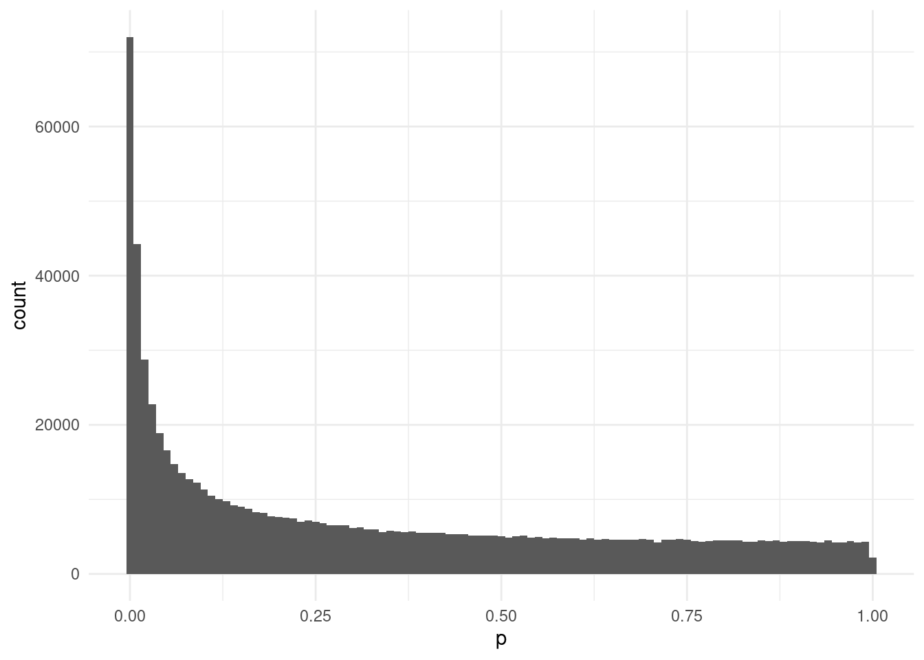
This looks relatively uniform towards the right-end of the distribution, but there’s quite a sharp skew towards the low end. This may indicate some p-value inflation due to unaccounted confounders.
We can better visualise the issue of inflation using a Q-Q plot. For this, we need to calculate the expected p-values, corresponding to our observed ones. We do this in two steps:
- Sorting our table by p-value, using the
arrange()function. - Create a new column with as many data points, but uniformly split between 0 and 1 (the “uniform” distribution expectation). We can do this with the
ppoints()(“probability points”) function.
Note that due to the very high number of data points (915795 in our case), it is often a good idea to plot a random sample of points, to avoid overloading the plotting device (at best it may be very slow to render the plots, at worse it may crash your R session). As in this case we are particularly interested in the low p-values, we retain all p-values below 0.01 and then randomly sample 5% of the rest.
blood_nocovar |>
  arrange(p) |>
  # generate uniformly split points between 0-1
  # also -log10 transform our p-values
  mutate(expected = -log10(ppoints(n())),
         observed = -log10(p)) |>
  # retain all p-values below 0.001
  # but only ~5% of those above that threshold
  filter(p <= 0.001 | (p > 0.001 & runif(n()) < 0.05)) |>
  ggplot(aes(expected, observed)) +
  geom_point() +
  geom_abline()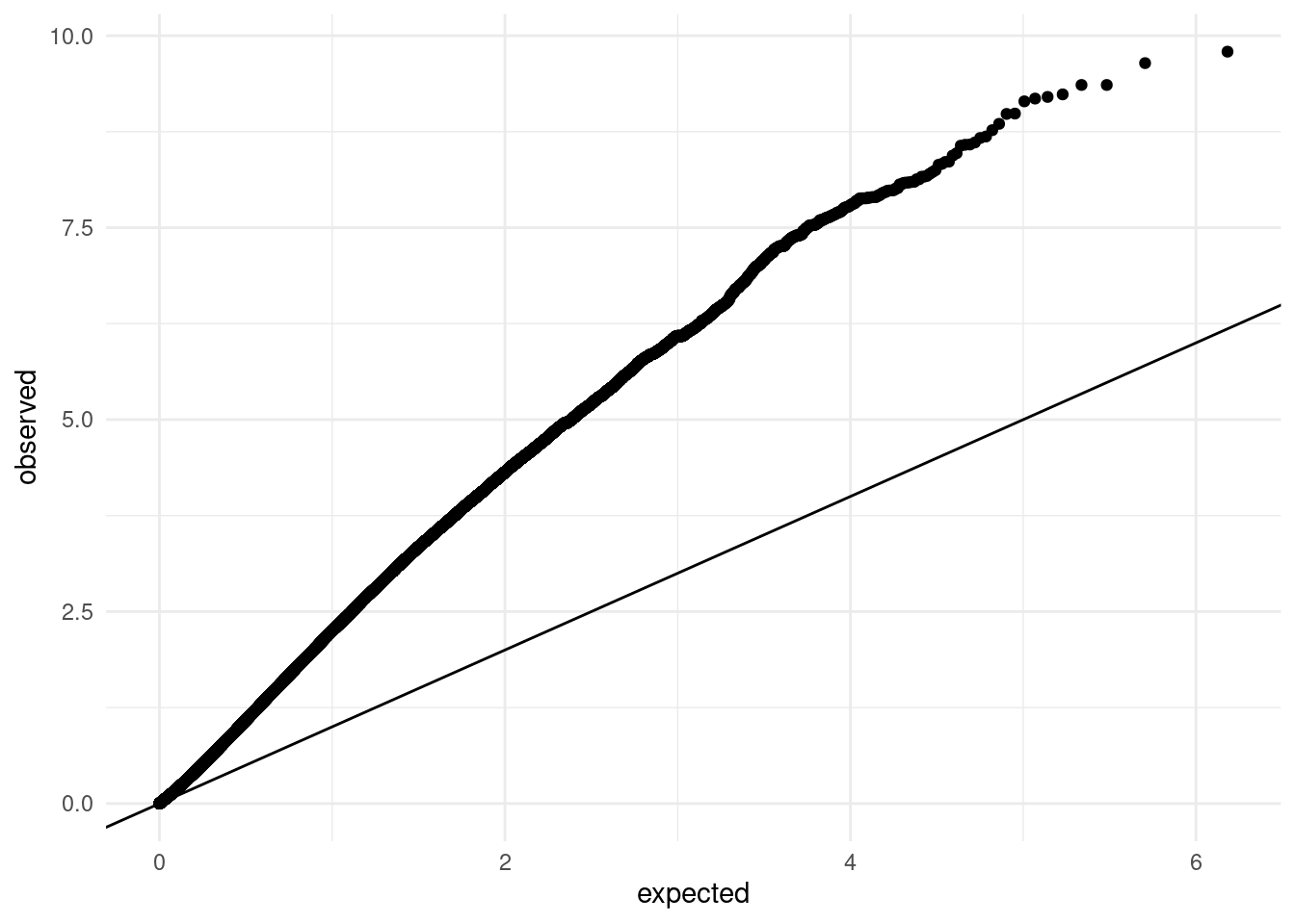
This plot clearly shows substantial inflation of our p-value distribution, as nearly all points fall above the expected diagonal.
We can calculate the so-called inflation factor for our p-values, which is derived from a χ² distribution. An inflation factor of ~1 indicates no inflation, whereas values above that indicate an inflation relative to the null expectation.
Here is the code to calculate the inflation factor for our p-values:
median(qchisq(blood_nocovar$p, df=1, lower.tail = FALSE), na.rm = T)/qchisq(0.5, 1)[1] 4.049382We get a value of ~3, which clearly indicates an inflation. This is not surprising, as we already assessed that our data has substantial population structure, which will confound some of our analysis.
One way to understand this confounding is to consider the distribution of our trait across world regions. The code below reads the phenotype and sample metadata tables, and joins them together to generate a boxplot of blood pressure across countries.
pheno <- read_tsv("data/phenotypes.tsv")
sample_info <- read_tsv("data/sample_info.tsv")

sample_info |>
  full_join(pheno, by = c("individual_id" = "IID")) |>
  ggplot(aes(blood, population, fill = super_pop)) +
  geom_boxplot()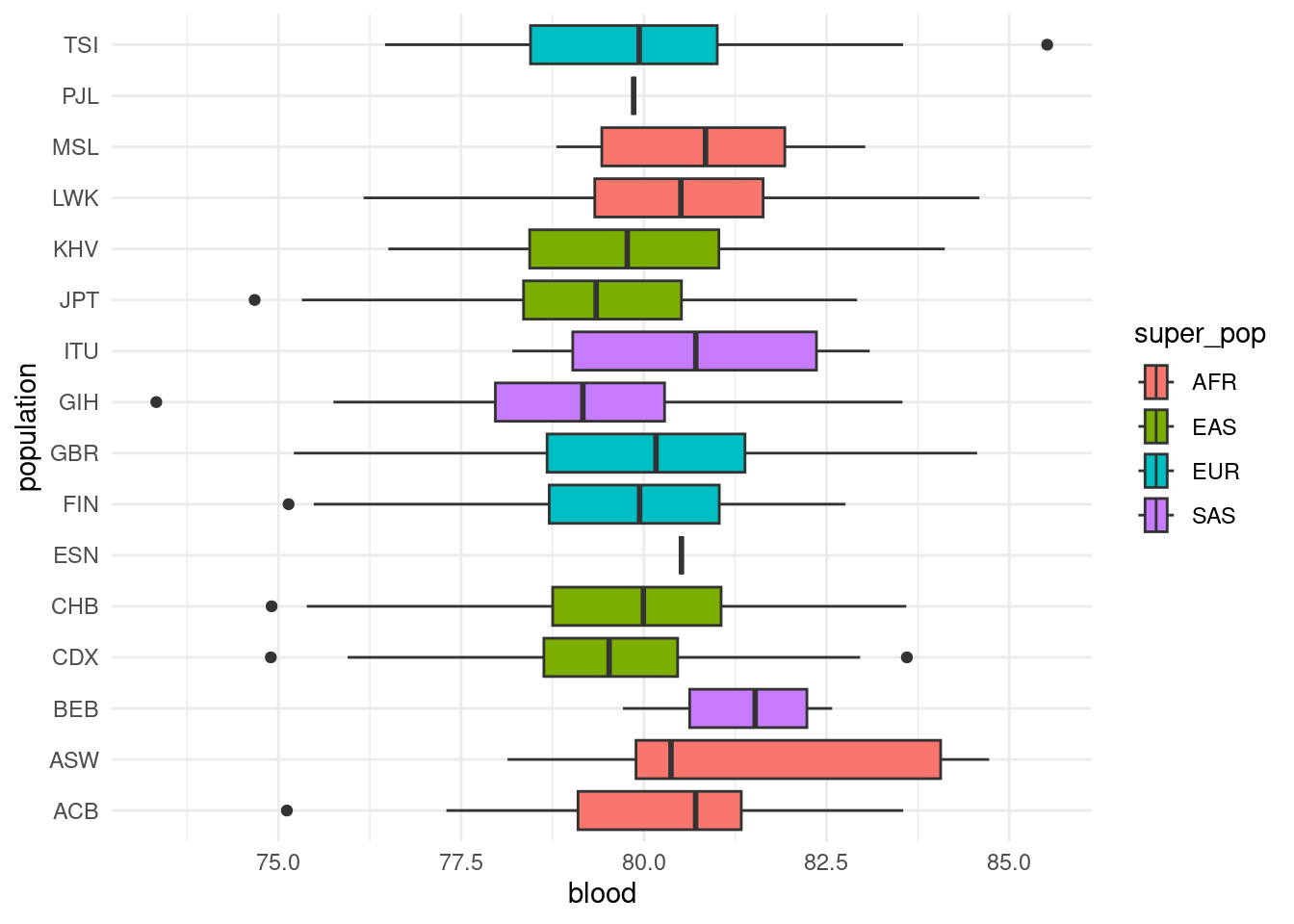
As we can see, there are differences in the mean blood pressure of different populations. This means that any genetic differences between those populations (due to non-random mating, drift, selection, etc.) may show as “significant” associations with blood pressure, causing false positives.
9.3 Adjusting for population structure
To avoid the confounding due to population structure, we can add the PCA scores as covariates to our GLM. This is done using the --covar option:
plink2 --pfile data/plink/1000G_subset --out results/1000G_subset_pca \
  --geno 0.05 --maf 0.01 --hwe 0.001 keep-fewhet \
  --mind 0.05 --keep results/1000G_subset.king.cutoff.in.id \
  --pheno data/phenotypes.tsv \
  --glm \
  --covar results/1000G_subset.eigenvec
As before, we import our results and re-assess the issue of p-value inflation.
# import the results table
blood_covar <- read_tsv("results/1000G_subset_pca.blood.glm.linear") |>
  clean_names(replace = c("#" = ""))

head(blood_covar)
# A tibble: 6 × 16
chrom pos id ref alt provisional_ref a1 omitted a1_freq test
<chr> <dbl> <chr> <chr> <chr> <chr> <chr> <chr> <dbl> <chr>
1 1 14470 rs1385614… G A N A G 0.0402 ADD
2 1 14470 rs1385614… G A N A G 0.0402 PC1
3 1 14470 rs1385614… G A N A G 0.0402 PC2
4 1 14470 rs1385614… G A N A G 0.0402 PC3
5 1 14470 rs1385614… G A N A G 0.0402 PC4
6 1 14470 rs1385614… G A N A G 0.0402 PC5
# ℹ 6 more variables: obs_ct <dbl>, beta <dbl>, se <dbl>, t_stat <dbl>,
# p <dbl>, errcode <chr>You may notice that this table, while similar to the previous before, has many more rows. This is because we now have 10 covariates (each of the principal components from our PCA), and PLINK reports the statistical test for their association with the trait, in addition to the genotype association. This is indicated in the test column:
# get the unique values in the "test" column
unique(blood_covar$test)
[1] "ADD" "PC1" "PC2" "PC3" "PC4" "PC5" "PC6" "PC7" "PC8" "PC9"
[11] "PC10" "SEX" We have test results for each PC as well as a test labelled “ADD”. This refers to the “additive genotypic effect”, which is what we are interested in. As we are not interested in the association between PCs and our trait, we exclude them from the table in downstream analysis:
# retain only the SNP test
blood_covar <- blood_covar |>
  filter(test == "ADD")
We can now make the same p-value diagnostic plots as before:
# histogram of p-values
blood_covar |>
  arrange(p) |>
  mutate(expected = -log10(ppoints(n())),
         observed = -log10(p)) |>
  filter(p <= 0.001 | (p > 0.001 & runif(n()) < 0.01)) |>
  ggplot(aes(p)) +
  geom_histogram(binwidth = 0.01) +
  labs(title = "P-value histogram")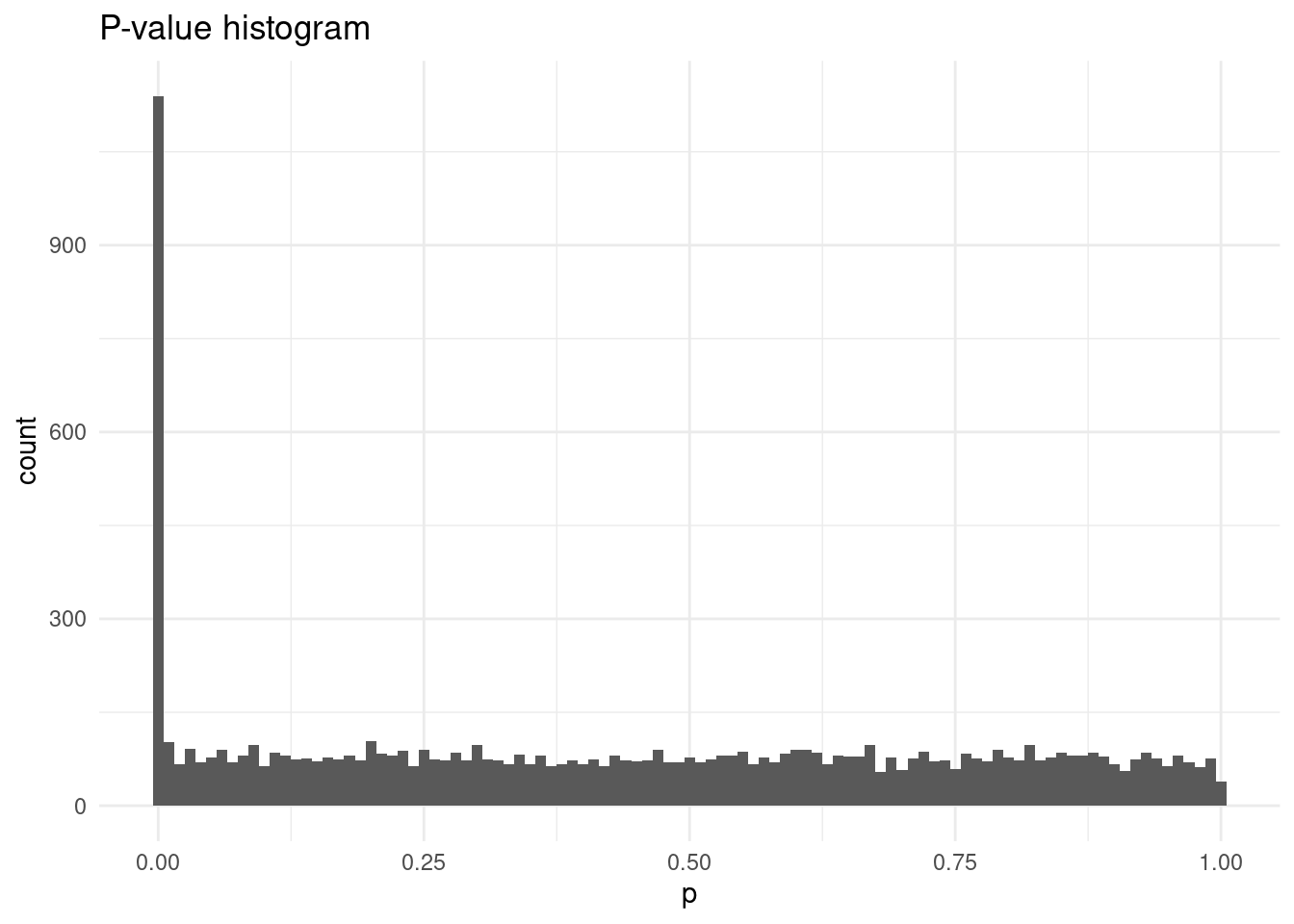
# qqplot
blood_covar |>
  arrange(p) |>
  mutate(expected = -log10(ppoints(n())),
         observed = -log10(p)) |>
  filter(p <= 0.001 | (p > 0.001 & runif(n()) < 0.01)) |>
  ggplot(aes(expected, observed)) +
  geom_point() +
  geom_abline() +
  labs(title = "Q-Q plot")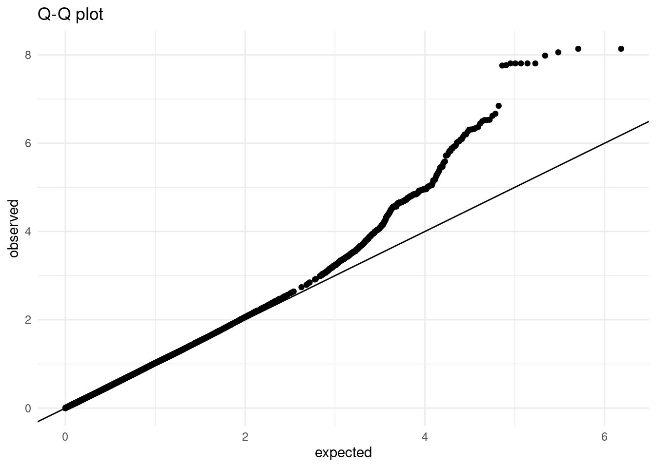
From the visualisations above, we can see the issue of p-value inflation seems to have been resolved, as most points in the Q-Q plot seem to fall in the line. We can also calculate the inflation factor, which confirms this:
median(qchisq(blood_covar$p, df=1, lower.tail = F), na.rm = T)/qchisq(0.5, 1)[1] 1.016059The value is now ~1, indicating no major issues.
The histogram and Q-Q plot also reveal an excess of very low p-values, which is a sign we have some significant (true) associations. The next chapter explores how we can visualise these potential associations across our genome.
9.4 Summary
TipKey Points
- The
--glmoption in PLINK can be used to fit a generalised linear model to the trait data.- This option automatically detects whether the trait(s) provided are binary or quantitative.
- Q-Q plots are an essential tool to assess p-value inflation in the association results.
- One method to adjust for population structure is to add the PCA scores as covariates to the linear model.
- The option
--covarcan be used to give a file of covariate variables to PLINK’s model.
- The option