# load the libraries
library(tidyverse) # data manipulation
library(patchwork) # to compose plots
library(janitor)   # to clean column names
theme_set(theme_minimal()) # change default ggplot2 theme5 Variant QC
Caution
These materials are still under development
TipLearning objectives
- List metrics that can be used for variant-level quality control and filtering.
- Use PLINK to calculate genotype call rates, minor allele frequency and deviations from Hardy-Weinberg equilibrium.
- Analyse quality metric results in R and assess the need for filtering in downstream analyses.
- Discuss how these quality metrics are impacted by population structure.
- Produce a set of uncorrelated variants using linkage disequilibrium pruning.
5.1 Per-variant metrics
Before proceeding with downstream analyses, it’s good practice to investigate quality issues in our variants. We will consider the following metrics for each variant:
- Call rate: Fraction of missing genotypes. Variants with a high fraction of missing data may indicate overall low quality and thus be removed from downstream analysis.
- Allele frequency: The frequency of the allele in the population of samples. Variants with low frequency (rare alleles) are usually excluded from downstream analysis as they incur low statistical power for association tests.
- Hardy-Weinberg deviations: In randomly mating populations, there is a theoretical expectation of how many homozygous and heterozygous individuals there should be given the frequency of the two alleles. Deviations from this expectation may be due to genotyping errors.
We will cover each of these below.
ImportantSet up your R session
If you haven’t done so already, start an R session with the following packages loaded:
5.2 Call rates
One way to assess the genotype quality of each variant is to calculate how many missing genotypes each sample has. This can then be used to assess the need to exclude variants from our downstream analysis. There are no set rules as to what constitutes a “good call rate”, but typically we may exclude variants with more than ~5% of missing genotypes. This threshold may vary, however, depending on the nature of data you have.
In the previous exercise, you should have produced a file containing the counts and frequency of missing genotypes for each variant. As we did before for the allele frequency file, we can import this table into R:
vmiss <- read_tsv("results/1000G_subset.vmiss") |>
  clean_names(replace = c("#" = ""))

# inspect the table
head(vmiss)
# A tibble: 6 × 5
chrom id missing_ct obs_ct f_miss
<chr> <chr> <dbl> <dbl> <dbl>
1 1 rs1639560406 0 1037 0
2 1 rs1463012642 21 1037 0.0203
3 1 rs1200541360 0 1037 0
4 1 rs1472769893 0 1037 0
5 1 rs1422057391 0 1037 0
6 1 rs540466151 0 1037 0 We can tabulate how many variants have missing genotypes:
table(vmiss$missing_ct > 0)
  FALSE    TRUE
3409393 1065311
Around 24% of variants have a missing genotype in at least one of the samples. For those, we can plot the missing rate distribution:
vmiss |>
  filter(f_miss > 0) |>
  ggplot(aes(f_miss)) +
  geom_histogram()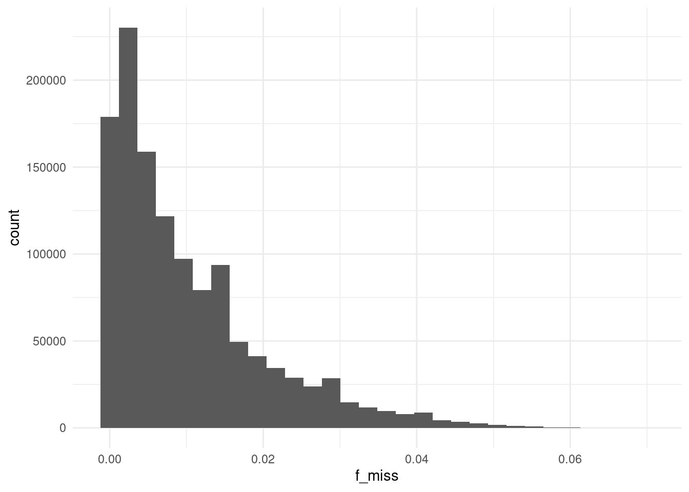
We can see most of these SNVs have relatively low rates of missing data.
We can see what fraction of variants would be discarded if we used the conventional 5% threshold:
sum(vmiss$f_miss > 0.05)/nrow(vmiss)[1] 0.001427357At this threshold we will discard 6387 variants, which we can see is a very small fraction of the variants we have. We can therefore be satisfied that, in general, there are no major issues with our call rates.
In our downstream analyses, we can exclude variants with >5% missing data by adding the option --geno 0.05 to PLINK.
5.3 Allele frequency
In the previous chapter we already saw how to calculate the allele frequency of our variants using the --freq option.
We can read this file into R as usual:
afreq <- read_tsv("results/1000G_subset.afreq") |>
  clean_names(replace = c("#" = ""))

head(afreq)
# A tibble: 6 × 6
chrom id ref alt alt_freqs obs_ct
<dbl> <chr> <chr> <chr> <dbl> <dbl>
1 1 rs1639560406 A C 0 2074
2 1 rs1463012642 C T 0.00344 2032
3 1 rs1200541360 T C 0.00193 2074
4 1 rs1472769893 G C 0.000964 2074
5 1 rs1422057391 C T 0.000964 2074
6 1 rs540466151 T G 0.000482 2074By default PLINK calculates the allele frequency of the alternative allele. However, this is somewhat arbitrary, as the alternative allele is simply defined as the allele that different from whichever happens to be the reference genome. A more common approach is to visualise the minor allele frequency (MAF), i.e. the frequency of the least-common alelle in the population.
We can calculate the MAF for each variant, adding it as a new column to our data frame, followed by a new histogram:
# add a column of minor allele frequency
afreq <- afreq |>
  mutate(maf = ifelse(alt_freqs > 0.5, 1 - alt_freqs, alt_freqs))

# MAF histogram
afreq |>
  ggplot(aes(maf)) +
  geom_histogram(binwidth = 0.01)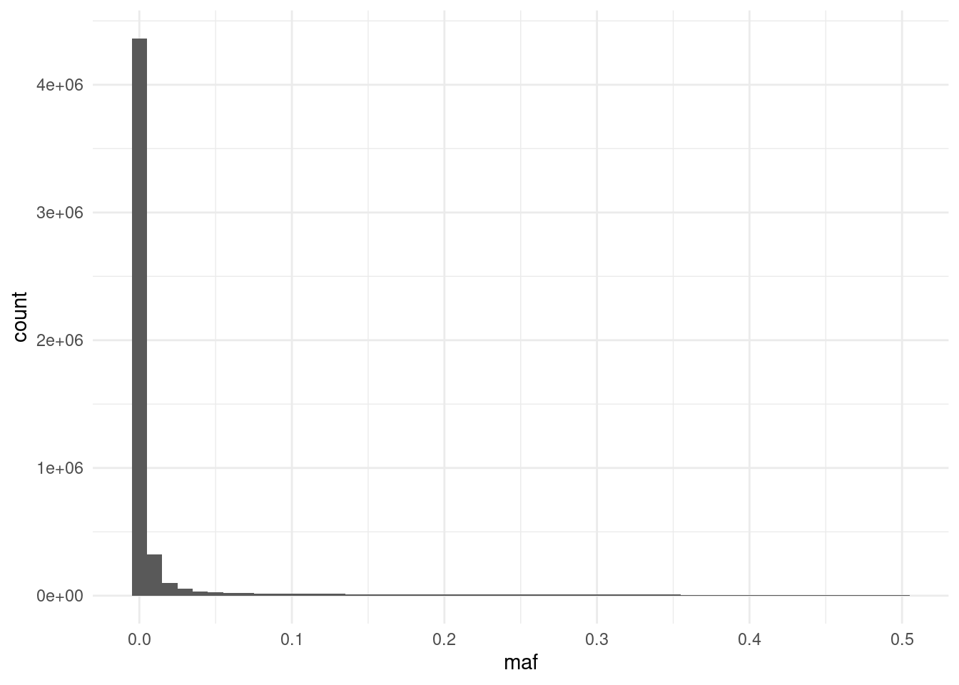
We can see the histogram is quite skewed, with many SNPs having very low frequency. In fact, some of them are not variable at all in our samples! We can quickly tabulate how many SNPs are above the commonly-used 1% threshold of allele frequency:
table(afreq$maf > 0.01)
  FALSE    TRUE
3474658  876844
We can see that the majority of variants have very low frequency. These must be variants that have been found to vary in other individuals of the 1000 genomes project, but happen to be invariant in our relatively small collection of samples.
Low frequency variants are often filtered out when performing downstream analyses, such as the association test. This is because they have low statistical power, leading to noisy estimates (you can think of it as having a low sample size for one of the classes of genotypes).
To exclude variants with low minor allele frequency, for example at a 1% threshold, we can use PLINK’s option --maf 0.01.
5.4 Hardy–Weinberg
Another quality control step is to check whether SNPs significantly deviate from Hardy-Weinberg equilibrium, which is expected if individuals mate randomly.
plink2 \
  --pfile data/plink/1000G_subset \
  --out results/1000G_subset \
  --chr 1-22 \
  --hardy
This outputs a file with .hardy extension, which we can read into R:
hardy <- read_tsv("results/1000G_subset.hardy") |>
  clean_names(replace = c("#" = ""))

head(hardy)
# A tibble: 6 × 10
chrom id a1 ax hom_a1_ct het_a1_ct two_ax_ct o_het_a1 e_het_a1 p
<dbl> <chr> <chr> <chr> <dbl> <dbl> <dbl> <dbl> <dbl> <dbl>
1 1 rs16… A C 1037 0 0 0 0 1
2 1 rs14… C T 1010 5 1 0.00492 0.00687 0.0103
3 1 rs12… T C 1033 4 0 0.00386 0.00385 1
4 1 rs14… G C 1035 2 0 0.00193 0.00193 1
5 1 rs14… C T 1035 2 0 0.00193 0.00193 1
6 1 rs54… T G 1036 1 0 0.000964 0.000964 1 One possible visualisation of these data is to plot the expected heterozygosity versus the observed heterozygosity and colour the points as to whether they are below a chosen p-value threshold:
hardy |>
  # randomply sample SNPs
  # to avoid plot window from crashing
  sample_n(10e3) |>
  ggplot(aes(e_het_a1, o_het_a1)) +
  geom_point(aes(colour = p < 0.001)) +
  geom_abline() +
  labs(x = "Expected heterozygosity", y = "Observed heterozygosity")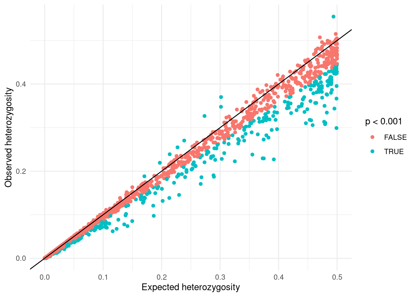
From this plot, we can see an excess of SNVs with lower heterozygosity than expected compared to those with higher heterozygosity. This discrepancy is because our samples originate from diverse global regions that do not form a “randomly mating population”.
As an example, consider a variant present in one geographical area (e.g., individuals from a specific country) but absent elsewhere. The Hardy-Weinberg equilibrium assumes random mating across the entire population, therefore variants with limited geographic distribution may appear to have an excess of homozygotes. In reality, these variants are simply missing from certain populations.
So, while variants might fit Hardy-Weinberg expectations within randomly mating sub-populations, they will seem to deviate from it when these groups are pooled together. This phenomenon is known as the Wahlund effect and results from population structure, a topic which we return to in a later chapter.
In downstream analysis, we can exclude SNPs with a low p-value for the Hardy-Weinberg deviation test. However, due to the population structure issue just discussed, we only exclude SNPs with higher-than-expected heterozygosity. High rates of heterozygosity may indicate genotyping errors, which we want to eliminate. Wehreas low rates of heterozygosity may simply be due to population structure, which we want to retian. To discard only high heterozygosity SNVs having p-value < 0.001, we can use the option --hwe 0.001 keep-fewhe.
TipTip: Running multiple options at once
We have seen a few PLINK commands that are useful for checking properties of our genotype data:
--missingto assess genotype missingness both across SNPs and samples.--freqto assess the allele frequency across SNPs.--hardyto assess genotype frequency deviations from the Hardy-Weinberg equilibrium expectation.
So far, we have run each of these options individually, however you can run multiple options simultaneously. For example, our previous analyses could have been run with a single command:
plink2 \
  --pfile data/plink/1000G_subset \
  --out results/1000G_subset \
  --chr 1-22 \
  --freq --hardy --missing
This would produce all three respective results files in one go.
5.5 LD prunning
Before proceeding with our next quality checks, we will perform a linkage disequilibrium (LD) pruning step. This is a process that identifies variants that are in high linkage disequilibrium with each other, i.e. they are correlated and therefore provide redundant information.
Having a set of uncorrelated variants (i.e. in linkage equilibrium) is useful for many downstream analyses, such as principal component analysis (PCA) and estimates of individual inbreeding, which we will cover in the next chapter.
Identify variants in linkage equilibrium, we can use the --indep-pairwise option in PLINK. This option requires at least two options:
- Window size: how many neighbouring variants are considered at each step of the algorithm.
- R-squared threshold: how correlated the variants need to be in order to be prunned.
The algorithm then proceeds by sliding a window of the specified size across the genome, calculates the correlation for each pair of variants in that window, and prunes one of them if the correlation is above the specified threshold.
For our analysis, we will use a window size of 100 variants and an r-squared threshold of 0.8:
plink2 \
  --pfile data/plink/1000G_subset \
  --out results/1000G_subset \
  --chr 1-22 --hwe 0.001 keep-fewhe --maf 0.01 \
  --indep-pairwise 100 0.8
We have also restricted the analysis to chromosomes 1-22, as our main downstream analyses will only consider autosomes. And we exclude sites that have excess heterozygosity (i.e. those that deviate from Hardy-Weinberg equilibrium) and low minor allele frequency (MAF < 1%).
The command above produces two files with the suffix .prune.in (variants that were kept by the algorithm, i.e. they should be largely uncorrelated) and .prune.out (the variants that were eliminated).
These files simply have a single column with the variant IDs:
head results/1000G_subset.prune.inrs1463012642
rs1200541360
rs1472769893
rs1422057391
rs540466151
rs1478422777
rs1365462007
rs1385614989
rs1385058577
rs533630043Now, in downstream analyses where we only want to use uncorrelated SNPs (e.g., PCA, sample inbreeding, relatedness), we can use the --extract option to use only the variants in the .prune.in file.
5.6 Summary
TipKey Points
- Key metrics for variant-level quality control include: call rate, minor allele frequency and Hardy-Weinberg equilibrium.
- Call rates (
--missing): variants with low call rates (e.g. <95% or >5% missing data) are typically excluded.- To remove variants with missing data above a certain threshold use
--geno X(replaceXwith the desired fraction, e.g. 0.05).
- To remove variants with missing data above a certain threshold use
- Minor allele frequency (
--maf): very rare variants (e.g. <1%) have low statistical power and are usually removed from downstream analysis.- To remove variants with MAF below a certain threshold use
--maf X(replaceXwith the desired frequency, e.g. 0.01).
- To remove variants with MAF below a certain threshold use
- Hardy-Weinberg equilibrium: variants for which genotype frequencies of homozygotes and heterozygous individuals deviate from expectation are removed as they may be due to genotyping errors, inbreeding, and other causes.
- Care should be taken with this statistic, as an excess of homozygotes is expected if there are different sub-populations within the sample being analysed (e.g. samples from different geographic regions).
- Genotyping errors usually result in an excess of heterozygous, and these can be removed using
--hwe X keep-fewhe(replaceXwith a p-value threshold, typically a low value such as 0.001).
- Linkage disequilibrium (LD) pruning (
--indep-pairwise): identifies variants that in high LD with each other, i.e. they are correlated and therefore provide redundant information.- Useful for downstream analyses, such as PCA, estimating individual inbreeding and relatedness between samples.
- To perform LD pruning use
--indep-pairwise X Y(replaceXwith the window size, e.g. 100, andYwith the r-squared threshold, e.g. 0.8).