# A collection of R packages designed for data science
library(tidyverse)

# A package for cleaning up data
library(janitor)

# A package for creating composite plots
library(patchwork)

messy_data <- read_csv("data/messy_data.csv")
surveys <- read_csv("data/surveys.csv")
plot_types <- read_csv("data/plots.csv")
surveys_left <- left_join(surveys, plot_types, by = "plot_id")14 Clean, style & arrange
TipLearning objectives
- Learn how to deal with messy variables names.
- Be able to update
idcolumns. - Show confidence in fixing common encoding issues.
- Know how to tidy plot labels.
- Be able to change plot colours.
- Learn how to arrange composite plots (in
R).
14.1 Context
Often data is in a messy state before you can work with it. So, it is useful to know when and how to make changes to your data.
14.2 Section setup
We’ll continue this section with the script named 05_session. If needed, add the following code to the top of your script and run it.
We’ll continue this section with the Notebook named 05_session. Add the following code to the first cell and run it.
# A Python data analysis and manipulation tool
import pandas as pd

# Python equivalent of `ggplot2`
from plotnine import *

# A package for cleaning up data
import janitor

# A package for text wrapping
import textwrap

messy_data = pd.read_csv("data/messy_data.csv")
surveys = pd.read_csv("data/surveys.csv")
plot_types = pd.read_csv("data/plots.csv")
surveys_left = pd.merge(surveys, plot_types, how = "left", on = "plot_id")
14.3 Cleaning data
Perhaps it’s not the most glamorous part of data analysis, but it is a very important one: cleaning data. If you need motivation for it, just think of the amount of time you can save yourself by recording your data consistently and correctly in the first place.
In the next few sections we’ll go through some (very) common messy data issues you’re likely to come across. We will revisit some of our previous data sets, but will mostly illustrate things using the messy data set. This data set has been synthesised for this exact purpose, so it’s over-the-top bad. If you ever come across a real data set that looks like this, then a stern word with that researcher is in order!
We’ll read in the data and take it from there:
messy_data <- read_csv("data/messy_data.csv")Rows: 100 Columns: 8
── Column specification ────────────────────────────────────────────────────────
Delimiter: ","
chr (7): ID, Age, Gender, Score, country, employed.or.not, notes
dbl (1): Income.in.GBP
ℹ Use `spec()` to retrieve the full column specification for this data.
ℹ Specify the column types or set `show_col_types = FALSE` to quiet this message.messy_data = pd.read_csv("data/messy_data.csv")14.3.1 Variable naming
The messy data set has many different issues with it. One of the issues is that the column headers are not consistent. This is an issue that you’ll come across on a regular basis, since people have their own style (usually an inconsistent one!).
In both R and Python we have access to a “janitor” package (janitor in R and pyjanitor in Python). These are fantastic packages that can save you tons of time. Here we’ll just use one of the functions: clean_names().
First, let’s see what we’re dealing with.
messy_data |>
  colnames()
[1] "ID" "Age" "Gender" "Score"
[5] "Income.in.GBP" "country" "employed.or.not" "notes" messy_data.columns.tolist()['ID', 'Age', 'Gender', 'Score', 'Income.in.GBP', 'country', 'employed.or.not', 'notes']That’s not ideal. There is inconsistency in the use of capitalisation and there are full stops in the column names.
Now, let’s see what the clean_names() function makes of all of this (without updating the names just yet).
messy_data |>
  clean_names() |>
  colnames()
[1] "id" "age" "gender" "score"
[5] "income_in_gbp" "country" "employed_or_not" "notes" (messy_data # data
.clean_names() # clean column names
.columns.tolist()) # put column names in list['id', 'age', 'gender', 'score', 'income_in_gbp', 'country', 'employed_or_not', 'notes']We can see that the column names are now consistently lowercase and that the full stop . in the names have been replaced with _ underscores.
I’m happy with that, so I’ll assign those new names to the data.
messy_data <- messy_data |>
  clean_names()
messy_data = messy_data.clean_names()Sometimes we also want to include generic prefixes to our column names. We can do this with f-strings.
NoteFormatted string literals (f-strings)
These let you insert variables or expressions directly into a string by prefixing it with f or F.
Have a look at this example:
course = "Data analysis in"
language = "Python"

message = f"This is the {course} in {language} course."

print(message)
This is the Data analysis in in Python course.We already used f-strings earlier in Section 12.4. There we created a prefix yr_ for each column.
surveys_wide.columns = [f"yr_{col}" for col in surveys_wide.columns]This example uses list comprehension: [f"yr_{col}" for col in surveys_wide.columns]. It loops through each col in surveys_wide.columns and for each column it creates an f-string f"yr_{col}. The value of col gets taken from whatever the column name is, in our case a number representing the year.
14.3.2 Adjusting numbers
In the joining section we saw that it wasn’t great practice to just use numbers to indicate plot_id, since they obviously have no numerical value, but instead define a category. This is something that often occurs, so it’s useful to know how to be able to format them differently.
For example, we could encode them in the format plot_xxx where xxx is a number with leading zeros (so that it sorts nicely).
We can do that as follows:
plot_types |>
  mutate(plot_id = paste0("plot_", sprintf("%03d", plot_id)))
# A tibble: 5 × 2
plot_id plot_type
<chr> <chr>
1 plot_001 Spectab exclosure
2 plot_002 Control
3 plot_003 Long-term Krat Exclosure
4 plot_004 Rodent Exclosure
5 plot_005 Short-term Krat Exclosure
TipAlternative: using the
stringr package
The stringr package is part of tidyverse and has a whole range of functions that allow you to change strings (text). The equivalent of the code above would be:
plot_types |>
  mutate(plot_id = str_c("plot_", str_pad(plot_id, width = 3, pad = "0")))
# A tibble: 5 × 2
plot_id plot_type
<chr> <chr>
1 plot_001 Spectab exclosure
2 plot_002 Control
3 plot_003 Long-term Krat Exclosure
4 plot_004 Rodent Exclosure
5 plot_005 Short-term Krat ExclosureYou can read this as: “Use mutate() to update the plot_id column, where (=) the contents of plot_id is a combined string (str_c) containing the text "plot_ and we pad out (str_pad) plot_id so it’s 3 digits wide (width = 3) and we pad out with "0" (pad = "0").”
If you wanted to update the column, just add plot_types <- in front of this!
plot_types["plot_id"].apply(
    lambda x: f"plot_{x:03d}"
)
0 plot_001
1 plot_002
2 plot_003
3 plot_004
4 plot_005
Name: plot_id, dtype: object
TipAlternative: using
.zfill()
If you’re not keen on this method using the lambda x: approach, you can use .zfill:
"plot_" + plot_types["plot_id"].astype(str).str.zfill(3)0 plot_001
1 plot_002
2 plot_003
3 plot_004
4 plot_005
Name: plot_id, dtype: objectYou can read this as: “Take the plot_id column from plot_types (plot_types["plot_id"]) and update it (=) with a combination of the text plot_ ("plot_") and the value of plot_types["plot_id"], which needs to be converted to a string (.astype(str)) before we can fill it with zeros up to a maximum of 3 digits (.str.zfill(3)).”
If you wanted to update the column, just add plot_types["plot_id"] = in front of this!
Note: this means that you would also have to change the plot_id column values in the surveys data set, if you wanted to combine the data from these tables!
14.3.3 Encoding issues
In the messy_data data set it’s not just the column names that are an issue. There are quite a few different encoding issues. We will address several of them now, but some of these you’ll investigate later in the exercises.
| Variable | Problem(s) |
|---|---|
id |
Clean — serves as a unique identifier |
age |
(to investigate later) |
gender |
(to investigate later) |
score |
Numeric-like variable contains text entries: "five", "high", NA |
income_gbp |
(to investigate later) |
country |
Inconsistent naming for UK: "UK", "U.K.", "United Kingdom", "United kingdom", NA |
employed_or_not |
Inconsistent boolean values: "yes", "y", "TRUE", "n", NA, etc. |
notes |
Free-text notes with mixed missing indicators: "N/A", "", "none", NA |
Let’s focus on the country column, which is a classical case of “different people have different ways of encoding the same thing”.
First, we check what entries we have in this column. Apart from just showing the different types of entries, we’re also looking at how many times they occur.
messy_data |>
  count(country)
# A tibble: 5 × 2
country n
<chr> <int>
1 U.K. 18
2 UK 24
3 United Kingdom 19
4 United kingdom 20
5 <NA> 19counts = (messy_data
.groupby("country")
.size()
.reset_index(name = "n"))
counts country n
0 U.K. 18
1 UK 24
2 United Kingdom 19
3 United kingdom 20We’ve got quite some variation going on here. A convenient way of addressing this is to create a list of substitutions and then apply that to the data. This makes it easier in the future if you get more variations that you need to update.
In R we have the case_when() function, which can help you do exactly that. It’s more general though: it allows you to re-encode values based on conditions. So, before we apply it to our data, let’s go through a simplified example.
TipUsing
case_when() for recoding values
It works in this way:
# 1. create some dummy data
df <- tibble(score = c(45, 67, 82, 90, 55))

# 2. recode the values
df <- df |>
  mutate(performance = case_when(
    score < 60               ~ "fail",
    score >= 60 & score < 80 ~ "pass",
    TRUE                     ~ "excellent"
  ))

# 3. show the result
df
# A tibble: 5 × 2
score performance
<dbl> <chr>
1 45 fail
2 67 pass
3 82 excellent
4 90 excellent
5 55 fail In the mini-example above we create a simple data set with one column: score. There are 5 values in this column. We now want to assign a performance value to it, which will differ based on the score.
The case_when() function goes through each possible defined comparison (e.g. score < 60, ...) and then assigns the value based on that (~ "fail"). We put the whole thing in a mutate() because we are creating a new column: performance.
At the end of the case_when() we have TRUE ~ "excellent. The TRUE ~ designation means: “for everything else do…”.
Let’s apply this to our messy_data.
messy_data <- messy_data |>
  mutate(country = case_when(
    country %in% c("United kingdom", "U.K.", "UK") ~ "United Kingdom",
    TRUE ~ country
  ))
country =indicates that we are updating ourcountrycolumn.country %in% c("United kingdom", "U.K.", "UK")says, for each value incountry, compare it to the values withinc()~ "United Kingdom"if it finds it, replace it with `“United Kingdom”TRUE ~ countryotherwise, leave it unchanged (including the missing values)
Let’s apply this to our messy_data.
First we create a “translation” table: which values do we want to re-encode and how?
# Define standard mapping for inconsistent names
country_map = {
    "United kingdom": "United Kingdom",
    "U.K.": "United Kingdom",
    "UK": "United Kingdom"
    # Add more variations if needed
}
Next, we apply this to our data:
# Update the country names
messy_data["country"] = (
    messy_data["country"]
    .replace(country_map))
We can view the end result:
messy_data |>
  count(country)
# A tibble: 2 × 2
country n
<chr> <int>
1 United Kingdom 81
2 <NA> 19counts = (messy_data
.groupby("country")
.size()
.reset_index(name = "n"))
counts country n
0 United Kingdom 8114.3.4 Boolean values
We have a column employed_or_not, which contains information on the employment status of each person. This is encoded inconsistently, as "yes, "y", "TRUE", …
Apart from being consistent, it’s useful to keep columns that can only have 1 of 3 value (true, false, missing) as a boolean. This makes it easier to filter and tally contents than if we’d encode it as text.
Let’s tackle this issue in a similar approach as above. First, let’s see what we’re dealing with here, by looking up the column types and the contents of employed_or_not.
class(messy_data$employed_or_not)[1] "character"messy_data |>
count(employed_or_not)# A tibble: 7 × 2
employed_or_not n
<chr> <int>
1 FALSE 9
2 TRUE 15
3 n 14
4 no 17
5 y 15
6 yes 12
7 <NA> 18We can see that the column is viewed as a "chr" or character column.
messy_data["employed_or_not"].dtypedtype('O')We can see that the column is viewed as an object type ('O'). This type usually holds text, but can also be used for a mixture of Python objects.
Let’s see what kind of values we have in our column:
counts = (messy_data
.groupby("employed_or_not", dropna = False)
.size()
.reset_index(name = "n"))
counts employed_or_not n
0 FALSE 9
1 TRUE 15
2 n 14
3 no 17
4 y 15
5 yes 12
6 NaN 18The reason why we end up with a generic data type is because there is a mixture of data in the column. Let’s fixed that.
messy_data <- messy_data |>
mutate(employed_or_not = case_when(
employed_or_not %in% c("no", "n") ~ "FALSE",
employed_or_not %in% c("yes", "y") ~ "TRUE",
TRUE ~ employed_or_not
))Let’s count again:
messy_data |>
  count(employed_or_not)
# A tibble: 3 × 2
employed_or_not n
<chr> <int>
1 FALSE 40
2 TRUE 42
3 <NA> 18But the employed_or_not column is still viewed as character:
class(messy_data$employed_or_not)[1] "character"So, we need to force it to view it as such.
To make it a boolean / logical column, we use the as.logical() function.
messy_data <- messy_data |>
  mutate(employed_or_not = as.logical(employed_or_not))
We check one last time:
class(messy_data$employed_or_not)[1] "logical"# Define standard mapping for inconsistent names
employment_map = {
"no": "False",
"n": "False",
"yes": "True",
"y": "True"
# Add more variations if needed
}Next, we apply this to our data:
# Update the country names
messy_data["employed_or_not"] = (
    messy_data["employed_or_not"]
    .replace(employment_map))
We count again to check what has happened:
counts = (
    messy_data
    .groupby("employed_or_not", dropna = False)
    .size()
    .reset_index(name = "n")
)

counts
employed_or_not n
0 FALSE 9
1 False 31
2 TRUE 15
3 True 27
4 NaN 18This still shows a difference between FALSE and False, and TRUE and True. That’s because the all-caps words are interpreted as text. In fact, all of them are viewed as text, because we used " " in our mapping.
Python’s boolean phrases are True and False, so we need to adjust that.
To do this, we first convert all the values to lower case with .str.lower(), and then convert those values to boolean (without " "). Lastly, we convert the column to "boolean". We need to do that last step, because we have missing data. If we didn’t, then Python would keep all the contents as text.
messy_data["employed_or_not"] = (
    messy_data["employed_or_not"]
    .str.lower()
    .map({"true": True, "false": False})
    .astype("boolean")     # convert to boolean type
)
We can see that we only have True, False or <NA>.
counts = (
    messy_data
    .groupby("employed_or_not", dropna = False)
    .size()
    .reset_index(name = "n")
)

counts
employed_or_not n
0 False 40
1 True 42
2 <NA> 18And our data type is now correct.
messy_data["employed_or_not"].dtypeBooleanDtypeSuccess!
14.4 Cleaning plots
Often we need to put a bit of work into making plots more presentable. Perhaps default colours are not quite right, or labels need adjusting. Below we cover some common changes.
Let’s use the surveys_left data set for the next few sections.If you haven’t done so already, please load the following:
surveys <- read_csv("data/surveys.csv")
plot_types <- read_csv("data/plots.csv")
surveys_left <- left_join(surveys, plot_types, by = "plot_id")
surveys = pd.read_csv("data/surveys.csv")
plot_types = pd.read_csv("data/plots.csv")
surveys_left = pd.merge(surveys, plot_types, how = "left", on = "plot_id")14.4.1 Adding titles and axis labels
First we visualise some data. Here we are creating a violin plot. Partly because we can, but mostly because they are useful. They can tell you a lot about how your data are distributed.
ggplot(surveys_left, aes(x = plot_type, y = hindfoot_length)) +
         geom_violin()
Warning: Removed 4111 rows containing non-finite outside the scale range
(`stat_ydensity()`).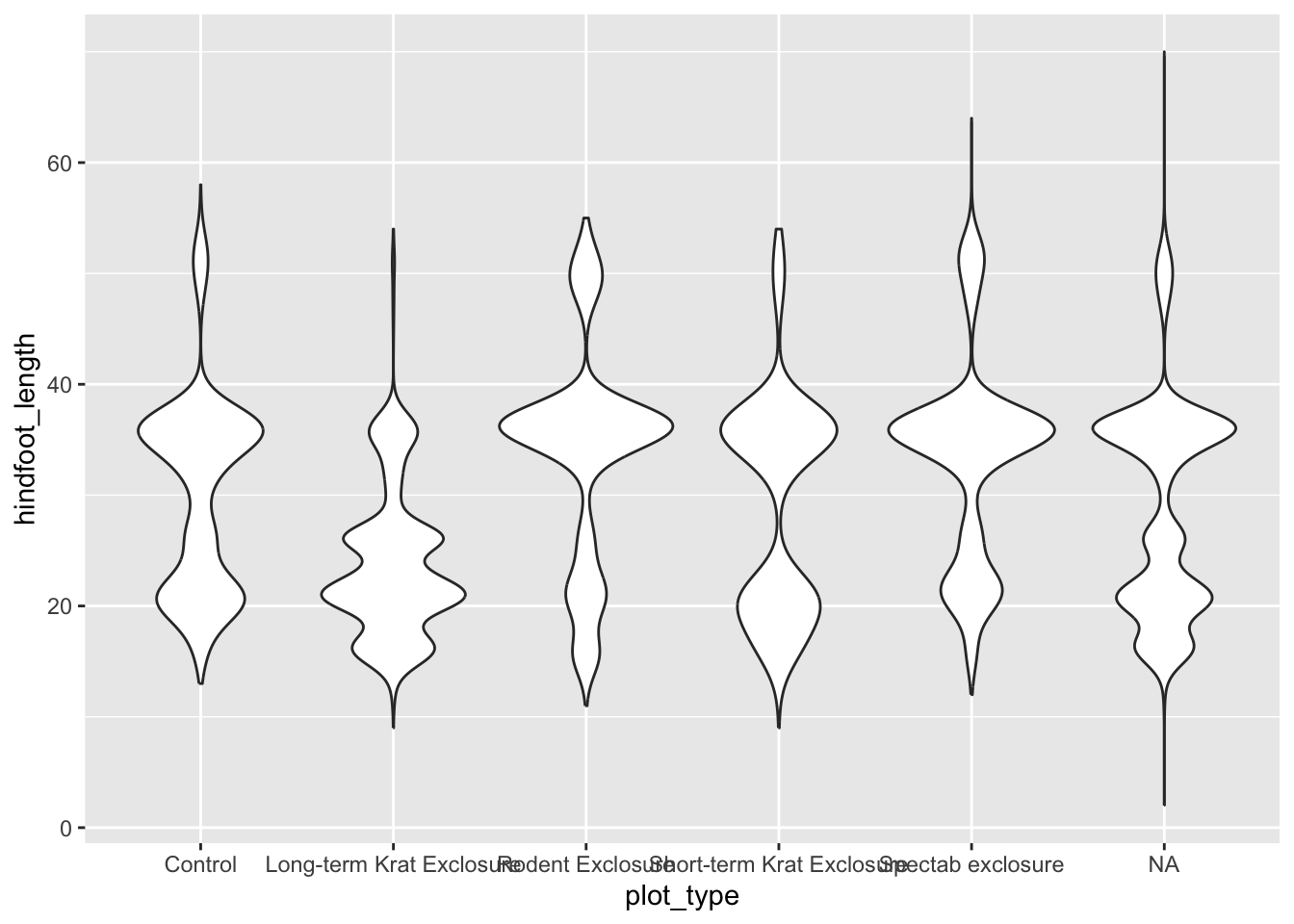
p = (ggplot(surveys_left, aes(x = "plot_type", y = "hindfoot_length")) +
         geom_violin())

p.show()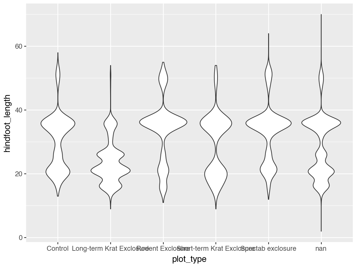
It’d be nice to have plot title, as well as some clearer (and nicer) axis labels. We can do this as follows:
ggplot(surveys_left, aes(x = plot_type, y = hindfoot_length)) +
         geom_violin() +
  labs(title = "Violin plot for hindfoot length by plot type",
       subtitle = "1977 - 2022",
       x = "Plot type",
       y = "Hindfoot length (mm)")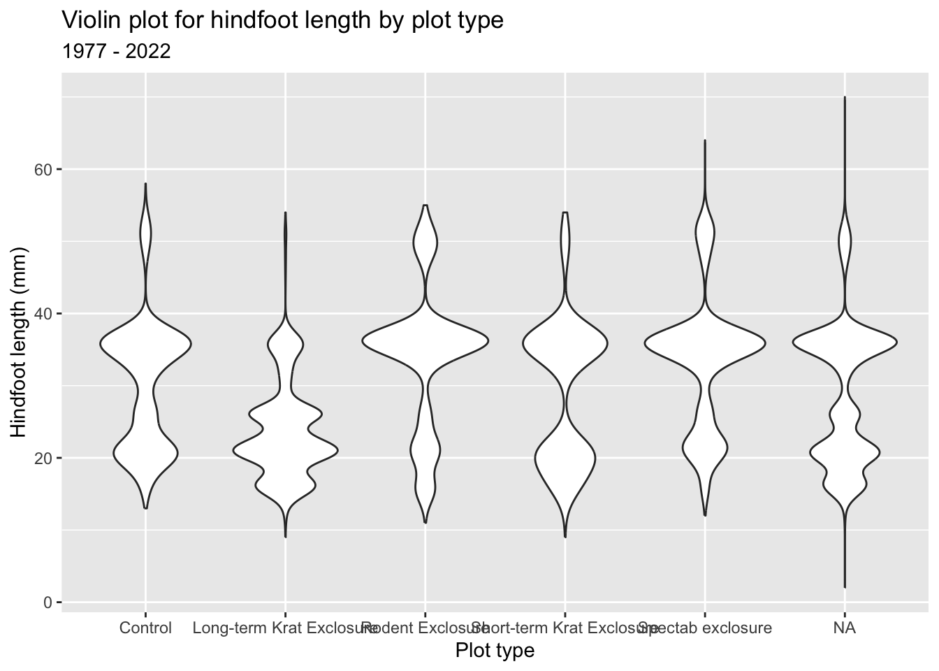
p = (ggplot(surveys_left, aes(x = "plot_type", y = "hindfoot_length")) +
         geom_violin() +
       labs(title = "Violin plot for hindfoot length by plot type",
            subtitle = "1977 - 2022",
            x = "Plot type",
            y = "Hindfoot length (mm)"))

p.show()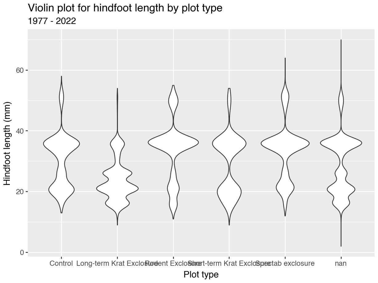
14.4.2 Text axis labels: rotate
Another common issue is that axis text labels are poorly aligned. In the plots above the plot_type values are too long and the text overlaps. Let’s fix this. We’ll do this in two ways:
- Rotating the axis text
- Wrapping / inserting a line break in the axis text
ggplot(surveys_left, aes(x = plot_type, y = hindfoot_length)) +
  geom_violin() +
  labs(title = "Violin plot for hindfoot length by plot type",
       subtitle = "1977 - 2022",
       x = "Plot type",
       y = "Hindfoot length (mm)") +
  theme(axis.text.x = element_text(angle = 45, hjust = 1))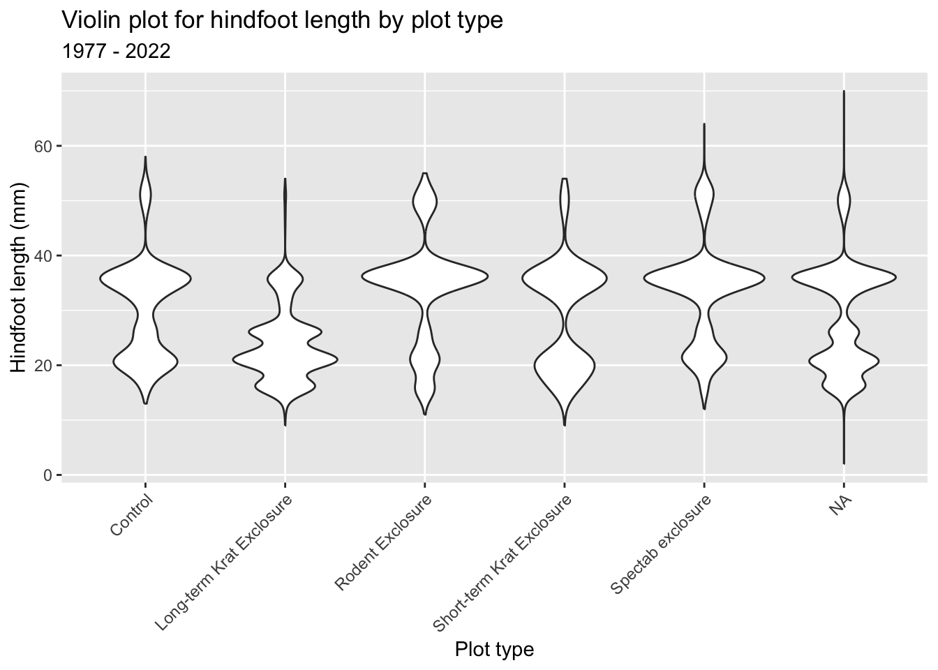
p = (ggplot(surveys_left, aes(x = "plot_type", y = "hindfoot_length")) +
         geom_violin() +
       labs(title = "Violin plot for hindfoot length by plot type",
            subtitle = "1977 - 2022",
            x = "Plot type",
            y = "Hindfoot length (mm)") +
        theme(axis_text_x = element_text(rotation = 45, ha = "right")))

p.show()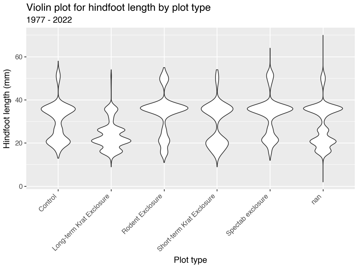
14.4.3 Text axis labels: wrap
Rotating the text labels can work in a lot of cases, but doesn’t get round the issue of long strings. The plot_type values aren’t exactly concise. So, it might be better to have some text wrapping instead.
ggplot(surveys_left, aes(x = plot_type, y = hindfoot_length)) +
  geom_violin() +
  labs(
    title = "Violin plot for hindfoot length by plot type",
    subtitle = "1977 - 2022",
    x = "Plot type",
    y = "Hindfoot length (mm)") +
  scale_x_discrete(labels = function(x) str_wrap(x, width = 10))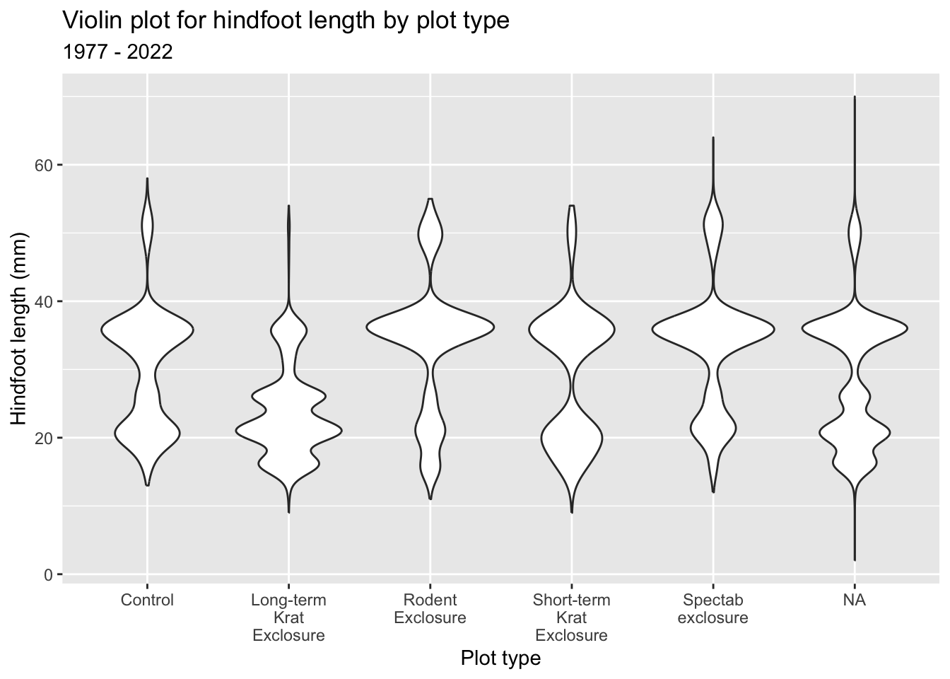
Python has a packages called textwrap that can help here.
import textwrapAlthough the code is a bit convoluted (it’s a case of copy/paste in future plots, really) it does result in a much cleaner plot:
p = (ggplot(surveys_left, aes(x = "plot_type", y = "hindfoot_length")) +
         geom_violin() +
       labs(title = "Violin plot for hindfoot length by plot type",
            subtitle = "1977 - 2022",
            x = "Plot type",
            y = "Hindfoot length (mm)") +
       scale_x_discrete(labels = lambda labels: [
                          textwrap.fill(str(l), 10) if l is not None else ""
                          for l in labels]))

p.show()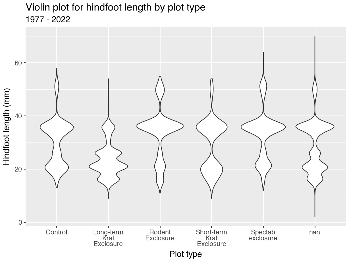
14.5 Changing colours
Often we want to use colours to emphasise parts of our plot or to highlight different groups within our data. Default options might not always be the most appropriate ones, so it’s good to know how to control the aesthetics of your plot. We’ll cover that below. We’ll use a small subset of the data so we can highlight the differences better.
surveys_y2k <- surveys_left |>
  filter(plot_type %in% c("Control", "Rodent Exclosure")) |>
  filter(year %in% c(2000, 2001, 2002)) |>
  drop_na()
surveys_y2k = (
surveys_left[
surveys_left["plot_type"].isin(["Control", "Rodent Exclosure"])
& surveys_left["year"].isin([2000, 2001, 2002])]
.dropna())14.5.1 Colours: default
The default here is various shades of grey.
ggplot(surveys_y2k, aes(x = plot_type, y = hindfoot_length)) +
  geom_boxplot() +
  geom_jitter(width = 0.1)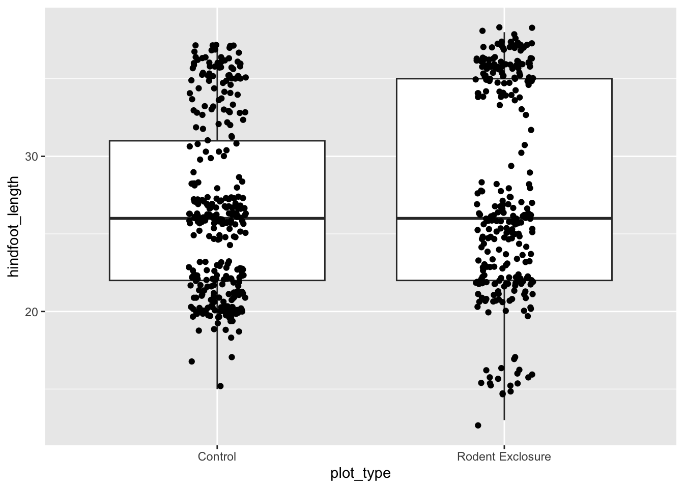
p = (ggplot(surveys_y2k, aes(x = "plot_type", y = "hindfoot_length")) +
  geom_boxplot() +
  geom_jitter(width = 0.1))

p.show()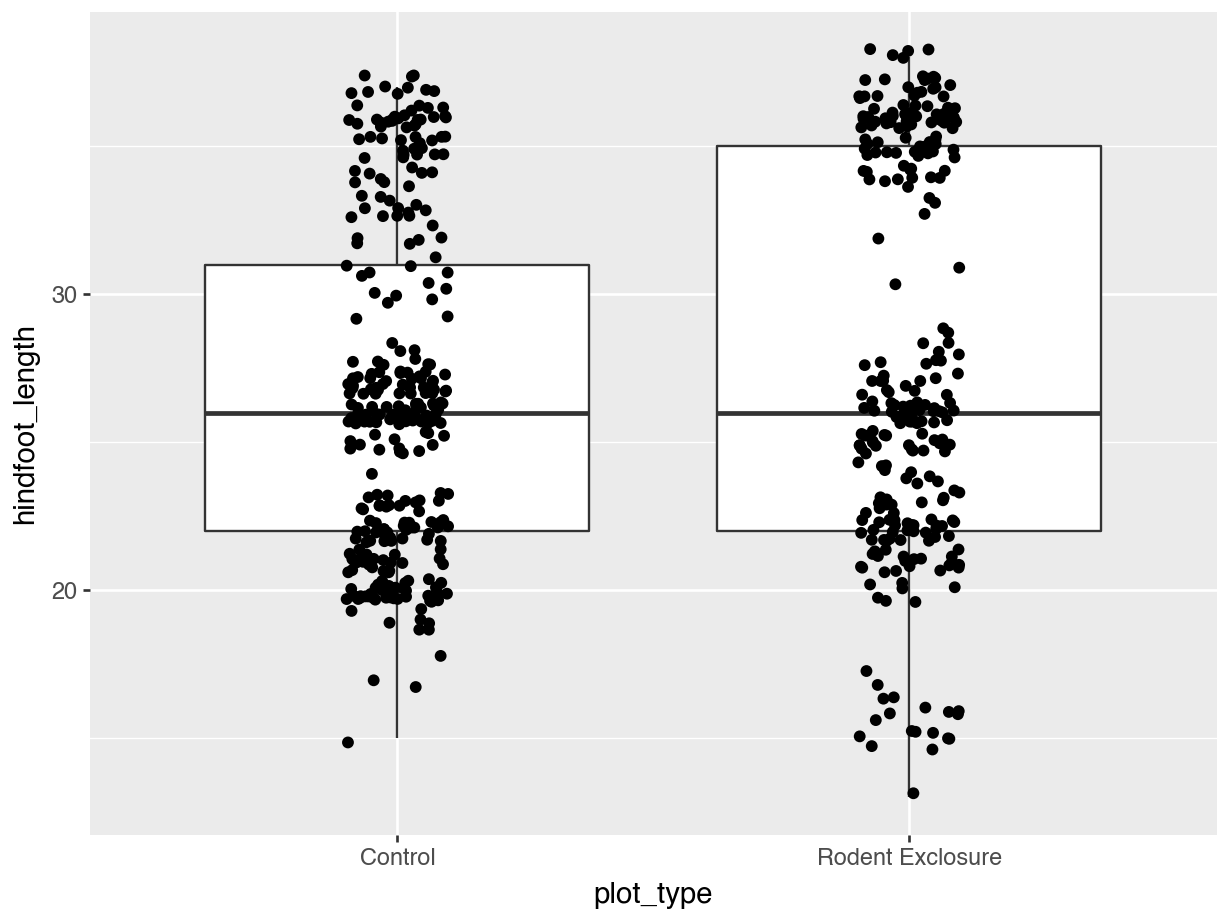
Let’s colour some of our data using the information from the sex variable.
ggplot(surveys_y2k, aes(x = plot_type, y = hindfoot_length, fill = sex)) +
  geom_boxplot() +
  geom_jitter(width = 0.1)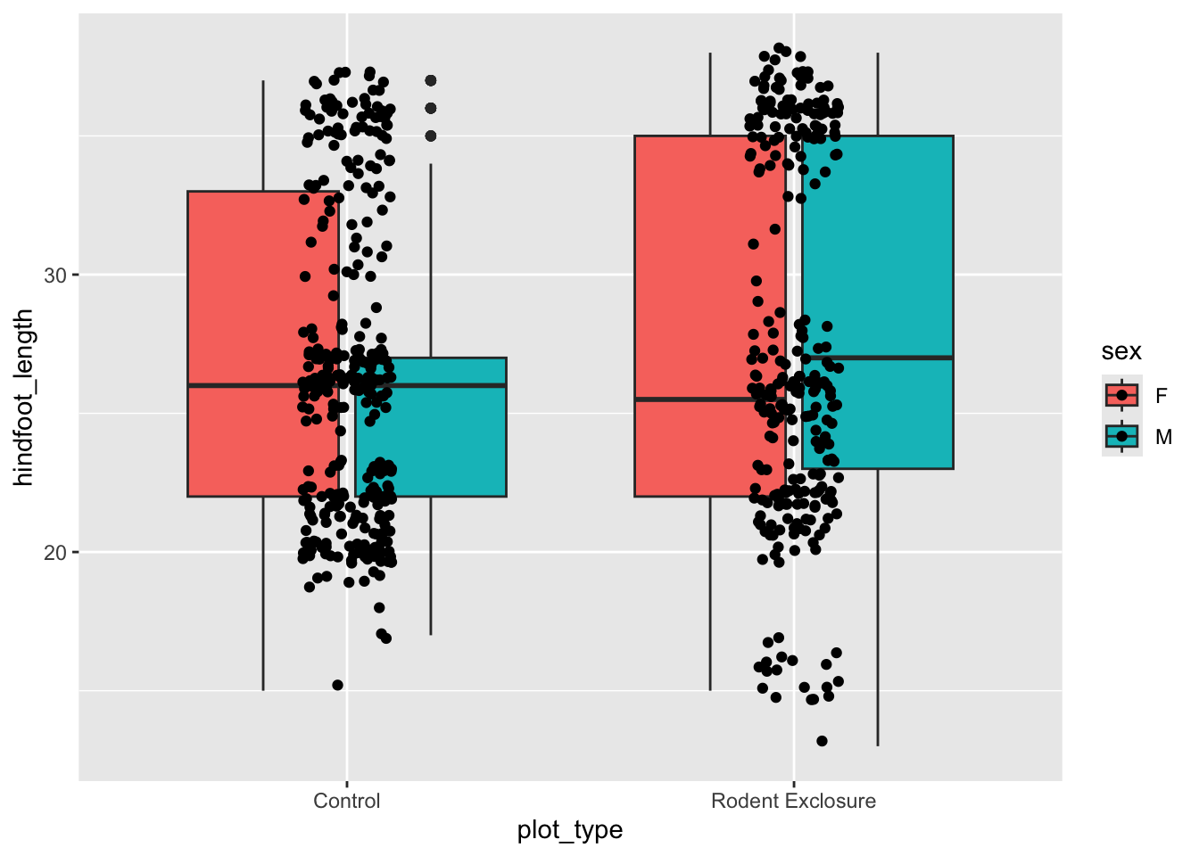
p = (ggplot(surveys_y2k,
            aes(x = "plot_type", y = "hindfoot_length", fill = "sex")) +
  geom_boxplot() +
  geom_jitter(width = 0.1, fill = "black"))

p.show()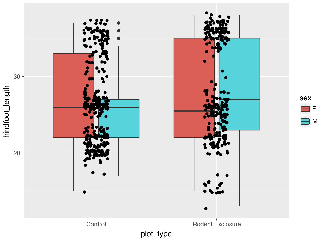
We can see that some default colours get applied. Let’s update this with some other default colour scheme.
NoteColour inheritance in
ggplot2 vs plotnine
You might have noticed that we’ve specifically given the instruction to geom_jitter() to use black: geom_jitter(width = 0.1, fill = "black")). This is because colour inheritance in plotnine works subtly different from ggplot2.
In ggplot2, geom_jitter() by default uses the colour aesthetic (outline color) and does not inherit fill (which is used for boxplots and polygons). This is why points appear black in R. However, plotnine is less consistent and therefor you need to specify the colour yourself, otherwise the geom_jitter() data would also get coloured by sex in the example above.
14.5.2 Colours: standard palettes
A popular colour scheme is the so-called Brewer palette. Although originally developed for R, the colour combinations are appropriate in many contexts. It has colour palettes that are appropriate for data continuous data or ordered data, where colour signifies a difference in magnitude. It also contains colour palettes for qualitative data, where the emphasis is on creating visual separation between different groups.
The brewer set of colours can be called using a set of functions in ggplot2. We’ll mostly use two of these:
scale_fill_brewer()for objects in a plot that have a surface area (such as boxplots)scale_colour_brewer()for objects that do not have a surface area (such as points)
We simply define the one we want, then add the type of palette with palette =. Here we use "Dark2", which is particularly suited for clear separation between categories.
ggplot(surveys_y2k, aes(x = plot_type, y = hindfoot_length, fill = sex)) +
  geom_boxplot() +
  geom_jitter(width = 0.1) +
  scale_fill_brewer(palette = "Dark2")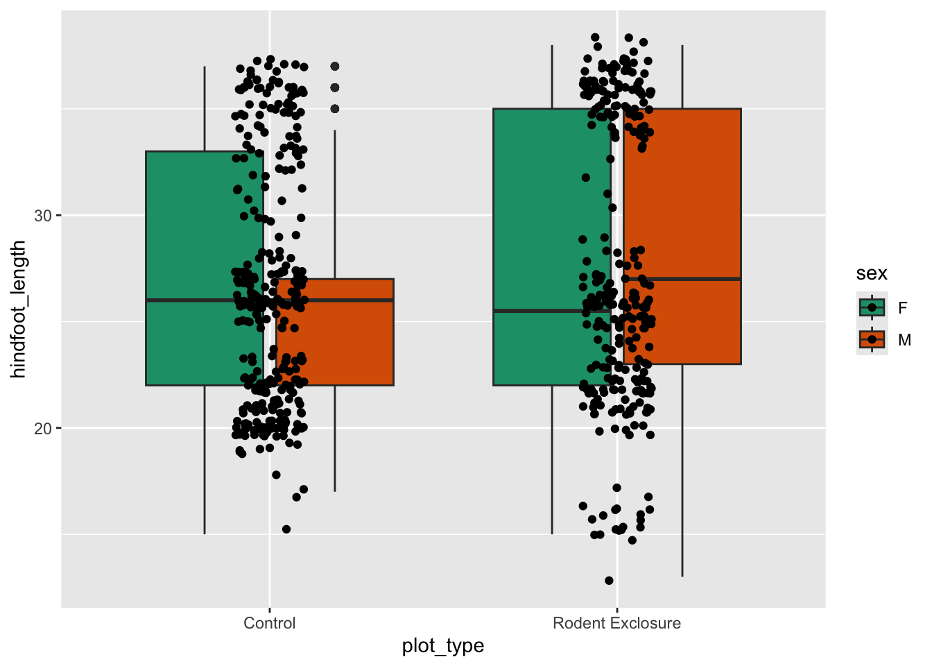
The brewer set of colours can be called using a set of functions in plotnine. We’ll mostly use two of these:
scale_fill_brewer()for objects in a plot that have a surface area (such as boxplots)scale_colour_brewer()for objects that do not have a surface area (such as points)
We simply define the one we want, then add the type of palette with palette =. Here we use "Dark2", which is particularly suited for clear separation between categories. We also need to define that the data are qualitative, using type = qual.
p = (ggplot(surveys_y2k,
            aes(x = "plot_type", y = "hindfoot_length", fill = "sex")) +
  geom_boxplot() +
  geom_jitter(width = 0.1, fill = "black") +
  scale_fill_brewer(type = "qual", palette = "Dark2"))

p.show()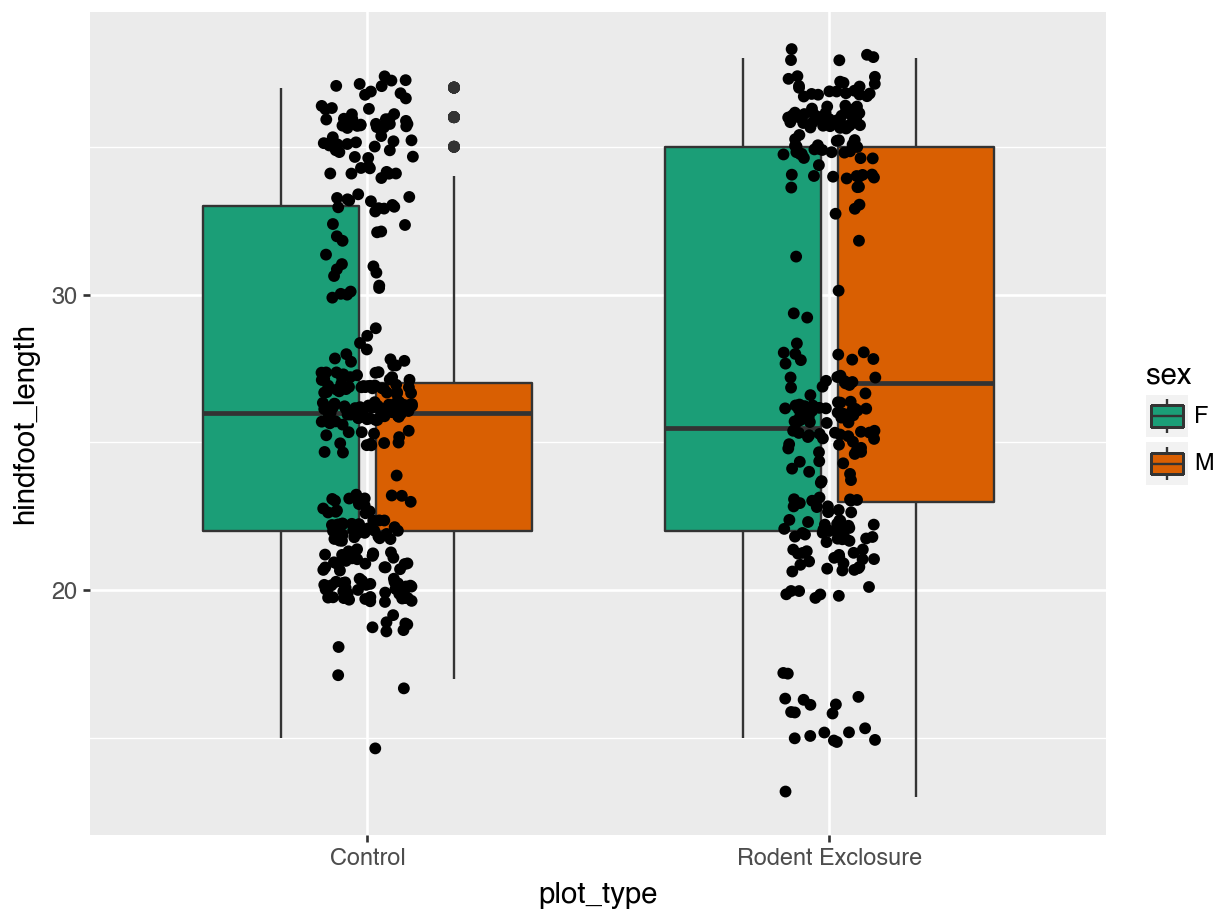
14.5.3 Colours: colour-blind friendly
Colour blindness is a reasonably common occurrence, with around 4.5% of the U.K. population having some form, according to Colour Blind Awareness (2025).
The brewer palettes often have a good visual separation, but might not always be the most optimal ones. There is a set of colour-blind friendly colours developed by Okabe and Ito (2008).
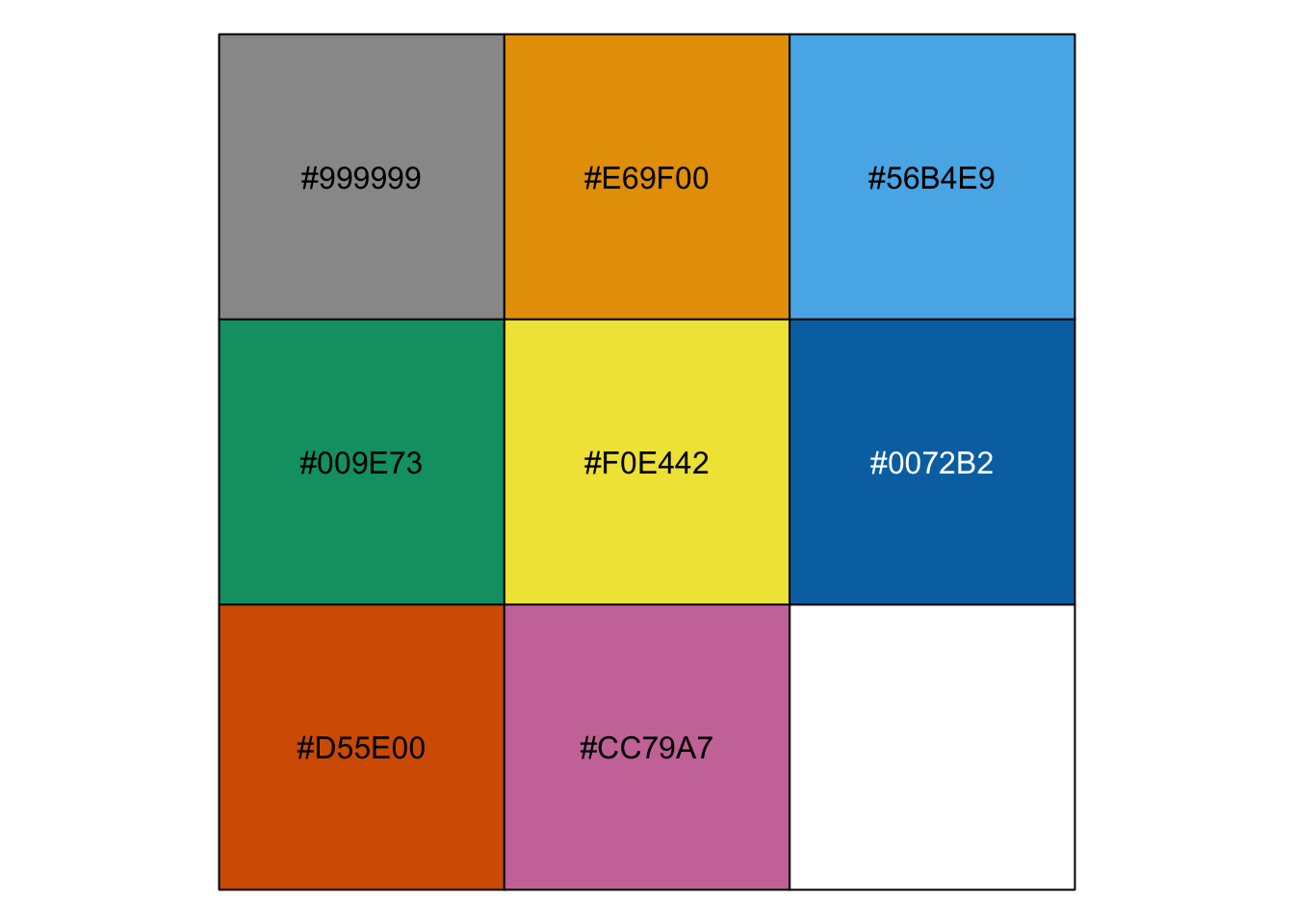
If we want to apply these custom colours, we’ll have to do that manually. The easiest way is to assign them to a manual colour palette, and then use that when plotting.
cb_palette   <- c("#999999", "#E69F00", "#56B4E9", "#009E73",
"#F0E442", "#0072B2", "#D55E00", "#CC79A7")ggplot(surveys_y2k, aes(x = plot_type, y = hindfoot_length, fill = sex)) +
geom_boxplot() +
geom_jitter(width = 0.1) +
scale_fill_manual(values = cb_palette)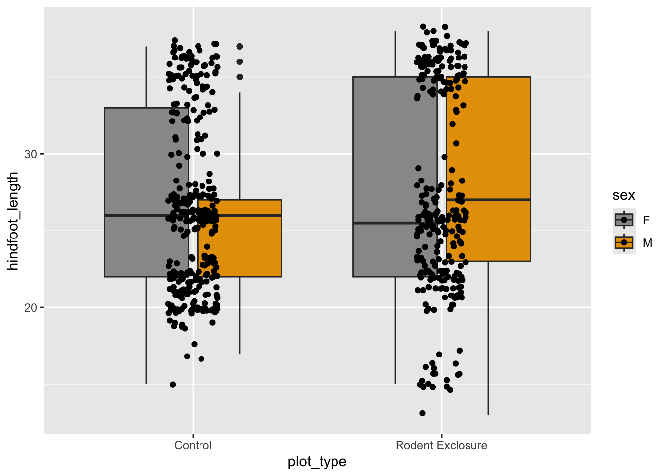
cb_palette = ["#999999", "#E69F00", "#56B4E9", "#009E73",
              "#F0E442", "#0072B2", "#D55E00", "#CC79A7"]
p = (ggplot(surveys_y2k,
aes(x = "plot_type", y = "hindfoot_length", fill = "sex")) +
geom_boxplot() +
geom_jitter(width = 0.1, fill = "black") +
scale_fill_manual(values = cb_palette))
p.show()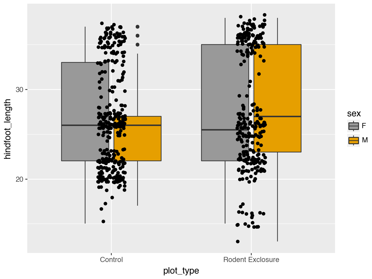
14.6 Arranging plots
We’ve already seen that we can use facetting to divide plots into sub-plots. Sometimes it can be very useful to combine completely separate plots into a single figure. We’ll show how to do this below.
Let’s keep using our surveys_y2k data set. We’ll first create three plots (randomly chosen) to play around with. Just copy/paste the code below.
p1 <- ggplot(surveys_y2k, aes(x = plot_type, y = weight)) +
  geom_boxplot() +
  labs(title = "plot 1")

p2 <- ggplot(surveys_y2k, aes(x = weight, y = hindfoot_length)) +
  geom_point() +
  labs(title = "plot 2")

p3 <- ggplot(surveys_y2k, aes(x = factor(month), y = weight)) +
  geom_boxplot() +
  labs(title = "plot 3")
p1 = (ggplot(surveys_y2k, aes(x='plot_type', y='weight')) +
geom_boxplot() +
labs(title="plot 1"))
p2 = (ggplot(surveys_y2k, aes(x='weight', y='hindfoot_length')) +
geom_point() +
labs(title="plot 2"))
p3 = (ggplot(surveys_y2k, aes(x='factor(month)', y='weight')) +
geom_boxplot() +
labs(title="plot 3"))In R we can use the patchwork package. Install it, if needed, with:
install.packages("patchwork")And then load it:
library(patchwork)
Note
We’re not covering the functionality of patchwork extensively here, since there is a very good vignette doing that. So, for more details, please refer to that link!
In Python there is a patchworklib that tries to emulate what R’s patchwork is doing. However, it seems to run into issues quite quickly when plotnine gets updated.
So, we don’t provide code for this for the time being. We’ll revisit this once the package is more stable.
We can easily combine the 3 plots we created into a single panel.
(p1 + p2) / p3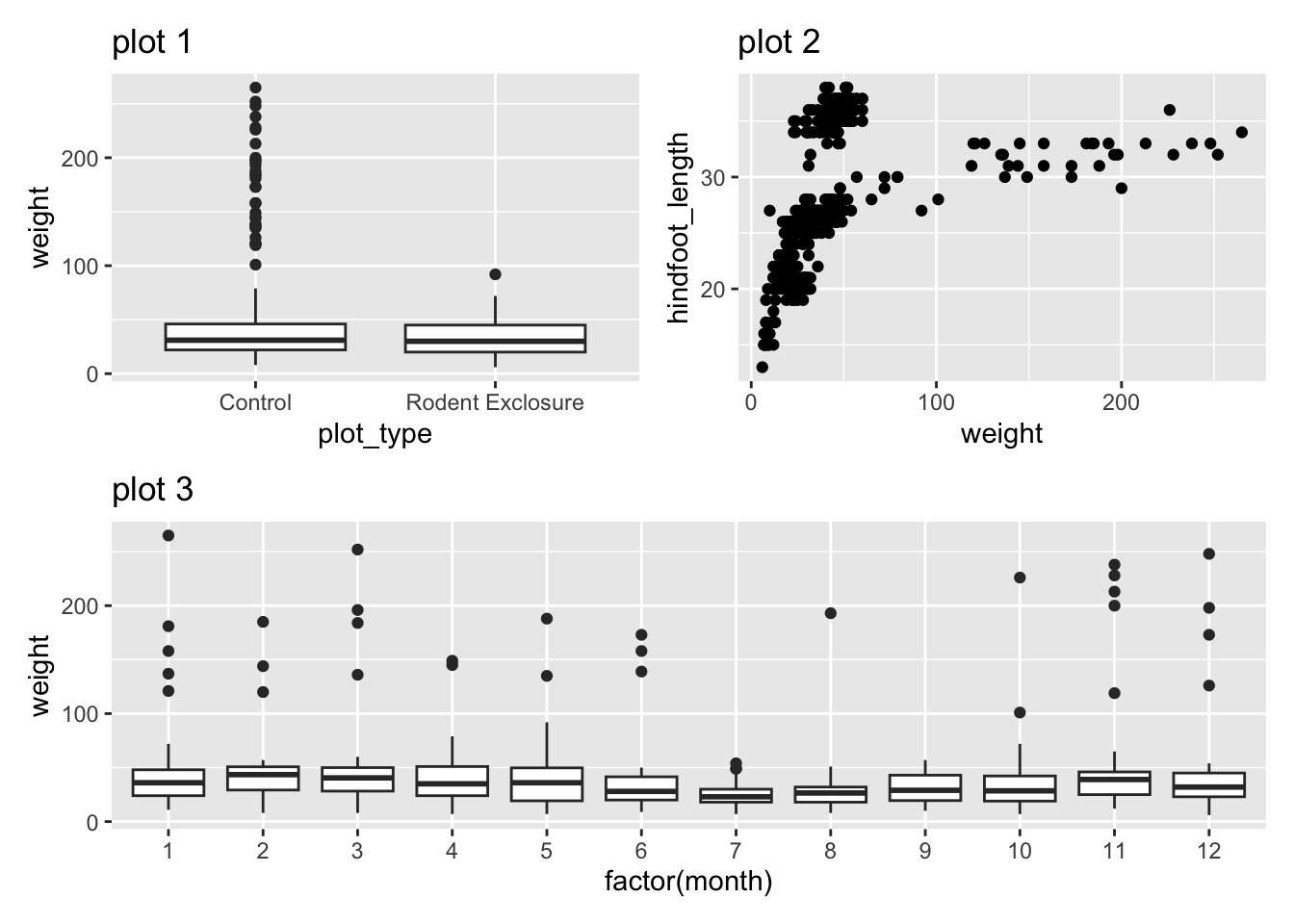
Often it’s helpful to add labels, either to the figure itself and/or to the subpanels.
We can add a title using the title = and add tags using tag_levels = arguments. These get added to the plot, using plot_annotation():
(p1 + p2) / p3 +
  plot_annotation(title = "Fig. 1: Trialling composite plots",
                  tag_levels = "a")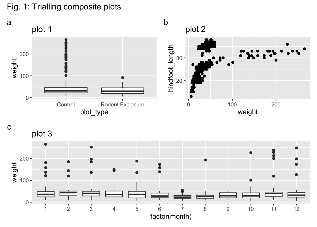
You can change the tag_levels = value to "A" for uppercase tags, or "1" for numbers (which wouldn’t be very clear).
14.7 Summary
TipKey points
- We can use the
clean_names()function from thejanitorpackage to clean up column names, avoiding spaces, inconsistent case use etc. - Try to avoid ID columns with numbers only, but instead use a prefix, so the data are not viewed as numerical.
- Common encoding issues include: inconsistent (upper) case use (e.g.
Belgiumvsbelgium); poorly defined boolean values (y/yesinstead ofTRUEorFALSE). - It is good practice to include a plot
titleand well-definedxandyaxis labels. - Ensure axes labels are clear by wrapping text or, less ideal, rotating them.
- Use colours wisely, ensuring separation between groups.
- Consider colour blindness in your audience and use colour-blind safe colour schemes.
- Arrange plots using
patchwork
- We can use the
clean_names()function from thepyjanitorpackage to clean up column names, avoiding spaces, inconsistent case use etc. - Try to avoid ID columns with numbers only, but instead use a prefix, so the data are not viewed as numerical.
- Common encoding issues include: inconsistent (upper) case use (e.g.
Belgiumvsbelgium); poorly defined boolean values (y/yesinstead ofTrueorFalse). - It is good practice to include a plot
titleand well-definedxandyaxis labels. - Ensure axes labels are clear by wrapping text or, less ideal, rotating them.
- Use colours wisely, ensuring separation between groups.
- Consider colour blindness in your audience and use colour-blind safe colour schemes.