# A collection of R packages designed for data science
library(tidyverse)

surveys_join <- read_csv("data/surveys_join.csv")12 Reshaping data
TipLearning objectives
- Learn what long and wide data formats are.
- Be able to recognise when best to use each.
- Be able to switch from long to wide and back.
12.1 Context
So far, we have provided data in the most convenient format. In real life, this is of course not always the case, because people collect data in a format that works best for them - not the computer. So, sometimes we need to change the shape of our data, so we can calculate or visualise the data we’d like.
12.2 Section setup
We’ll continue this section with the script named 04_session. If needed, add the following code to the top of your script and run it.
We’ll continue this section with the Notebook named 04_session. Add the following code to the first cell and run it.
# A Python data analysis and manipulation tool
import pandas as pd

# Python equivalent of `ggplot2`
from plotnine import *

# If using seaborn for plotting
import seaborn as sns
import matplotlib.pyplot as plt

surveys_join = pd.read_csv("data/surveys_join.csv")
12.3 Data reshaping
Let’s look at a hypothetical data set, based on the type of variables we’ve come across in the surveys data.
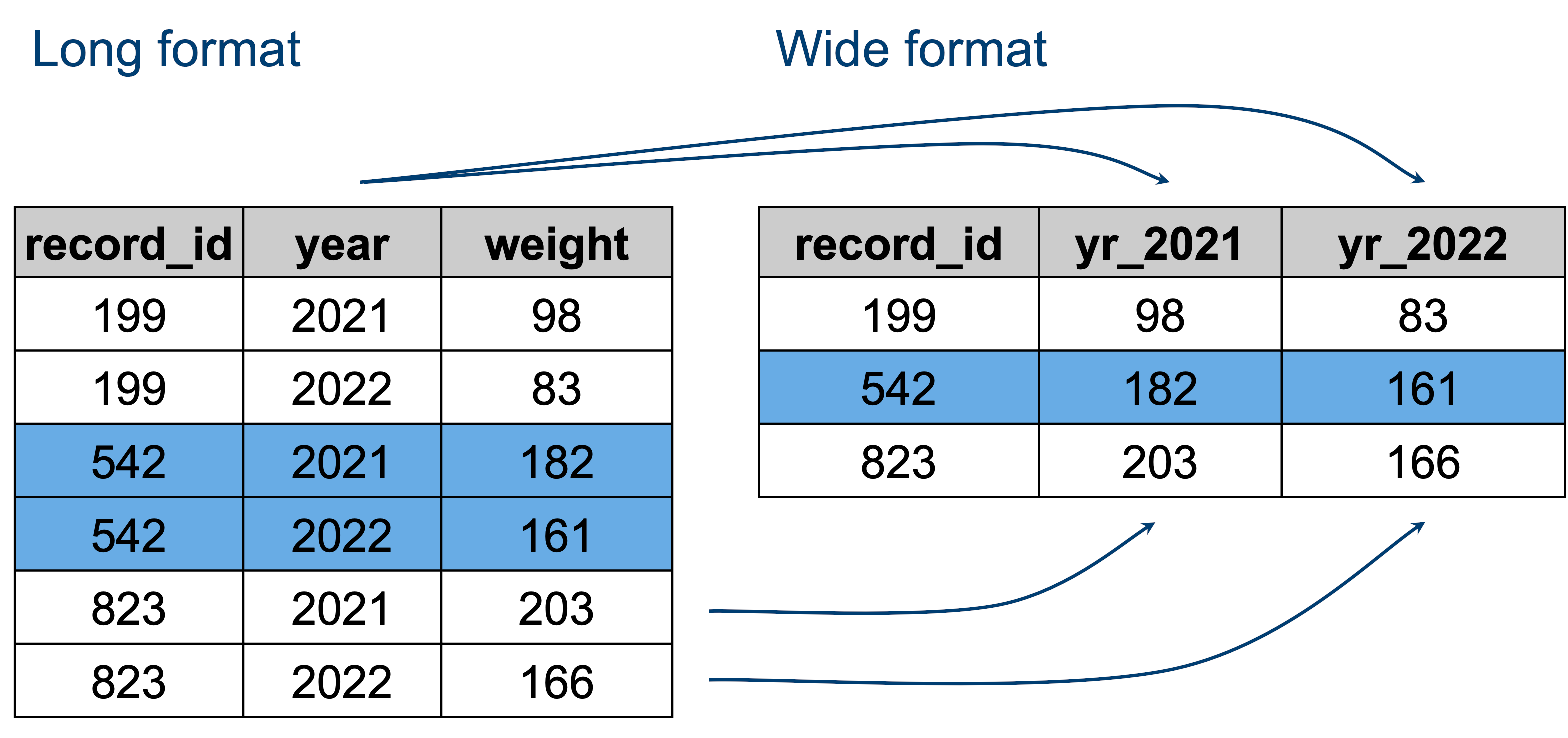
The data that is present in both tables is the same - it’s just encoded slightly differently.
- The “long” format is where we have a column for each of the types of things we measured or recorded in our data. In other words, each variable has its own column.
- The “wide” format occurs when we have data relating to the same measured thing in different columns. In this case, we have values related to our metric spread across multiple columns (a column each for a year).
For an animated representation of the underlying principle of joining, have a look at the garrickadenbuie website.
NoteWide or long?
Neither of these formats is necessarily more correct than the other: it will depend on what analysis you intend on doing. However, it is worth mentioning that the “long” format is often preferred, as it is clearer how many distinct types of variables we have in the data.
To figure out which format you might need, it may help to think of which visualisations you may want to build with ggplot() (or other packages, for that example). Taking the above example:
- If you were interested in looking at the change of
weightacross years for each individual, then the long format is more suitable to define each aesthetic of such a graph:aes(x = year, y = weight, colour = record_id). - If you were interested in the correlation of this metric between 2021 and 2022, then the wide format would be more suitable:
aes(x = yr_2021, y = yr_2022, colour = record_id).
12.4 From long to wide
Let’s illustrate that with a dummy data set, called surveys_join. In this synthetic data set we have weight measurements for individuals across four years: 2021 - 2024. This means that there are four measurements for each record_id.
# Read in the data
surveys_join <- read_csv("data/surveys_join.csv")

# Look at the first few rows
head(surveys_join)
# A tibble: 6 × 3
record_id year weight
<dbl> <dbl> <dbl>
1 166 2021 195.
2 166 2022 190.
3 166 2023 184.
4 166 2024 182
5 228 2021 192.
6 228 2022 189 We can reshape our data from long to wide as follows, where I do not overwrite the existing data, but instead just pipe it through to the head() function, so we can see what the pivot_wider() function is doing:
surveys_join |>
  pivot_wider(names_from = "year",
              values_from = "weight",
              names_prefix = "yr_") |>
  head()
# A tibble: 6 × 5
record_id yr_2021 yr_2022 yr_2023 yr_2024
<dbl> <dbl> <dbl> <dbl> <dbl>
1 166 195. 190. 184. 182
2 228 192. 189 188 179
3 337 181. 176. 177 168.
4 330 172. 170. 165. 157.
5 205 177. 176. 167. 166.
6 878 170. 172 167. 161.Let’s unpack that a bit.
The pivot_wider() function needs at least the first two arguments:
names_from =the column who’s values we want to use for our new column names (year)values_from =the column who’s values we want to use to populate these new columns (weight)names_prefix =a prefix for our column names (optional)
Here we also add names_prefix = "yr_", otherwise the column names would contain only numbers and that’s not very good programming habit.
Let’s assign it to a new object and then visualise some of the data.
surveys_wide <- surveys_join |>
  pivot_wider(names_from = "year",
              values_from = "weight",
              names_prefix = "yr_")
# Read in the data
surveys_join = pd.read_csv("data/surveys_join.csv")
# Look at the first few rows
surveys_join.head() record_id year weight
0 166 2021 195.4
1 166 2022 189.5
2 166 2023 183.6
3 166 2024 182.0
4 228 2021 191.9surveys_wide = surveys_join.pivot(
index = "record_id",
columns = "year",
values = "weight"
)
# Add 'yr_' prefix to year columns
surveys_wide.columns = [f"yr_{col}" for col in surveys_wide.columns]
# Reset index to make 'record_id' a column again
surveys_wide = surveys_wide.reset_index()
surveys_wide.head() record_id yr_2021 yr_2022 yr_2023 yr_2024
0 118 199.5 192.8 192.6 187.6
1 160 192.5 189.0 184.3 181.4
2 166 195.4 189.5 183.6 182.0
3 178 190.1 188.4 182.2 177.5
4 184 195.1 186.7 193.5 187.3
NoteMore on adding the prefix
We explain the f notation in more detail in Section 14.3.1. Briefly, in the example above we take all the column names (surveys_wide.columns and for each column (for col in) we add the yr_ prefix.
We can then use this to visualise possible relationships between the different years:
ggplot(surveys_wide, aes(x = yr_2021, y = yr_2022)) +
  geom_point()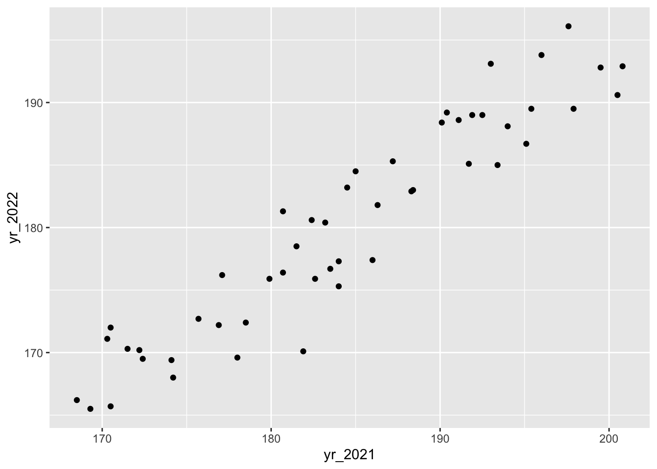
weight for 2021 and 2022
If you’d be interested in comparisons across all years, you’d have to use the original, long format because there isn’t a single column in the wide table that contains all of the year information.
ggplot(surveys_join, aes(x = factor(year), y =  weight)) +
  geom_boxplot()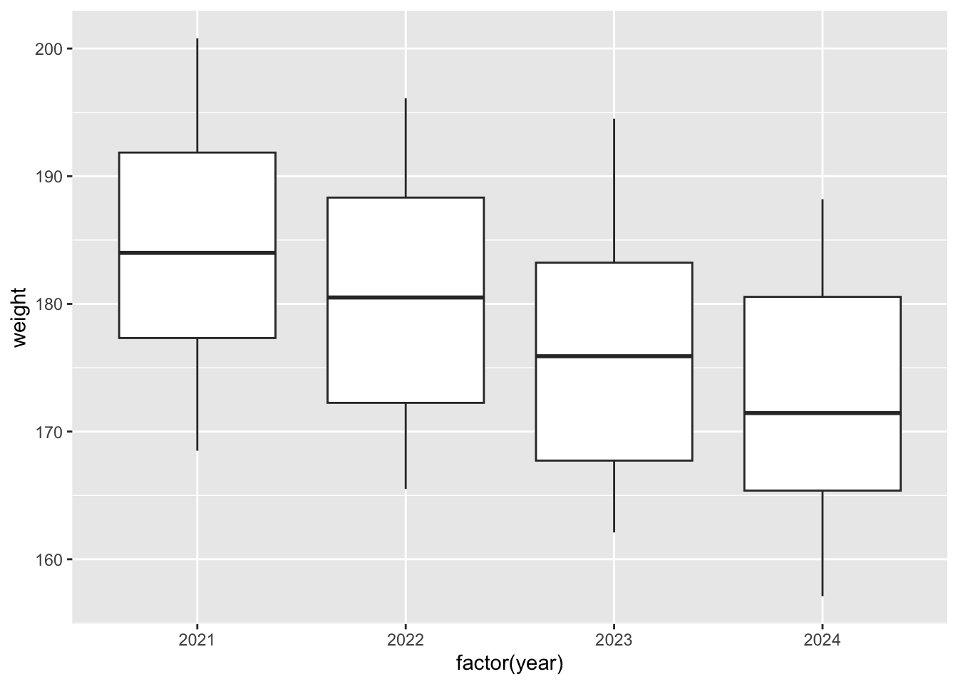
weight for 2021 - 2024
p = (ggplot(surveys_wide, aes(x = "yr_2021", y = "yr_2022")) +
    geom_point())

p.show()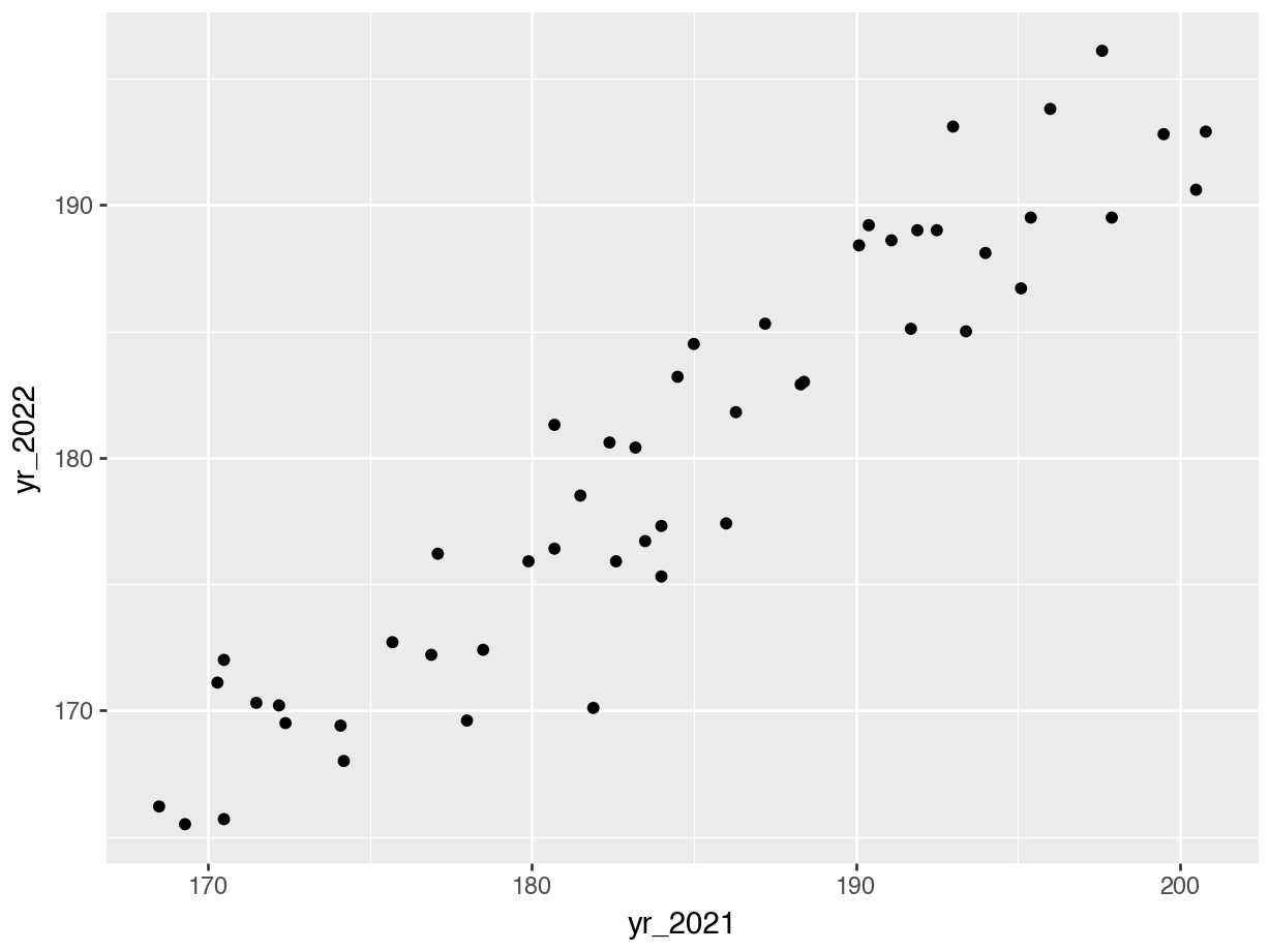
weight for 2021 and 2022
NoteSeaborn equivalent
sns.scatterplot(
    data = surveys_wide,
    x = "yr_2021",
    y = "yr_2022"
)

plt.title("Scatterplot of yr_2021 vs yr_2022")
plt.show()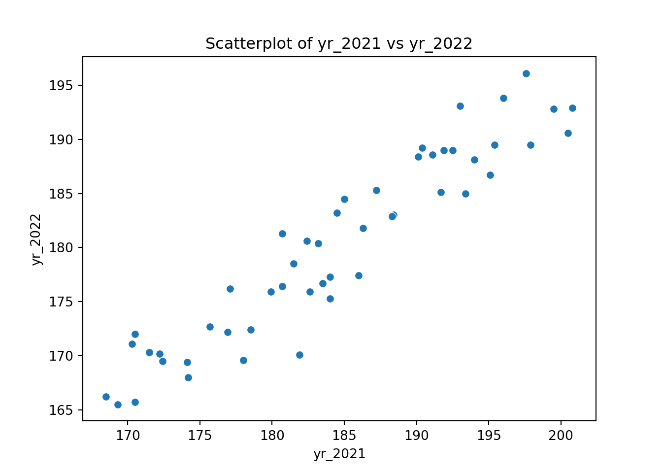
weight for 2021 and 2022
p = (ggplot(surveys_join, aes(x = "factor(year)", y = "weight")) +
    geom_boxplot())

p.show()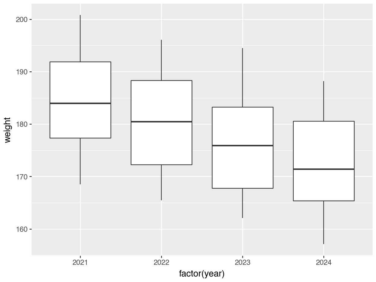
weight for 2021 - 2024
NoteSeaborn equivalent
sns.boxplot(
    data = surveys_join,
    x = "year", # seaborn treats numeric as categorical automatically if discrete
    y = "weight"
)

plt.title("Weight by year (boxplot)")
plt.show()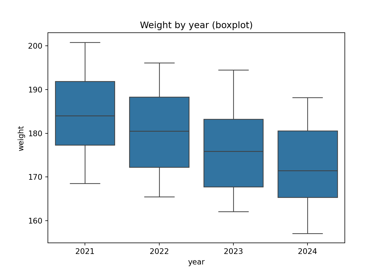
weight for 2021 - 2024
12.5 From wide to long
We can reshape our data from wide to long. This is more or less the inverse of what we did above.
surveys_wide |>
  pivot_longer(cols = -record_id,
               names_to = "year",
               values_to = "weight",
               names_prefix = "yr_")
# A tibble: 200 × 3
record_id year weight
<dbl> <chr> <dbl>
1 166 2021 195.
2 166 2022 190.
3 166 2023 184.
4 166 2024 182
5 228 2021 192.
6 228 2022 189
7 228 2023 188
8 228 2024 179
9 337 2021 181.
10 337 2022 176.
# ℹ 190 more rowsHere we use the following arguments:
cols =this tellspivot_longer()which columns to pivot - here we want to use all but therecord_idcolumnnames_to =the name of the column that gets to hold the column names (e.g.yr_2021,yr_2022…)values_to =the name of the column that will contain the measured values (here those are theweightmeasurements)names_prefix =here we tell it that all column names have a prefixyr_, which then gets removed prior to populating the column
To go back to the long format, we use the .melt() function.
surveys_long = surveys_wide.melt(
    id_vars = "record_id",            # columns to keep fixed
    var_name = "year",                # name of the new 'year' column
    value_name = "weight"             # name of the new 'weight' column
)

surveys_long.head()
record_id year weight
0 118 yr_2021 199.5
1 160 yr_2021 192.5
2 166 yr_2021 195.4
3 178 yr_2021 190.1
4 184 yr_2021 195.1This uses the following arguments:
id_vars =this tells it what theidcolumn is -record_idin our case, which does not get pivoted.var_name =the name of the column that gets to hold the column names (e.g.yr_2021,yr_2022…)value_name =the name of the column that will contain the measured values (here those are theweightmeasurements)
This then creates a column year that contains the values yr_2021, yr_2022, ..., since we added the prefix. If we want to remove the prefix we can do the following:
# Remove 'yr_' prefix and convert year to integer
surveys_long["year"] = surveys_long["year"].str.replace("yr_", "").astype(int)

surveys_long.head()
record_id year weight
0 118 2021 199.5
1 160 2021 192.5
2 166 2021 195.4
3 178 2021 190.1
4 184 2021 195.112.6 Exercises
12.6.1 Reshaping: auxin
12.7 Summary
TipKey points
- We can reshape data, going from long to wide (and back).
- Which format you use depends on the aim: consider how you’d plot data.
- We can use
pivot_wider()to create a wide-format data set. - We can use
pivot_longer()to create a long-format data set.
- We can reshape data, going from long to wide (and back).
- Which format you use depends on the aim: consider how you’d plot data.
- We can use
.pivot()to create a wide-format data set. - We can use
.melt()to create a long-format data set.