library(tidyverse)
theme_set(theme_bw())13 Abundance Visualisation
- Perform basic exploratory analysis of variant/lineage abundance data using the software R.
- Generate several plots showing the change in variant abundance over time.
- Explore which lineages are detected and assess the uncertainty in their estimates due to sequencing.
- Recognise the pros and cons of analysing data from individual lineages or summarised across variants of concern.
13.1 Data exploration with R
In the previous section we have generated a CSV file that aggregated all the lineage/variant abundances into a single table. Although some basic exploration of these data can be done in Excel, we can perform more advanced and customised visualisations using the R software (see the R fundamentals appendix for a quick introduction to this software).
The main functions used in this section are:
- Data import (Posit cheatsheet):
read_csv()to import a CSV file as a data.frame/tibble object.
- Data manipulation (Posit cheatsheet):
filter()to subset rows of the table that match a particular condition.arrange()to sort the table by the values of selected columns.count()to count the unique values of selected columns.mutate()to add new columns to the table or modify the values of existing ones.
- Working with categorical variables (Posit cheatsheet):
fct_reorder()to order categorical values based on a numeric variable (rather than the default alphabetical ordering).
- Working with dates (Posit cheatsheet):
floor_date()to round a date down to the time unit specified (e.g. “week” or “month”).
- Visualisation with
ggplot2(Posit cheatsheet).
We start by loading the tidyverse package, which contains several functions for data manipulation and visualisation:
We have also set a “black-and-white” theme for our ggplot plots, instead of the default “grey” theme.
The next step is to read our data in:
vocs <- read_csv("results/tidyfreyja/vocs_abundances.csv")We can check the first few rows of our data, to check that is was imported correctly:
head(vocs)# A tibble: 6 × 10
sample name abundance boot_lo boot_up date country city latitude
<chr> <chr> <dbl> <dbl> <dbl> <date> <chr> <chr> <dbl>
1 SRR18541074 Delta 0.964 0.960 0.968 2021-12-01 United… San … 32.7
2 SRR18541074 Omicr… 0.0197 0.0132 0.0228 2021-12-01 United… San … 32.7
3 SRR18541074 Other 0.00122 0 0.00872 2021-12-01 United… San … 32.7
4 SRR18541043 Omicr… 0.876 0.873 0.881 2021-12-26 United… San … 32.7
5 SRR18541043 Other 0.0786 0.0683 0.0807 2021-12-26 United… San … 32.7
6 SRR18541043 Delta 0.0338 0.0343 0.0447 2021-12-26 United… San … 32.7
# ℹ 1 more variable: longitude <dbl>We can start with some basic exploration of our data, answering some simple questions. Some examples are given here.
How many VOCs have >75% frequency?
vocs |>
  # keep rows with >= 75% abundance
  filter(abundance >= 0.75) |>
  # sort them by date
  arrange(date)
# A tibble: 12 × 10
sample name abundance boot_lo boot_up date country city latitude
<chr> <chr> <dbl> <dbl> <dbl> <date> <chr> <chr> <dbl>
1 SRR18541092 Delta 0.966 0.936 0.971 2021-09-05 United… San … 32.7
2 SRR18541114 Delta 0.982 0.976 0.984 2021-09-06 United… San … 32.7
3 SRR18541096 Delta 0.905 0.898 0.923 2021-09-07 United… Caer… 40.1
4 SRR18541099 Delta 0.888 0.876 0.960 2021-09-07 United… Caer… 40.1
5 SRR18541098 Delta 0.973 0.961 0.977 2021-09-13 United… Caer… 40.1
6 SRR18541049 Delta 0.962 0.960 0.973 2021-11-28 United… San … 32.7
7 SRR18541074 Delta 0.964 0.960 0.968 2021-12-01 United… San … 32.7
8 SRR18541042 Delta 0.795 0.782 0.820 2021-12-06 United… San … 32.7
9 SRR18541043 Omic… 0.876 0.873 0.881 2021-12-26 United… San … 32.7
10 SRR18541028 Omic… 0.932 0.909 0.945 2021-12-27 United… San … 32.7
11 SRR18541027 Omic… 0.886 0.883 0.890 2022-01-04 United… San … 32.7
12 SRR18541030 Omic… 0.915 0.905 0.946 2022-01-23 United… San … 32.7
# ℹ 1 more variable: longitude <dbl>What was the count of each detected variant?
vocs |>
  count(name)
# A tibble: 8 × 2
name n
<chr> <int>
1 A 7
2 Alpha 6
3 Beta 7
4 Delta 17
5 Epsilon 1
6 Gamma 8
7 Omicron 9
8 Other 15We can also start doing some visualisations. For example, the previous question can be visualised with a barplot:
vocs |>
  # count occurrence of each VOC
  count(name) |>
  # visualise
  ggplot(aes(x = n, y = name)) +
  geom_col()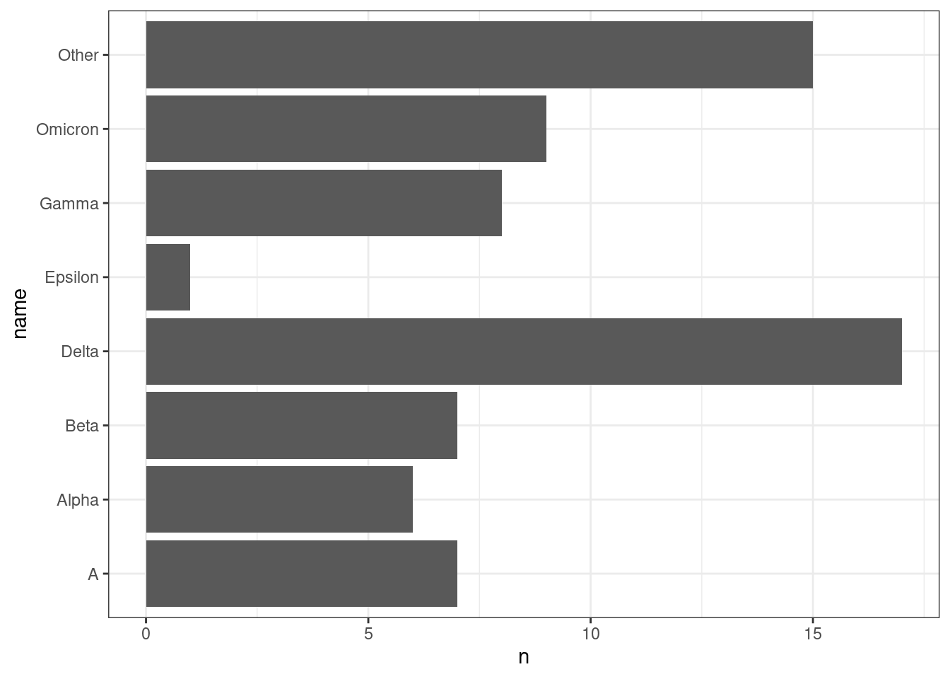
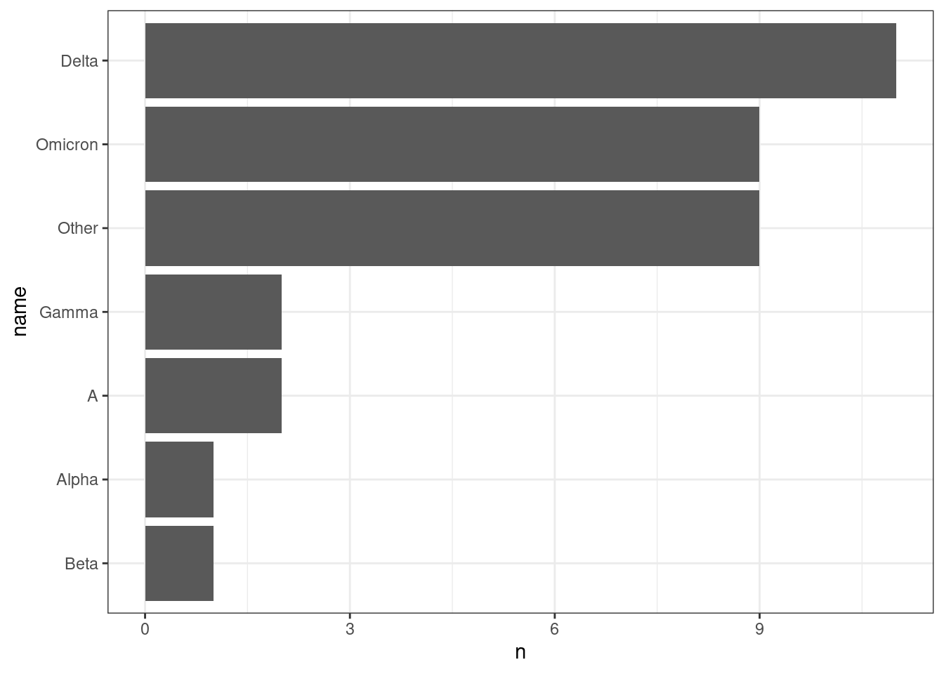
Even better, we can sort our variants by count rather than alphabetically:
vocs |>
  # count occurrence of each VOC
  count(name) |>
  # reorder the names by their count
  mutate(name = fct_reorder(name, n)) |>
  # visualise
  ggplot(aes(x = n, y = name)) +
  geom_col()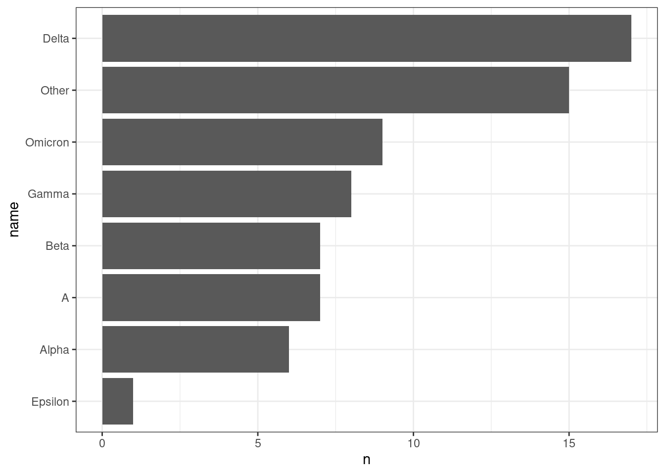
We may also want to break this down by city:
vocs |>
  # count by city and name
  count(city, name) |>
  # reorder the names by their count
  mutate(name = fct_reorder(name, n)) |>
  # visualise
  ggplot(aes(x = n, y = name)) +
  geom_col(aes(fill = city))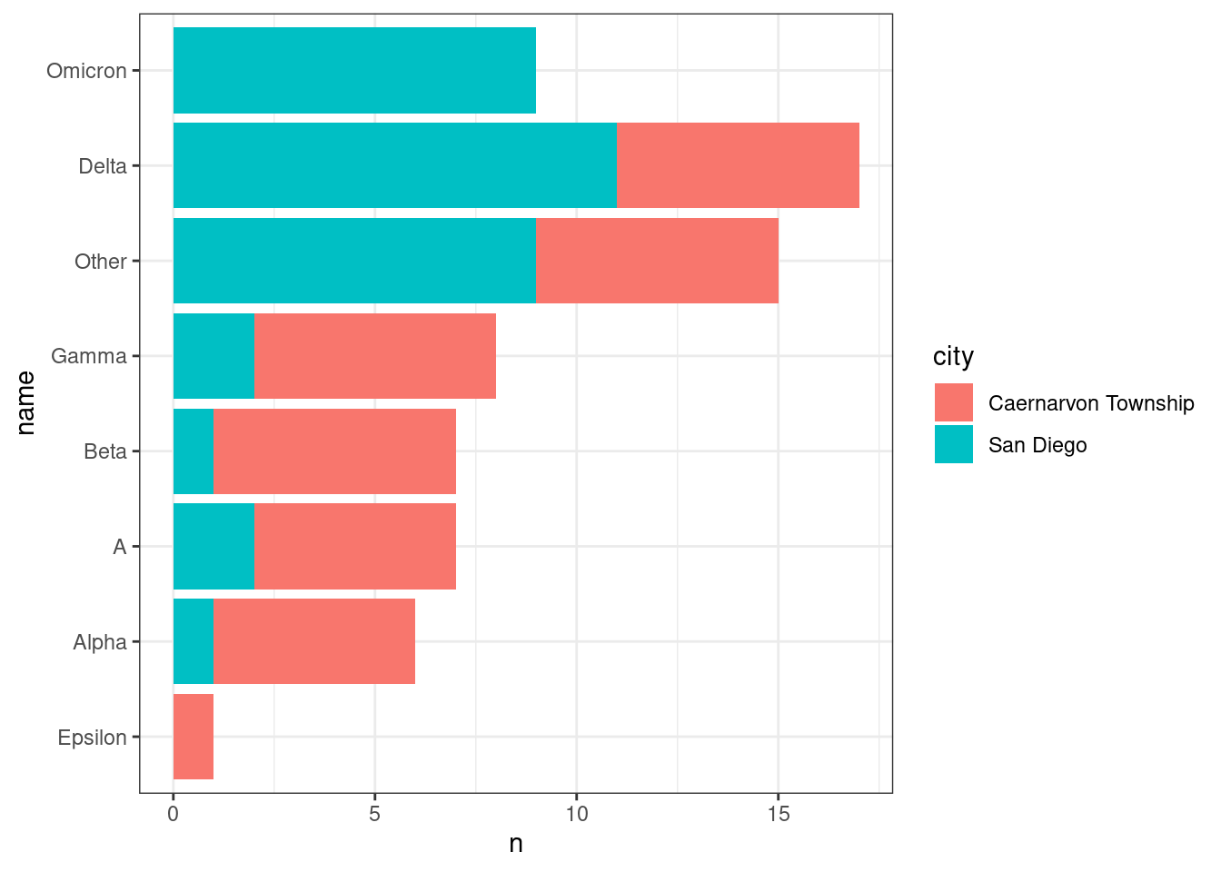
It seems like Omicron was only detected in San Diego. Could this be because of the dates when the samples were collected in each city?
vocs |>
  # create a variable with the start of the week for each sample
  mutate(week = floor_date(date, "week")) |>
  # count how many samples per week and city
  count(week, city) |>
  # barplot
  ggplot(aes(week, n)) +
  geom_col() +
  facet_grid(rows = vars(city))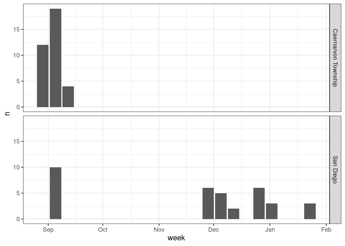
Indeed, it seems like San Diego has a wider coverage across time. It is also clear from this plot that we have a time gap in our sampling, missing samples in Oct and Nov.
13.2 Variant abundances
Relative lineage abundances can be visualised as a barplot, where the samples are ordered by their date of collection. Using ggplot:
sandiego |>
  ggplot(aes(x = sample, y = abundance)) +
  geom_col(aes(fill = name)) +
  scale_x_discrete(guide = guide_axis(angle = 45))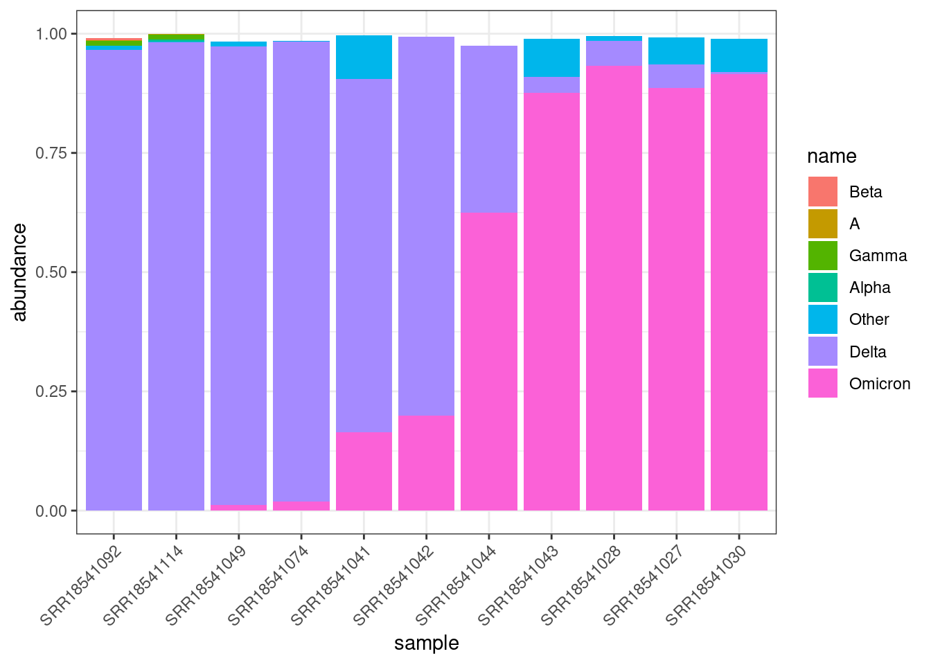
To add further information about the date of collection, we can also “facet” the plot by the month when the samples were collected:
sandiego |>
  ggplot(aes(x = sample, y = abundance)) +
  geom_col(aes(fill = name)) +
  scale_x_discrete(guide = guide_axis(angle = 45)) +
  facet_grid(cols = vars(month), scales = "free_x", space = "free_x")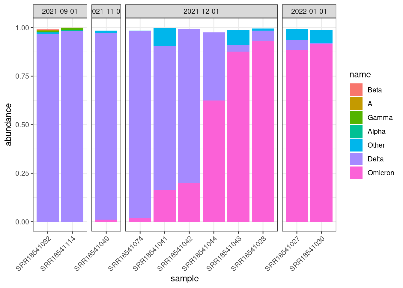
You may notice that some of the bars don’t quite add up to 1. This is simply a rounding issue from Freyja output.
We can also visualise the abundances in a heatmap-style plot, which may be useful if the number of samples is very large:
sandiego |>
  ggplot(aes(sample, name)) +
  geom_tile(aes(fill = abundance)) +
  scale_fill_viridis_c(limits = c(0, 1)) +
  scale_x_discrete(guide = guide_axis(angle = 45)) +
  facet_grid(~ month, scales = "free_x", space = "free_x")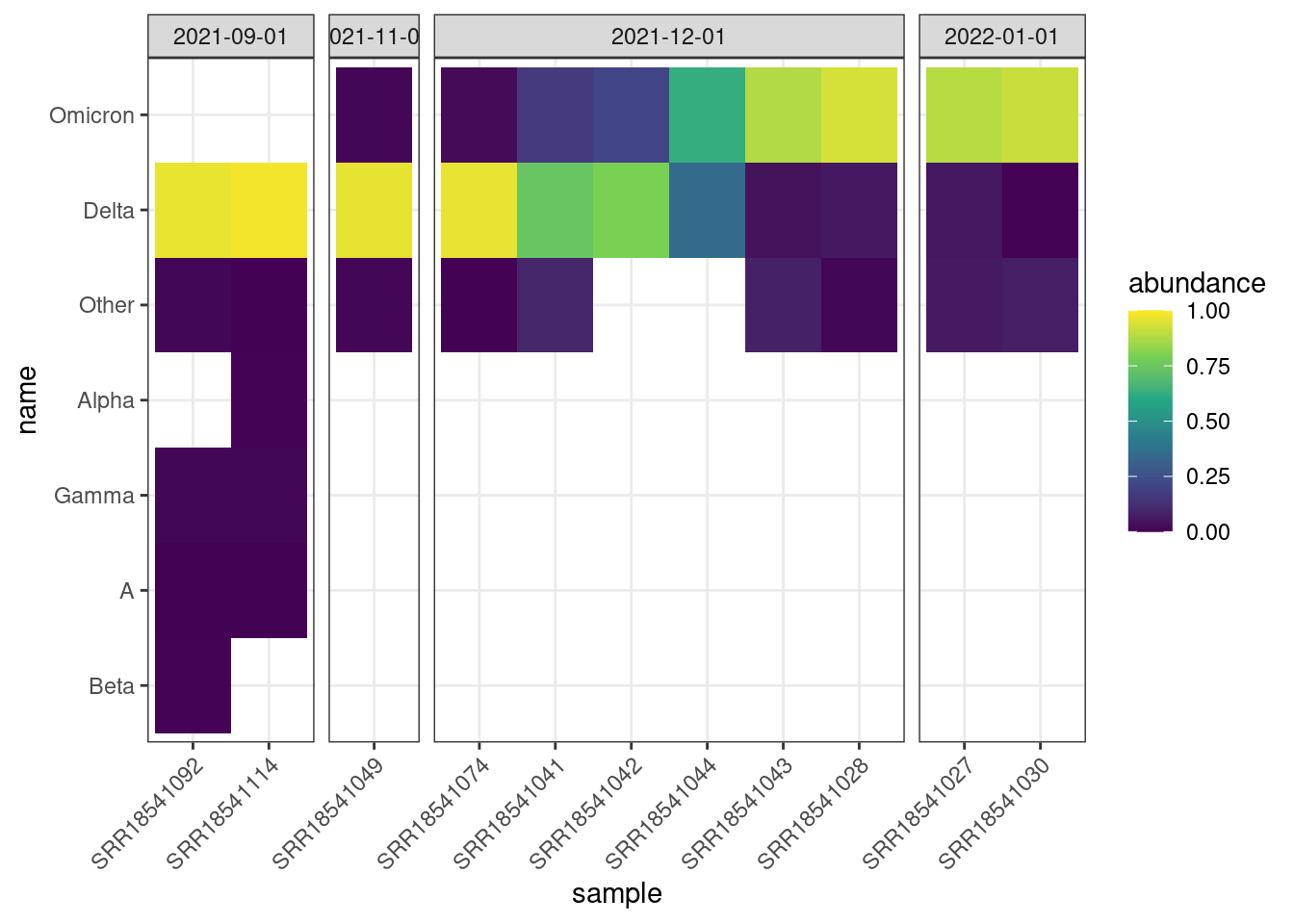
We can clearly see the transition between Delta and Omicron. Delta is dominant in Sep and Nov, then samples start to appear more mixed in Dec, and finally replaced by Omicron by Jan.
Another way to visualise these data is using a line plot, with a line for each variant:
sandiego |>
  ggplot(aes(date, abundance, colour = name)) +
  geom_point(size = 2) +
  geom_line(linewidth = 1)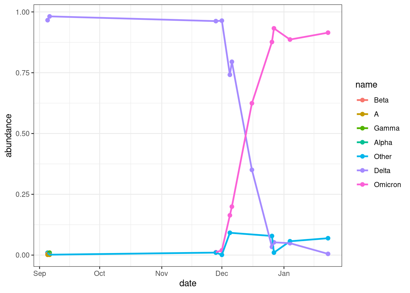
This plot also shows the clear shift between Delta and Omicron. We can also see the other variants are much less frequent in these samples.
13.3 Lineage abundances
So far, we have been analysing the frequencies summarised by Variant of Concern (VOC). We could do similar analyses using the individual lineages, however these tend to be less clear.
Let’s start by importing our data:
lineages <- read_csv("results/tidyfreyja/lineage_abundances.csv")Here is an example of the heatmap-style visualisation for the San Diego samples:
lineages |>
  # keep only samples from San Diego
  filter(city == "San Diego") |>
  # order the samples and lineages by date
  mutate(sample = fct_reorder(sample, date),
         name = fct_reorder(name, date)) |>
  # visualise
  ggplot(aes(sample, name)) +
  geom_tile(aes(fill = abundance)) +
  scale_fill_viridis_c(limits = c(0, 1)) +
  theme_classic() +
  scale_x_discrete(guide = guide_axis(angle = 45)) +
  scale_y_discrete(guide = guide_axis(check.overlap = TRUE))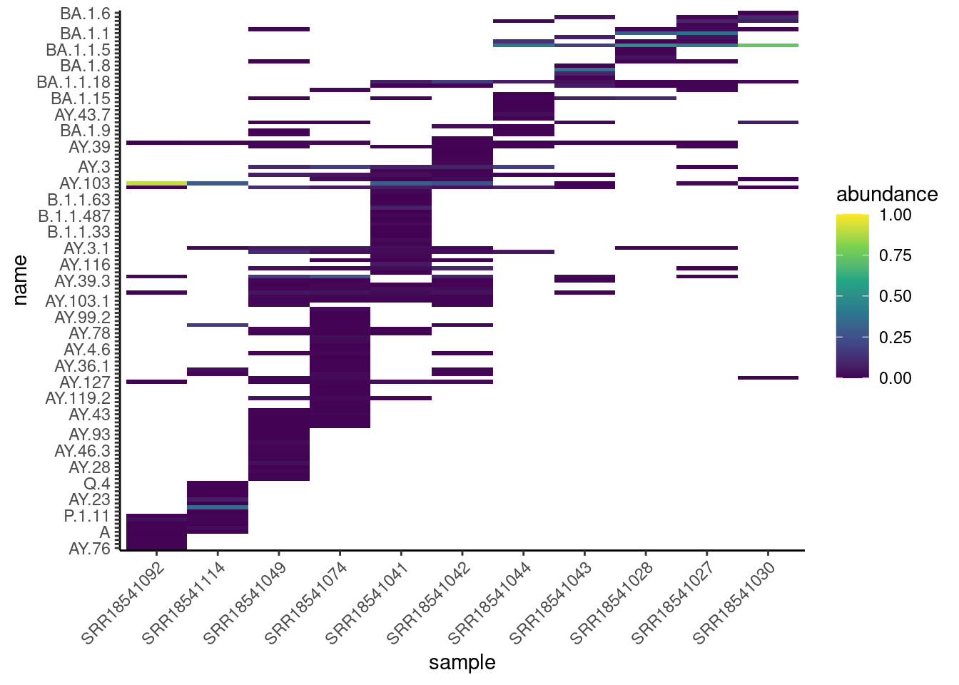
In this case, there are too many lineages to be easily visible on a plot like this (not all lineage names are shown on the y-axis, as they were overlapping each other). Therefore, using the VOCs summaries is more suited for these types of visualisations.
We can also see that the abundance of these lineages is generally very low, most lineages have a low frequency. This may be due to a mixture of sub-lineages being present in the sample, or even due to imprecisions in the estimates from our data. This can happen for lineages that have very similar mutation profiles.
Here is a histogram showing the distribution of lineage abundances:
lineages |>
  ggplot(aes(abundance)) +
  geom_histogram(binwidth = 0.01)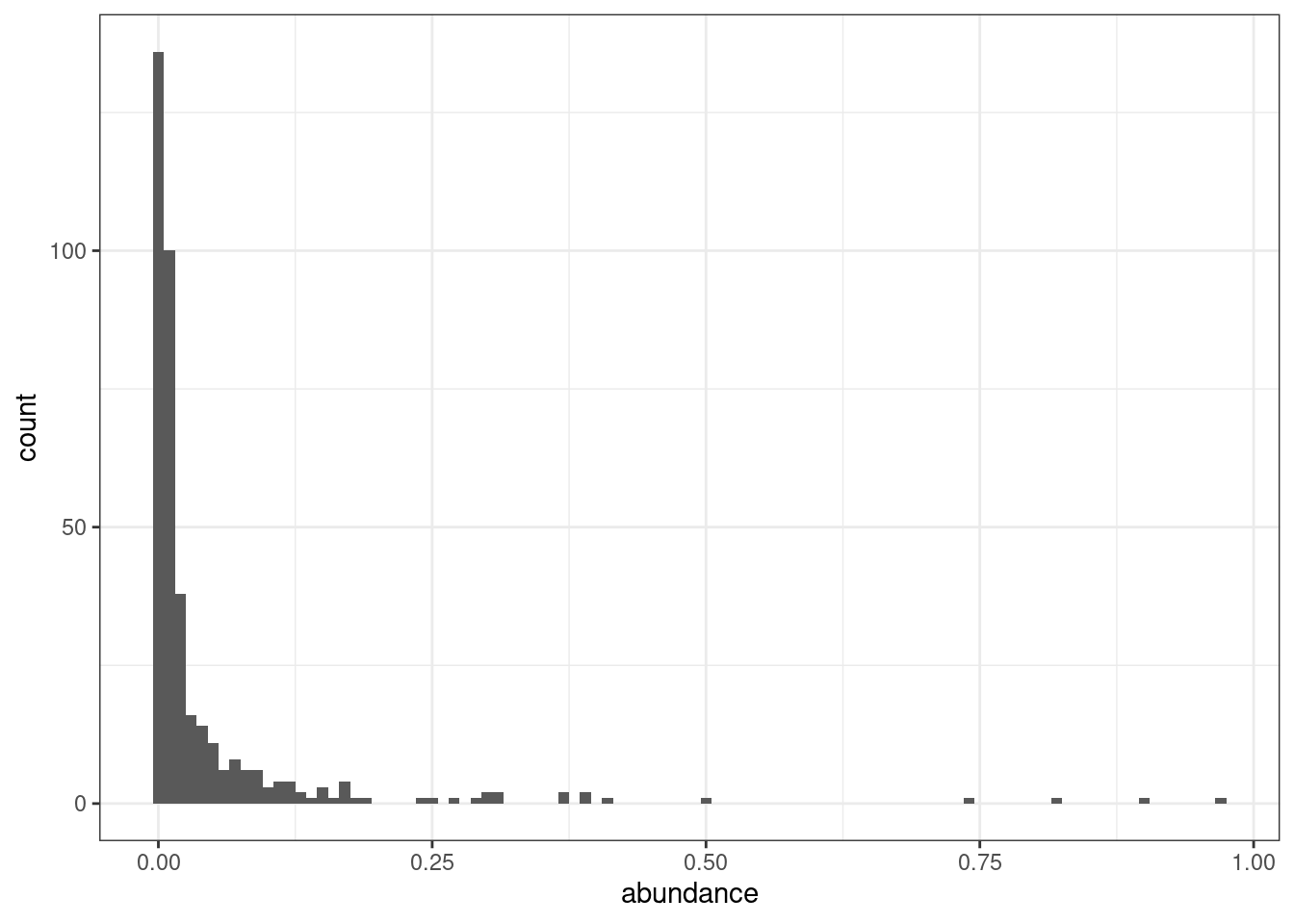
As we can see, most lineages have an abundance of less than 1% (the first bar in the plot). Since many of these lineages are, in fact, part of the same clade, the summarised VOCs table gives a clearler picture for these types of visualisation.
However, the lineage data may be useful to investigate specific samples in more detail. For example, what were the lineages present in the latest sample collected?
lineages |>
  filter(sample == "SRR18541030")
# A tibble: 10 × 10
sample name abundance boot_lo boot_up date country city latitude
<chr> <chr> <dbl> <dbl> <dbl> <date> <chr> <chr> <dbl>
1 SRR18541030 BA.1… 0.738 0.693 0.799 2022-01-23 United… San … 32.7
2 SRR18541030 BA.1… 0.0991 0.0674 0.102 2022-01-23 United… San … 32.7
3 SRR18541030 XD 0.0626 0.0282 0.0769 2022-01-23 United… San … 32.7
4 SRR18541030 BA.1… 0.0604 0.0513 0.0690 2022-01-23 United… San … 32.7
5 SRR18541030 BA.1… 0.0161 0 0.0349 2022-01-23 United… San … 32.7
6 SRR18541030 XS 0.00684 0 0.0137 2022-01-23 United… San … 32.7
7 SRR18541030 AY.1… 0.00260 0 0.00540 2022-01-23 United… San … 32.7
8 SRR18541030 BA.1… 0.00129 0 0.00389 2022-01-23 United… San … 32.7
9 SRR18541030 AY.2… 0.00128 0 0.00278 2022-01-23 United… San … 32.7
10 SRR18541030 AY.1… 0.00125 0 0.00177 2022-01-23 United… San … 32.7
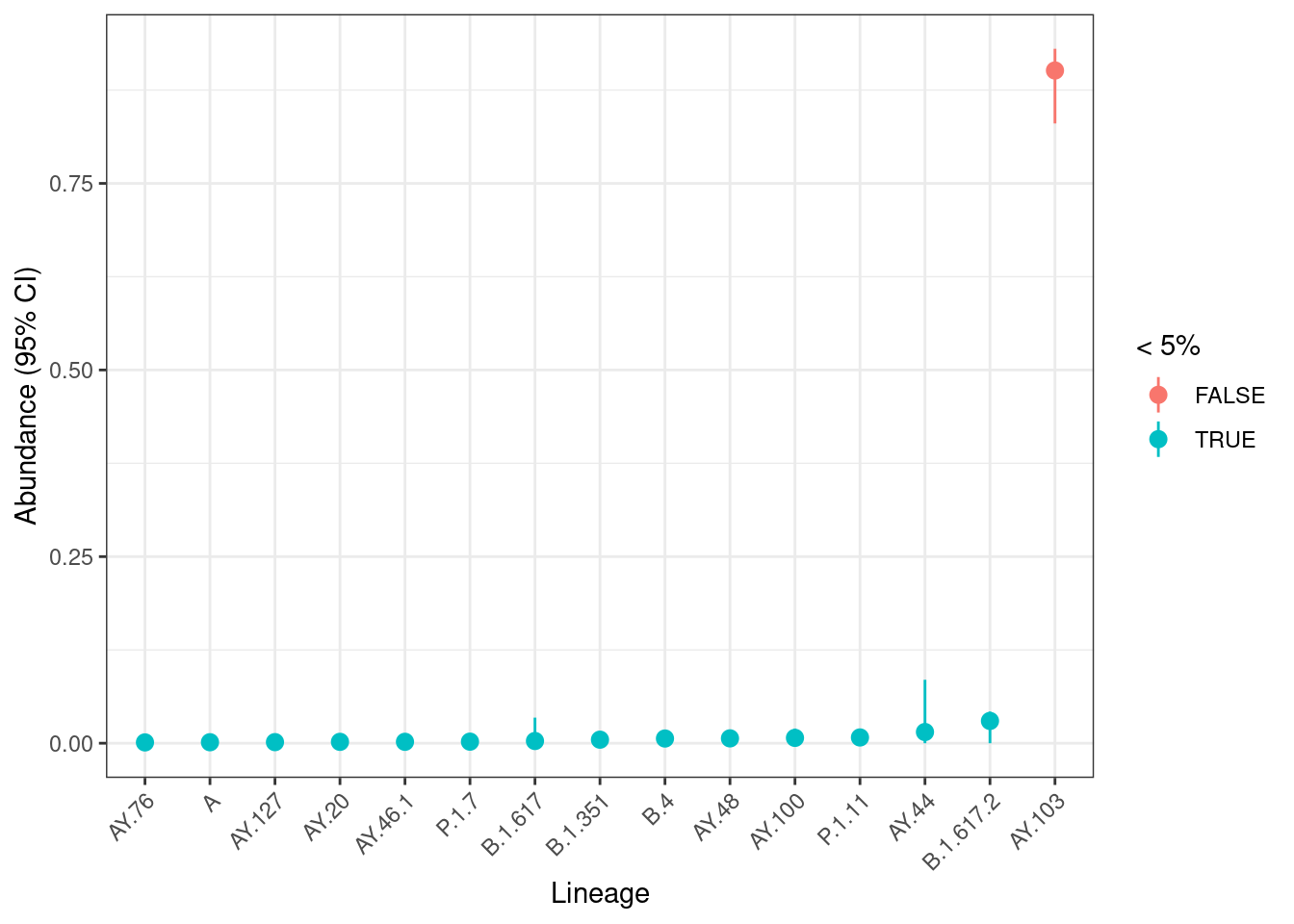
# ℹ 1 more variable: longitude <dbl>We can plot their frequency and bootstrap uncertainty interval:
lineages |>
  # keep rows for sample of interest only
  filter(sample == "SRR18541030") |>
  # sort lineage by abundance
  mutate(name = fct_reorder(name, abundance)) |>
  # make the plot
  ggplot(aes(x = name, y = abundance, colour = abundance < 0.05)) +
  geom_pointrange(aes(ymin = boot_lo, ymax = boot_up)) +
  labs(x = "Lineage", y = "Abundance (95% CI)", colour = "< 5%")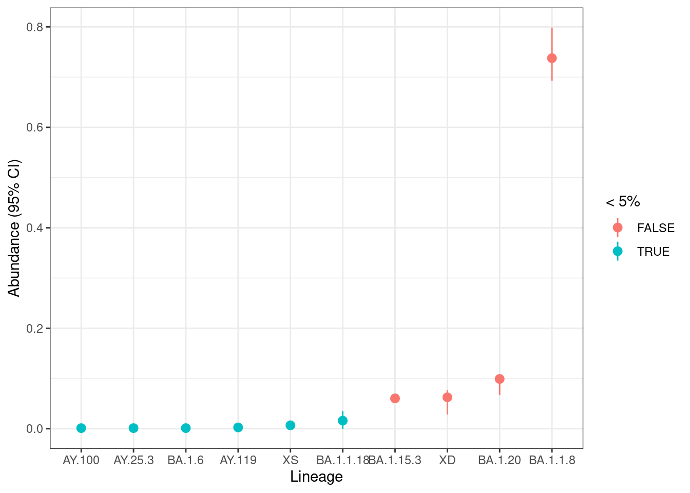
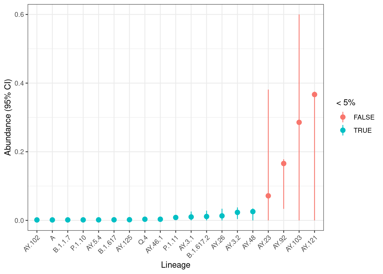
We can see several lineages with low frequency (less than 5%), which we should interpret carefully as those tend to less precise (see Sutcliffe et al. 2023). For higher frequency lineages the confidence intervals are relatively narrow, suggesting the uncertainty due to sequencing depth is not problematic for this sample.
13.3.1 Exercise
13.4 Freyja dashboard
In this chapter we covered the use of R to generate these visualisations. This is because of the flexibility of this language, which allows us to perform many different types of visualisation and data exploration.
However, the Freyja developers provide a command to generate a dashboard with a barplot of VOC abundances. We have found this solution less flexible, and it requires configuring the metadata file in a very specific format.
There are two steps involved:
freyja aggregateis used to combine the results of multiple samples into a single file.freyja dashis then used to create the dashboard.
The Freyja documentation gives more details about how to use these commands. You will need to pay attention to the specific file format for metadata, which requires certain columns to be present in order for the commands to work.
13.5 Summary
- There are several useful exploratory analyses that can be done on variant abundances:
- Which variants were detected at high frequency.
- How many times each variant was detected across all samples.
- How many samples were collected weekly in different regions.
- Variant abundance over time can be displayed as barplots, heatmaps or line plots.
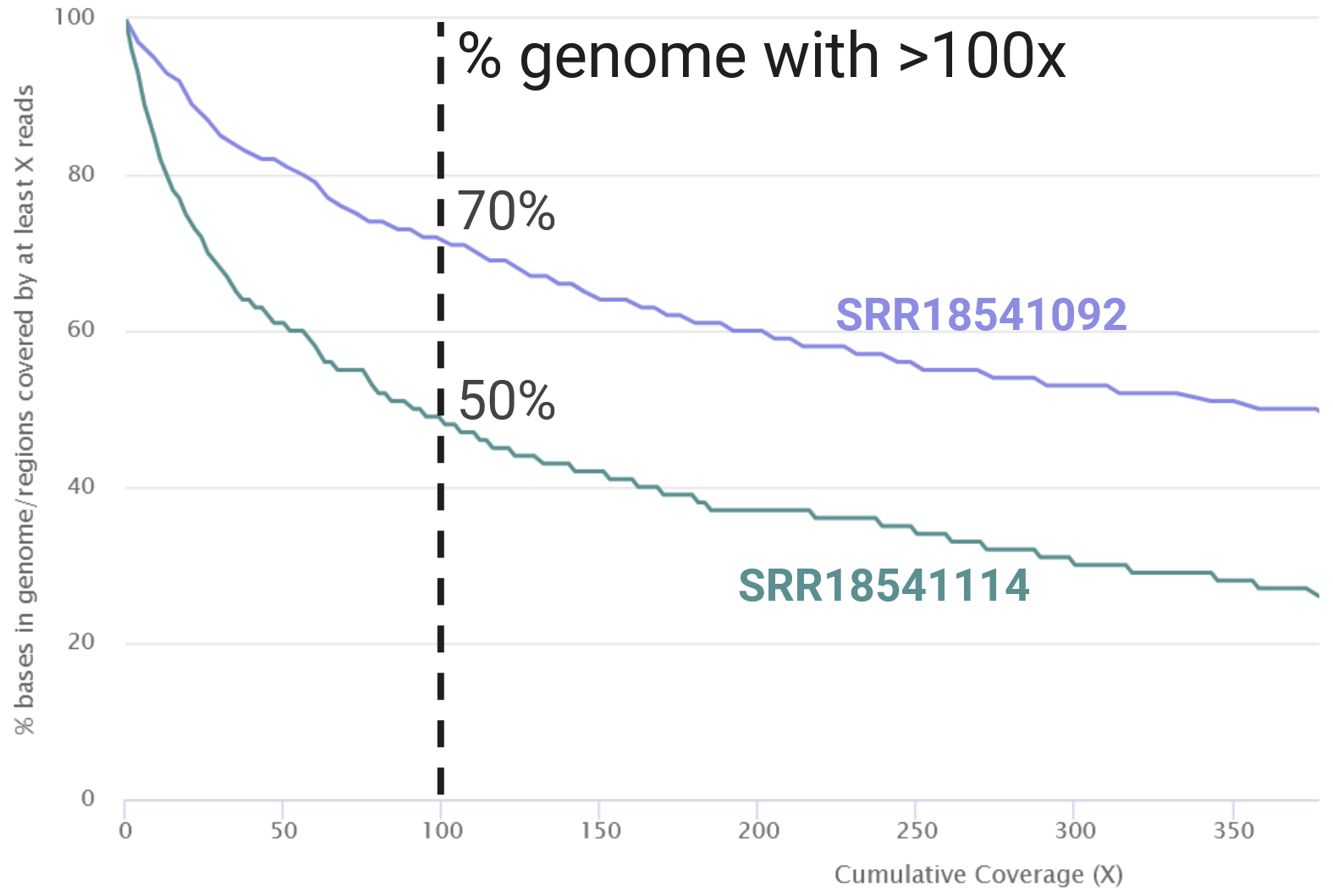
- Samples with higher sequencing depth usually have narrower confidence intervals compared to those with low sequencing depth.
- Analysis of both lineage and VOC abundance is useful:
- VOC abundance gives more stable estimates and provides a “big picture” of the variants circulating the population.
- Lineage abundance gives more detail about which exact lineages of a variant are circulating in the population, however the estimates are less precise with wider confidence intervals.
