library(tidyverse)

library(patchwork)15 Space and layout
Learning outcomes
- Learn how to organise space and layout in plots
15.1 Libraries and functions
Click to expand
15.1.1 Libraries
15.1.2 Functions
15.2 Purpose and aim
Using space and layout in plots can have a huge impact on how your message comes across (or not!). For example, by composing multiple panels in a single plot you can walk the reader through a series of subplots to arrive at a point. It is of course possible to create multipanel plots using an imaging programme, copying/pasting individual images. However, this is not very reproducible and there are several ways to do this programmatically. Some of them are illustrated here.
15.3 Loading data
If you haven’t done so yet, please load the data as follows:
gapminder <- read_csv("data/gapminder_clean.csv")15.4 Composing plots
In R, the patchwork package (check its documentation, which is full of excellent examples of its usage) is a really useful tool to create multi-panel plots.
Before we can use it, we need to install it. You can do this by running the following line of code in the console (there is no need to add it to your script, since you do not want to install it every time you run your script):
install.packages("patchwork")Next, we need to load it, so we can add this to our script (remember: packages need to be loaded every time you restart R, so we do add this to our script):
library(patchwork)The easiest way to use the package is to first save the individual plots we want to assemble in different objects. Let’s create three plots to play with. The axis labels are not entirely complete, but it avoids them being too long for demonstration purposes:
p1 <- ggplot(data = gapminder,
             aes(x = child_mortality, y = children_per_woman)) +
  geom_point(aes(colour = world_region, size = population)) +
  scale_colour_brewer(palette = "Dark2") +
  scale_size_continuous(trans = "log10") +
  annotate(geom = "rect", xmin = 0, xmax = 25, ymin = 1, ymax = 3,
           colour = "grey", fill = NA) +
  labs(x = "Child mortality", y = "Fertility rate",
       colour = "Income", size = "Population")

p2 <- ggplot(data = gapminder,
             aes(x = child_mortality, y = children_per_woman)) +
  geom_point(aes(colour = world_region, size = population)) +
  scale_colour_brewer(palette = "Dark2") +
  scale_size_continuous(trans = "log10") +
  coord_cartesian(xlim = c(0, 25), ylim = c(1, 3)) +
  labs(x = "Child mortality", y = "Fertility rate",
       colour = "Income", size = "Population")

p3 <- ggplot(data = gapminder,
             aes(x = world_region, y = income_per_person)) +
  geom_boxplot(aes(fill = world_region)) +
  scale_fill_brewer(palette = "Dark2") +
  scale_y_continuous(trans = "log10") +
  annotation_logticks(sides = "l") +
  labs(x = "World region", y = "Annual income") +
  theme(legend.position = "none",
        axis.text.x = element_text(angle = 45, hjust = 1))
There are different ways in which you can specify how to put graphs together using patchwork, but the way we’re going to use in this lesson uses these two operators:
p1 | p2puts the first plot on the left and the second on the rightp1 / p2puts the first plot on the top and the second on the bottom
Here is an example using the plots we’ve made:
# side by side
p1 | p2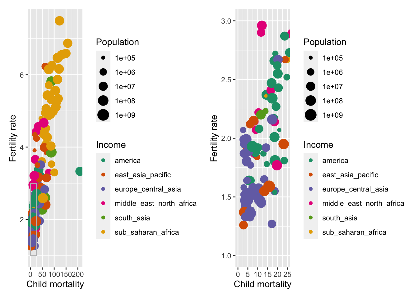
# top and bottom
p1 / p2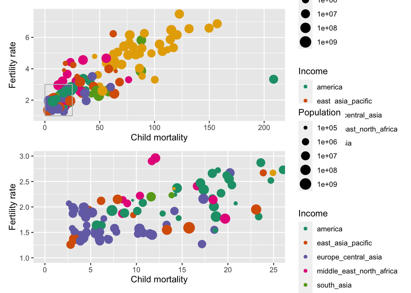
We can combine these two operators for more complex arrangements, by wrapping different parts of the grid of plots with (). For example:
# Put p1 and p2 side by side.
# Then put those on the top and p3 on the bottom
(p1 | p2) / p3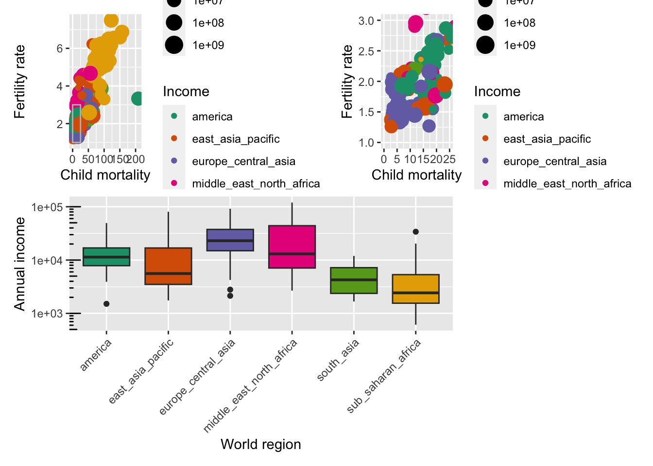
Finally, you can customise these arrangements in several ways using the plot_layout() function. For example, we can “collect” the legends and define the relative height of each panel:
((p1 | p2) / p3 ) +
  plot_layout(guides = "collect", heights = c(2, 1))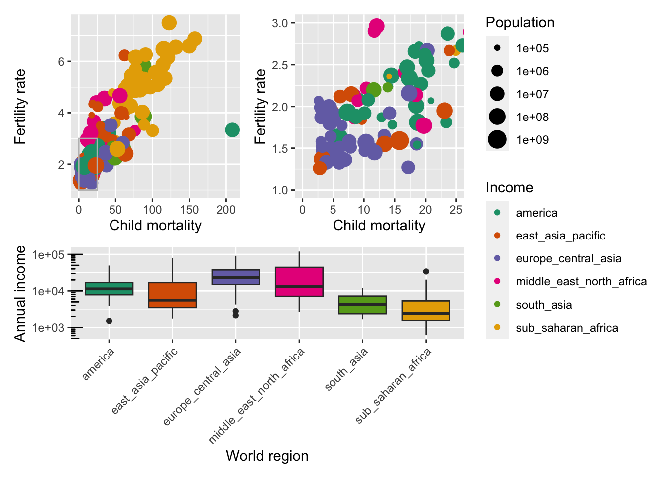
We can use plot_spacer() to add an empty space to our graph, which can be useful if we want to add something else later on using another program (e.g. an image).
For example, let’s put a blank space where the second plot should be
((p1 | plot_spacer()) / p3 ) +
  plot_layout(guides = "collect", heights = c(2, 1))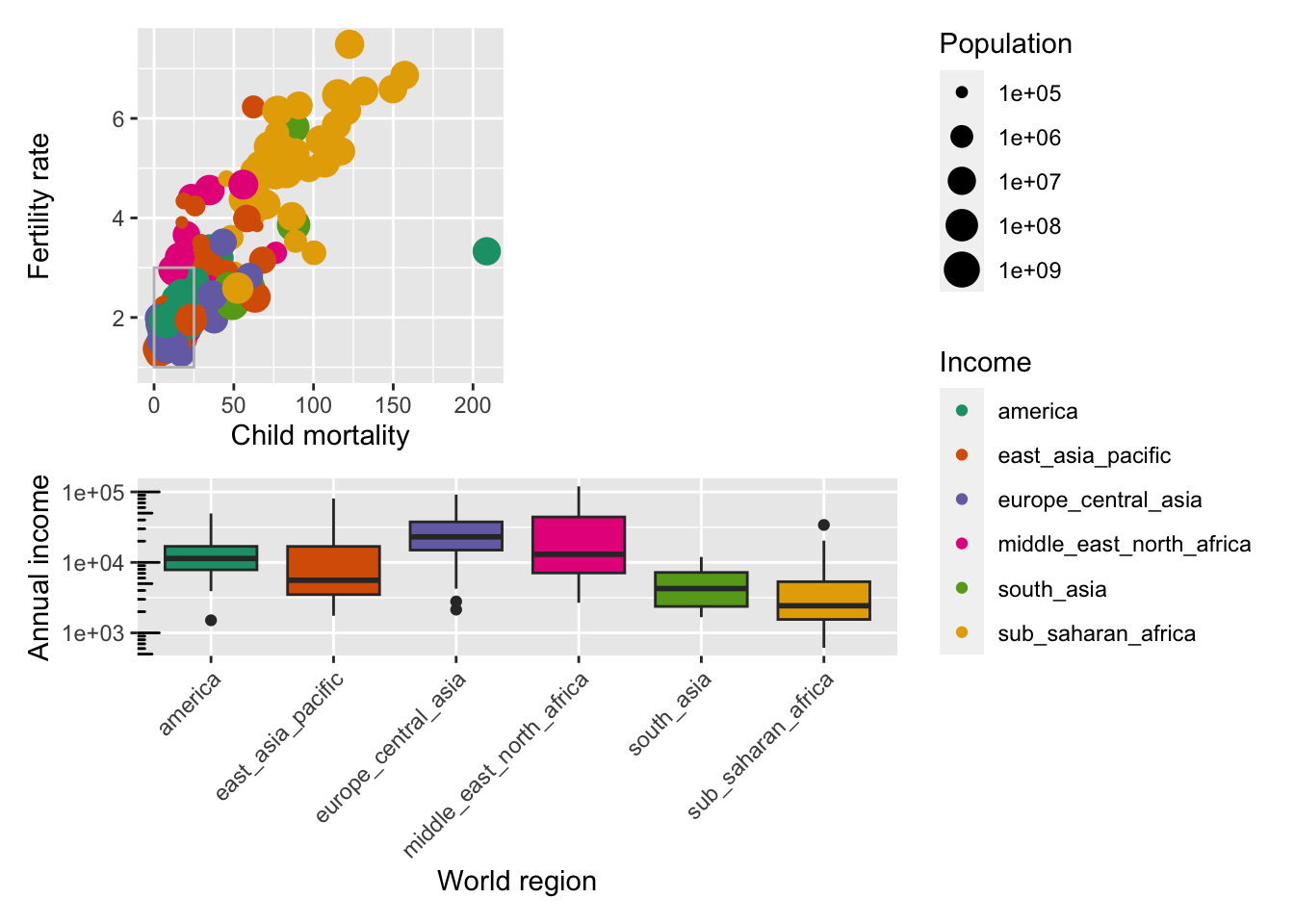
Finally, we can also add annotations, which is very useful to add automatic “tags” to each panel:
((p1 | p2) / p3 ) +
  plot_layout(guides = "collect", heights = c(2, 1)) +
  plot_annotation(tag_levels = "A",
                  title = "Figure 1")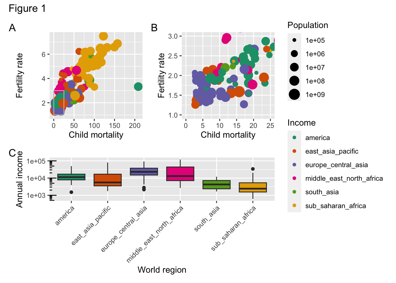
15.5 Facetting
If you’re trying to visualise different groups in your data, then you can also create a multi-panel figure. Instead of saving each individual group to a plot and combining them afterwards, you can use facetting.
There are two types of facet functions:
facet_wrap() arranges a one-dimensional sequence of panels to fit on one page. facet_grid() allows you to form a matrix of rows and columns of panels.
For example, if we want to visualise a scatter plot, displaying the number of children_per_woman, against life_expectancy. We want to colour the data by world_region and split by income_groups.
Both geometries allow to to specify faceting variables specified with vars(). In general:
facet_wrap(facets = vars(facet_variable))
facet_grid(rows = vars(row_variable), cols = vars(col_variable)).ggplot(gapminder,
aes(x = children_per_woman, y = life_expectancy, colour = world_region)) +
geom_point() +
facet_wrap(facets = vars(income_groups))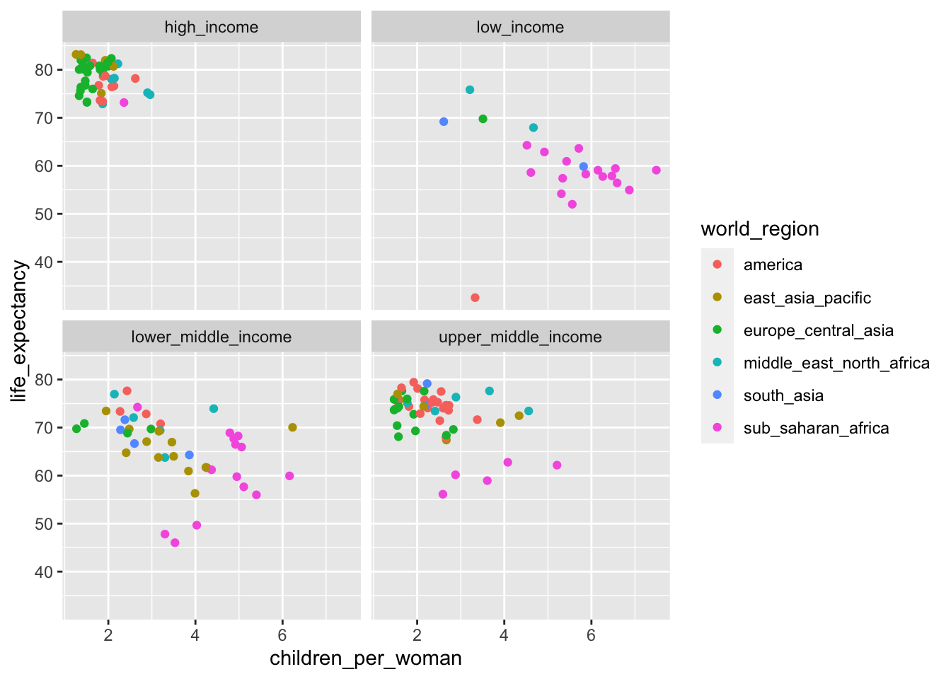
If instead we want a matrix of facets to display income_groups and economic_organisation, then we use facet_grid():
ggplot(gapminder,
       aes(x = children_per_woman, y = life_expectancy, colour = world_region)) +
  geom_point() +
  facet_grid(rows = vars(income_groups), cols = vars(is_oecd))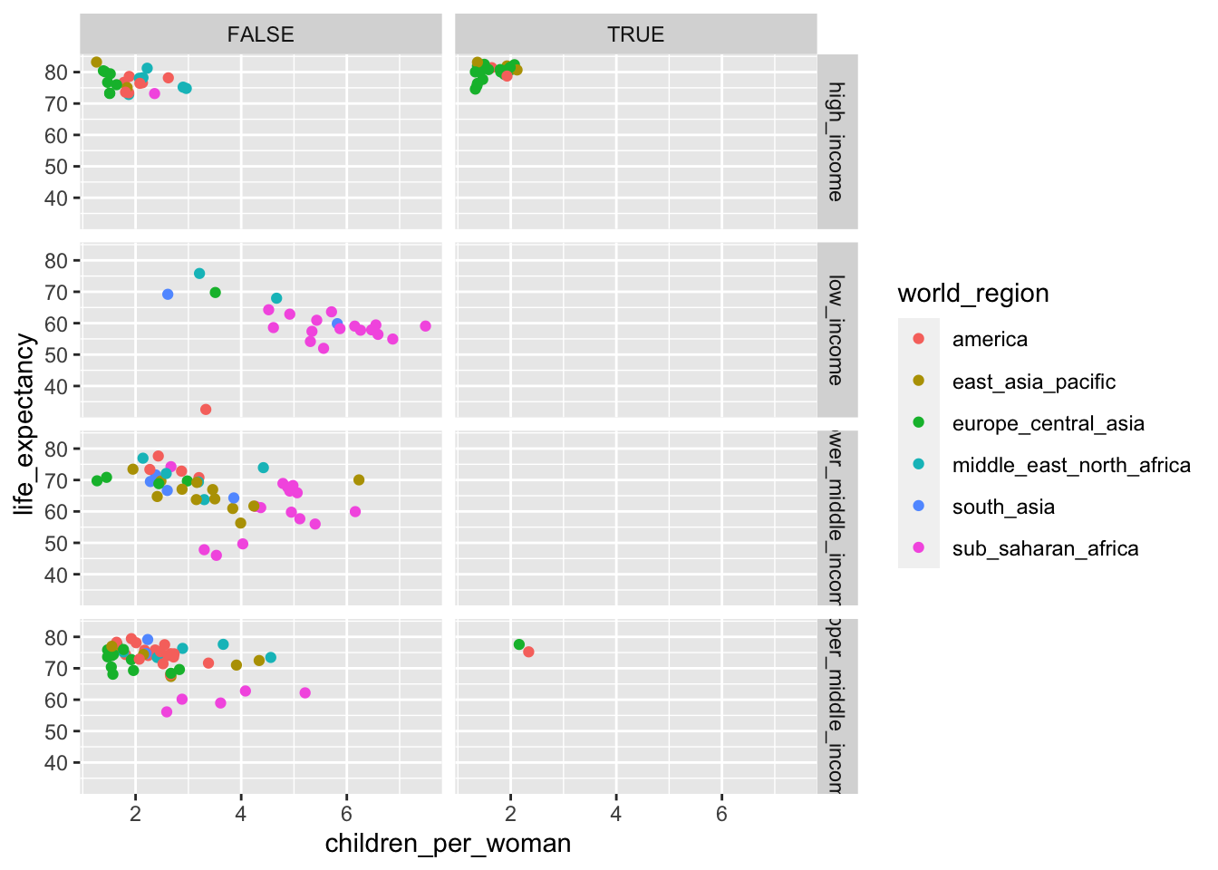
15.6 Summary
Key points
- Use of white space helps readability and focus
- Grouping of related graphs can help navigating through complex data
- We can split our data in groups using facetting