finches <- read_csv("data/finches.csv")7 Introduction to plotting
Learning outcomes
- Be able to create basic plots
7.1 Libraries and functions
Click to expand
7.1.1 Libraries
7.1.2 Functions
7.2 Purpose and aim
Be able to create basic plots to explore your data.
7.3 Loading data
If you haven’t done so yet, please load the data as follows:
7.4 Building a plot
Here we’ll learn how to build a plot, using the ggplot2 package. This package has a consistent set of grammer rules that allow you to create a plot. It needs 3 basic pieces of information:
- A data.frame with data to be plotted
- The variables (columns of
data.frame) that will be mapped to different aesthetics of the graph (e.g. axis, colours, shapes, etc.) - the geometry that will be drawn on the graph (e.g. points, lines, boxplots, violinplots, etc.)
This translates into the following basic syntax:
ggplot(data = <data.frame>,
       mapping = aes(x = <column of data.frame>,
                     y = <column of data.frame>)) +
   geom_<type of geometry>()
For our first visualisation, let’s play around with our finches data.
The question we’re interested in is: how much separation is there between the two finch species in terms of beak length and beak depth?
A scatterplot showing the relationship between bdepth and blength.
Let’s do it step-by-step to see how ggplot2 works. Start by giving data to ggplot:
ggplot(data = finches)
That “worked” (as in, we didn’t get an error). But because we didn’t give ggplot() any variables to be mapped to aesthetic components of the graph, we just got an empty square.
For mappping columns to aesthetics, we use the aes() function:
ggplot(data = finches,
       mapping = aes(x = bdepth,
                     y = blength))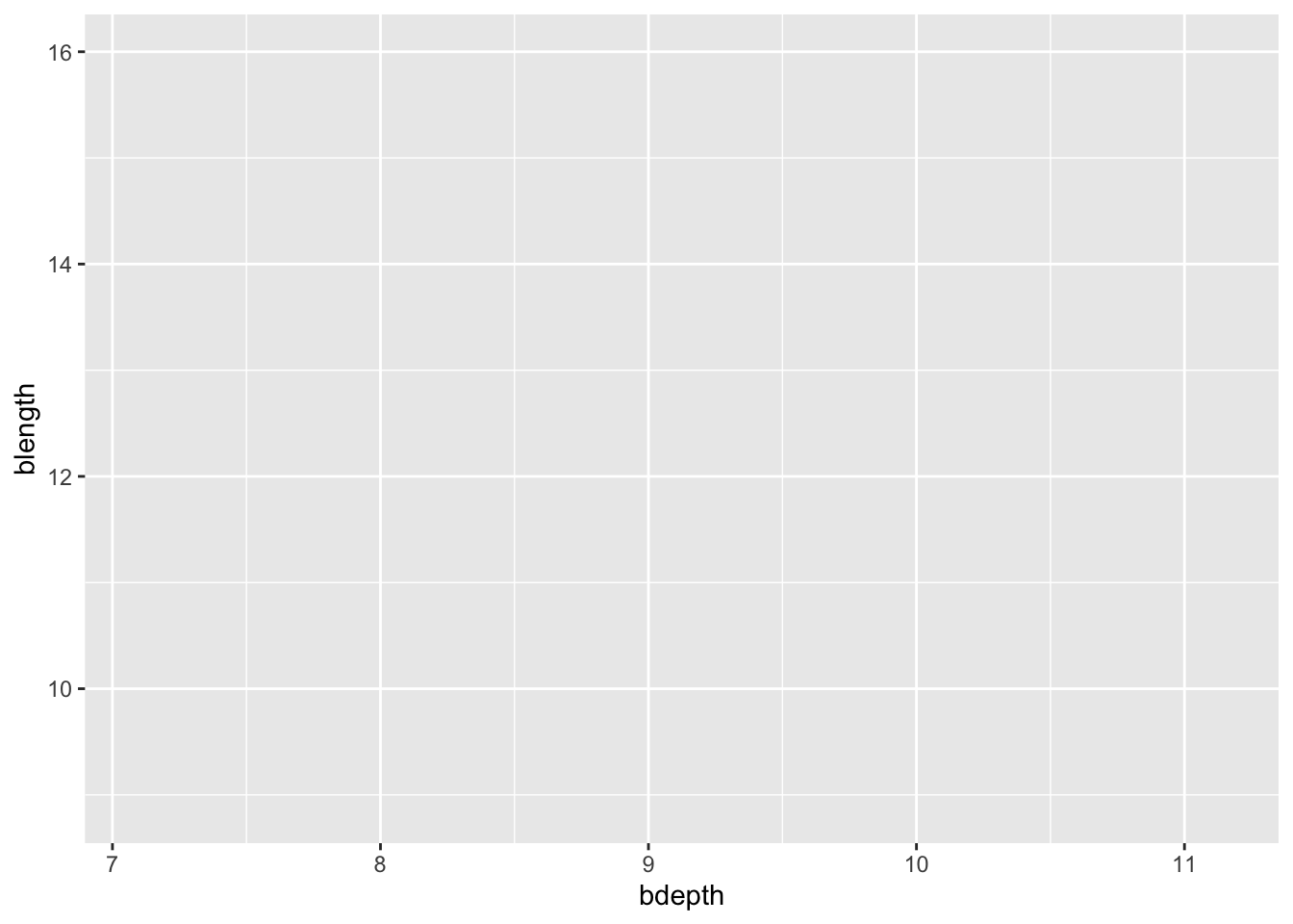
That’s better, now we have some axis. Notice how ggplot() defines the axis based on the range of data given. But it’s still not a very interesting graph, because we didn’t tell what it is we want to draw on the graph.
This is done by adding (literally +) geometries to our graph:
ggplot(data = finches,
       mapping = aes(x = bdepth,
                     y = blength)) +
  geom_point()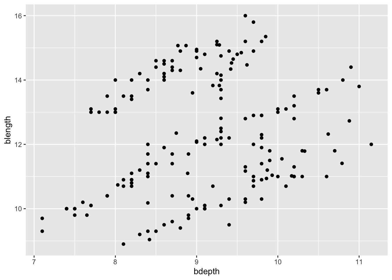
If you have any missing values then geom_point() will warn you that it had to remove some missing values. After all, if the data is missing for at least one of the variables, then it cannot plot the points.
7.5 Changing aesthetics
Let’s say we’re not very happy with the default options we have been given here. The colour of the data points isn’t terribly exciting and there appears to be a bit of overlap as well.
We can define these attributes within ggplot(). For example, to change the colour of the data points we can do the following:
ggplot(data = finches,
       mapping = aes(x = bdepth,
                     y = blength)) +
  geom_point(colour = "firebrick")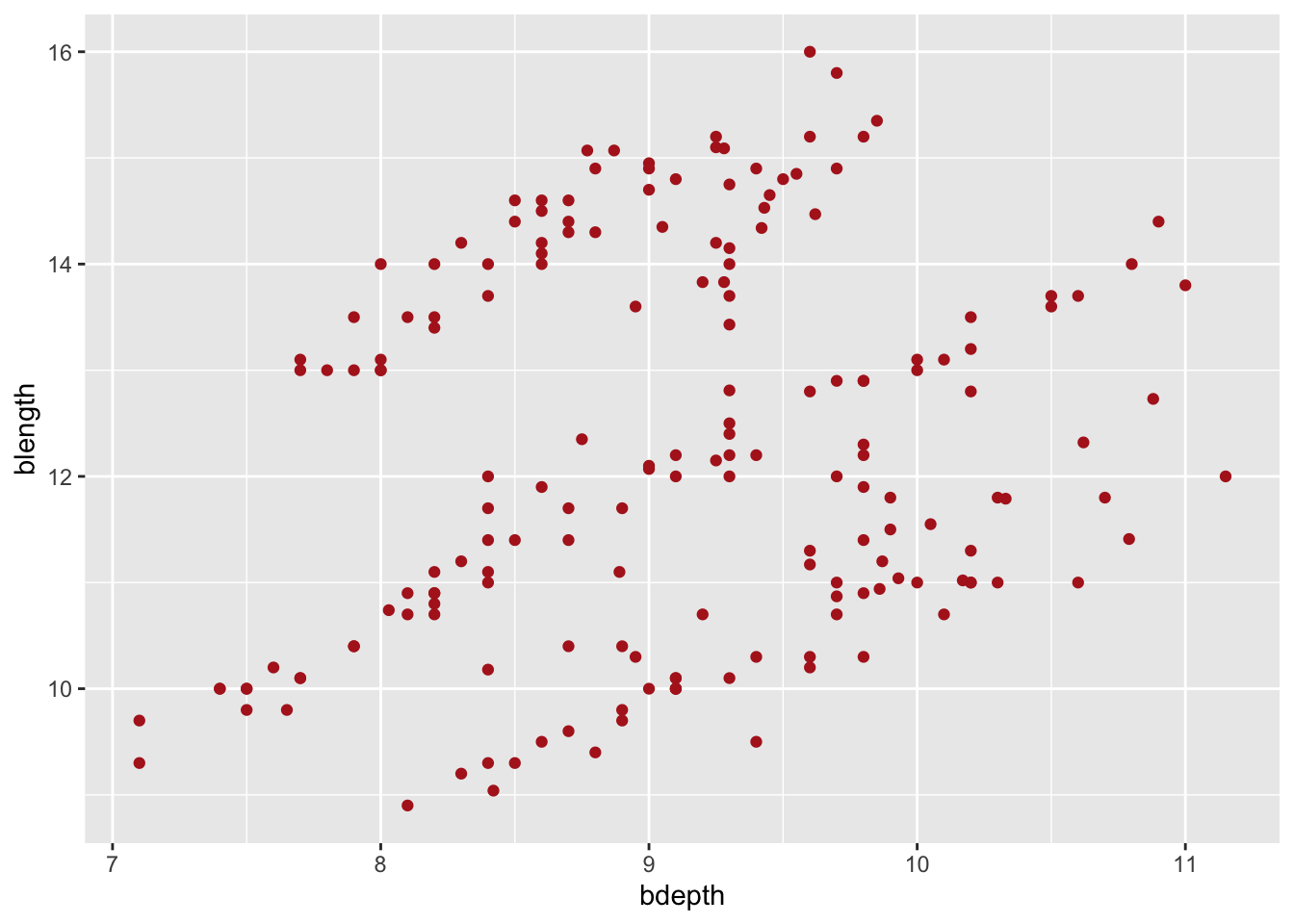
To fix the issue with overlapping data points, we can change the level of transparency. This is set with the alpha argument, where alpha = 1 is no transparency at all and alpha = 0 is complete transparency. We’ll pick something in between 0 and 1.
ggplot(data = finches,
       mapping = aes(x = bdepth,
                     y = blength)) +
  geom_point(alpha = 0.6)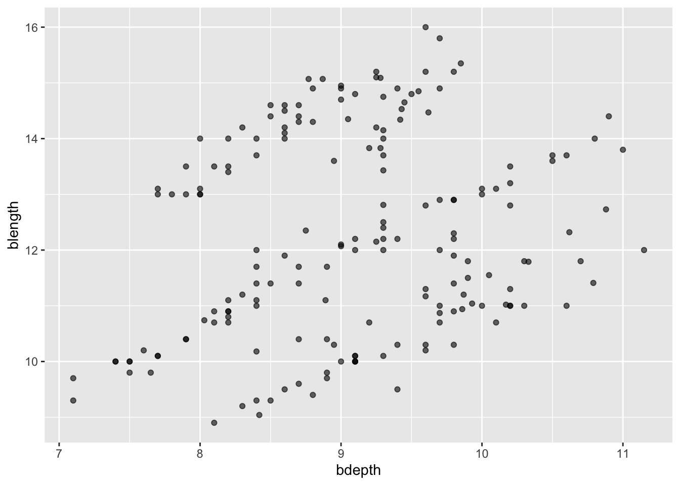
7.6 Data-based aesthetics
In the plot above we lumped all the data together. We’ve ignored the fact that these measurements come from two different species. These species are also subdivided into different groups. We’ll explore the grouping later, but now we’re interested to see if there are clear differences between the species.
A way to visualise this is by colouring the points based on a variable of interest, in our case species.
We can do this by passing this information to the colour aesthetic inside the aes() function:
ggplot(data = finches,
       mapping = aes(x = bdepth,
                     y = blength,
                     colour = species)) +
  geom_point()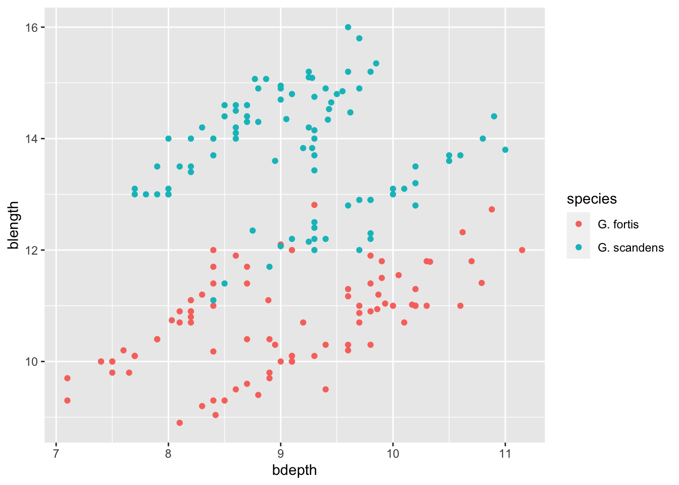
Aesthetics: inside or outside
aes()?
The previous examples illustrate an important distinction between aesthetics defined inside or outside of aes():
- if you want the aesthetic to change based on the data it goes inside
aes() - if you want to manually specify how the geometry should look like, it goes outside
aes()
7.7 Multiple geometries
Often, we may want to overlay several geometries on top of each other. For example, we might want to visualise a box plot together with the data points.
Let’s start by creating a plot that shows our data, split by species. In that case, species ends up on the x-axis, and the variable of interest is blength (beak length). This goes onto the y-axis.
That gives us the following:
ggplot(finches, aes(x = species,
                    y = blength)) +
  geom_point()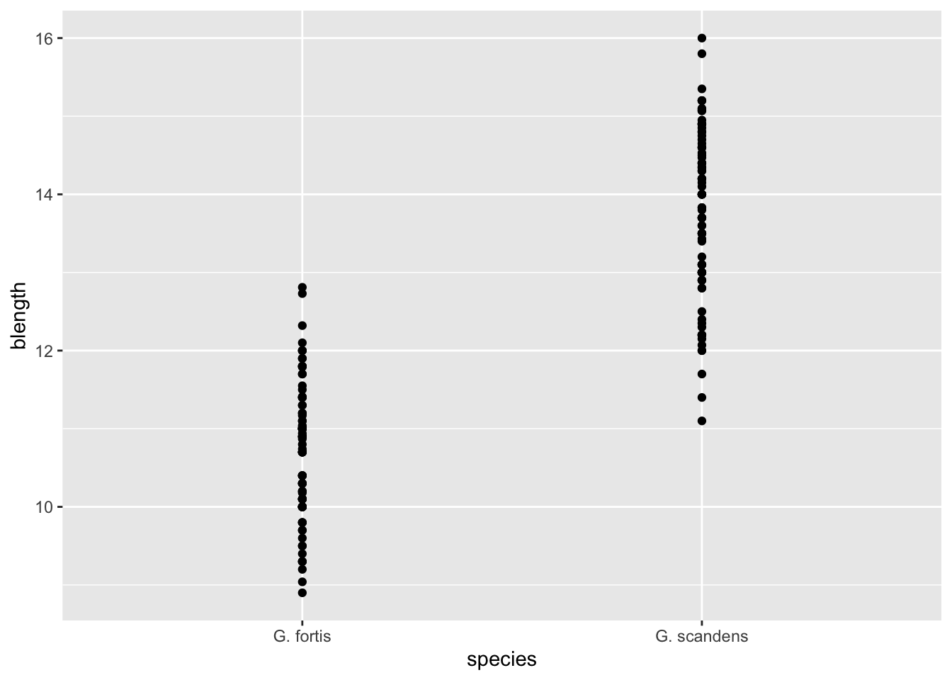
To layer a boxplot on top of it we “add” (with +) another geometry to the graph:
ggplot(finches, aes(x = species,
                    y = blength)) +
  geom_point() +
  geom_boxplot()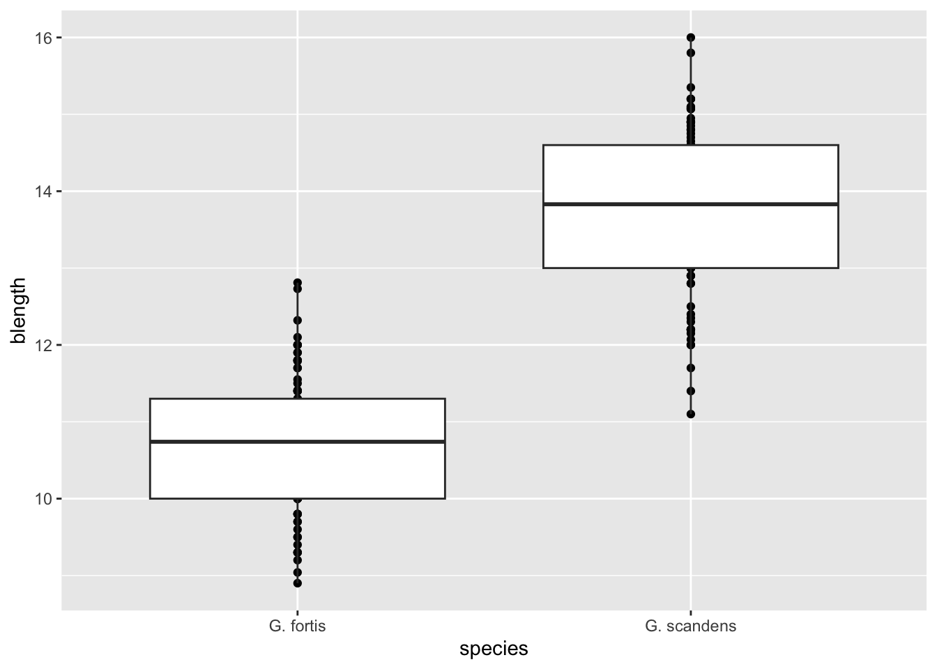
The order in which you add the geometries defines the order they are “drawn” on the graph. For example, try swapping their order and see what happens.
Notice how we’ve shortened our code by omitting the names of the options data = and mapping = inside ggplot(). Because the data is always the first thing given to ggplot() and the mapping is always identified by the function aes(), this is often written in the more compact form as we just did.
7.8 Exercises
7.8.1 Finch weight
Exercise
Level:
Let’s put this knowledge into practice. The finches data set contains multiple variables, among which weight measurements for individual birds.
Create a boxplot for these weight measurements, splitting the data by species.
Answer
7.9 Answer
ggplot(finches, aes(x = species,
                    y = weight)) +
  geom_boxplot()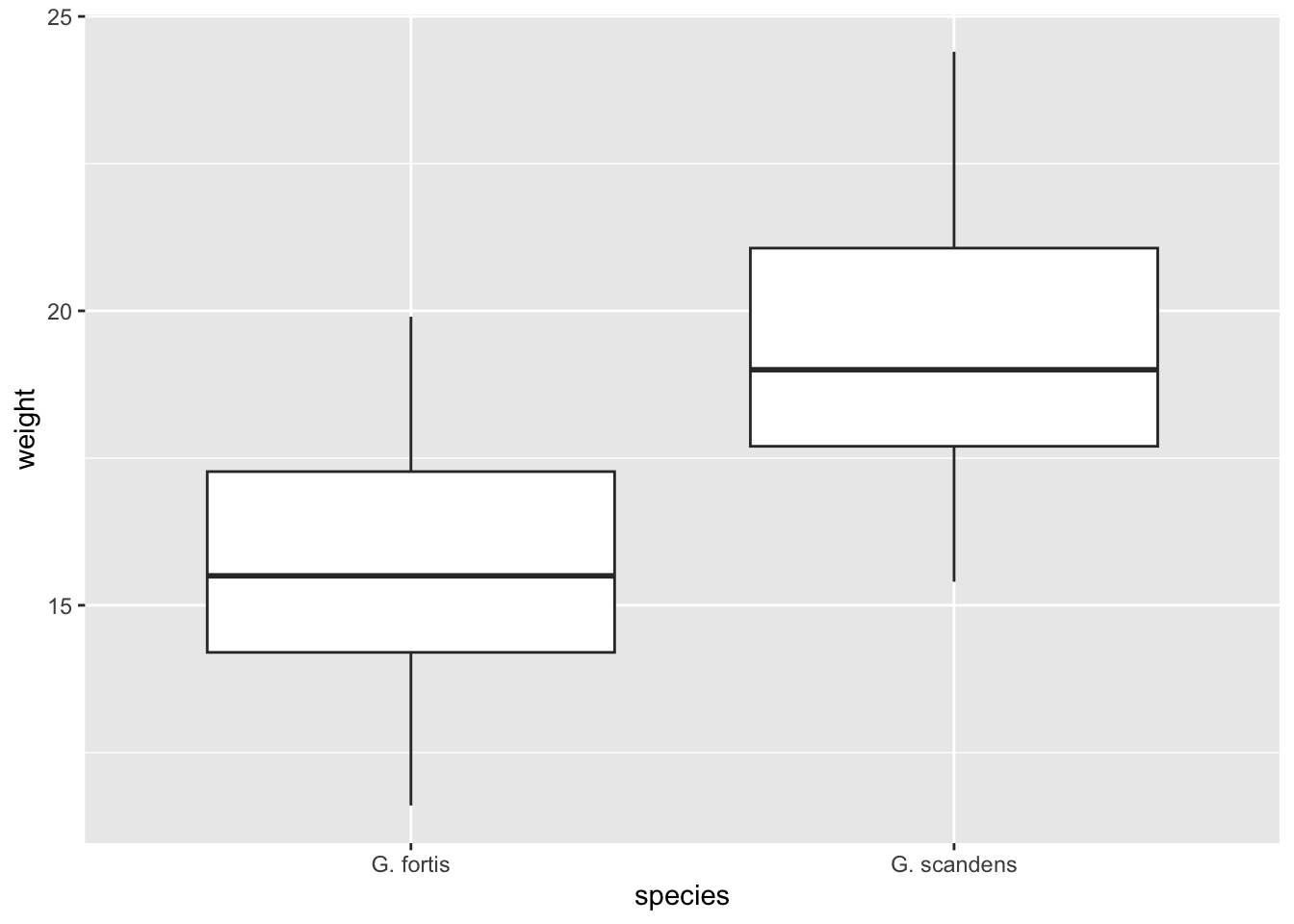
7.9.1 Subgroup weight
Exercise
Level:
The measurements are not only recorded by species, but also by group (the originally named group variable in the data set). The grouping has been determined on basis of the shape of the beak (pointed or blunt) and a certain timed event (early/late). We’ll talk in more detail about this a bit later.
For now, I’d like you to create a boxplot for the weight measurements of G. scandens only, splitting the data by group.
Overlay the data points on top of the boxplot, changing the colour to “blue”.
Answer
7.10 Answer
There are two options to approach this:
- You can either filter out the G. scandens measurements and save it into a new object or
- You can use the pipe to do filter first, sending the output directly to the
ggplot()function.
In the latter case you do not need to provide a data = argument, because ggplot() knows that the data are coming from the pipe. We’ll use this method here:
finches %>%
  filter(species == "G. scandens") %>%
  ggplot(aes(x = group,
             y = weight)) +
  geom_boxplot() +
  geom_point(colour = "blue")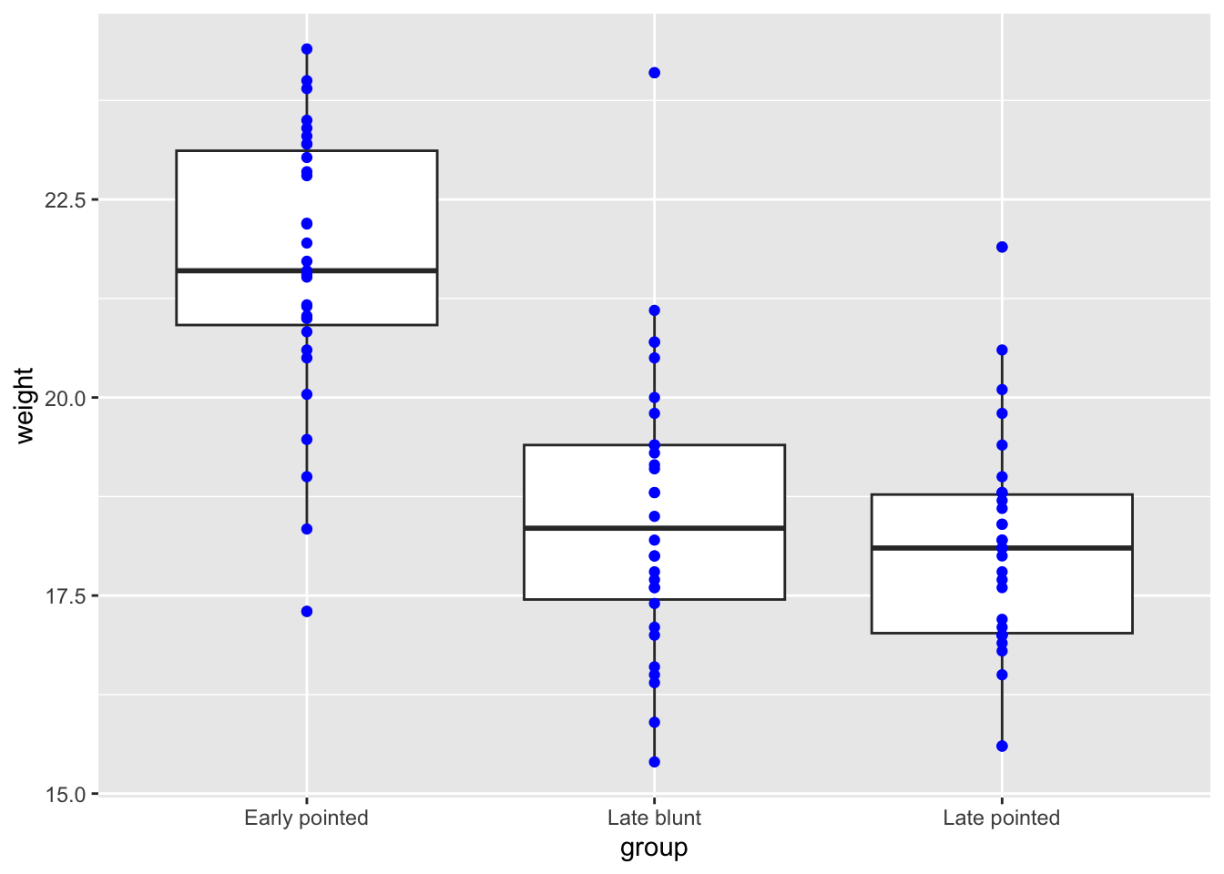
7.10.1 Separating data points
Exercise
Level:
In the previous exercise we’ve plotted finch weight for the different subgroups in G. scandens. You can see that all of the data points are in a line, causing quite some overlap. We could use transparency to solve this, but I’d like you to explore something different. Have a search for a phenomenon called jitter and replot the data.
Answer
7.11 Answer
It’s often best when searching for these terms to also include phrases related to your function. For example, I searched for “jitter data ggplot”. The first hit showed the help page for geom_jitter(). At the bottom of a help page you can usually find some code examples. Reading through the text, geom_jitter() adds a tiny bit of random variation to each data point, to avoid overplotting. We can even combine that with adding some transparency.
Here we can play around a bit with how wide we want the jittering to be. This is set with the width = argument, which takes a value between 0 and 1. We’ll set the width to 10% (= 0.1).
finches %>%
  filter(species == "G. scandens") %>%
  ggplot(aes(x = group,
             y = weight)) +
  geom_boxplot() +
  geom_jitter(colour = "blue",
              width = 0.1,
              alpha = 0.5)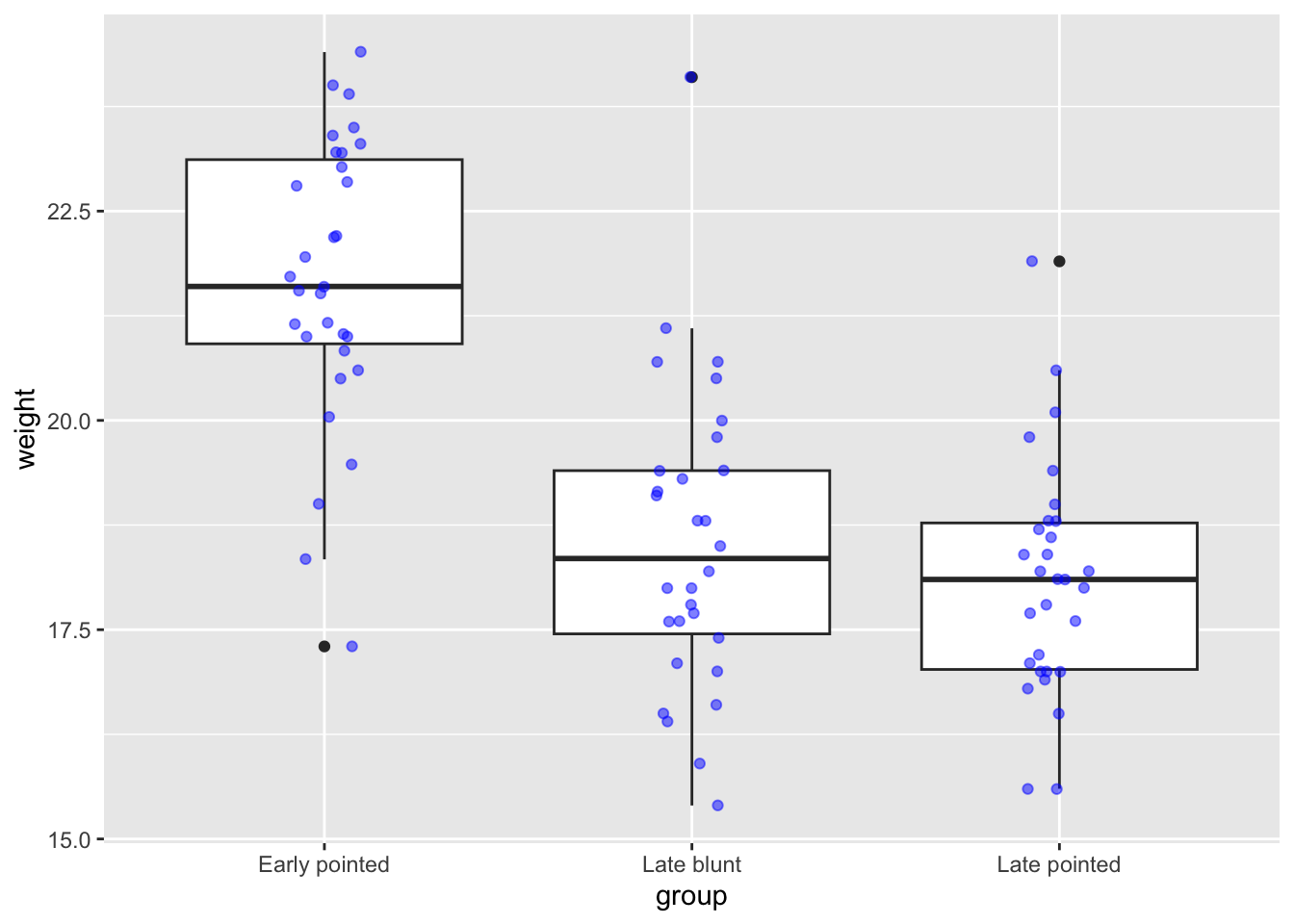
7.12 Summary
Key points
- We can build plots layer by layer
- Aesthetics can be based on data