gapminder1960_2010 <- read_csv("data/gapminder1960to2010_socioeconomic.csv")14 Grey is great
Learning outcomes
- Use the power of grey to your advantage
- Use text as a visual
14.1 Libraries and functions
Click to expand
14.1.1 Libraries
14.1.2 Functions
14.1.3 Libraries
14.1.4 Functions
14.2 Purpose and aim
We have seen that pop-outs can be very powerful to highlight parts of your data. We already played a bit with greying out some of the data, which moves it to the background.
Generally, grey scales are a very useful way of layering your data and emphasis. It’s not just limited to your data points, but easily extends to any text annotations.
We’ll explore this more below using the socioeconomic data from 1960 - 2010. To reduce the number of countries, we’re only plotting data from country names contains “stan”.
We will build up a fictional narrative as we go along.
Lets first extract the ’stans:
stans <- gapminder1960_2010 %>%
  filter(str_detect(country, "stan"))
We’ve got 6 countries in this data set. Let’s say we wanted to build a narrative around Turkmenistan. There is quite some variability in the income data, indicating that perhaps there have been some economic events that have led to drops and rises in overall income.
We’ll give Turkmenistan it’s own category, so we can highlight it later.
stans <- stans %>%
  mutate(is_turkmenistan = country == "Turkmenistan")
Let’s create a plot that illustrates the income per person over the period 1960 - 2010.
ggplot(stans, aes(x = year,
                  y = income_per_person,
                  colour = country,
                  group = country)) +
  geom_line()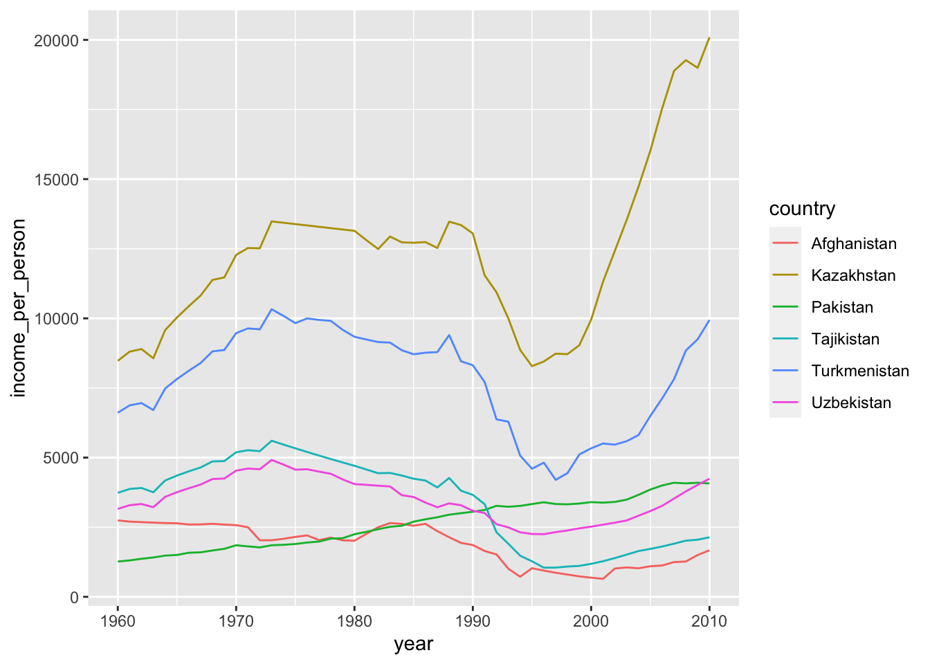
As we mentioned earlier, Turkmenistan’s income varies a lot over the period we’re looking at here. So we delve into that a bit more.
We’ll use the concept of less is more. Let’s strip back as much of the information as we can and then build things up from there.
ggplot(stans, aes(x = year, y = income_per_person, group = country)) +
  geom_line(aes(colour = is_turkmenistan)) +
  # remove background colour
  # and gridlines
  theme_classic() +
  # change colour scheme
  scale_colour_manual(values = c("grey", "firebrick"))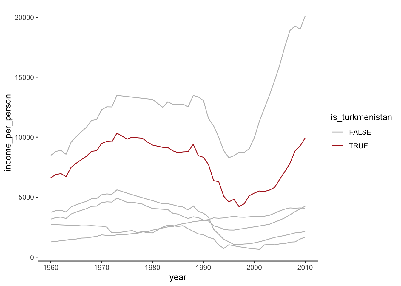
Next, we can remove the legend (we’ll add manual annotations later) and change the axis labels. We’ll store this plot, so we can make further changes without having the copy all of the code.
turkmenistan <- ggplot(stans, aes(x = year, y = income_per_person, group = country)) +
  geom_line(aes(colour = is_turkmenistan)) +
  # remove background colour
  # and gridlines
  theme_classic() +
  # change colour scheme
  scale_colour_manual(values = c("grey", "firebrick")) +
  # remove legend
  theme(legend.position = "none") +
  labs(title = "Income per person (Turkmenistan)",
       x = "Year",
       y = "Annual income per person (USD)")

turkmenistan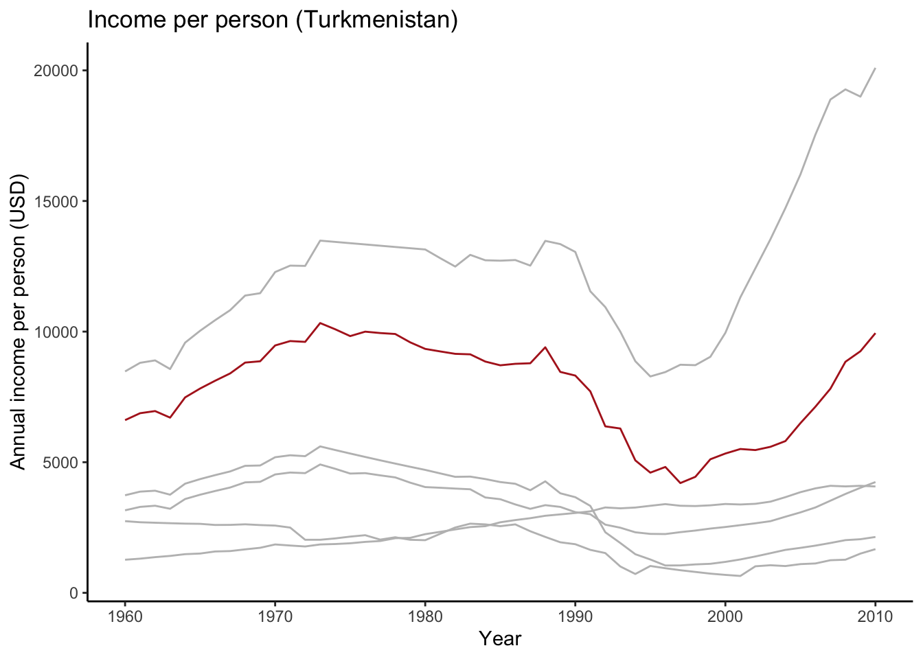
14.3 Plot annotations
Now that we have a decent starting point for the plot, we’re going to annotate it further.
There is a marked decline in income between 1989 and 1995. Let’s say our story involved the effect of the collapse of the USSR on 26-December 1991. We would then want to mark this on the plot.
turkmenistan +
  geom_vline(xintercept = 1991, linetype = "dashed")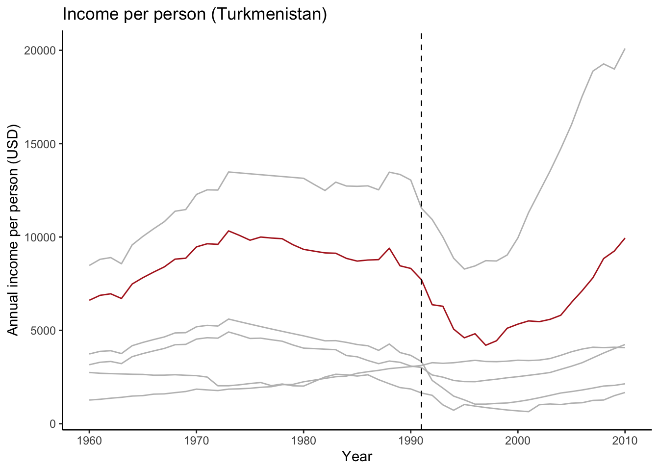
This particular line would be helpful if we wanted to make comparisons across the various countries. But in this case we’re not and we are better off just indicating the point directly:
This step is quite manual, so it’s helpful to have the actual data available.
stans %>%
  filter(country == "Turkmenistan" & year == 1991) %>%
  select(income_per_person)
# A tibble: 1 × 1
income_per_person
<dbl>
1 7713We can plot this point now. We probably want to adjust our title too, based on what we’re seeing!
turkmenistan +
  labs(title = "Economic decline in Turkmenistan pre-dates fall of USSR") +
  # add a segment
  annotate(geom = "segment", x = 1988, xend = 1991, y = 6400, yend = 7713,
           arrow = arrow(type = "closed", length = unit(0.02, "npc"))) +
  # add some text
  annotate(geom = "text", x = 1984, y = 6600, label = "Fall of USSR")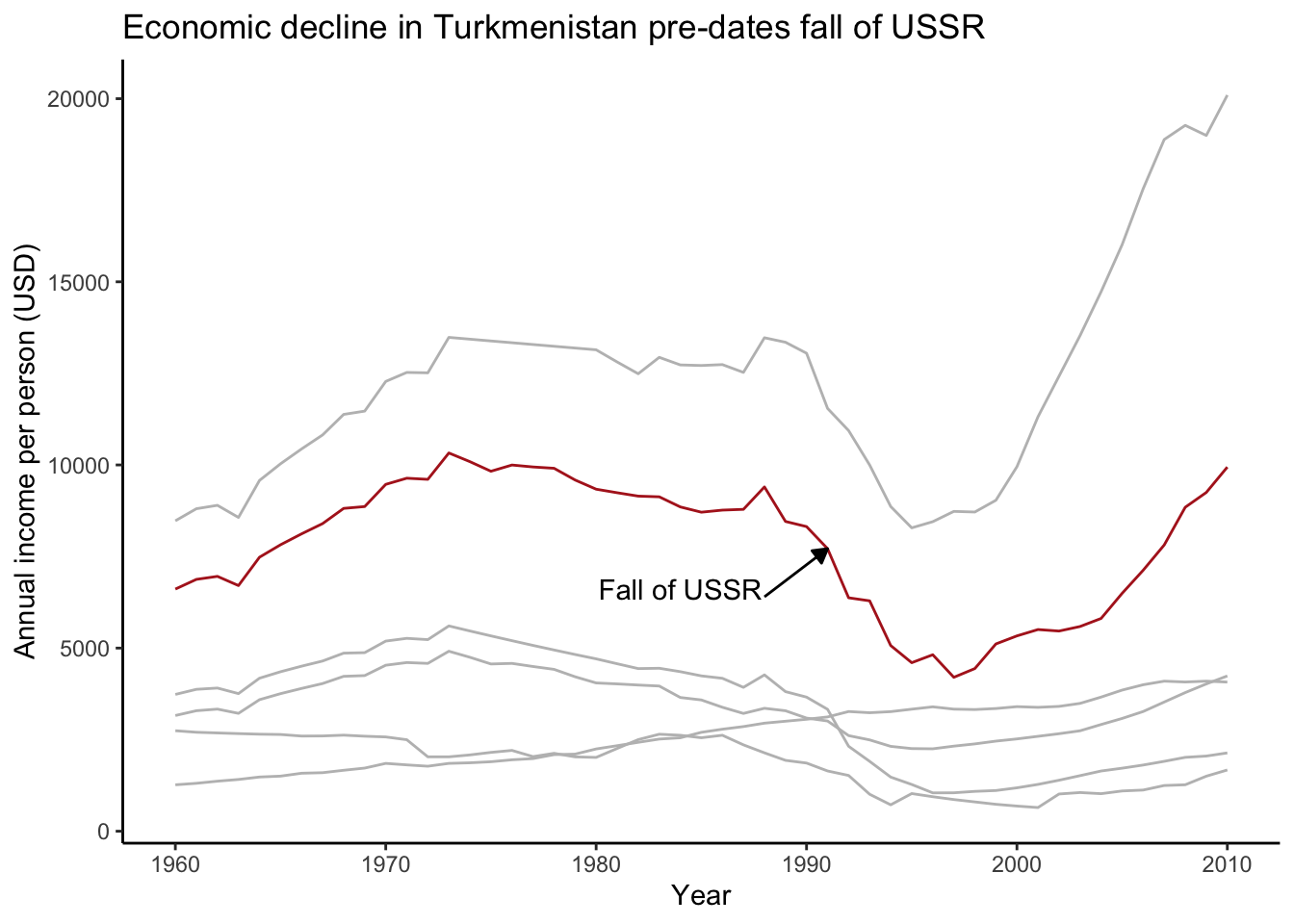
Using grey values like this allows you to guide your audience through your plot. All the data is still there, but you are emphasising particular points and trends.
14.4 Text as a visual component
Text itself is a very important visual component and one you should not be afraid of using. A plot often doesn’t “speak for itself” and you want to make sure that people are not filling in the narrative themselves, but that they are directed by you!
If you are interested in how the plot is created, expand the section below.
Click to expand
tajikistan_grey <- stans %>%
  filter(country == "Tajikistan") %>%
  ggplot(aes(x = year, y = income_per_person, group = country)) +
  geom_line(colour = "firebrick", linewidth = 1) +
  theme_classic() +
  # Fall of USSR
  annotate(geom = "segment", x = 1988, xend = 1991, y = 2600, yend = 3328,
           arrow = arrow(type = "closed", length = unit(0.02, "npc")),
           colour = "grey") +
  annotate(geom = "text", x = 1984, y = 2600, label = "fall of USSR",
           colour = "grey") +
  # Oil crisis 1973
  annotate(geom = "segment", x = 1978, xend = 1973, y = 5800, yend = 5605,
           arrow = arrow(type = "closed", length = unit(0.02, "npc")),
           colour = "grey") +
  annotate(geom = "text", x = 1983, y = 5800, label = "oil crisis 1973",
           colour = "grey") +
  # Oil crisis 1979
  annotate(geom = "text", x = 1972, y = 4200, label = "oil crisis 1979",
           colour = "grey") +
  annotate(geom = "segment", x = 1976, xend = 1979, y = 4300, yend = 4825,
           arrow = arrow(type = "closed", length = unit(0.02, "npc")),
           colour = "grey") +
  # Economic reforms
  annotate(geom = "segment", x = 1995, xend = 2001, y = 1600, yend = 1600,
           colour = "grey") +
  annotate(geom = "segment", x = 1998, xend = 2003, y = 1600, yend = 2500,
           colour = "grey") +
  annotate(geom = "text", x = 2004, y = 3000, label = "economic reform",
           colour = "grey") +
  labs(x = "year", y = "income (USD)")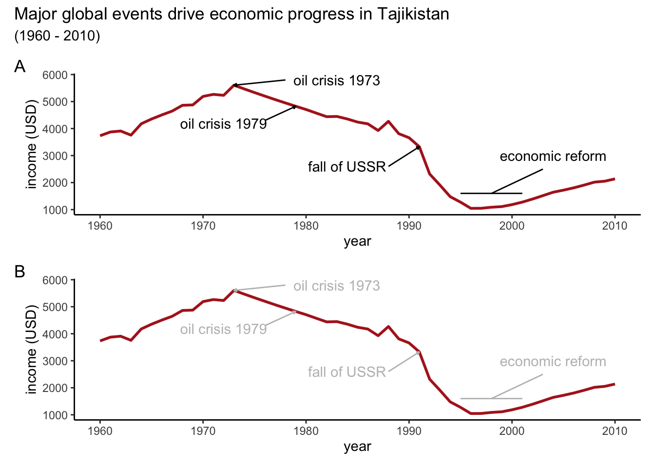
Comparing the two plots (which, admittedly require hideous levels of code to create) shows you how changing the colour of the text labels to grey pushes the label to the background. This allows you to first follow the overall trend of the economic changes, then look in more detail into the individual events.
14.5 Summary
Key points
- We can use grey to send information to the background
- Grey allows us to layer our plot, guiding people through the plot