library(tidyverse)
library(visdat)9 Data distributions
Learning outcomes
- Understand why we explore data distributions
- Be able to visualise the structure of data
- Use gained insight to explore further questions
9.1 Libraries and functions
Click to expand
9.1.1 Libraries
9.1.2 Functions
9.2 Purpose and aim
Sometimes we’re dealing with large data sets, other times they might be small. Either way, gaining insight in how your data are distributed across the different variables will help you understand your data better. This is important, since it will affect how and which conclusions you may draw from your data at a later stage. In our case we’re using the finches data set.
A good starting point of any analysis/exploration is to get a general sense of the data structure. Let’s look into how we can do this.
9.3 Loading data
If you haven’t done so yet, please load the data as follows:
finches <- read_csv("data/finches.csv")9.4 Data structure
There are different ways to gain insight into the structure of your data. You can do this numerically or visually.
In R we can use a package called visdat to visualise the structure of our data. If you haven’t installed it yet, please run the following code in the console:
install.packages("visdat")

# load the package
library(visdat)
We can then visualise our data structure with the vis_dat() function:
vis_dat(finches)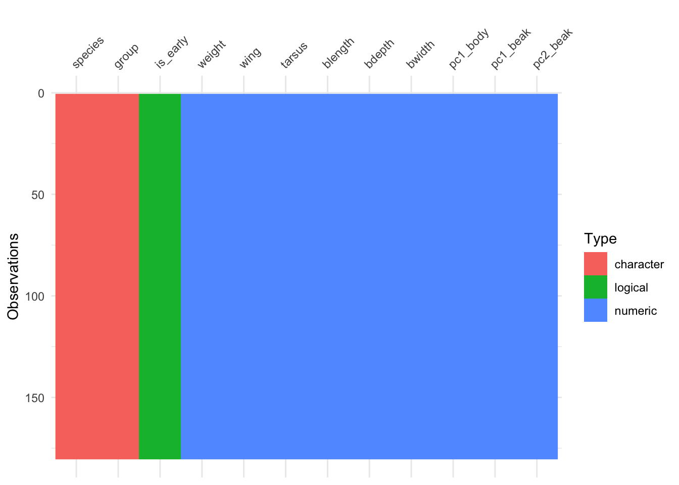
Looking at the y-axis, we can see that there are over 150 observations in this data set. The data are organised and coloured by type, with the column names (our variables) at the top.
From this we can see that we have two character or text variables (species and group). There are also several numerical variables, such as weight and wing.
There is one variable which contains logical data (TRUE/FALSE), called is_early.
There is a wealth of data there! So where do we go from here? In this case we’re going to use one of the variables as an example. We’ll use bdepth (beak depth) to illustrate how you can get more insight into how certain parts of your data are distributed.
9.5 Box plots
An easy way to get a sense of the data distribution is to create a box plot. For the bdepth variable we can do this as follows:
ggplot(data = finches,
       aes(x = 1,
           y = bdepth)) +
  geom_boxplot()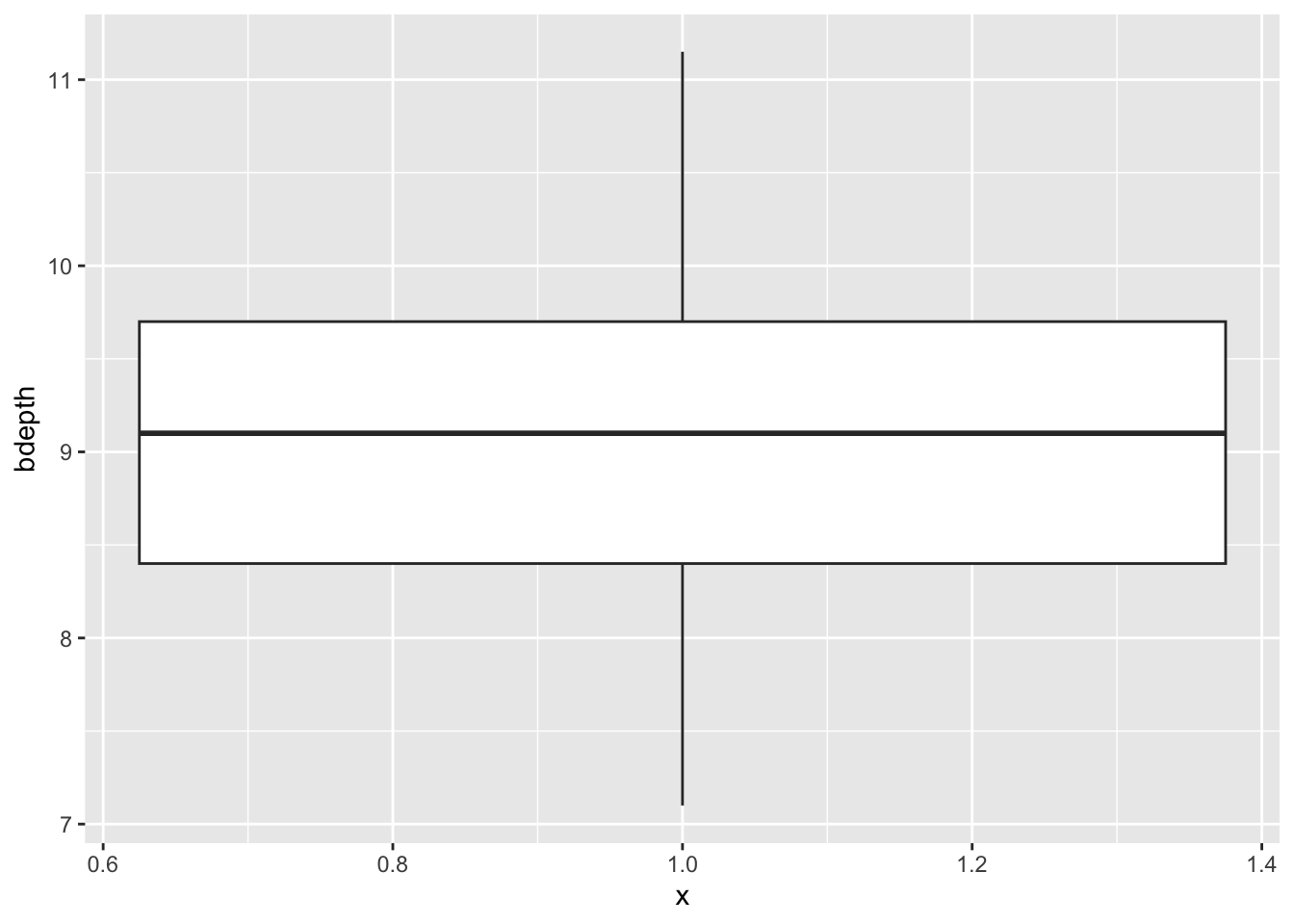
Since we are plotting only one variable, we’re defining the x value as 1, but it doesn’t actually have any numerical meaning.
Box plots give you some summary statistics, so therefore it’s often useful to plot them together with the actual data. We can do this quite easily by adding another layer to the plot that contains the data points. We’re also adding some transparency (alpha = 0.4 - which is 40% opacity) so we can still see the box plots themselves. We’re also defining the width = 0.1 so that the data points are not spread out over the entire width of the box plot, but are constrained a bit more.
ggplot(data = finches,
       aes(x = 1,
           y = bdepth)) +
  geom_boxplot() +
  geom_jitter(alpha = 0.4, width = 0.1)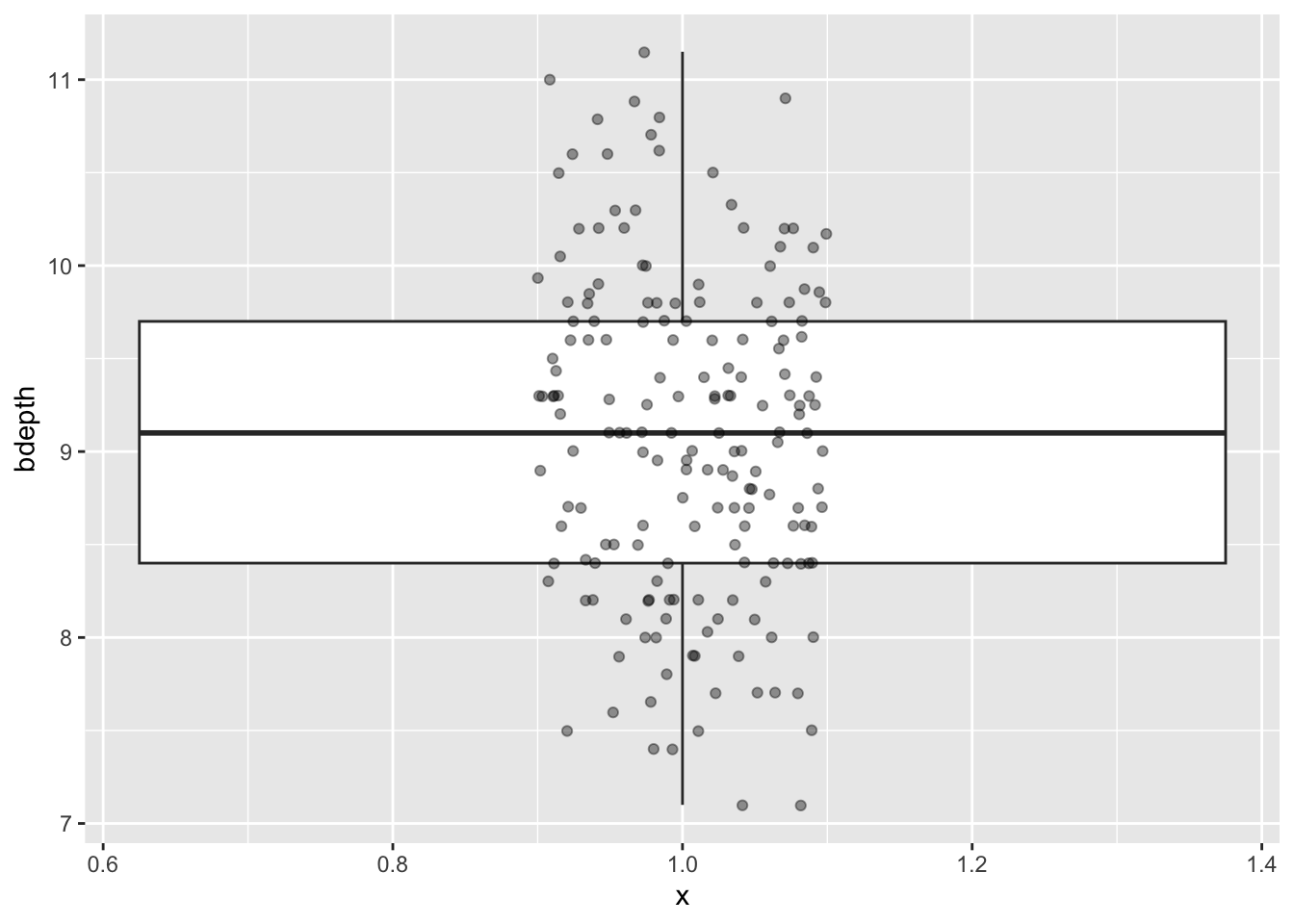
9.6 Violin plots
Violin plots are similar to box plots, but they give extra information on the distribution of the data. This can be particularly useful if your data is multi-modal, as in, it has more than one peak.
This can happen if your data splits into two or more discernible groups.
Let’s say we wanted to look at the beak length across both species. Since we’ve got early and late time points it would not be fair to lump all the data together. So, let’s focus on just the early observations. We can filter these out using the is_early variable.
We can use geom_violin() to create a violin plot in ggplot2:
finches %>%
  filter(is_early == TRUE) %>%
  ggplot(aes(x = species,
             y = bdepth)) +
  geom_violin()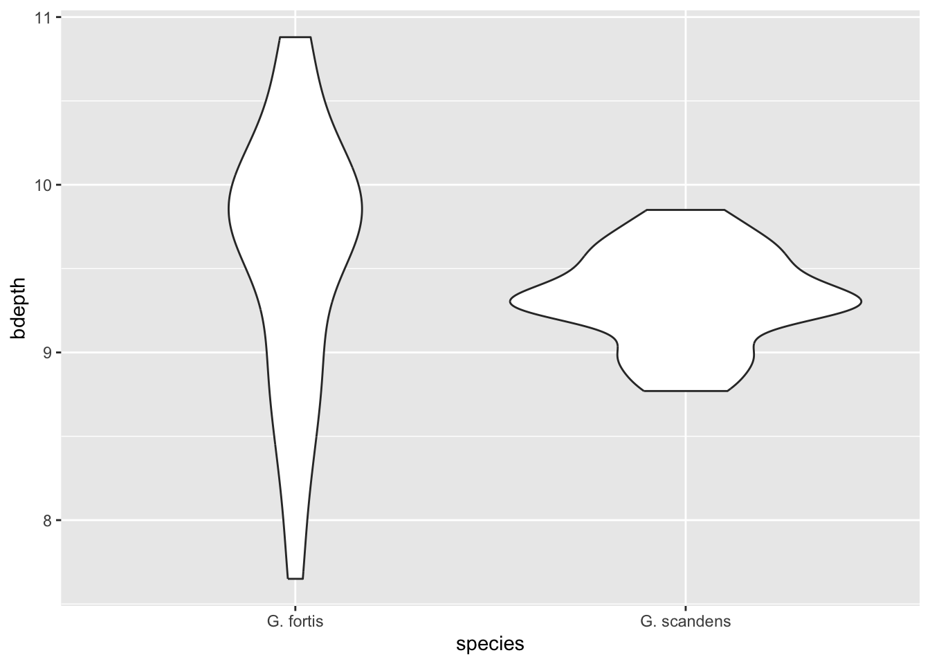
We can see that in G. fortis the beak depth is more spread out than in G. scandens in these early observations (pre-1983). To illustrate this in more detail, we can overlay the actual data points - again avoiding overlap. We update our code as follows:
finches %>%
  filter(is_early == TRUE) %>%
  ggplot(aes(x = species,
           y = bdepth)) +
  geom_violin() +
  geom_jitter(width = 0.05,
              alpha = 0.6)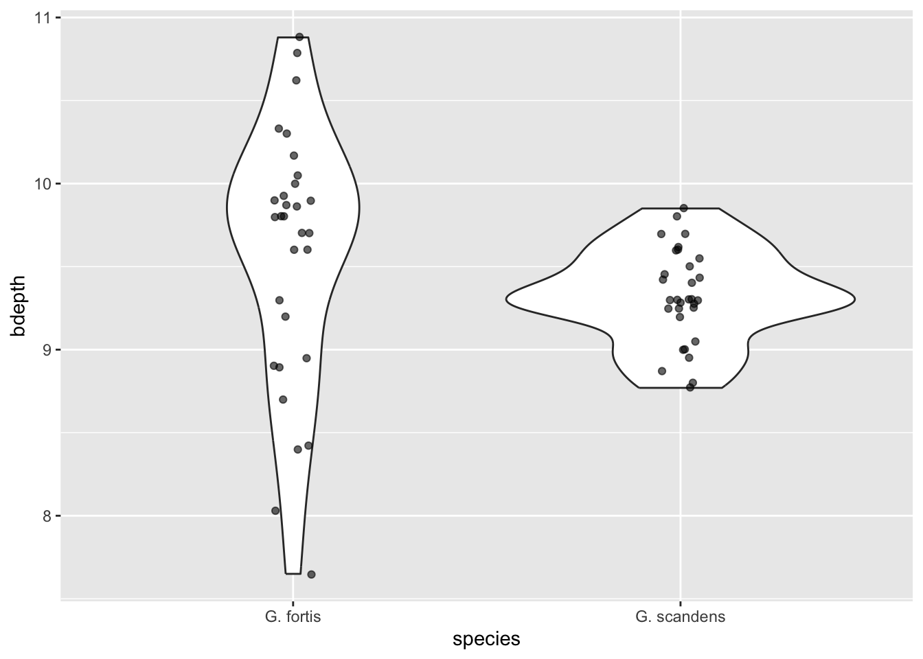
9.7 Histograms
Another way to look at how data is distributed is to create a histogram. Here we slice our beak depth data into intervals and count how many observations fall into each interval. This gives us a frequency for the number of observations into each interval group.
We can do this quite straightforwardly by using geom_histogram():
ggplot(data = finches,
       aes(x = bdepth)) +
  geom_histogram()
`stat_bin()` using `bins = 30`. Pick better value with `binwidth`.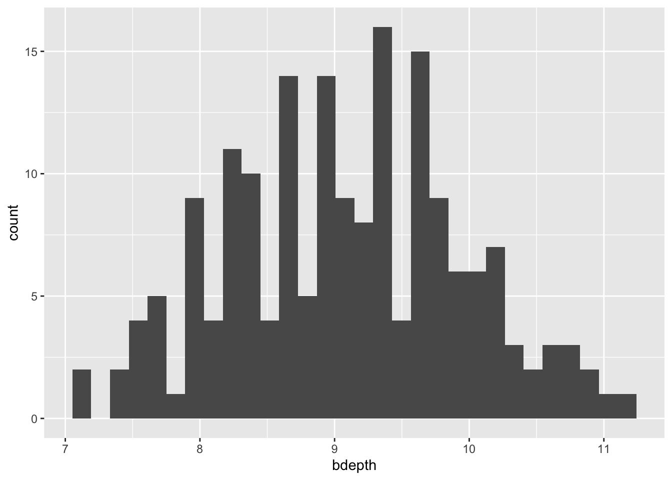
When you run this bit of code it gives you some information:
`stat_bin()` using `bins = 30`. Pick better value with `binwidth`.What this means is that it chopped our data into 30 chunks/intervals and done the counting based on that. This might not be what we want and we can change this by changing the bins argument or using binwidth. The difference between the two is that with, for example, bins = 5 we’re saying “chop the data into 5 equal chunks” whereas with binwidth = 5 we’re saying “chop the data into chunks of 5 millimeters each”.
To illustrate that histograms can vary heavily depending on the bin size, look at the following plots:
ggplot(data = finches,
       aes(x = bdepth)) +
  geom_histogram(bins = 5) +
  labs(title = "bins = 5")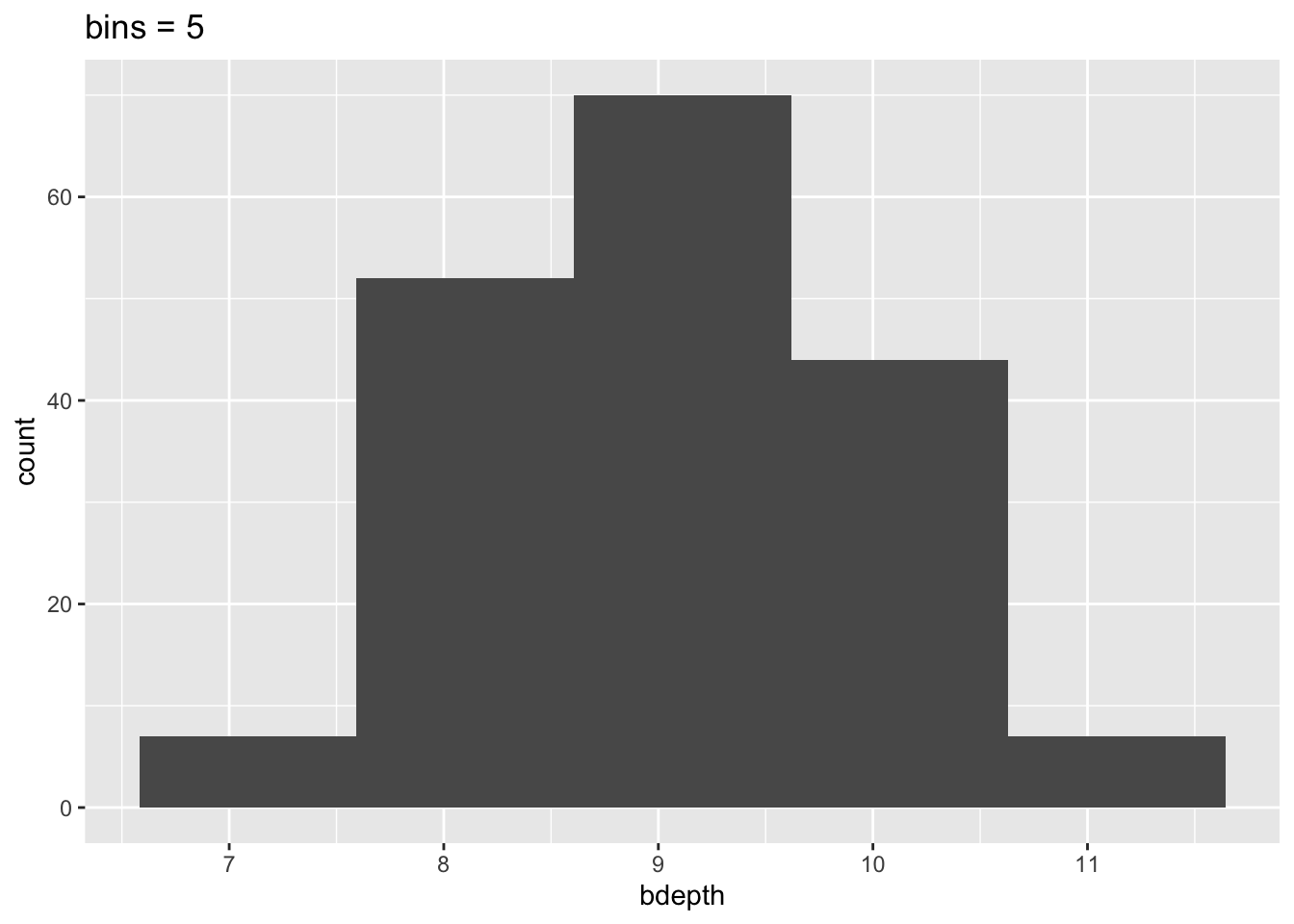
ggplot(data = finches,
       aes(x = bdepth)) +
  geom_histogram(bins = 15) +
  labs(title = "bins = 15")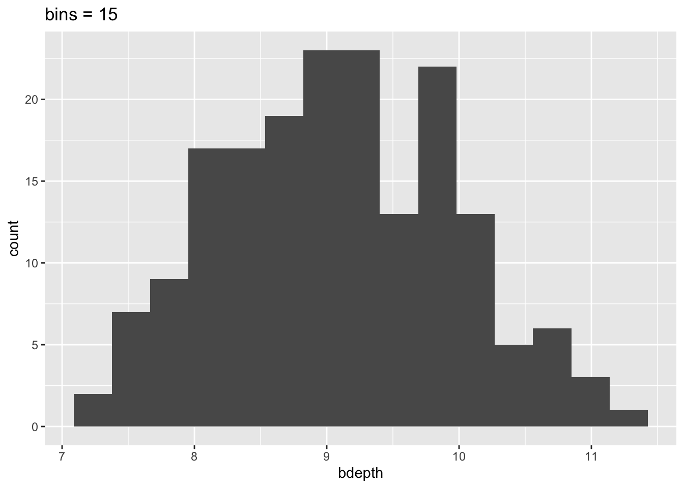
This means that our interpretation can also change, depending on the number of bins we’ve specified. So we need to be aware of this when we’re using histograms!
However we slice the data, a beak depth of around 9 mm appears to be most common.
9.8 Exercises
9.8.1 Late beak depth measurements
Exercise
Level:
We’ve looked at the beak depth of the finches that were recorded before the 1983 event. I’d like you to do the same for the observations post-1983, using a violin plot. Plot the data by species.
Answer
9.9 Answer
finches %>%
  filter(is_early == FALSE) %>%
  ggplot(aes(x = species,
             y = bdepth)) +
  geom_violin()
9.9.1 Beak depth over time
Exercise
Level:
In the previous exercise we’ve plotted the beak depth values for the post-1983 finches, for each species as a violin plot. If you haven’t done so yet, please plot them now and answer the following questions:
- Are there any clear visual differences between the early and late measurements?
- Depending on the answer in (1), is a violin plot the most appropriate type of plot? Explain why.
Answer
9.10 Answer
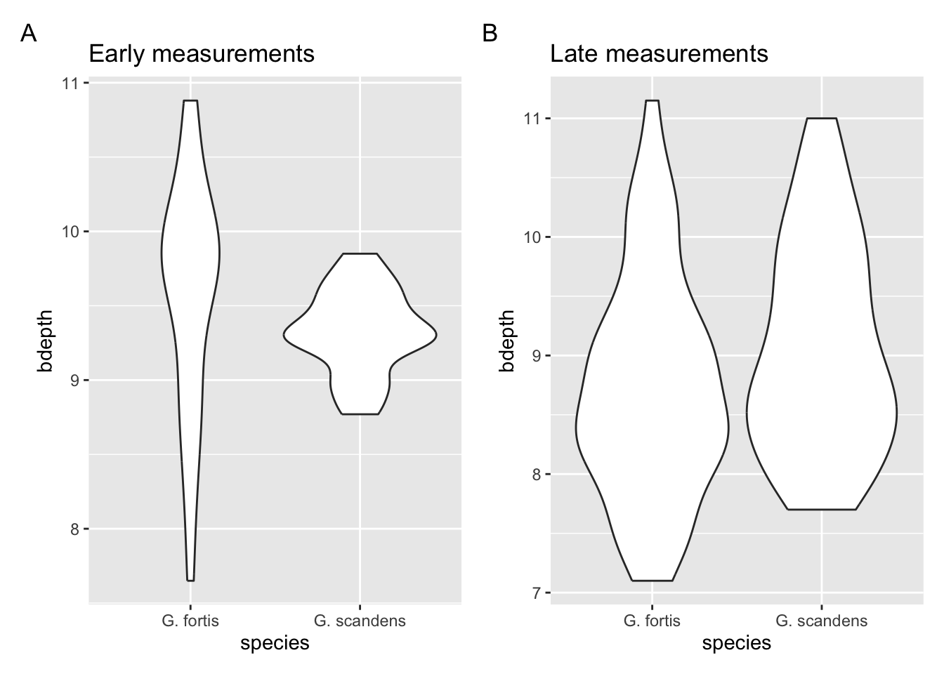
The spread of the data in the early G. scandens data is much less than in the later observations. This suggests that the beak depth in this species was less variable before 1983. The spread in G. fortis seems relatively comparable between the two time points. But the violin is wider at the lower beak depth range in the later time point, compared to the early one. This suggests a reduction in the overall beak depth over time.
The violin plot might not be the most suitable way of looking at these data. The width of the violins has information, but does make interpretation more complicated to the average reader.
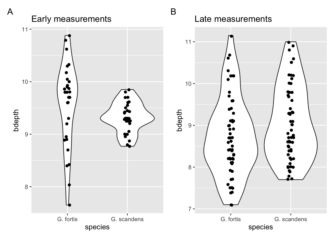
How to improve? Well, I would start by looking at the actual data (see below). This seems to support the suggestion about the changes in G. fortis. If that’s a message we would like to focus on we could represent the data as averages and highlight the changes. We’ll practice this in the next exercise.
9.10.1 Changes in G. fortis beak depth
Exercise
Level:
In Section 9.9.1 we saw that using a violin plot may not be the most appropriate method of displaying changes across the two time points. If we want to focus on the beak depth change in G. fortis, we could also plot the average value at each time point. If we connect these averages with a line, then we can visualise the direction of change. We’ll cover this in more detail in a later chapter, but you can challenge yourself in advance!
Hints:
- If you want to plot the average values, have a look at the
stat_summary()function. - If you want to connect the means, Google for something along the lines of “connect means using stat_summary”
- It’s useful to plot the original data as well!
Answer
9.11 Answer
There are actually quite a few steps to get the plot we’d like. Thankfully, using ggplot(), this is quite modular. So we’ll do the following:
- Keep only the G. fortis data
- Plot the original data, perhaps adding some jitter/transparency to aid visual separation
- Calculate the mean value for each group (early/late) using
stat_summary()and display this as a point - Connect the two mean values. This is a bit trickier than it really ought to be, but in effect we need to tell
ggplot()that the two mean values belong together. They do this through thespeciesvariable, since they both come from the same species. - Change the colour of the points/line of the averages to stand out from the original data
finches %>%
  filter(species == "G. fortis") %>%
  ggplot(aes(x = is_early,
             y = bdepth)) +
  geom_jitter(width = 0.05,
              alpha = 0.6) +
  stat_summary(fun = mean,
               geom = "point",
               size = 3,
               colour = "firebrick") +
  stat_summary(aes(group = species), fun = mean,
               geom = "line",
               linewidth = 1,
               colour = "firebrick")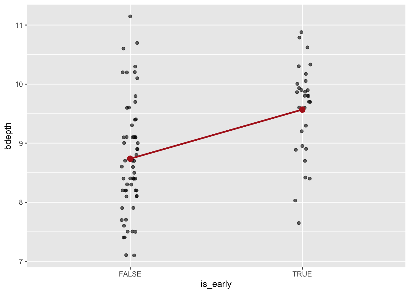
We can see that, on average, the beak depth is lower in the post-1983 measurements (is_early = FALSE). This is further emphasised through connecting the two averages: the slope of the line indicates the difference between them.
I would personally prefer to see the early data on the left, and the later data on the right. That makes more sense chronologically. That is indeed possible, but includes something called factors, which we’ll cover later. So for now, we won’t worry about it.
9.12 Summary
Key points
- Data distributions allows us to understand the structure of our data better
- Box and violin plots give us summary statistics
- Histograms displays the frequency of observations
- Once you have a story to tell (or point to make), revisit your plots and choose the most appropriate one to convey that