Customising plots
Annotating your graphs
In this session we are going to expand on our skills using the
ggplot2 package, which will allow us to further customise
our plots. We’re also going to learn how to assemble several plots
together, and export them in a publication-ready manner.
For this lesson, we’ll use the surveys dataset. Let’s
read it into R, along with loading the tidyverse
package.
# load package
library(tidyverse)
# read data the data
surveys <- read_csv("data_raw/portal_data_joined.csv")
# create a data set without missing values
surveys_complete <- surveys %>% drop_na()
Let’s also start by making an initial graph, which includes features that we’ve learned about in the Data visualisation:
ggplot(data = surveys_complete,
       aes(x = weight, y = hindfoot_length)) +
  geom_point(aes(colour = plot_type))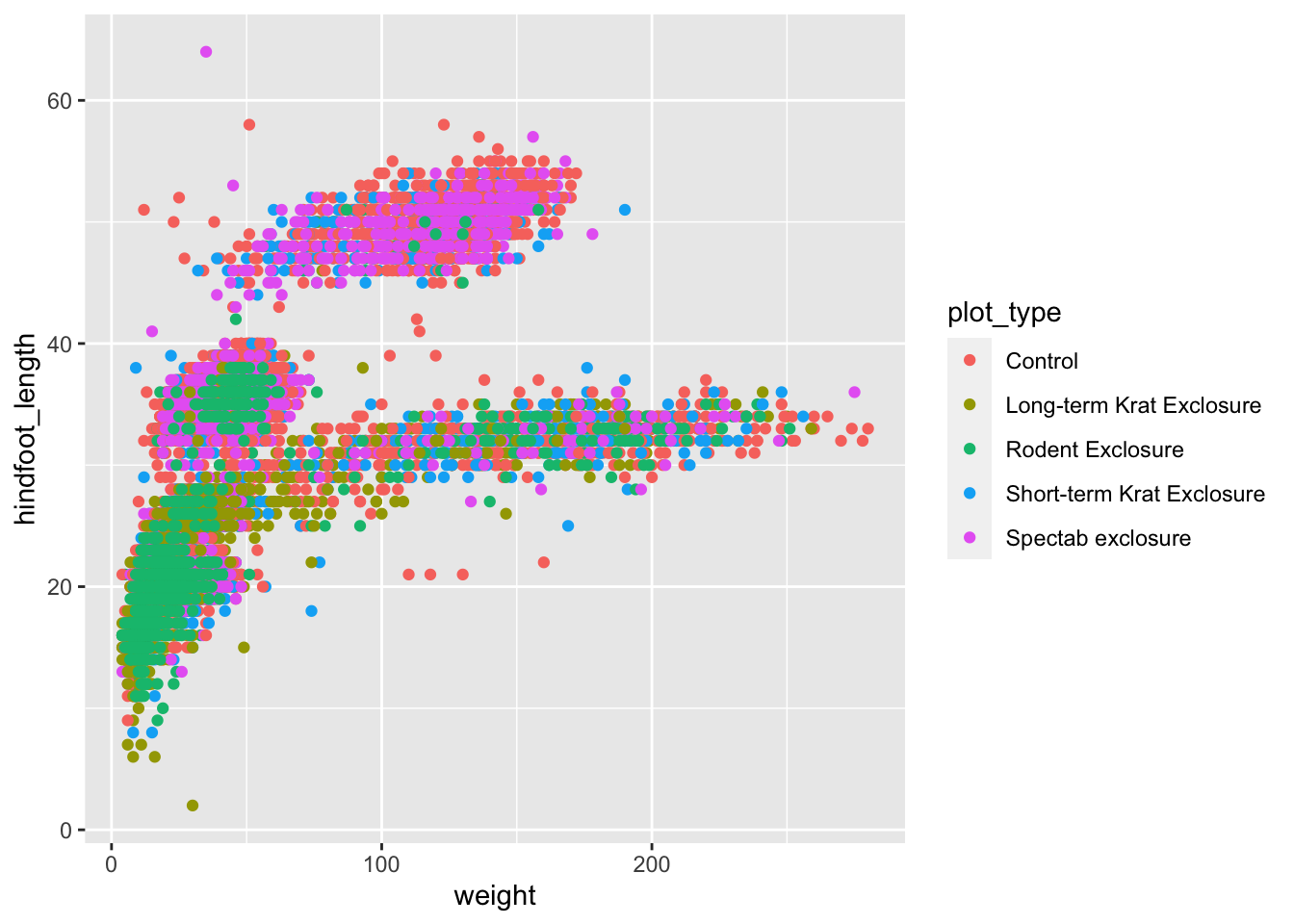
Let’s revise what we’ve done here:
- We’ve defined
surveys_completeas the data frame to be used as data - We used the
geom_point()to draw points on the graph - We defined three aesthetics from columns of our data within
aes():xaxis withweightyaxis withhindfoot_lengthcolourwithplot_type
What if we wanted to customise this plot a bit more?
Let’s save this graph in an object (you can do this with ggplot graphs). This is optional, but often convenient when we want try different customisations or when assembling different plots together, as we will see later on.
# save our graph within an object called `p1`
p1 <- ggplot(data = surveys_complete,
       aes(x = weight, y = hindfoot_length)) +
  geom_point(aes(colour = plot_type))
To view the plot, you can type its name on the console:
The beauty of ggplot() is that it allows you to
customise any part of the plot. Sometimes it can be helpful to change
the overall feel of the graph or maybe just a small part of it. Below
are some common ways to change the appearance of your graph.
Themes
You can change the overall look of your graphs by customising the
so-called theme used by ggplot2.
Using built-in themes
ggplot2 comes with some pre-defined themes,
which can be accessed using the theme_* family of
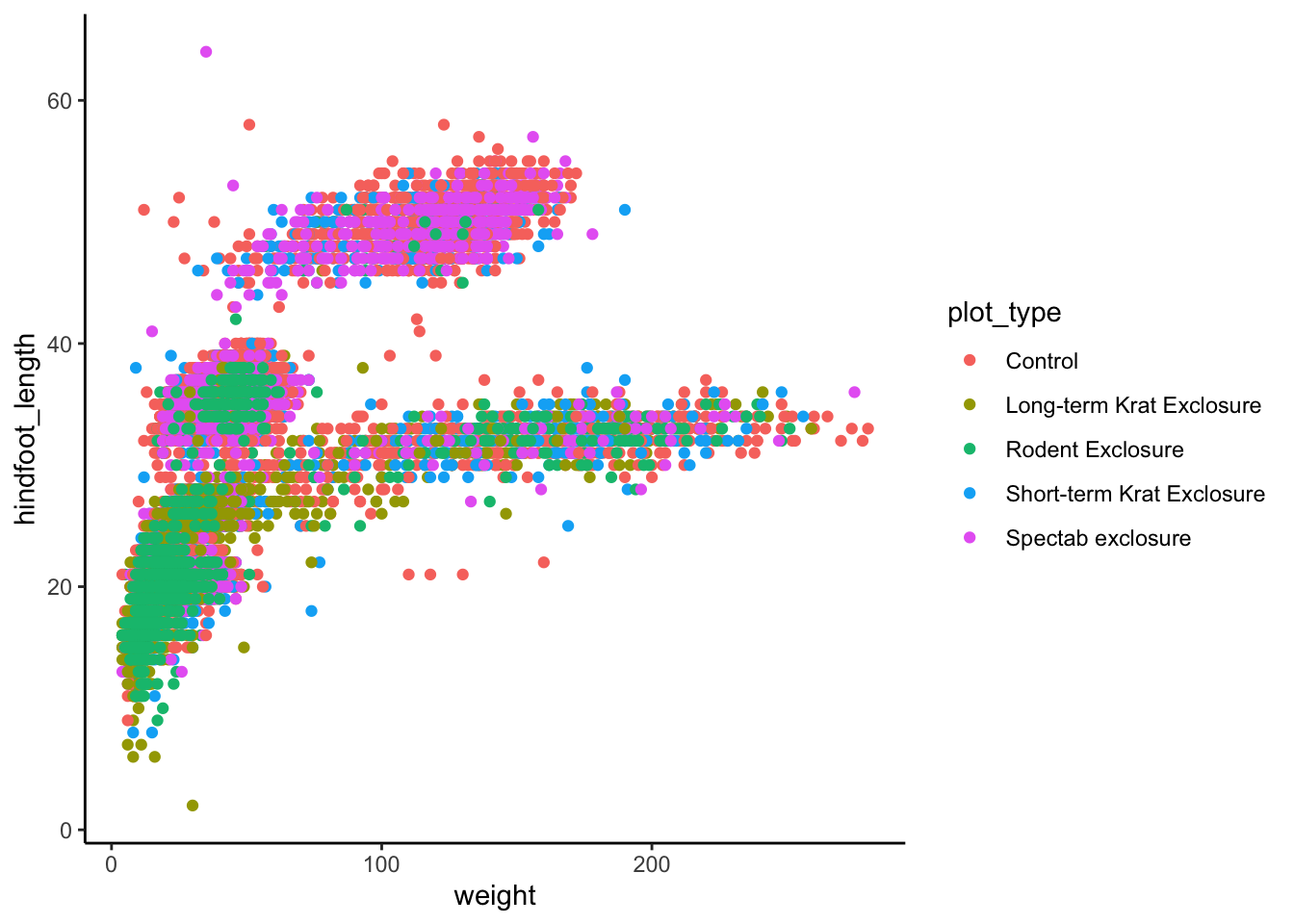
functions. For example, let’s use theme_classic() for a
cleaner-looking graph:
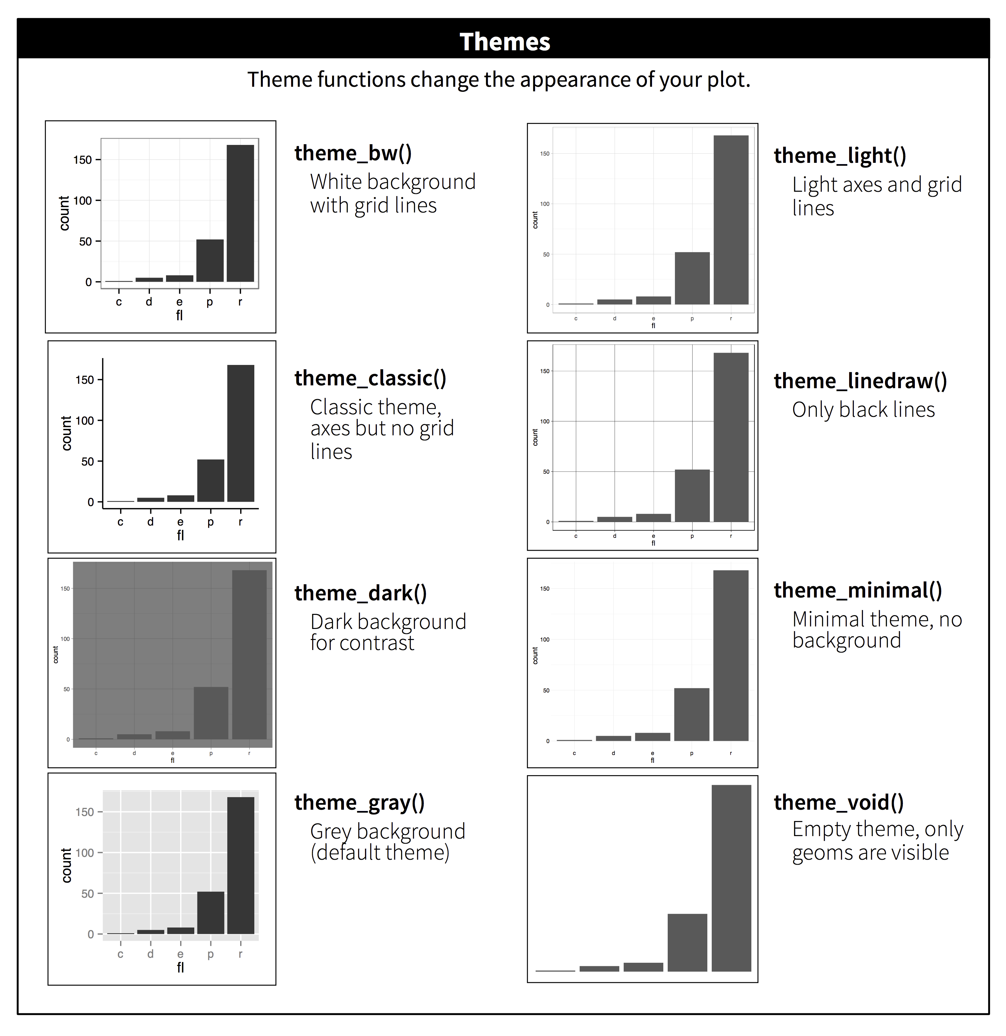
There are multiple themes available in ggplot2:
There are also packages that provide with other themes. One of them
is the ggthemes
package (you can install it with
install.packages("ggthemes")), which also provides some
additional colour scales, including colour blind friendly ones.
Finer customisation with theme()
To tune individual elements of the graph, you can use the generic
theme() function. This allows you to change the look of
every single aspect of the graph, so we cannot cover it all
here (look at ?theme documentation to see how many things
you can customise!). With this function you can essentially make your
own theme.
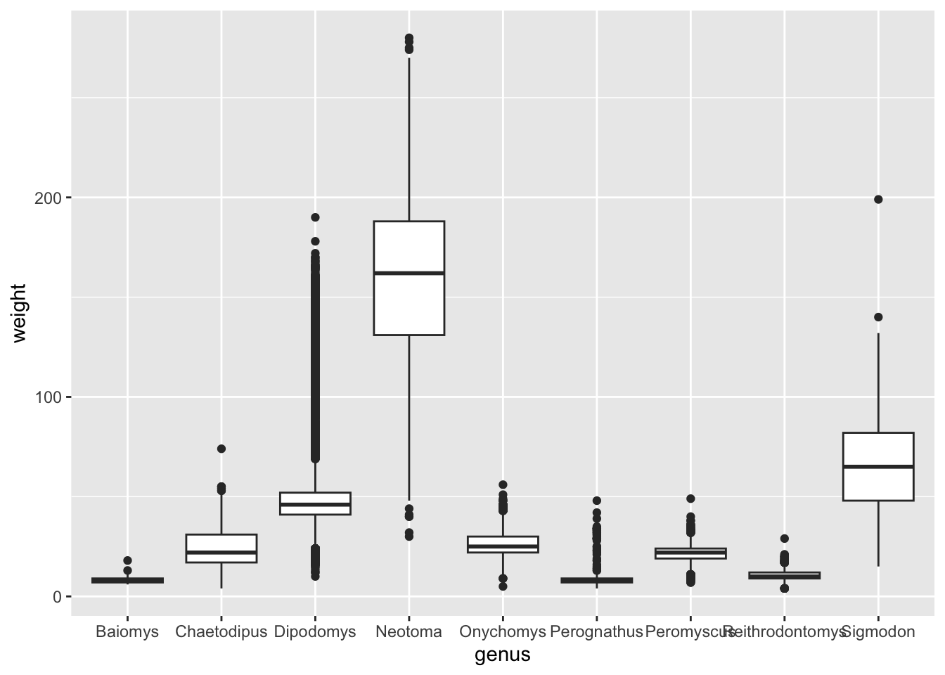
We already noticed that if you plot the weight for each genus, then
the x-axis labels of the genera names overlap (see Reordering
Categorical Variables). We can fix this using
theme().
The original code we used was as follows:
Next, we can specify how we want to orientate the x-axis label:
surveys_complete %>%
  ggplot(aes(x = genus, y = weight)) +
geom_boxplot() +
theme(axis.text.x = element_text(angle = 45, hjust = 1))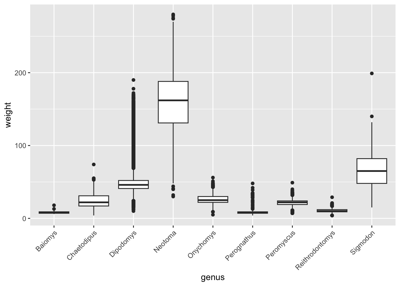
The code looks (and is) a bit convoluted, but in most cases, the way to figure out how to do these customisations is to do a web search. For example searching for “ggplot2 how to change axis text orientation” returns this stackoverflow answer as one of the top results.
What this code does is take the x-axis text
(axis.text.x), then takes the text element within it
(element_text()) and specify that the angle should be 45
degrees (angle = 45). This automatically centres the text
in the vertical orientation, so you need to make sure that the text ends
where the axis begins by setting the height adjustment
(hjust = 1).
Here are some other uses of this function that might be useful (try running them yourself!):
# Change the font size
p1 + theme(text = element_text(size = 16))
# Remove legend
p1 + theme(legend.position = "none") # can also use "top", "bottom", "left"
# Adjust each grid line
p1 + theme(panel.grid.minor.x = element_blank(),
           panel.grid.major.x = element_blank(),
           panel.grid.minor.y = element_blank(),
           panel.grid.major.y = element_line(colour = "black", linetype = "dotted"))
Colours
We have already seen that we can manually change colours when we created the popout graph, but this would be a bit tedious if we are colouring by many different colours.
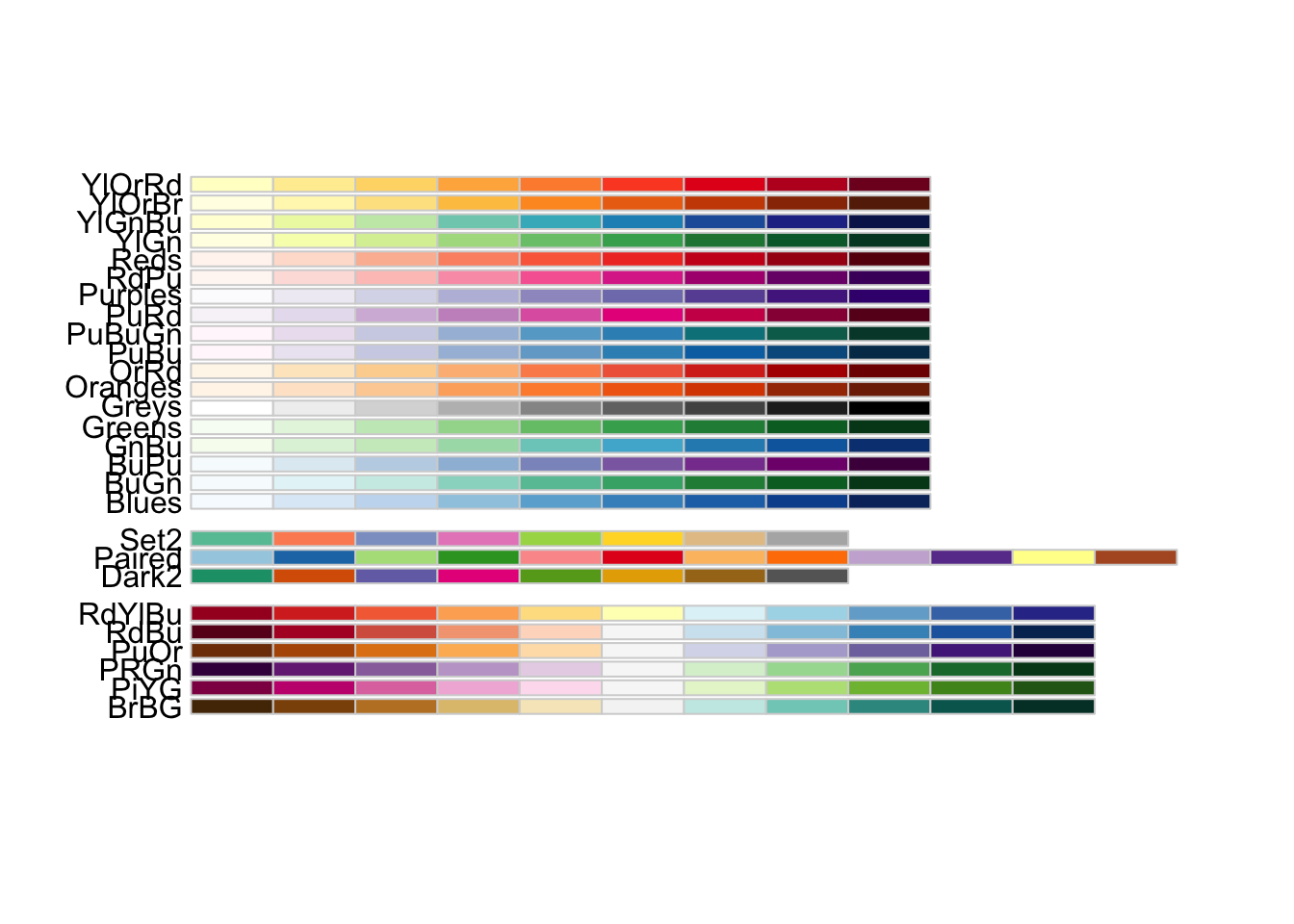
Fortunately there are many colour palettes available
in R and one of the most popular ones can be found in the
RColorBrewer package (documentation can be found here).
There are many different colour palettes, but it’s good practice to ensure that you choose a colour palette that is clear, provides contrast and is colour-blind friendly. Plotting 10 grouping variables in 10 different shades of grey is not going to be helpful, nor is plotting them in red/green combinations if your audience is colour blind (it is a lot more common than you might think!).
If you want to have a quick look at the palettes that are
colour-blind friendly in the RColorBrewer package, you can
run the following line of code:
There are different arguments that you can use from this package and
we will give you an example here. If you want to change the colour of
the data points, you can use scale_colour_brewer() as an
extra option in your plot:
ggplot(data = surveys_complete,
       aes(x = weight, y = hindfoot_length)) +
  geom_point(aes(colour = plot_type)) +
  scale_colour_brewer(palette = "Dark2")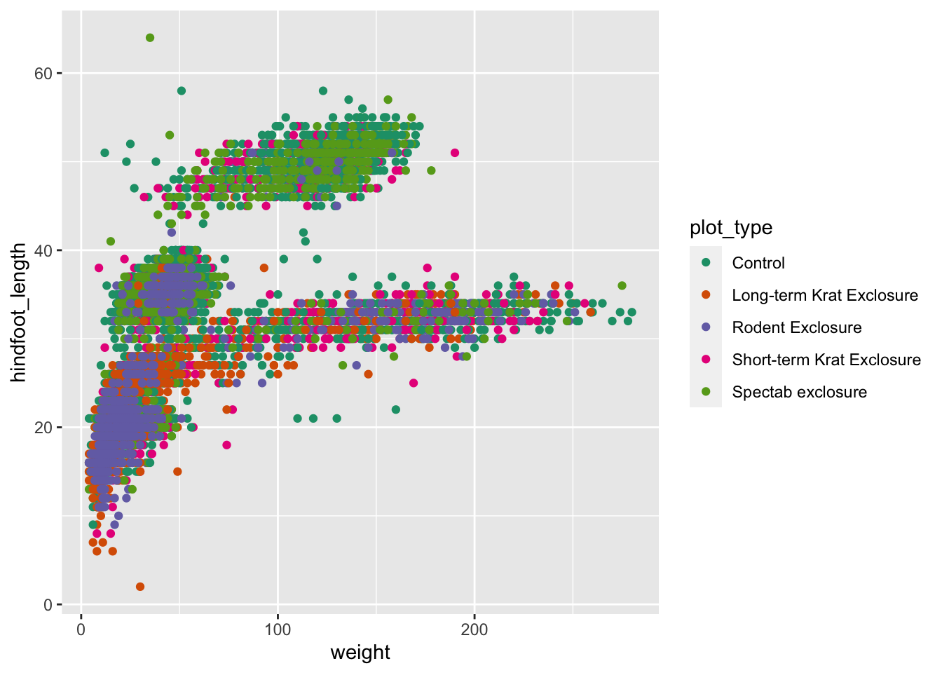
Equally, you can use scale_fill_brewer() to specify fill
colours.
Labels
By default ggplot() uses the variable names to label the
axes and legend. This might not always be exactly what you want and it
is possible to change these labels manually. Furthermore, you can also
add titles, subtitles and
captions to your plot.
We can change the labels of every aesthetic using the
labs() function, added on to the graph.
For example:
p1 +
  labs(x = "Weight (g)",
       y = "Hindfoot length (mm)",
       colour = "Plot type",
       tag = "A",
       title = "Relationship between weight and hindfoot length",
       subtitle = "Based on Portal data set",
       caption = "done with ggplot2 in R")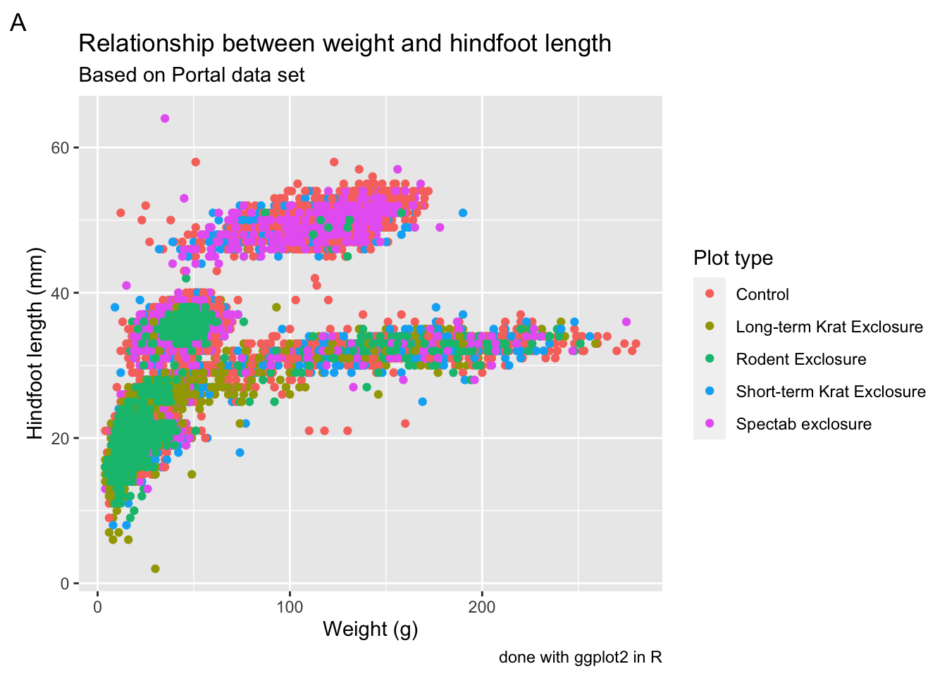
Numbering panels
The tag label is particularly useful for numbering
panels in composite figures. However, we will see an even more
convenient way of doing it later on using the patchwork
package.
Saving graphs
We’ve already covered how to use the ggsave() function
in the first ggplot session. To
save assembled graphs, you can do a similar thing, but instead of saving
a single graph, you can save the whole assembly into an object, and then
pass that to ggsave():
# Save annotated graph to file
p1_annotated <- p1 +
  labs(x = "Weight (g)",
       y = "Hindfoot length (mm)",
       colour = "Plot type",
       tag = "A",
       title = "Relationship between weight and hindfoot length",
       subtitle = "Based on Portal data set",
       caption = "done with ggplot2 in R")

# save it as PDF using 15cm x 7cm
ggsave(filename = "figures/weight_vs_hindfoot_per_plot_type.pdf",
       plot = p1_annotated,
       width = 15,
       height = 7,
       units = "cm")
Composing plots with patchwork
So far we have mostly created single plots, with the exception of facetting where we were able to divide our data into sub-panels based on a variable (or two).
It is often very useful to create a multi-panel plot, where you
combine multiple plots into a single figure. The patchwork
package (check its documentation, which is full of excellent
examples of its usage) is really useful to do this.
Before we can use it, we need to install it. You can do this by running the following line of code in the console (there is no need to add it to your script, since you do not want to install it every time you run your script):
Next, we need to load it, so we can add this to our script (remember: packages need to be loaded every time you restart R, so we do add this to our script):
The easiest way to use the package is to first save the individual
plots we want to assemble in different objects. We have already created
a plot called p1, so we can create a few other plots to
complement that. For completeness we have included the code for three
plots, including p1. You can run the following:
# scatter plot with weight versus hindfoot length
p1 <- ggplot(data = surveys_complete,
       aes(x = weight, y = hindfoot_length)) +
  geom_point(aes(colour = plot_type)) +
  scale_colour_brewer(palette = "Dark2")

# boxplot with weight versus hindfoot length, by genus
p2 <- surveys_complete %>%
  ggplot(aes(x = genus, y = weight)) +
  geom_boxplot()

# scatter plot with data points after 2000 coloured differently
p3 <- surveys_complete %>%
  mutate(after_2000 = year > 2000) %>%
  arrange(after_2000) %>%
  ggplot(aes(x = weight, y = hindfoot_length, colour = after_2000)) +
  geom_point() +
  scale_colour_brewer(palette = "Dark2")
There are different ways in which you can specify how to put graphs
together using patchwork, but the way we’re going to use in
this lesson uses these two operators:
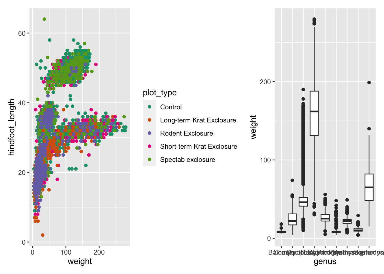
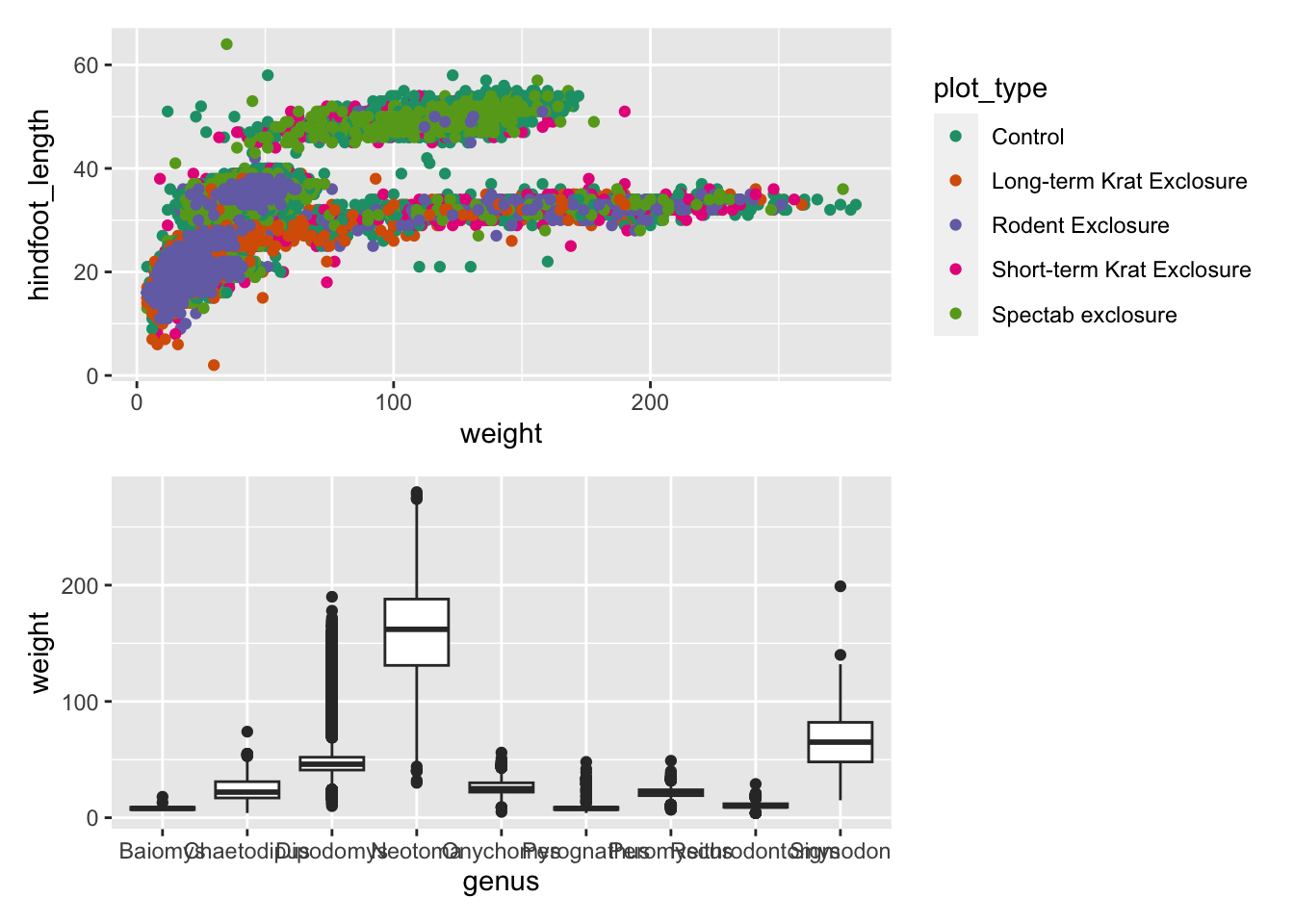
p1 | p2puts the first plot on the left and the second on the rightp1 / p2puts the first plot on the top and the second on the bottom
Here is an example using the plots we’ve made on our exercise:
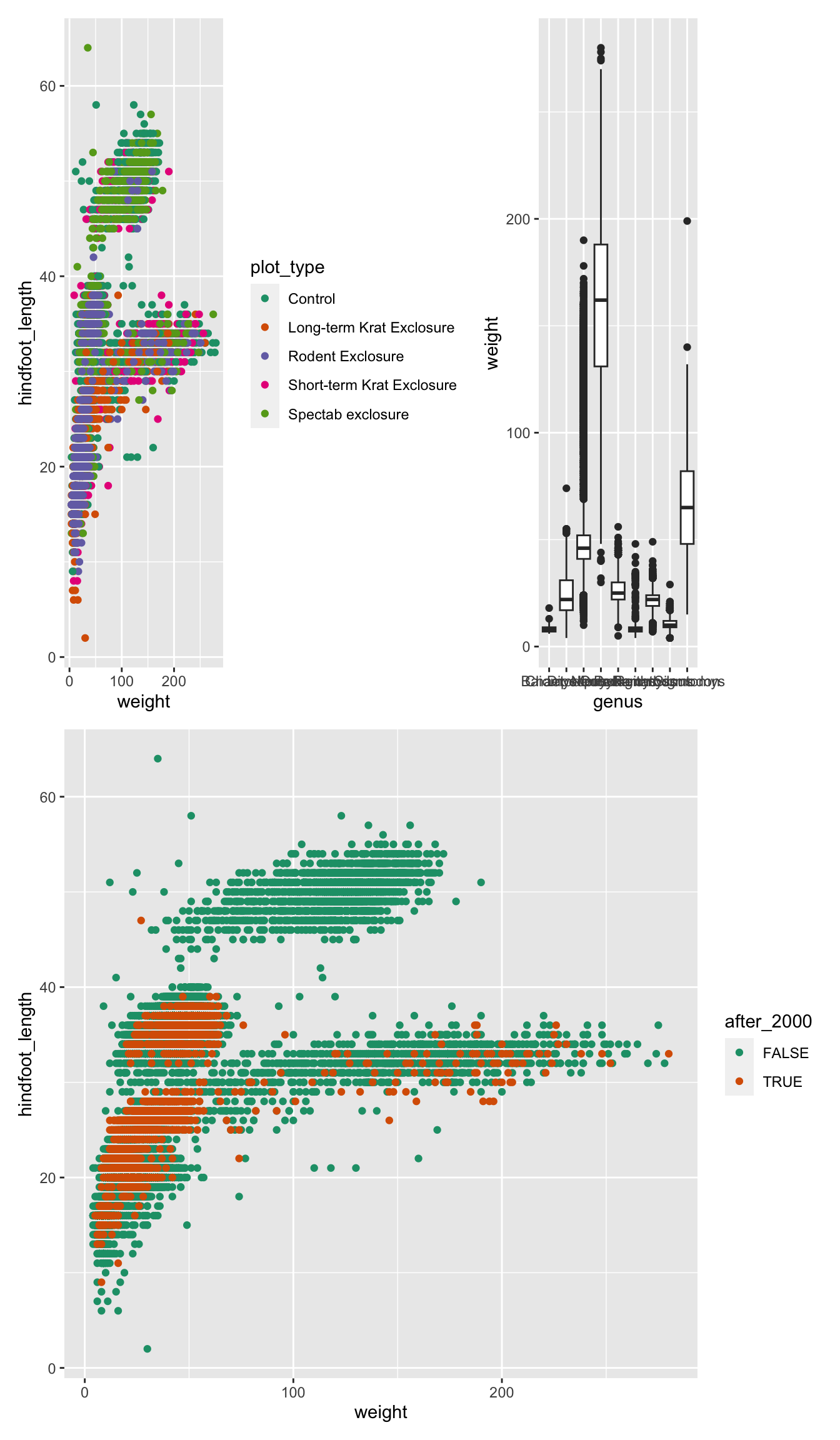
We can combine these two operators for more complex arrangements, by
wrapping different parts of the grid of plots with (). For
example:
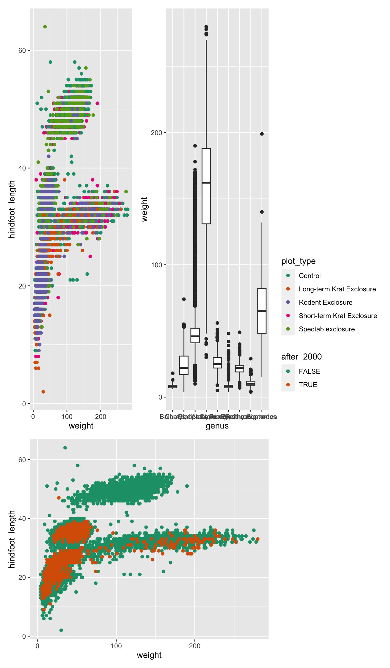
Finally, you can customise these arrangements in several ways using
the plot_layout() function. For example, we can “collect”
the legends and define the relative height of each panel:
We can use plot_spacer() to add an empty space to our
graph, which can be useful if we want to add something else later on
using another program (e.g. an image).
For example, let’s put a “blank” space where the second plot should be
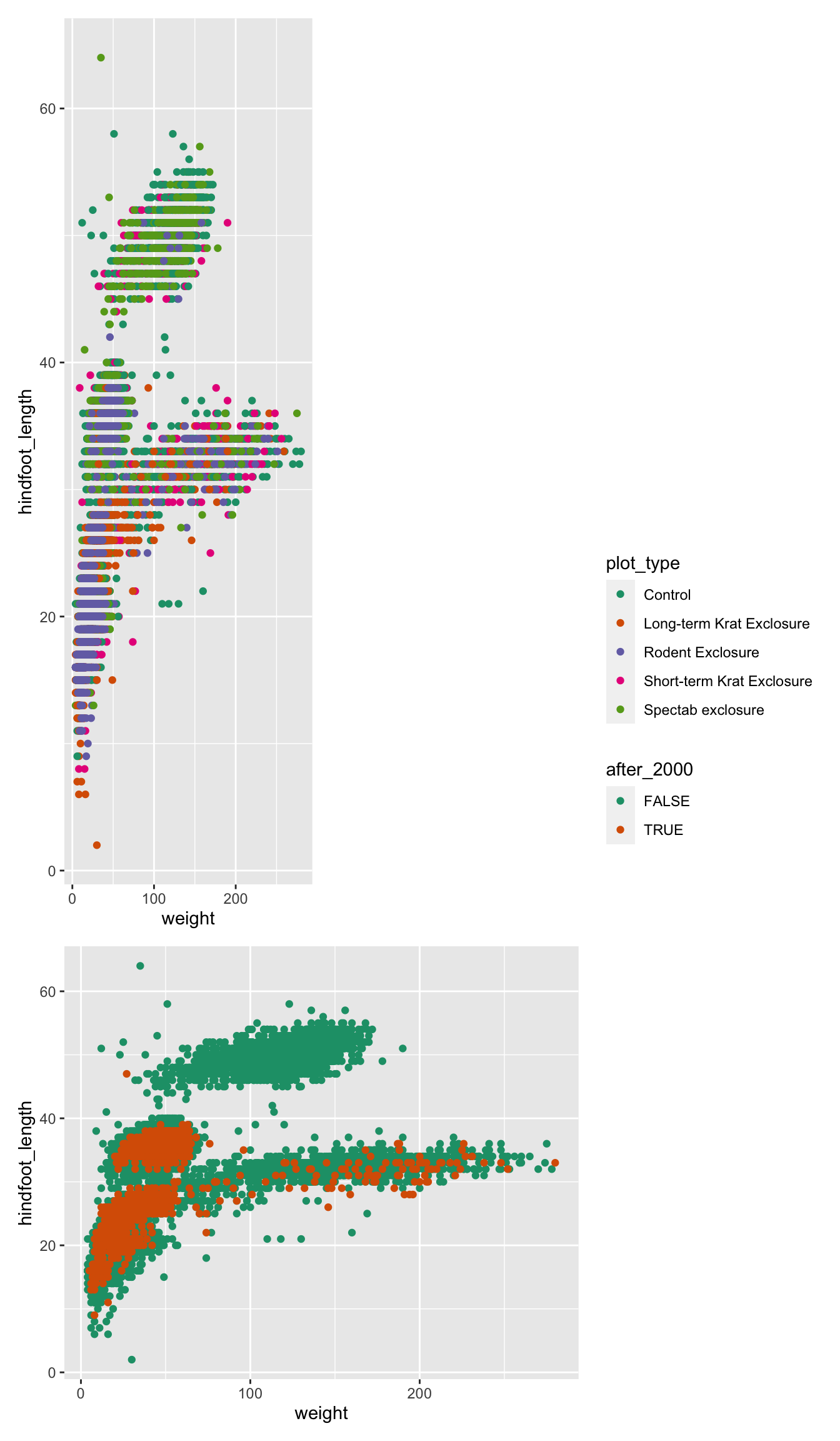
Finally, we can also add annotations, which is very useful to add automatic “tags” to each panel:
( (p1 | p2) / p3 ) +
plot_layout(guides = "collect", heights = c(2, 1)) +
plot_annotation(tag_levels = "A",
title = "Figure 1")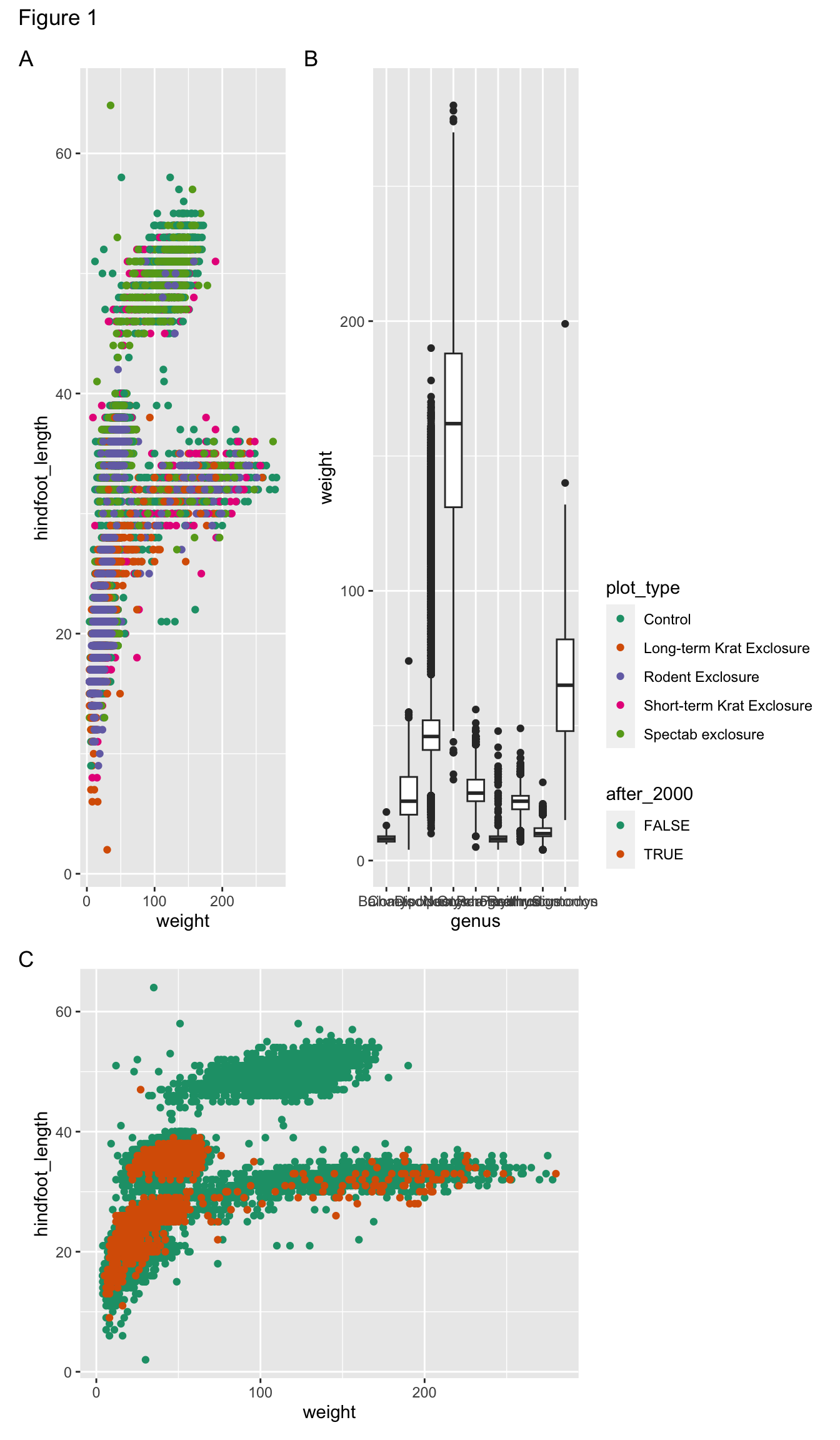
Additional customisation
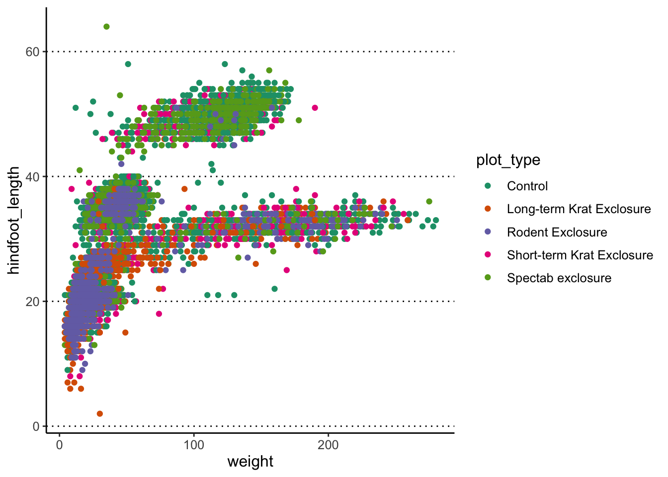
Setting up a custom theme
To avoid having to add the theme functions to every
graph you make, you can set the default theme you want to use for your
graphs using the theme_set() function.
Usually, it may be a good idea to include this at the top of your script, just after you load the libraries:
# Use the "classic" theme as the basis,
# with horizontal grid lines for the y axis and a bigger font
theme_set(theme_classic() +
            theme(panel.grid.major.y = element_line(colour = "black", linetype = "dotted"),
                  text = element_text(size = 12)))
Now, every time you display your graphs, they will use the theme set in this way:
Labelling data points
You can use the geom_text() or geom_label()
functions to add labels to your data points. These two geometries work
similarly to geom_point(), except they also need an
aesthetic called label to indicate which variable should be
used as the text to plot.
For example, let’s label each of our data points with their respective species name. To make the plot more readable, we are only selecting a subset of the data:
surveys_complete %>%
  filter(year == 2000) %>%
  ggplot(aes(x = weight, y = hindfoot_length)) +
  geom_point(aes(colour = plot_type)) +
  scale_colour_brewer(palette = "Dark2") +
  geom_text(aes(label = species))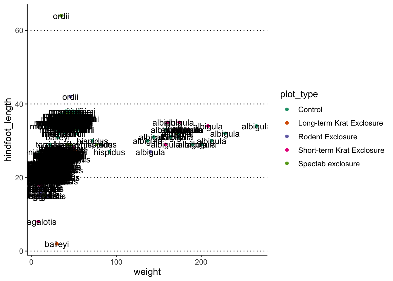
Oh dear, that’s a bit too much, and not very informative. We can do better, by telling the geometry to check for overlaps:
surveys_complete %>%
  filter(year == 2000) %>%
  ggplot(aes(x = weight, y = hindfoot_length)) +
  geom_point(aes(colour = plot_type)) +
  scale_colour_brewer(palette = "Dark2") +
  geom_text(aes(label = species), check_overlap = TRUE)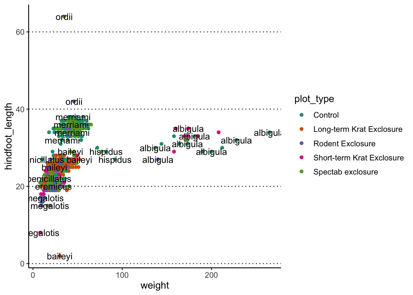
If you want to see all data points in a plot but it is still
unreadable there is another option. The library ggrepel
provides geoms to avoid overlapping text: geom_text_repel()
and geom_label_repel(). You can install
ggrepel with the command
install.packages("ggrepel").
Let’s look at a subset of the data and compare the plots without and
with geom_text_repel():
surveys_complete %>%
  filter(year == 2000 & sex == "F" & weight > 150) %>%
  ggplot(aes(x = weight, y = hindfoot_length)) +
  geom_point(aes(colour = plot_type)) +
  scale_colour_brewer(palette = "Dark2") +
  geom_text(aes(label = record_id))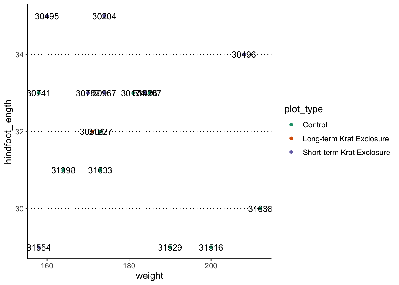
library(ggrepel)

surveys_complete %>%
  filter(year == 2000 & sex == "F" & weight > 150) %>%
  ggplot(aes(x = weight, y = hindfoot_length)) +
  geom_point(aes(colour = plot_type)) +
  scale_colour_brewer(palette = "Dark2") +
  geom_text_repel(aes(label = record_id))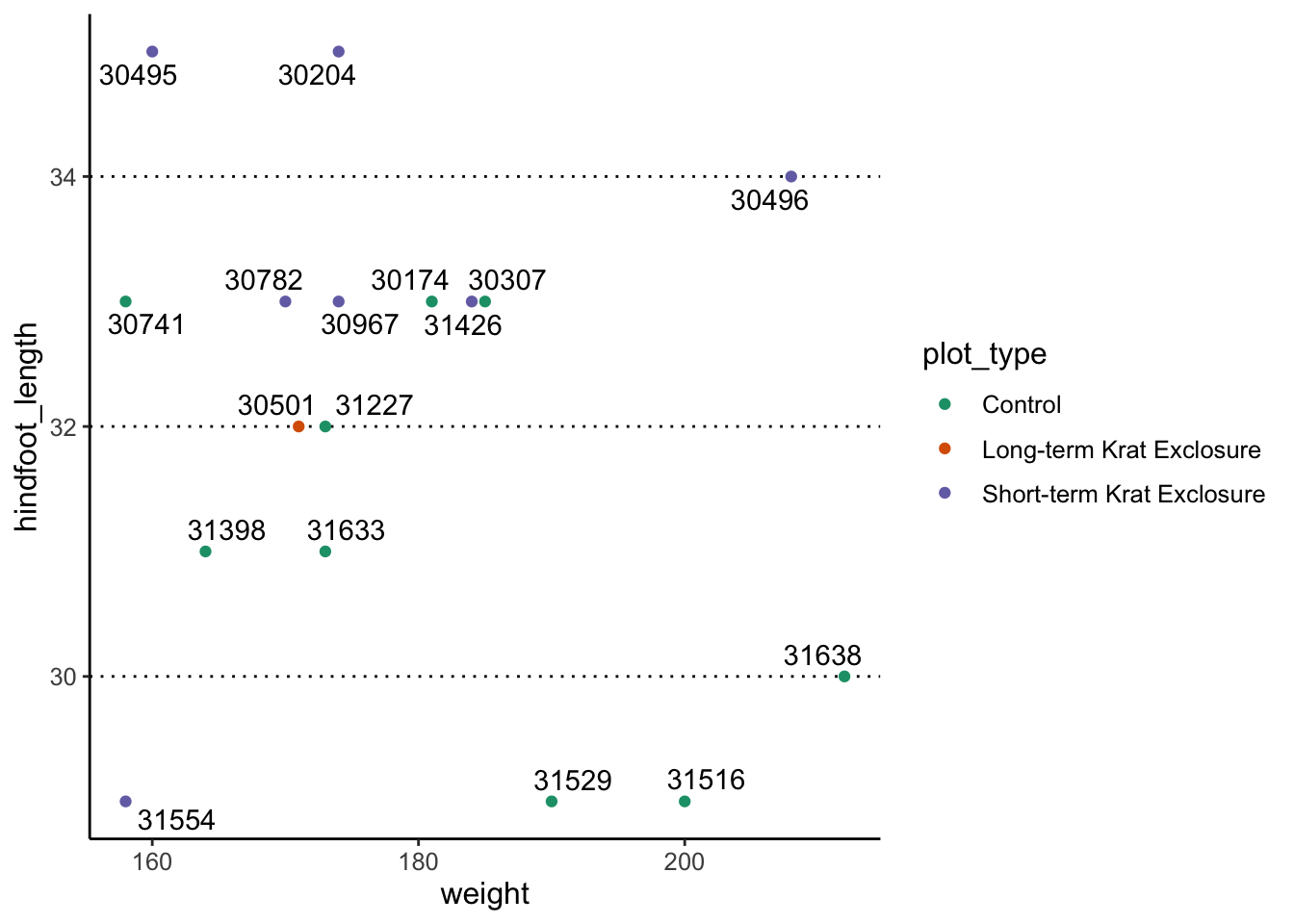
Although the text labels do not overlap anymore, you do need to be
careful when using this option. If your data points are close together,
then it might not be so clear which label belongs to which point. If
that’s the case, you can use the
box.padding = <value> argument to increase the
distance between the data point and the label. If they are then too far
apart, then they get automatically connected with a line:
surveys_complete %>%
  filter(year == 2000 & sex == "F" & weight > 150) %>%
  ggplot(aes(x = weight, y = hindfoot_length)) +
  geom_point(aes(colour = plot_type)) +
  scale_colour_brewer(palette = "Dark2") +
  geom_text_repel(box.padding = 0.5, aes(label = record_id))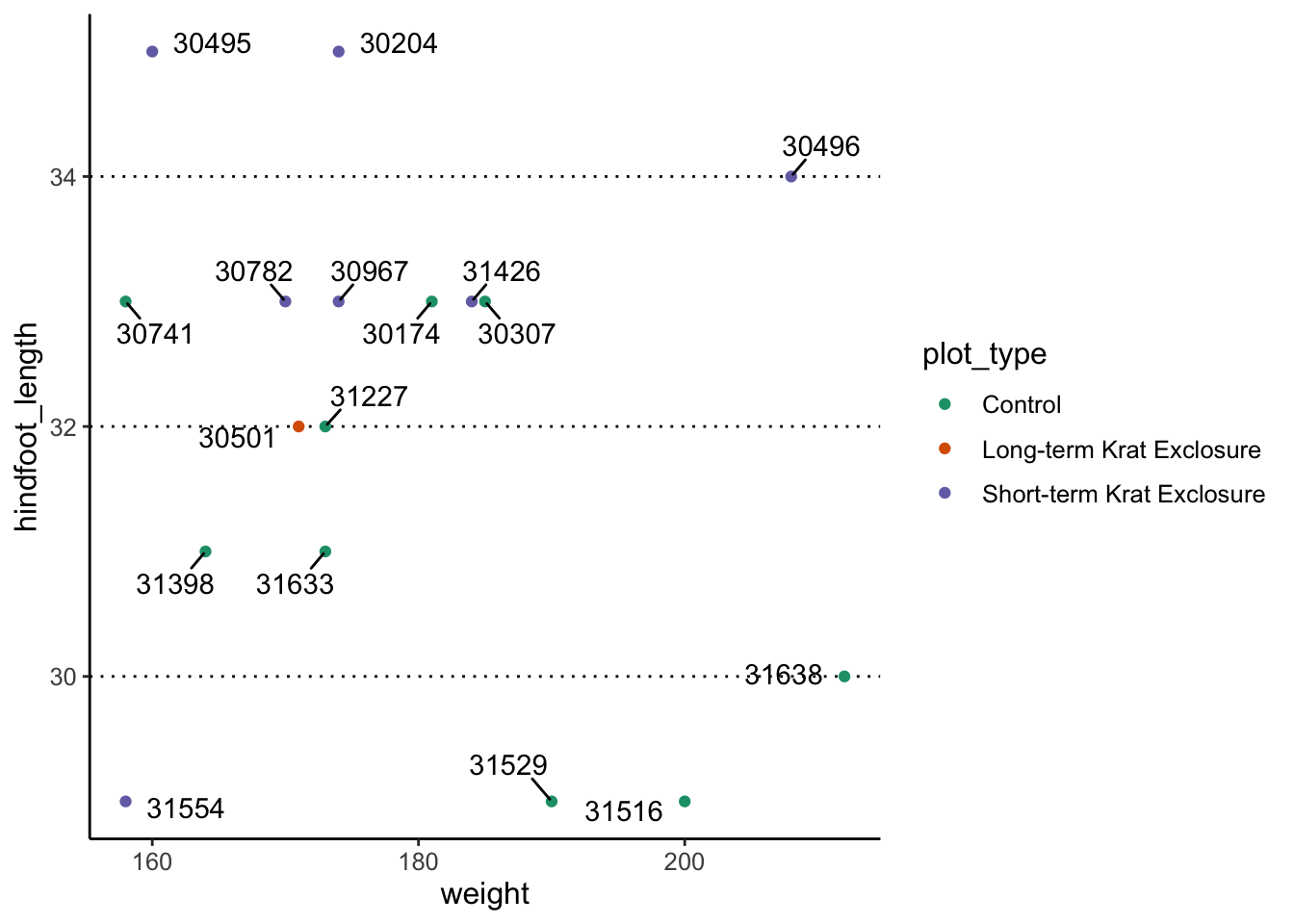
Free annotations
You can also use the more general annotate() function to
add any kind of geometry to your graph.
Here’s an example with 3 distinct annotations, each using a different geometry:
p1 +
  # add rectangle
  annotate(geom = "rect", alpha = 0.3,
           xmin = 200, xmax = 285, ymin = 25, ymax = 40) +
  # add a segment
  annotate(geom = "segment", x = 40, xend = 50, y = 65, yend = 68) +
  # add some text
  annotate(geom = "text", x = 85, y = 70, label = "Clear outlier")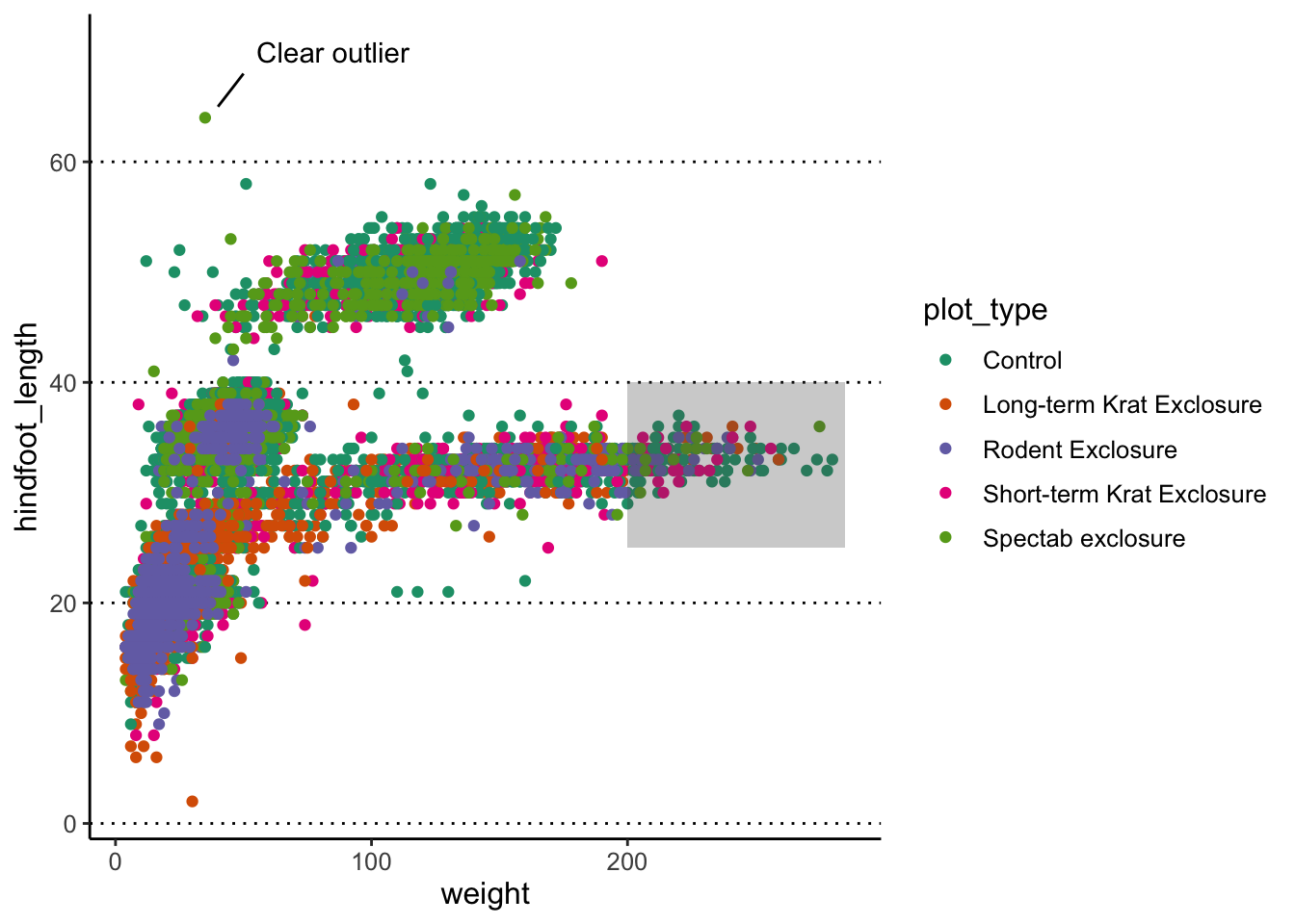
Adding annotations “manually” can be tedious, as it requires a lot of trial-and-error to get it just right, but it can be convenient when we want to highlight something very specific in our graph.
Adding lines
You can use geom_hline() and geom_vline()
to add horizontal and vertical lines, respectively. These can be useful,
for example, to mark thresholds that you want to highlight.
# Highlight regions with weight over/below 100
# and hindfoot length over/below 20
p1 +
  geom_hline(yintercept = 20, size = 1) +
  geom_vline(xintercept = 100, size = 1)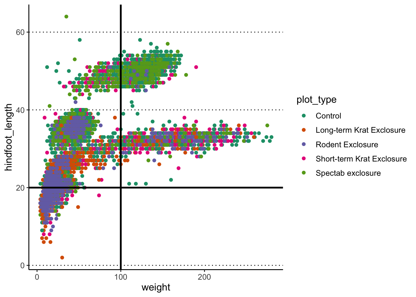
You can also add a sloped line, using geom_abline(),
which needs information about the y-intercept and slope of the line:
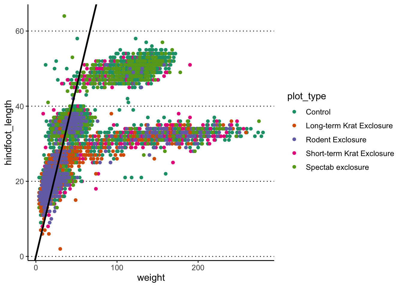
This function is often useful to use when looking at the correlation
between two variables on the same scale, and thus highlighting x = y
(intercept = 0, slope = 1, which is the default of the
function).
Finally, you can also use geom_smooth() to add a trend
line to your data.
#> `geom_smooth()` using method = 'gam' and
#> formula = 'y ~ s(x, bs = "cs")'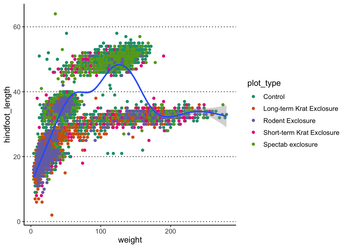
What geom_smooth() does is fit a model to the data, and
then graphs the mean prediction (with error estimate) from that model.
By default, the model used is a LOESS regression. Another common
usage is to display the result of a linear regression fit to the
data, in which case we can change the method option to “lm”
(to use the linear model function from R):
#> `geom_smooth()` using formula = 'y ~ x'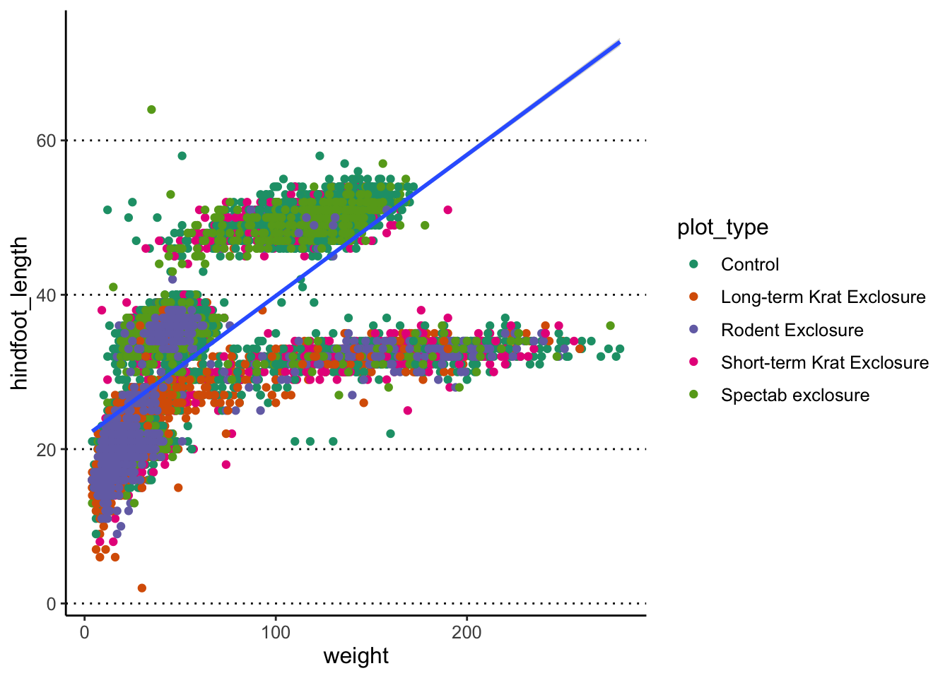
You can also remove the standard error by setting
se = FALSE inside the function.
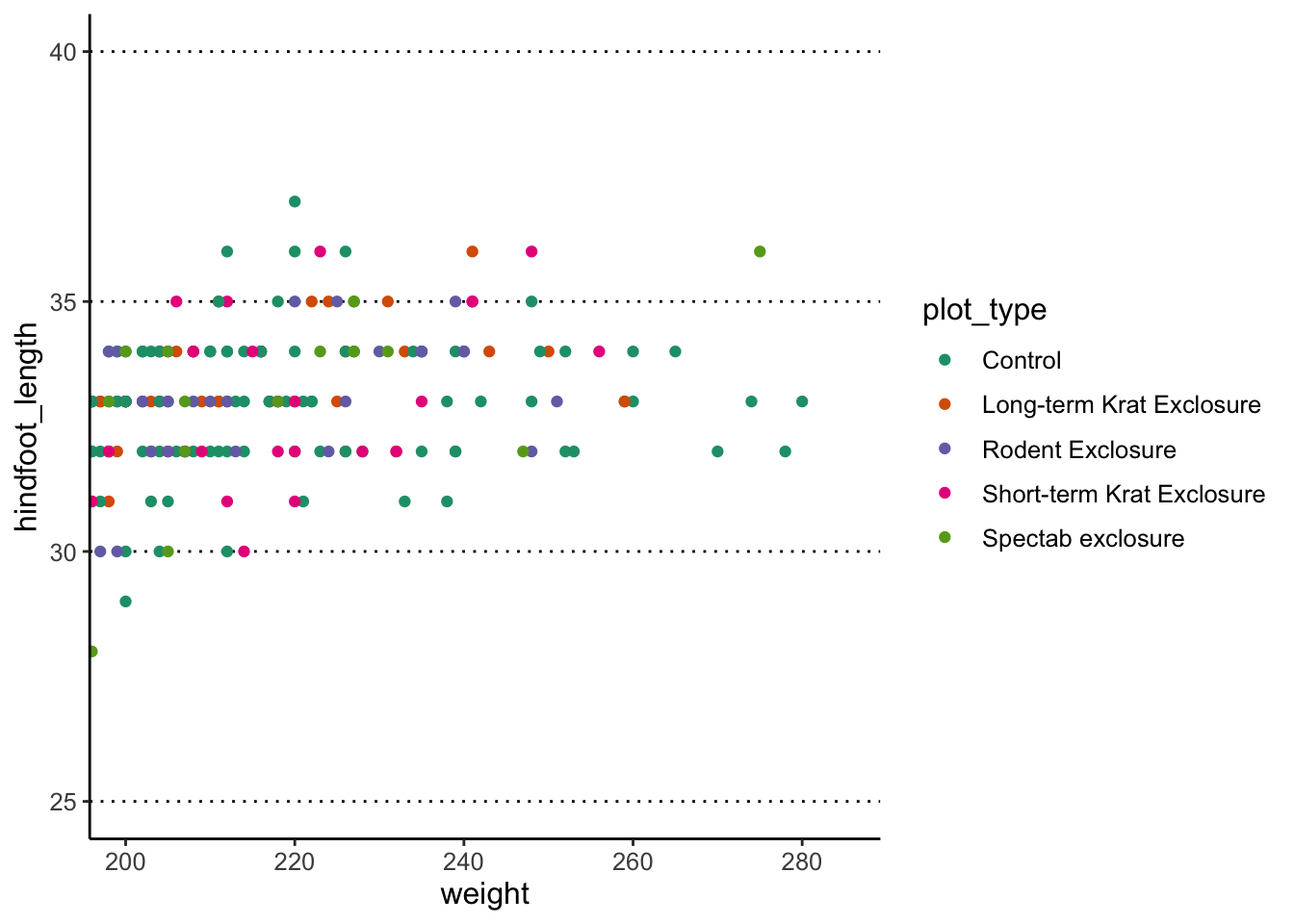
Adjusting axis limits (zooming)
You can use the coord_cartesian() function to adjust x
and y limits. For example, let’s highlight the observations that we
annotated with the rectangle earlier:
Exercise - multi-panel figures
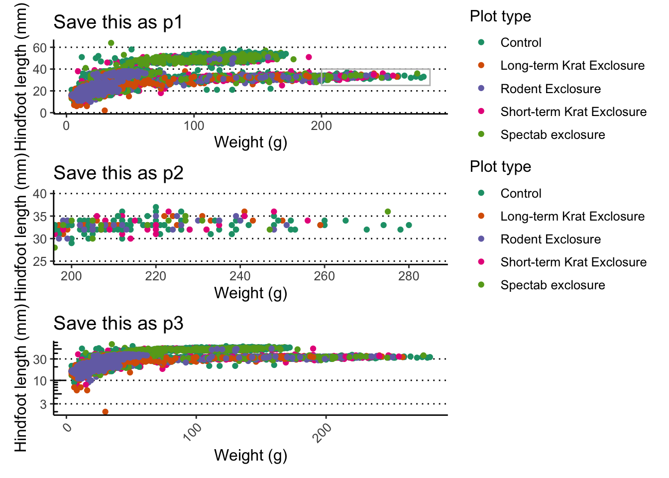
Combining what we’ve learned so far, try and create the following 3
graphs, which should be saved as p1, p2 and
p3.
p1is the same scatter plot we’ve been working with so far (showing the relationship between weight and hindfoot length), but annotated with a grey box to highlight a group of points that we want to look at in more detail.p2is a zoom-in of the region highlighted inp1, marked with the grey box (notice the x- and y-axis scales).p3, is a modification of the first plot, showing the weight on a log-scale.
Hint
- For
p1, change the graph by adding an annotation with a rectangle withxmin = 200, xmax = 285, ymin = 25, ymax = 40. Also add labels to the axis and scales. - To get
p2, change the plot coordinates to match that of the grey rectangle, usingcoord_cartesian(xlim = c(200, 285), ylim = c(25, 40)). - To create the log-scale y-axis in
p3, usescale_y_continuous()); you can further improve the readability of the plot by using theannotate_logticks()function to add the ticks on the y-axis; and use thetheme()function to ensure the legend doesn’t show and that the x-axis labels are at a 45 degree angle.
Answer
Here is the full code for each plot:
p1 <- ggplot(data = surveys_complete,
             aes(x = weight, y = hindfoot_length)) +
  geom_point(aes(colour = plot_type)) +
  scale_colour_brewer(palette = "Dark2") +
  annotate(geom = "rect", xmin = 200, xmax = 285, ymin = 25, ymax = 40,
           colour = "grey", fill = NA) +
  labs(x = "Weight (g)", y = "Hindfoot length (mm)",
       colour = "Plot type")

p2 <- ggplot(data = surveys_complete,
             aes(x = weight, y = hindfoot_length)) +
  geom_point(aes(colour = plot_type)) +
  scale_colour_brewer(palette = "Dark2") +
  coord_cartesian(xlim = c(200, 285), ylim = c(25, 40)) +
  labs(x = "Weight (g)", y = "Hindfoot length (mm)",
       colour = "Plot type")

p3 <- ggplot(data = surveys_complete,
             aes(x = weight, y = hindfoot_length)) +
  geom_point(aes(colour = plot_type)) +
  scale_colour_brewer(palette = "Dark2") +
  annotation_logticks(sides = "l") +
  scale_y_continuous(trans = "log10") +
  labs(x = "Weight (g)", y = "Hindfoot length (mm)") +
  theme(legend.position = "none",
        axis.text.x = element_text(angle = 45, hjust = 1))