# A collection of R packages designed for data science
library(tidyverse)7 Paired data
Questions
- When do I perform a paired two-sample test?
- What are the assumptions?
- How do I interpret and present the results of the test?
- How do I deal with paired non-normal data?
Objectives
- Set out your hypothesis for comparing two paired samples of continuous data
- Be able to summarise and visualise the data
- Understand and assess the underlying assumptions of the test
- Perform a paired two-sample t-test
- Be able to interpret and report the results
- Be able to do these steps on non-normal data
A paired t-test is used when we have two samples of continuous data that can be paired (examples of these sort of data would be weights of individuals before and after a diet). This test is applicable if the number of paired points within the samples is large (>30) or, if the number of points is small, then this test also works when the parent distributions are normally distributed.
7.1 Libraries and functions
7.1.1 Libraries
7.1.2 Functions
# Performs a one-sample t-test, Student's t-test
# and Welch's t-test in later sections
stats::t.test()

# Performs a Shapiro-Wilk test for normality
stats::shapiro.test()

# Performs one and two sample Wilcoxon tests
stats::wilcox.test()

# Plots a Q-Q plot for comparison with a normal distribution
ggplot2::stat_qq()

# Adds a comparison line to the Q-Q plot
ggplot2::stat_qq_line()

# Plots jittered points by adding a small amount of random
# variation to each point, to handle overplotting
ggplot2::geom_jitter()

# Computes summary statistics
rstatix::get_summary_stats()

# "Widens" the data, increasing the number of columns
tidyr::pivot_wider()| Libraries | Description |
|---|---|
plotnine |
The Python equivalent of ggplot2. |
pandas |
A Python data analysis and manipulation tool. |
pingouin |
A Python module developed to have simple yet exhaustive stats functions |
| Functions | Description |
|---|---|
pandas.DataFrame.read_csv |
Reads in a .csv file |
pandas.DataFrame.pivot() |
Return reshaped DataFrame organised by given index / column values. |
pingouin.normality() |
Performs the Shapiro-Wilk test for normality. |
pingouin.ttest() |
Performs a t-test |
plotnine.stats.stat_qq() |
Plots a Q-Q plot for comparison with a normal distribution. |
plotnine.stats.stat_qq_line() |
Adds a comparison line to the Q-Q plot. |
7.2 Data and hypotheses
For example, suppose we measure the cortisol levels in 20 adult females (nmol/l) first thing in the morning and again in the evening. We want to test whether the cortisol levels differs between the two measurement times. We will initially form the following null and alternative hypotheses:
- \(H_0\): There is no difference in cortisol level between times (\(\mu M = \mu E\))
- \(H_1\): There is a difference in cortisol levels between times (\(\mu M \neq \mu E\))
We use a two-sample, two-tailed paired t-test to see if we can reject the null hypothesis.
- We use a two-sample test because we now have two samples
- We use a two-tailed t-test because we want to know if our data suggest that the true (population) means are different from one another rather than that one mean is specifically bigger or smaller than the other
- We use a paired test because each data point in the first sample can be linked to another data point in the second sample by a connecting factor
- We’re using a t-test because we’re assuming that the parent populations are normal and have equal variance (We’ll check this in a bit)
The data are stored in a tidy format in the file data/CS1-twopaired.csv.
# load the data
cortisol <- read_csv("data/CS1-twopaired.csv")
Rows: 40 Columns: 3
── Column specification ────────────────────────────────────────────────────────
Delimiter: ","
chr (1): time
dbl (2): patient_id, cortisol
ℹ Use `spec()` to retrieve the full column specification for this data.
ℹ Specify the column types or set `show_col_types = FALSE` to quiet this message.# have a look at the data
cortisol# A tibble: 40 × 3
patient_id time cortisol
<dbl> <chr> <dbl>
1 1 morning 311.
2 2 morning 146.
3 3 morning 297
4 4 morning 271.
5 5 morning 268.
6 6 morning 264.
7 7 morning 358.
8 8 morning 316.
9 9 morning 336.
10 10 morning 221.
# ℹ 30 more rows# load the data
cortisol_py = pd.read_csv('data/CS1-twopaired.csv')
# inspect the data
cortisol_py.head() patient_id time cortisol
0 1 morning 310.6
1 2 morning 146.1
2 3 morning 297.0
3 4 morning 270.9
4 5 morning 267.5We can see that the data frame consists of three columns:
patient_id, a unique ID for each patienttimewhen the cortisol level was measuredcortisol, which contains the measured value.
For each patient_id there are two measurements: one in the morning and one in the afternoon.
7.3 Summarise and visualise
It’s always a good idea to visualise your data, so let’s do that.
# create a boxplot
ggplot(cortisol,
       aes(x = time, y = cortisol)) +
  geom_boxplot() +
  geom_jitter(width = 0.05) +
  ylab("Cortisol level (nmol/l)")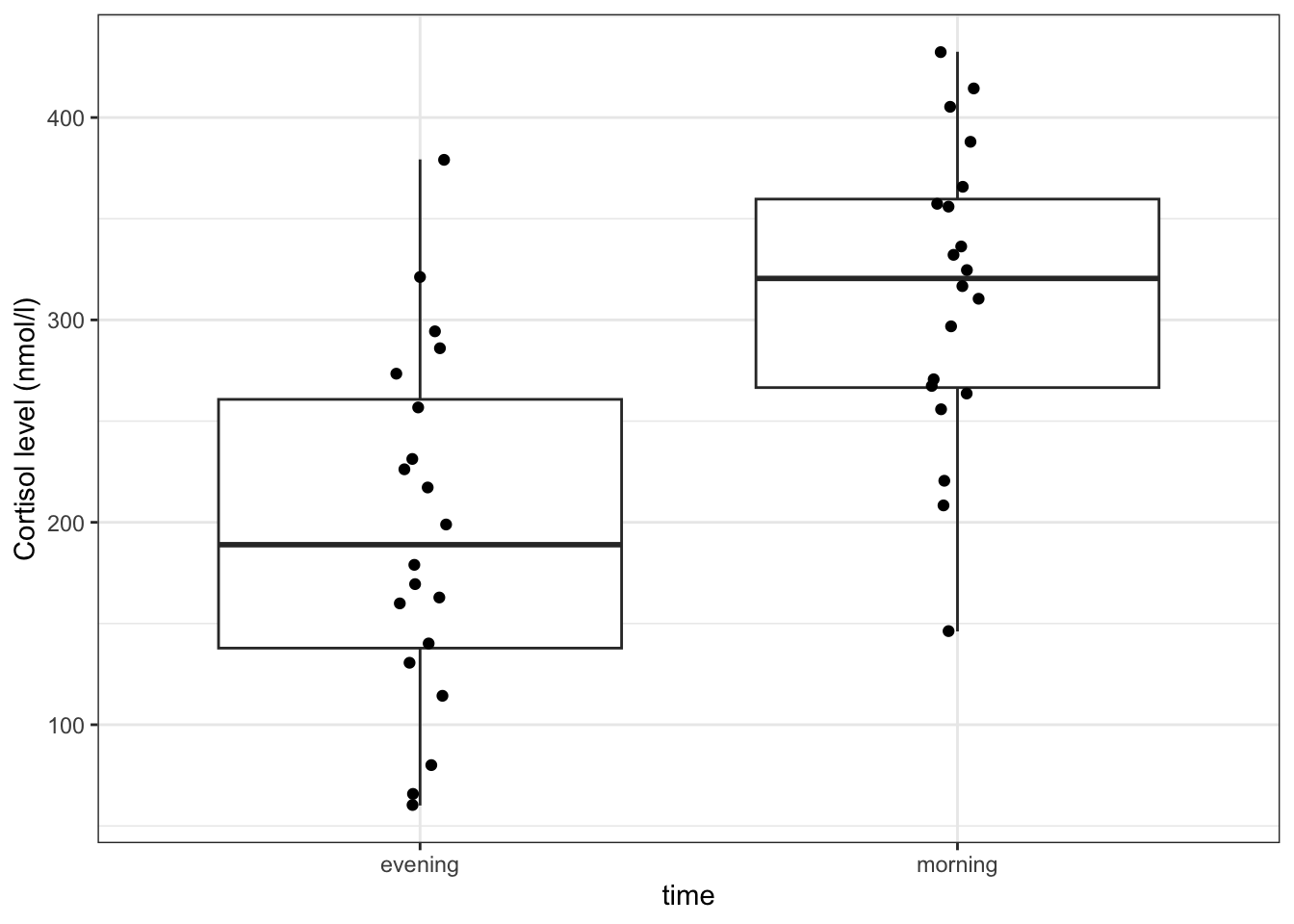
Here we use also visualise the actual data points, to get a sense of how these data are spread out. To avoid overlapping the data points (try using geom_point() instead of geom_jitter()), we jitter the data points. What geom_jitter() does is add a small amount of variation to each point.
(ggplot(cortisol_py,
        aes(x = "time",
            y = "cortisol")) +
     geom_boxplot() +
     geom_jitter(width = 0.05) +
     ylab("Cortisol level (nmol/l)"))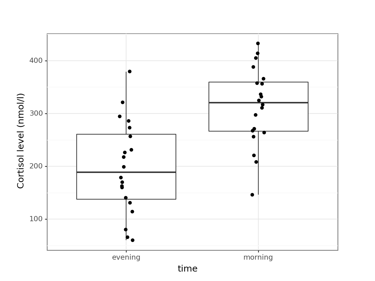
However, this plot does not capture how the cortisol level of each individual subject has changed though. We can explore the individual changes between morning and evening by looking at the differences between the two times of measurement for each patient.
To do this, we need to put our data into a wide format, so we can calculate the change in cortisol level for each patient.
In tidyverse we can use the pivot_wider() function.
# calculate the difference between evening and morning values
cortisol_diff <- cortisol %>%
  pivot_wider(id_cols = patient_id,
              names_from = time,
              values_from = cortisol) %>%
  mutate(cortisol_change = evening - morning)

cortisol_diff
# A tibble: 20 × 4
patient_id morning evening cortisol_change
<dbl> <dbl> <dbl> <dbl>
1 1 311. 273. -37.4
2 2 146. 65.7 -80.4
3 3 297 257. -40.4
4 4 271. 321 50.1
5 5 268. 80.3 -187.
6 6 264. 379. 116.
7 7 358. 163. -195.
8 8 316. 294. -22
9 9 336. 140. -196.
10 10 221. 231. 10.4
11 11 366 131. -235.
12 12 256. 114. -142.
13 13 432. 217. -215.
14 14 208. 60.1 -148.
15 15 324. 199. -125.
16 16 388. 170. -218.
17 17 332 160. -172.
18 18 414. 179. -235.
19 19 405. 286 -119.
20 20 356. 226. -130. There are three arguments in pivot_wider():
id_cols = patient_idtells it that each observational unit is determined bypatient_idnames_from = timesays that there will be new columns, with names from thetimecolumn (in this case, there are two values in there,morningandevening)values_from = cortisolpopulates the new columns with the values coming from thecortisolcolumn
Lastly, we create a new column cortisol_change that contains the difference between the evening and morning measurements.
After this we can plot our data:
# plot the data
ggplot(cortisol_diff,
       aes(y = cortisol_change)) +
  geom_boxplot() +
  ylab("Change in cortisol (nmol/l)")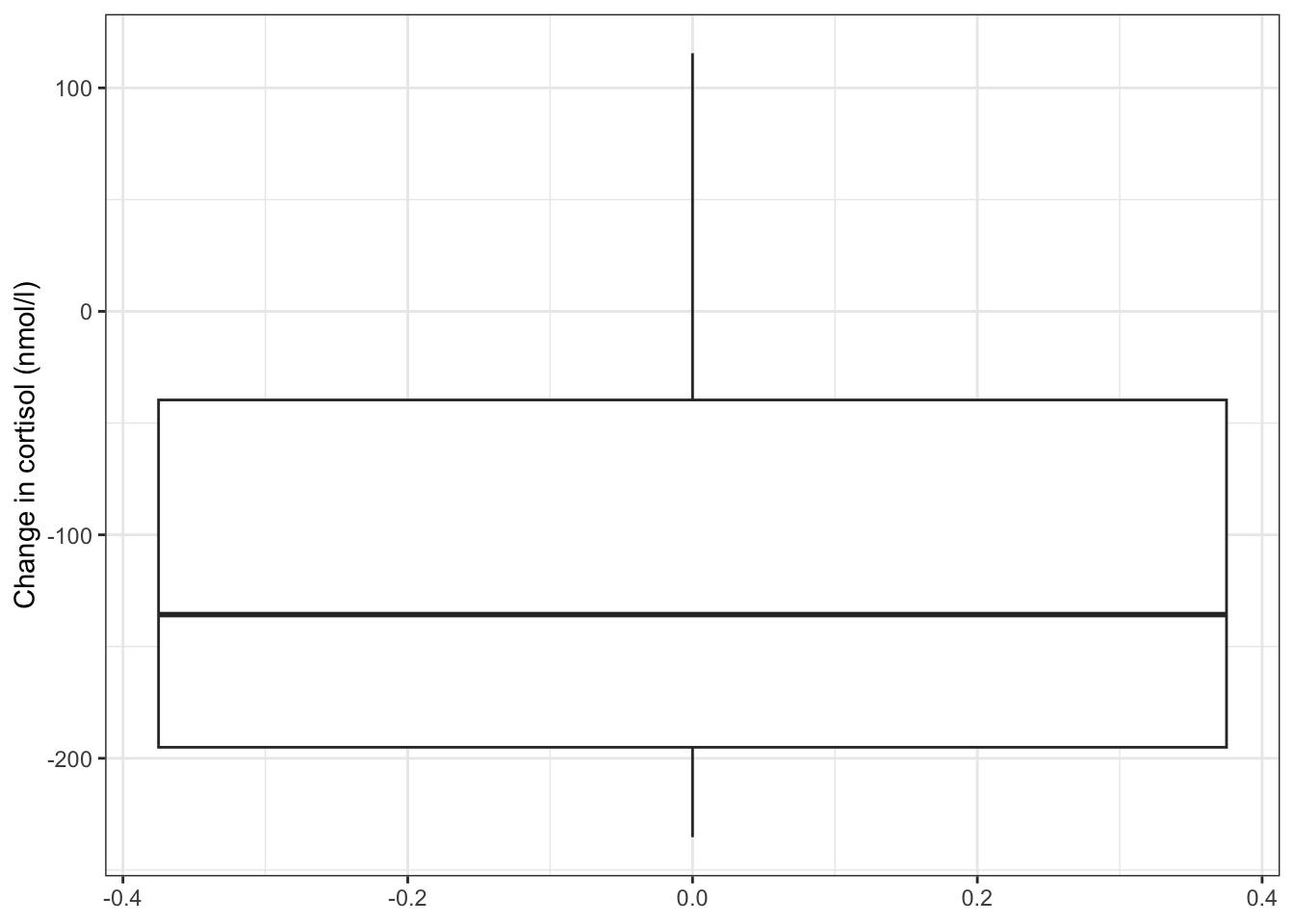
The differences in cortisol levels appear to be very much less than zero, meaning that the evening cortisol levels appear to be much lower than the morning ones. As such we would expect that the test would give a pretty significant result.
An alternative representation would be to plot the data points for both evening and morning and connect them by patient:
# plot cortisol levels by patient
ggplot(cortisol,
       aes(x = time,
           y = cortisol,
           group = patient_id)) +
  geom_point() +
  geom_line()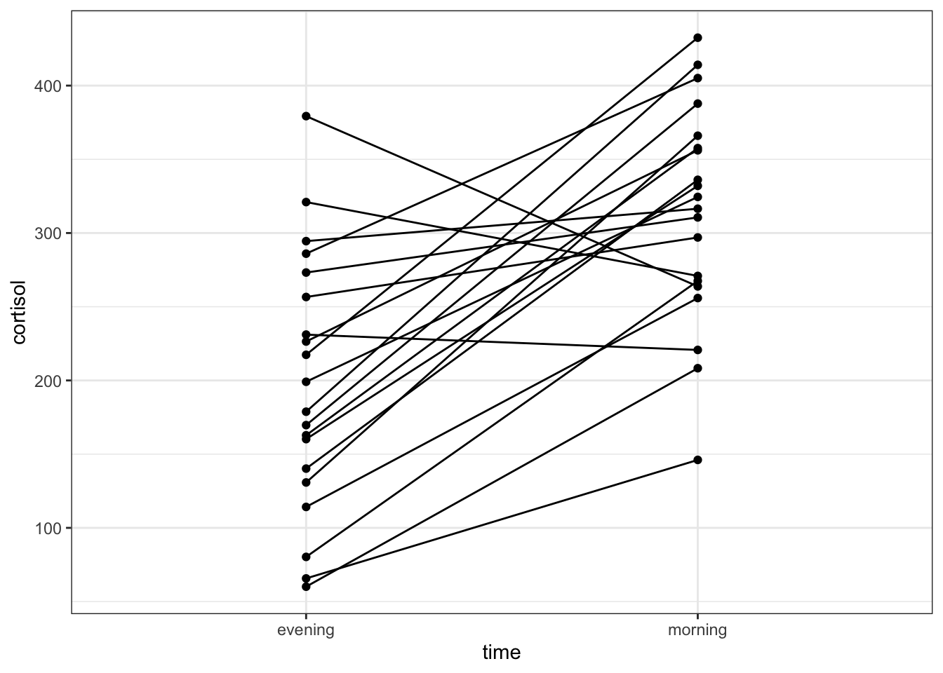
This gives a similar picture to what the boxplot was telling us, that for most patients the cortisol levels are higher in the morning than in the evening.
# reformat the data into a 'wide' format
cortisol_diff_py = pd.pivot(cortisol_py, index = "patient_id", columns = "time", values = "cortisol")

# add a new column with difference between
# evening and morning cortisol levels
cortisol_diff_py["cortisol_change"] = cortisol_diff_py["evening"].subtract(cortisol_diff_py["morning"])

# have a look at the format
cortisol_diff_py.head()
time evening morning cortisol_change
patient_id
1 273.2 310.6 -37.4
2 65.7 146.1 -80.4
3 256.6 297.0 -40.4
4 321.0 270.9 50.1
5 80.3 267.5 -187.2After this we can plot our data:
# plot the data
(ggplot(cortisol_diff_py,
        aes(x = "1",
            y = "cortisol_change")) +
     geom_boxplot() +
     ylab("Change in cortisol (nmol/l)"))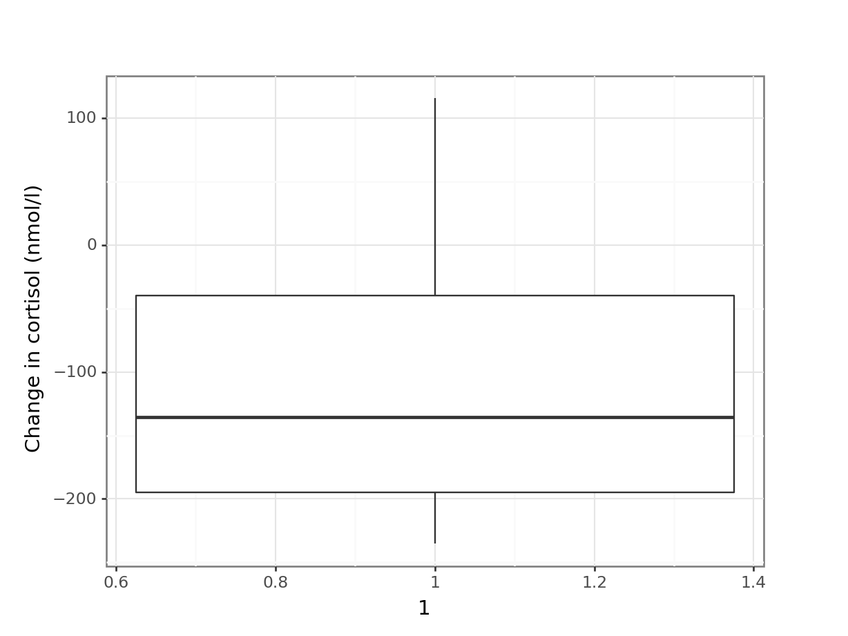
The differences in cortisol levels appear to be very much less than zero, meaning that the evening cortisol levels appear to be much lower than the morning ones. As such we would expect that the test would give a pretty significant result.
An alternative representation would be to plot the data points for both evening and morning and connect them by patient:
# plot cortisol levels by patient
(ggplot(cortisol_py,
        aes(x = "time",
            y = "cortisol",
            group = "patient_id")) +
     geom_point() +
     geom_line())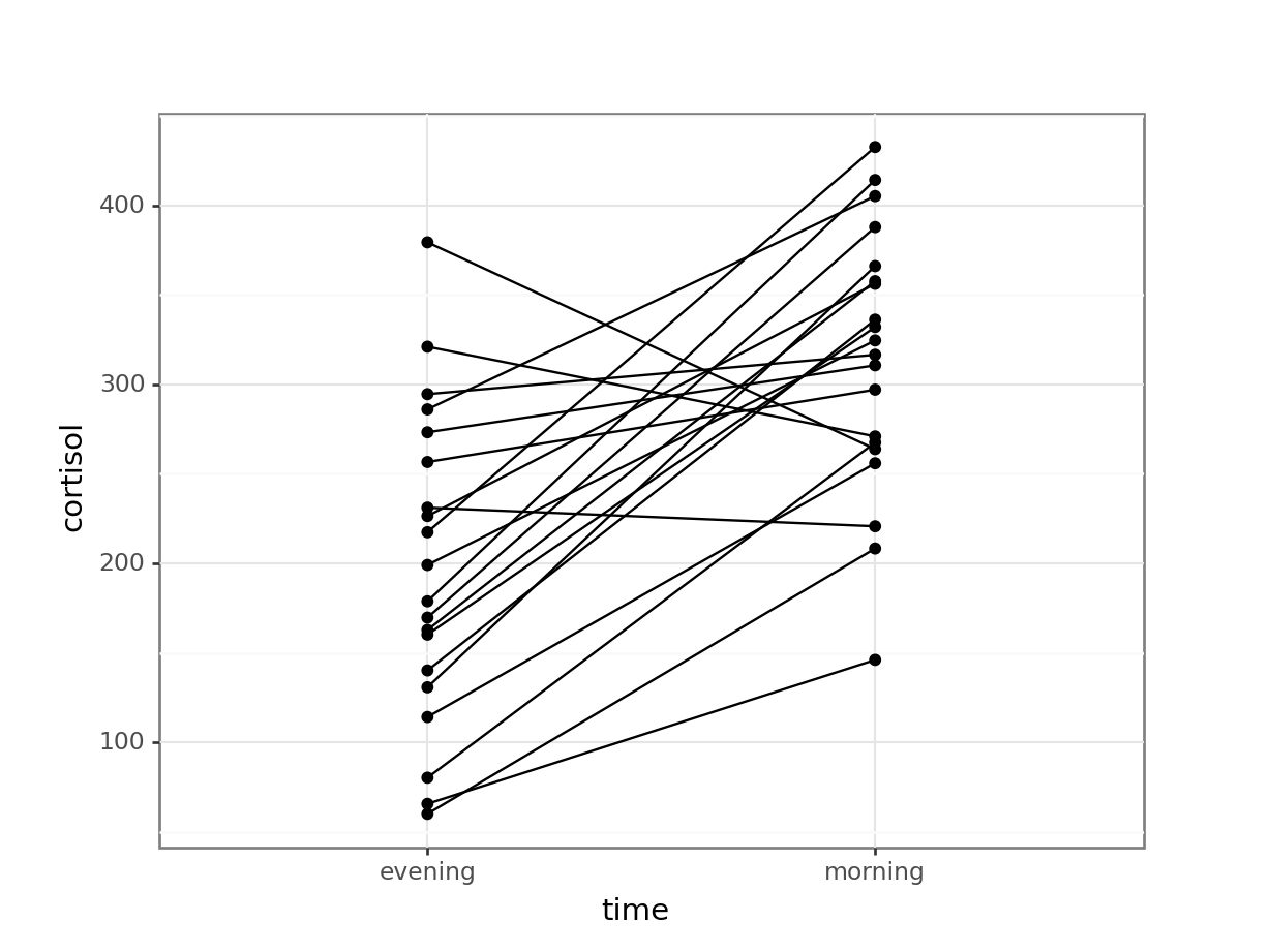
This gives a similar picture to what the boxplot was telling us, that for most patients the cortisol levels are higher in the morning than in the evening.
7.4 Assumptions
You will do this in the exercise!
7.5 Implement and interpret the test
Perform a two-sample, two-tailed, paired t-test:
# perform the test
t.test(cortisol ~ time,
       alternative = "two.sided",
       paired = TRUE,
data = cortisol)- The first two arguments define the formula
- The third argument gives the type of alternative hypothesis and must be one of
two.sided,greaterorless - The fourth argument says that the data are paired
From our perspective the value of interest is the p-value.
To perform a paired t-test we can use the same pg.ttest() as before, but set the argument paired = True.
Annoyingly, the output is not entirely visible because the data frame is too wide. To deal with that, we can simply transpose it with transpose()
pg.ttest(cortisol_diff_py["evening"],
         cortisol_diff_py["morning"],
         alternative = "two-sided",
         paired = True).transpose()
T-test
T -5.18329
dof 19
alternative two-sided
p-val 0.000053
CI95% [-162.96, -69.21]
cohen-d 1.434359
BF10 491.599
power 0.99998From our perspective the value of interest is the p-val.
Since the p-value = 5.29 \(\times\) 10-5) and thus substantially less than 0.05 we can reject the null hypothesis and state:
A two-tailed, paired t-test indicated that the average cortisol level in adult females differed significantly between the morning (313.5 nmol/l) and the evening (197.4 nmol/l, p = 5.3 * 10-5).
7.6 Dealing with non-normal data
The example above assumes that the paired data come from parent distributions that are normal. As we’ve seen before, we may have data where we can’t rely on that assumption. Fortunately, there is very little that we need to change in our approach if we want to analyse paired data that violate the assumption of normality.
As with the non-normal two-sample data, there is the underlying assumption that the parent distributions of the samples are comparable in shape and variance.
7.6.1 Data and hypotheses
Using the cortisol data from before we form the following null and alternative hypotheses:
- \(H_0\): The median of the difference in cortisol levels between the two groups is 0 \((\mu M = \mu E)\)
- \(H_1\): The median of the difference in cortisol levels between the two groups is not 0 \((\mu M \neq \mu E)\)
We use a two-tailed Wilcoxon signed rank test to see if we can reject the null hypothesis.
7.6.2 Summarise and visualise
Already implemented previously.
7.6.3 Assumptions
These have been checked previously.
7.6.4 Implement and interpret the test
Perform a two-tailed, Wilcoxon signed rank test:
wilcox.test(cortisol ~ time,
            alternative = "two.sided",
            paired = TRUE,
            data = cortisol)
    Wilcoxon signed rank exact test

data:  cortisol by time
V = 13, p-value = 0.0001678
alternative hypothesis: true location shift is not equal to 0- The first argument gives the formula
- The second argument gives the type of alternative hypothesis and must be one of
two.sided,greaterorless - The third argument indicates that the test is paired
- The last argument is the data set
We’ll use the wide format data set that we created previously:
pg.wilcoxon(x = cortisol_diff_py["evening"],
            y = cortisol_diff_py["morning"],
            alternative = "two-sided",
            correction = True)
W-val alternative p-val RBC CLES
Wilcoxon 13.0 two-sided 0.000168 -0.87619 0.16The p-value is given in the p column (p-value = 0.000168). Given that this is less than 0.05 we can still reject the null hypothesis.
A two-tailed, Wilcoxon signed rank test indicated that the median cortisol level in adult females differed significantly between the morning (320.5 nmol/l) and the evening (188.9 nmol/l, p = 0.00017).
7.7 Exercises
7.7.1 Cortisol levels
7.7.2 Deer legs
7.8 Summary
- Paired t-tests are used when you have two paired samples of continuous data, which are normally distributed and have equal variance
- A good way of assessing the assumption of normality is by checking the data against a Q-Q plot
- We can check equality of variance (homoscedasticity) with Bartlett’s (normal data) or Levene’s (non-normal data) test
- The Wilcoxon signed rank test is used when you have two paired samples of continuous data, which are not normally distributed (but have comparable distributional shapes), and have equal variance.
