# Load required R libraries
library(tidyverse)
library(broom)

# Read in the required data
challenger_data <- read_csv("data/challenger.csv")8 Proportional response
Learning outcomes
- Be able to analyse proportional response variables
- Be able to create a logistic model to test proportional response variables
- Be able to plot the data and fitted curve
8.1 Context
In the previous section, we explored how logistic regression can be used to model binary outcomes. We can extend this approach to proportional outcomes — situations where we count how many times an event occurs out of a fixed number of trials (for example, the number of successes out of 10 attempts).
In this section, we illustrate how to model proportional data using logistic regression, using the well-known Challenger dataset as an example.
8.2 Section setup
Click to expand
We’ll use the following libraries and data:
# Load required Python libraries
import pandas as pd
import math
import statsmodels.api as sm
import statsmodels.formula.api as smf
from scipy.stats import *
from plotnine import *

# Read in the required data
challenger_data = pd.read_csv("data/challenger.csv")
8.3 The Challenger dataset
The example in this section uses the challenger data. These data, obtained from the faraway package in R, contain information related to the explosion of the space shuttle Challenger on 28 January, 1986. An investigation traced the probable cause back to certain joints on one of the two solid booster rockets, each containing six O-rings that ensured no exhaust gases could escape from the booster.
The night before the launch was unusually cold, with temperatures below freezing. The final report suggested that the cold snap during the night made the o-rings stiff and unable to adjust to changes in pressure - leading to a proportion of them failing during launch. As a result, exhaust gases leaked away from the solid booster rockets, causing one of them to break loose and rupture the main fuel tank, leading to the final explosion.
The question we’re trying to answer in this session is: based on the data from the previous flights, would it have been possible to predict the failure of most o-rings on the Challenger flight?
8.4 Load and visualise the data
First we load the data, then we visualise it.
challenger <- read_csv("data/challenger.csv")Rows: 23 Columns: 2
── Column specification ────────────────────────────────────────────────────────
Delimiter: ","
dbl (2): temp, damage
ℹ Use `spec()` to retrieve the full column specification for this data.
ℹ Specify the column types or set `show_col_types = FALSE` to quiet this message.challenger_py = pd.read_csv("data/challenger.csv")The data set contains several columns:
temp, the launch temperature in degrees Fahrenheitdamage, the number of o-rings that showed erosion
Before we have a further look at the data, let’s calculate the proportion of damaged o-rings (prop_damaged) and the total number of o-rings (total) and update our data set.
challenger <-
challenger |>
  mutate(total = 6,                     # total number of o-rings
         intact = 6 - damage,           # number of undamaged o-rings
         prop_damaged = damage / total) # proportion damaged o-rings

challenger
# A tibble: 23 × 5
temp damage total intact prop_damaged
<dbl> <dbl> <dbl> <dbl> <dbl>
1 53 5 6 1 0.833
2 57 1 6 5 0.167
3 58 1 6 5 0.167
4 63 1 6 5 0.167
5 66 0 6 6 0
6 67 0 6 6 0
7 67 0 6 6 0
8 67 0 6 6 0
9 68 0 6 6 0
10 69 0 6 6 0
# ℹ 13 more rowschallenger_py['total'] = 6
challenger_py['intact'] = challenger_py['total'] - challenger_py['damage']
challenger_py['prop_damaged'] = challenger_py['damage'] / challenger_py['total']Plotting the proportion of damaged o-rings against the launch temperature shows the following picture:
ggplot(challenger, aes(x = temp, y = prop_damaged)) +
  geom_point()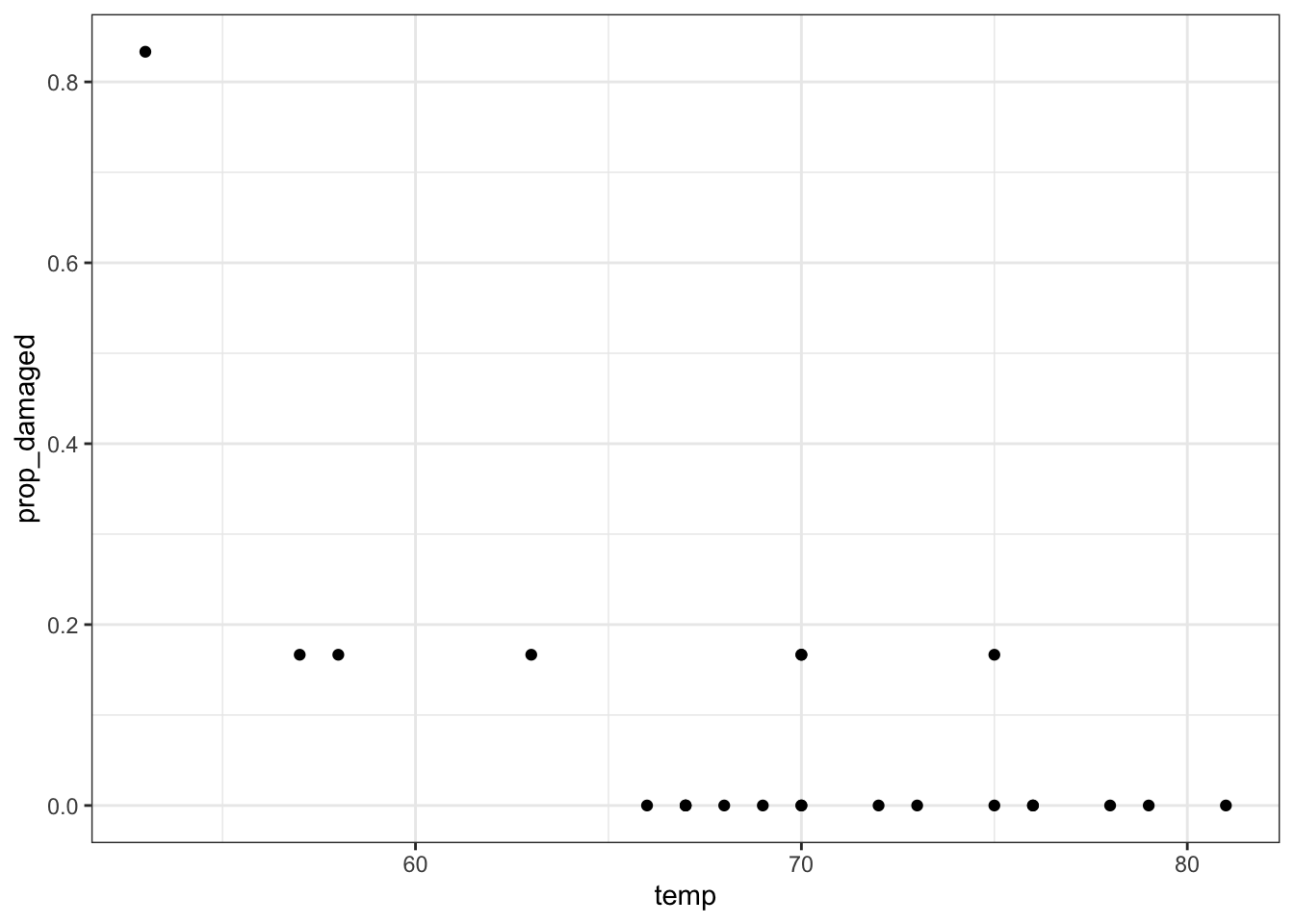
p = (ggplot(challenger_py,
         aes(x = "temp",
             y = "prop_damaged")) +
     geom_point())

p.show()
The point on the left is the data point corresponding to the coldest flight experienced before the disaster, where five damaged o-rings were found. Fortunately, this did not result in a disaster.
Here we’ll explore if we could have reasonably predicted the failure of both o-rings on the Challenger flight, where the launch temperature was 31 degrees Fahrenheit.
8.5 Creating a suitable model
We only have 23 data points in total. So we’re building a model on not that much data - we should keep this in mind when we draw our conclusions!
We are using a logistic regression for a proportion response in this case, since we’re interested in the proportion of o-rings that are damaged.
We can define this as follows:
glm_chl <- glm(cbind(damage, intact) ~ temp,
               family = binomial,
               data = challenger)
Defining the relationship for proportion responses is a bit annoying, where you have to give the glm model a two-column matrix to specify the response variable.
Here, the first column corresponds to the number of damaged o-rings, whereas the second column refers to the number of intact o-rings. We use the cbind() function to bind these two together into a matrix.
# create a generalised linear model
model = smf.glm(formula = "damage + intact ~ temp",
                family = sm.families.Binomial(),
                data = challenger_py)
# and get the fitted parameters of the model
glm_chl_py = model.fit()
If we’re using the original observations, we need to supply both the number of damaged o-rings and the number of intact ones.
Why don’t we use
prop_damaged as our response variable?
You might have noticed that when we write our model formula, we are specifically writing cbind(damage, intact) (R) or damage + intact (Python), instead of the prop_damaged variable we used for plotting.
This is very deliberate - it’s absolutely essential we do this, in order to fit the correct model.
When modelling our data, we need to provide the function with both the number of successes (damaged o-rings) and the number of failures (intact o-rings) - and therefore, implicitly, the total number of o-rings - in order to properly model our proportional variable.
If we provide it with just the prop_damaged, then R/Python will incorrectly think our response variable is fractional.
A fractional variable is not constructed from a series of trials with successes/failures. It doesn’t have trials - there’s just a single value somewhere between 0 and 1 (or a percentage). An example of a fractional response variable might be what percentage of rocket fuel was used on a launch. We would not model this response variable with a logistic regression.
8.6 Model output
That’s the easy part done! The trickier part is interpreting the output. First of all, we’ll get some summary information.
Next, we can have a closer look at the results:
summary(glm_chl)
Call:
glm(formula = cbind(damage, intact) ~ temp, family = binomial,
    data = challenger)

Coefficients:
            Estimate Std. Error z value Pr(>|z|)
(Intercept) 11.66299    3.29626   3.538 0.000403 ***
temp        -0.21623    0.05318  -4.066 4.78e-05 ***
---
Signif. codes:  0 '***' 0.001 '**' 0.01 '*' 0.05 '.' 0.1 ' ' 1

(Dispersion parameter for binomial family taken to be 1)

    Null deviance: 38.898  on 22  degrees of freedom
Residual deviance: 16.912  on 21  degrees of freedom
AIC: 33.675

Number of Fisher Scoring iterations: 6
We can see that the p-values of the intercept and temp are significant. We can also use the intercept and temp coefficients to construct the logistic equation, which we can use to sketch the logistic curve.
print(glm_chl_py.summary()) Generalized Linear Model Regression Results
================================================================================
Dep. Variable: ['damage', 'intact'] No. Observations: 23
Model: GLM Df Residuals: 21
Model Family: Binomial Df Model: 1
Link Function: Logit Scale: 1.0000
Method: IRLS Log-Likelihood: -14.837
Date: Fri, 25 Jul 2025 Deviance: 16.912
Time: 08:49:44 Pearson chi2: 28.1
No. Iterations: 7 Pseudo R-squ. (CS): 0.6155
Covariance Type: nonrobust
==============================================================================
coef std err z P>|z| [0.025 0.975]
------------------------------------------------------------------------------
Intercept 11.6630 3.296 3.538 0.000 5.202 18.124
temp -0.2162 0.053 -4.066 0.000 -0.320 -0.112
==============================================================================\[E(prop \ failed\ orings) = \frac{\exp{(11.66 - 0.22 \times temp)}}{1 + \exp{(11.66 - 0.22 \times temp)}}\]
Let’s see how well our model would have performed if we would have fed it the data from the ill-fated Challenger launch.
ggplot(challenger, aes(temp, prop_damaged)) +
  geom_point() +
  geom_smooth(method = "glm", se = FALSE, fullrange = TRUE,
              method.args = list(family = binomial)) +
  xlim(25,85)
Warning in eval(family$initialize): non-integer #successes in a binomial glm!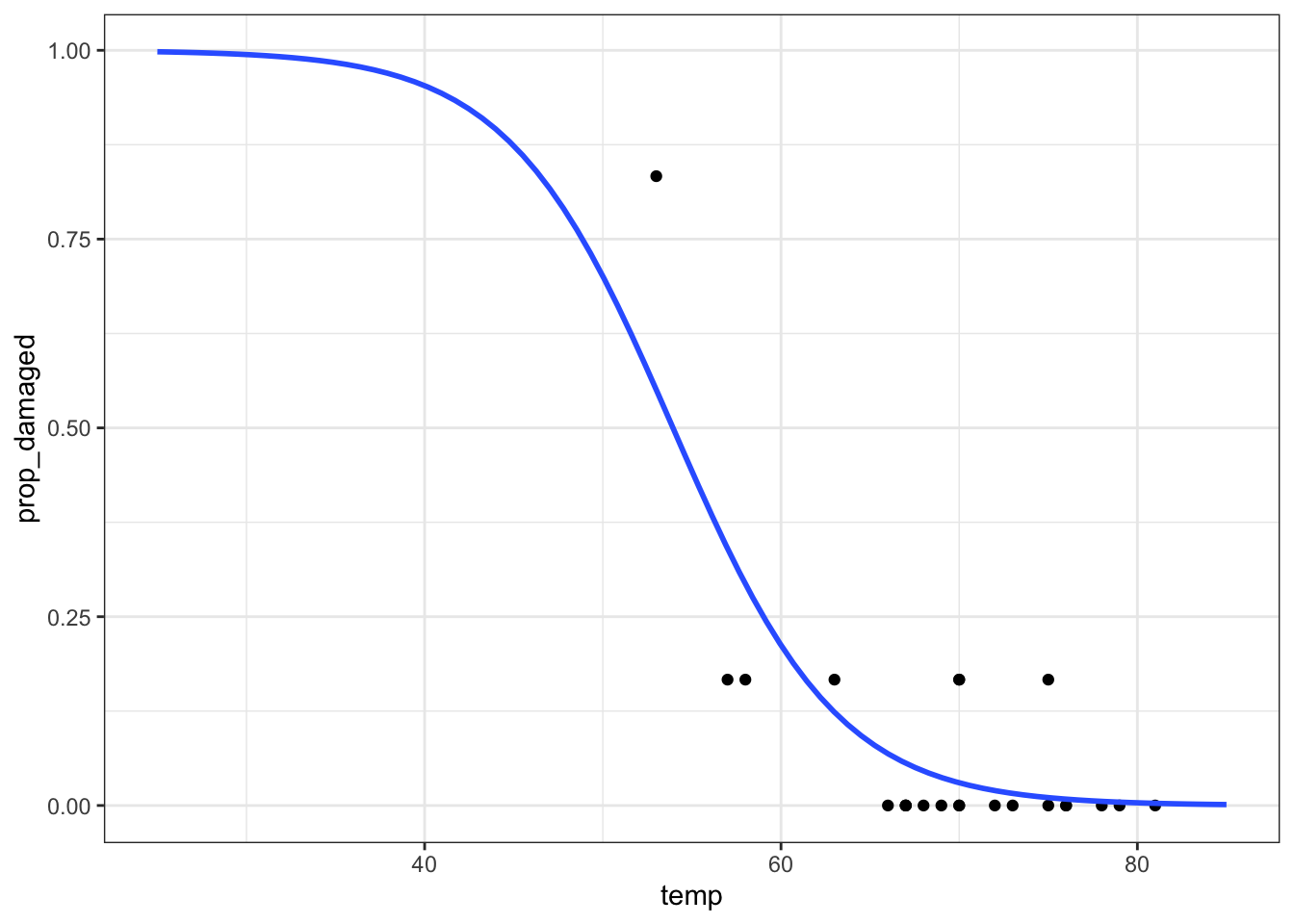
We get the warning Warning in eval(family$initialize): non-integer #successes in a binomial glm!. This is because we’re feeding a proportion value between 0 and 1 to a binomial GLM. What it is expecting is the number of successes out of a fixed number of trials. See the explanation above for more information. We’ll revisit this later!
We can get the predicted values for the model as follows:
challenger_py['predicted_values'] = glm_chl_py.predict()

challenger_py.head()
temp damage total intact prop_damaged predicted_values
0 53 5 6 1 0.833333 0.550479
1 57 1 6 5 0.166667 0.340217
2 58 1 6 5 0.166667 0.293476
3 63 1 6 5 0.166667 0.123496
4 66 0 6 6 0.000000 0.068598This would only give us the predicted values for the data we already have. Instead we want to extrapolate to what would have been predicted for a wider range of temperatures. Here, we use a range of \([25, 85]\) degrees Fahrenheit.
model = pd.DataFrame({'temp': list(range(25, 86))})

model["pred"] = glm_chl_py.predict(model)

model.head()
temp pred
0 25 0.998087
1 26 0.997626
2 27 0.997055
3 28 0.996347
4 29 0.995469p = (ggplot(challenger_py,
aes(x = "temp",
y = "prop_damaged")) +
geom_point() +
geom_line(model, aes(x = "temp", y = "pred"), colour = "blue", size = 1))
p.show()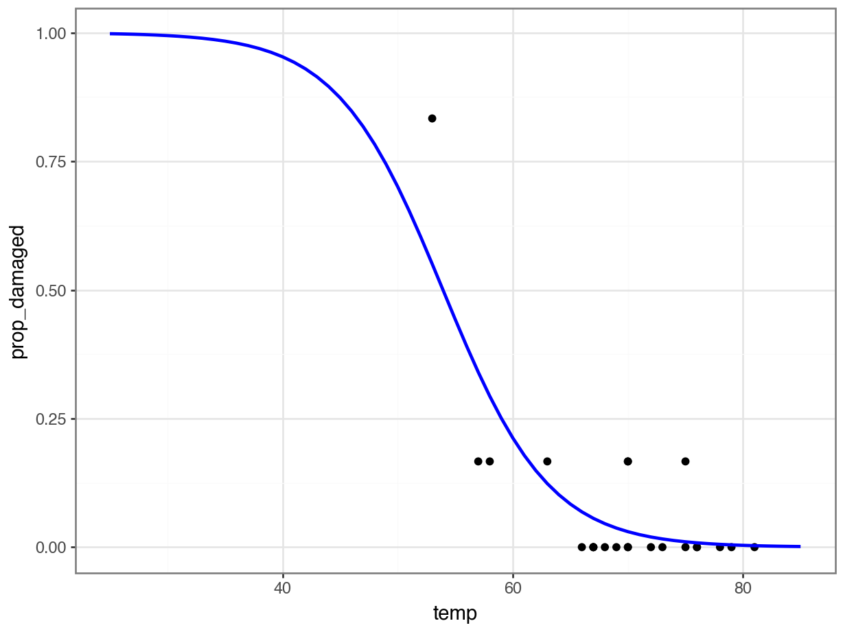
Generating predicted values
Another way of doing this it to generate a table with data for a range of temperatures, from 25 to 85 degrees Fahrenheit, in steps of 1. We can then use these data to generate the logistic curve, based on the fitted model.
# create a table with sequential numbers ranging from 25 to 85
new_data <- tibble(temp = seq(25, 85, by = 1))

model <- new_data |>
  # add a new column containing the predicted values
  mutate(.pred = predict(glm_chl, newdata = new_data, type = "response"))

ggplot(model, aes(temp, .pred)) +
  geom_line()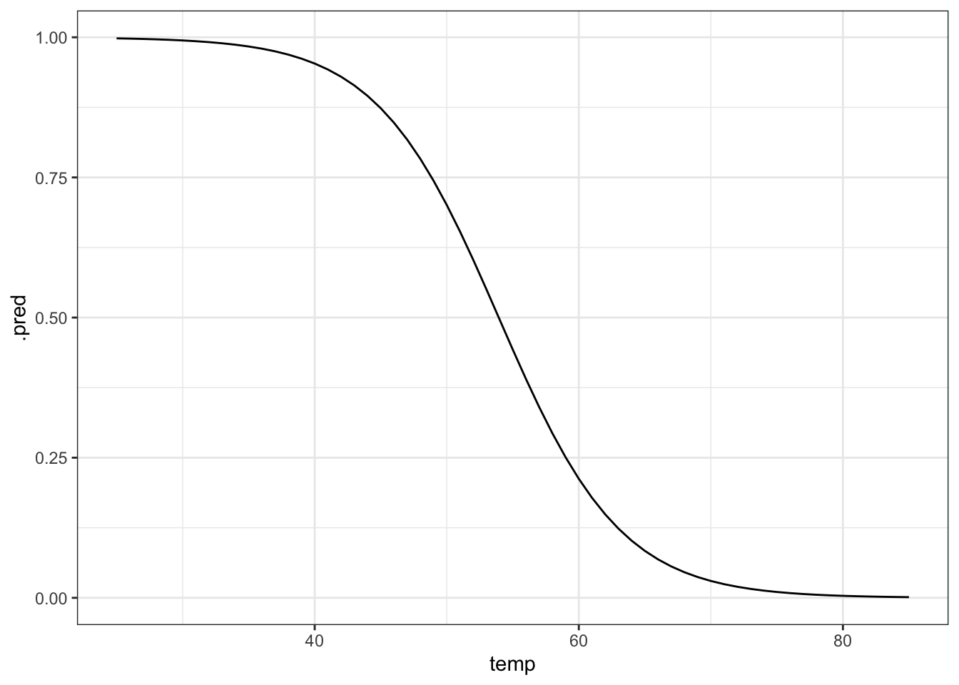
# plot the curve and the original data
ggplot(model, aes(temp, .pred)) +
  geom_line(colour = "blue") +
  geom_point(data = challenger, aes(temp, prop_damaged)) +
  # add a vertical line at the disaster launch temperature
  geom_vline(xintercept = 31, linetype = "dashed")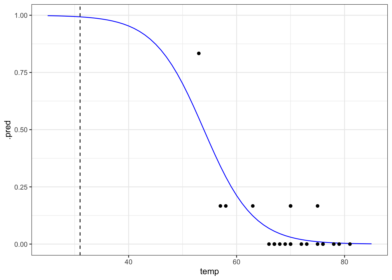
It seems that there was a high probability of both o-rings failing at that launch temperature. One thing that the graph shows is that there is a lot of uncertainty involved in this model. We can tell, because the fit of the line is very poor at the lower temperature range. There is just very little data to work on, with the data point at 53 F having a large influence on the fit.
We already did this above, since this is the most straightforward way of plotting the model in Python.
8.7 Exercises
8.7.1 Rats and levers
Exercise 1 - Rats and levers
Level:
This exercises uses the dataset levers.csv.
These data are from a simple animal behavioural experiment. Prior to testing, rats were trained to press levers for food rewards. On each trial, there were two levers, and the “correct” lever is determined by an audio cue.
The rats could vary in three different ways, which may impact their task performance at testing:
- The
sexof the rat - The
ageof the rat (in weeks) - Whether the rat experienced
stressduring the training phase (being exposed to the smell of a predator)
The researcher thinks that the effect of stress may differ between male and female rats.
In this exercise:
- Visualise these data
- Fit a model that captures the researcher’s hypotheses
Answer
Load and visualise
levers <- read_csv("data/levers.csv")

head(levers)
# A tibble: 6 × 7
rat_id stress_type sex rat_age trials correct_presses prop_correct
<dbl> <chr> <chr> <dbl> <dbl> <dbl> <dbl>
1 1 control female 13 20 7 0.35
2 2 control female 15 20 11 0.55
3 3 control female 11 20 5 0.25
4 4 control female 15 20 5 0.25
5 5 stressed female 13 20 8 0.4
6 6 stressed male 14 20 8 0.4 levers = pd.read_csv("data/levers.csv")
levers.head() rat_id stress_type sex rat_age trials correct_presses prop_correct
0 1 control female 13 20 7 0.35
1 2 control female 15 20 11 0.55
2 3 control female 11 20 5 0.25
3 4 control female 15 20 5 0.25
4 5 stressed female 13 20 8 0.40We can see that this dataset contains quite a few columns. Key ones to pay attention to:
trials; the total number of trials per rat - we’re going to need this when fitting our modelcorrect_presses; the number of successes (out of the total number of trials) - again, we’ll need this for model fittingprop_correct; this is \(successes/total\), which we’ll use for plotting but not model fitting
ggplot(levers, aes(x = rat_age,
                   y = prop_correct,
                   colour = sex)) +
  facet_wrap(~ stress_type) +
  geom_point()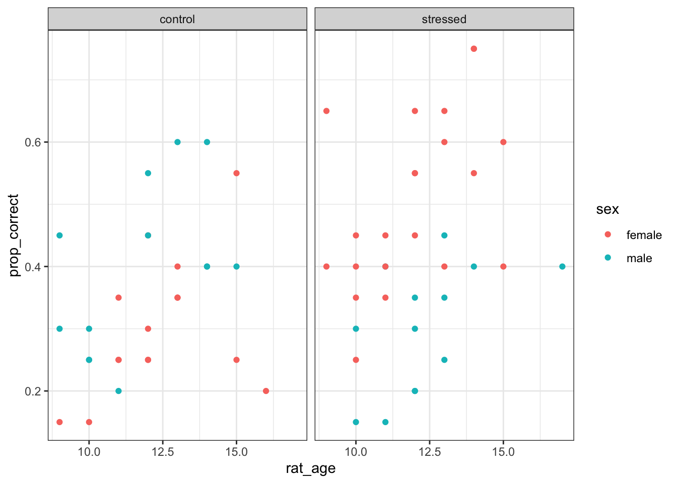
(
  ggplot(levers, aes(x='rat_age', y='prop_correct', colour='sex')) +
  geom_point() +
  facet_wrap('~stress_type')
)
<plotnine.ggplot.ggplot object at 0x17ad0f950>There’s some visual evidence of an interaction here. In the control group, it seems like older rats perform a little better on the task, but there’s not much effect of sex.
Meanwhile, in the stressed group, the female rats seem to be performing better than the male ones.
Fit a model
Let’s assess those relationships by fitting a logistic model.
# Create a new variable for the number of incorrect presses
levers <- levers |>
  mutate(incorrect_presses = trials - correct_presses)

# Fit the model
glm_lev <- glm(cbind(correct_presses, incorrect_presses) ~ stress_type * sex + rat_age,
               family = binomial,
               data = levers)
# Create a new variable for the number of incorrect presses
levers['incorrect_presses'] = levers['trials'] - levers['correct_presses']
model = smf.glm(formula = "correct_presses + incorrect_presses ~ stress_type * sex + rat_age",
family = sm.families.Binomial(),
data = levers)
glm_lev = model.fit()Make model predictions
Using this model, let’s make a prediction of the expected proportion of correct lever presses for:
- a male rat
- 8 weeks old
- in the stressed condition
First, we look at a summary of the model to extract the beta coefficients we need.
summary(glm_lev)
Call:
glm(formula = cbind(correct_presses, incorrect_presses) ~ stress_type *
    sex + rat_age, family = binomial, data = levers)

Coefficients:
                            Estimate Std. Error z value Pr(>|z|)
(Intercept)                 -2.51920    0.41956  -6.004 1.92e-09 ***
stress_typestressed          0.93649    0.16166   5.793 6.92e-09 ***
sexmale                      0.50633    0.18125   2.794  0.00521 **
rat_age                      0.13458    0.03197   4.210 2.56e-05 ***
stress_typestressed:sexmale -1.43779    0.24921  -5.769 7.96e-09 ***
---
Signif. codes:  0 '***' 0.001 '**' 0.01 '*' 0.05 '.' 0.1 ' ' 1

(Dispersion parameter for binomial family taken to be 1)

    Null deviance: 120.646  on 61  degrees of freedom
Residual deviance:  60.331  on 57  degrees of freedom
AIC: 275.8

Number of Fisher Scoring iterations: 4print(glm_lev.summary()) Generalized Linear Model Regression Results
====================================================================================================
Dep. Variable: ['correct_presses', 'incorrect_presses'] No. Observations: 62
Model: GLM Df Residuals: 57
Model Family: Binomial Df Model: 4
Link Function: Logit Scale: 1.0000
Method: IRLS Log-Likelihood: -132.90
Date: Fri, 25 Jul 2025 Deviance: 60.331
Time: 08:49:45 Pearson chi2: 59.5
No. Iterations: 4 Pseudo R-squ. (CS): 0.6220
Covariance Type: nonrobust
=======================================================================================================
coef std err z P>|z| [0.025 0.975]
-------------------------------------------------------------------------------------------------------
Intercept -2.5192 0.420 -6.004 0.000 -3.342 -1.697
stress_type[T.stressed] 0.9365 0.162 5.793 0.000 0.620 1.253
sex[T.male] 0.5063 0.181 2.794 0.005 0.151 0.862
stress_type[T.stressed]:sex[T.male] -1.4378 0.249 -5.769 0.000 -1.926 -0.949
rat_age 0.1346 0.032 4.210 0.000 0.072 0.197
=======================================================================================================lin_pred <- -2.519 +
0.937 * 1 + # 1 for stressed
0.506 * 1 + # 1 for male
-1.438 * 1 + # 1 for stressed:male
0.135 * 8 # 8 weeks old
# these will give identical results
exp(lin_pred) / (1 + exp(lin_pred))[1] 0.19247621 / (1 + exp(-lin_pred))[1] 0.1924762lin_pred = (-2.519 +
0.937 * 1 + # 1 for stressed
0.506 * 1 + # 1 for male
-1.438 * 1 + # 1 for stressed:male
0.135 * 8) # 8 weeks old
# these will give identical results
math.exp(lin_pred) / (1 + math.exp(lin_pred))0.192476202895035751 / (1 + math.exp(-lin_pred))0.19247620289503575This means we would expect an 8 week old stressed male rat to make approximately 19% correct button presses, on average.
Visualising glm_lev
This is not part of the exercise - it involves quite a bit of new code - but it’s something you might want to do with your own data, so we’ll show it here.
With multiple predictors, you will have multiple logistic curves. What do they look like, and how can you produce them?
The first thing we do is create a grid covering all the levels of our categorical predictor, and the full range of available values we have for the continuous predictor.
# Create prediction grid
new_data <- expand.grid(stress_type = levels(factor(levers$stress_type)),
                        sex = levels(factor(levers$sex)),
                        rat_age = seq(min(levers$rat_age), max(levers$rat_age), length.out = 100))

head(new_data)
stress_type sex rat_age
1 control female 9.000000
2 stressed female 9.000000
3 control male 9.000000
4 stressed male 9.000000
5 control female 9.080808
6 stressed female 9.080808Then, we use the predict function to figure out the expected proportion of correct responses at each combination of predictors that exists in that grid.
# Predict proportion of correct responses
new_data$predicted_prob <- predict(glm_lev, newdata = new_data, type = "response")
We can now use this grid of predictions to produce some nice lines, on top of the actual data points.
ggplot(levers, aes(x = rat_age, y = prop_correct,
                     color = stress_type, linetype = sex)) +
  geom_point() +
  geom_line(data = new_data, aes(y = predicted_prob), linewidth = 1)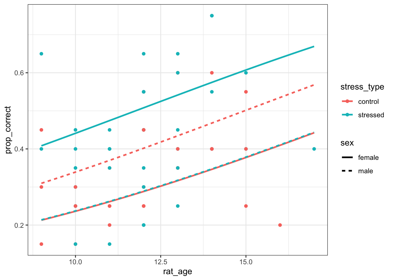
You could facet this plot further if you wanted to, but all the lines together help make the picture quite clear - we can see the interaction between stress:sex quite clearly!
The code to achieve this in Python very quickly becomes long, ugly and unwieldy.
If you’re absolutely determined to produce plots like this, you might want to use an IDE that lets you use both R and Python, and switch briefly into R for this!
8.7.2 Stem cells
Exercise 2 - Stem cells
Level:
For this exercise, you will need the dataset stemcells.csv.
There’s no worked answer for this dataset - we recommend that you compare and discuss your answer with a neighbour.
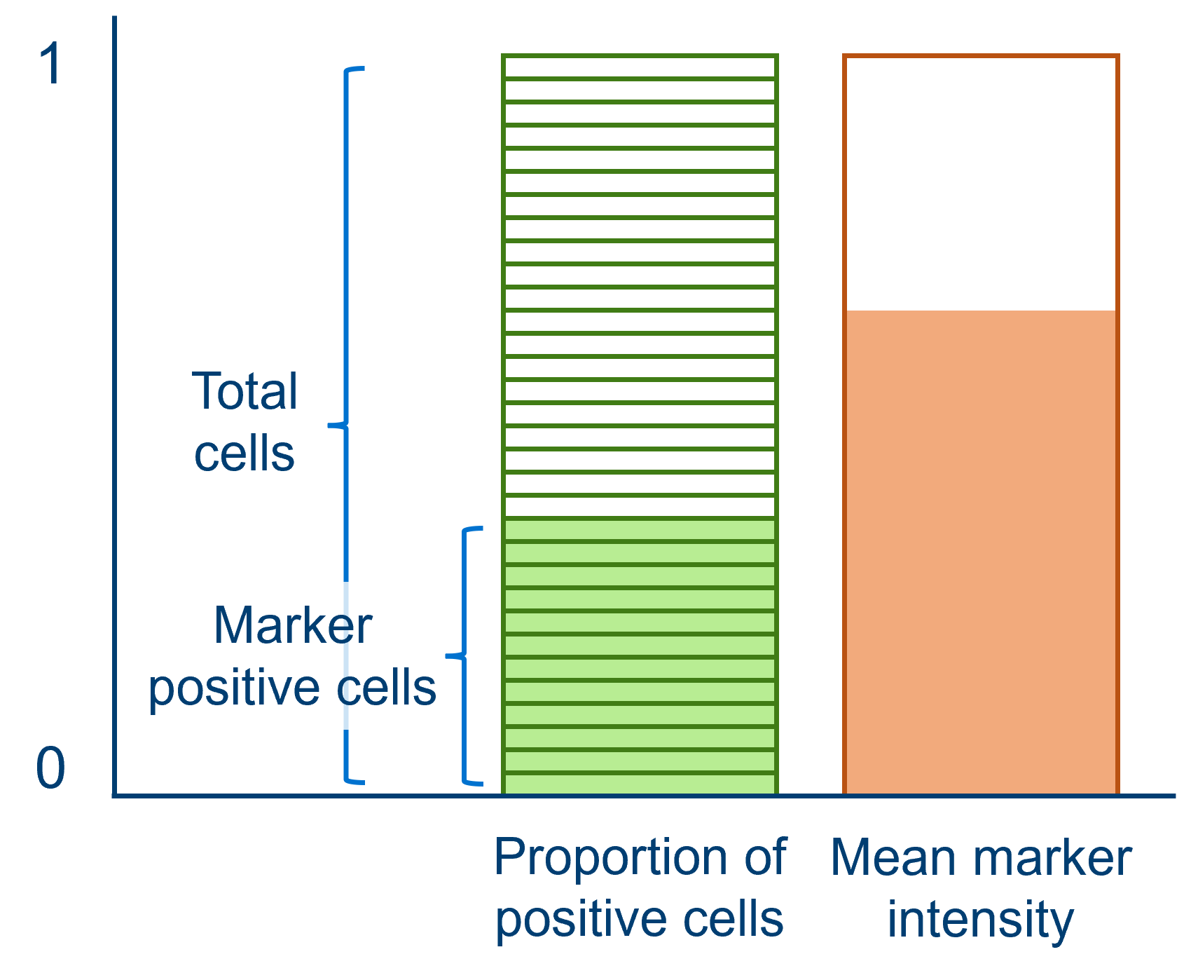
In this dataset, each row represents a unique culture or population of stem cells (a plate). Each plate is exposed to one of three different growth_factor_conc concentration levels (low, medium or high).
The researcher wanted to record how much of a particular bio-marker was being expressed in the plate, to quantify cell differentiation.
She measured this outcome in multiple ways:
marker_positive_cells, the number of cells expressing the markerprop_positive_cells, the proportion of thetotal_cellscount that have the markermean_marker_intensity, the normalised average fluorescence intensity across the plate, measured on a scale between 0 and 1
Between plates, there was also variation in the time (days) before observation. This variable should be included as a control/covariate of no interest.
You should:
- Produce a scatterplot of the data
- Decide which outcome measurement is appropriate for a logistic regression
- Fit an appropriate logistic model (with two predictor variables)
stemcells <- read_csv("data/stemcells.csv")stemcells = pd.read_csv("data/stemcells.csv")
Hint #1
Remember, you’ll need to input & combine two values to make up your response variable.
We won’t give away what those variables are (that defeats the point a bit!) but the appropriate code for fitting your logistic regression should look something like this:
glm_cells <- glm(cbind(var, var) ~ growth_factor_conc + time,
                 family = binomial,
                 data = stemcells)
model = smf.glm(formula = "var + var ~ growth_factor_conc + time",
family = sm.families.Binomial(),
data = stemcells)
glm_cells = model.fit()
Hint #2
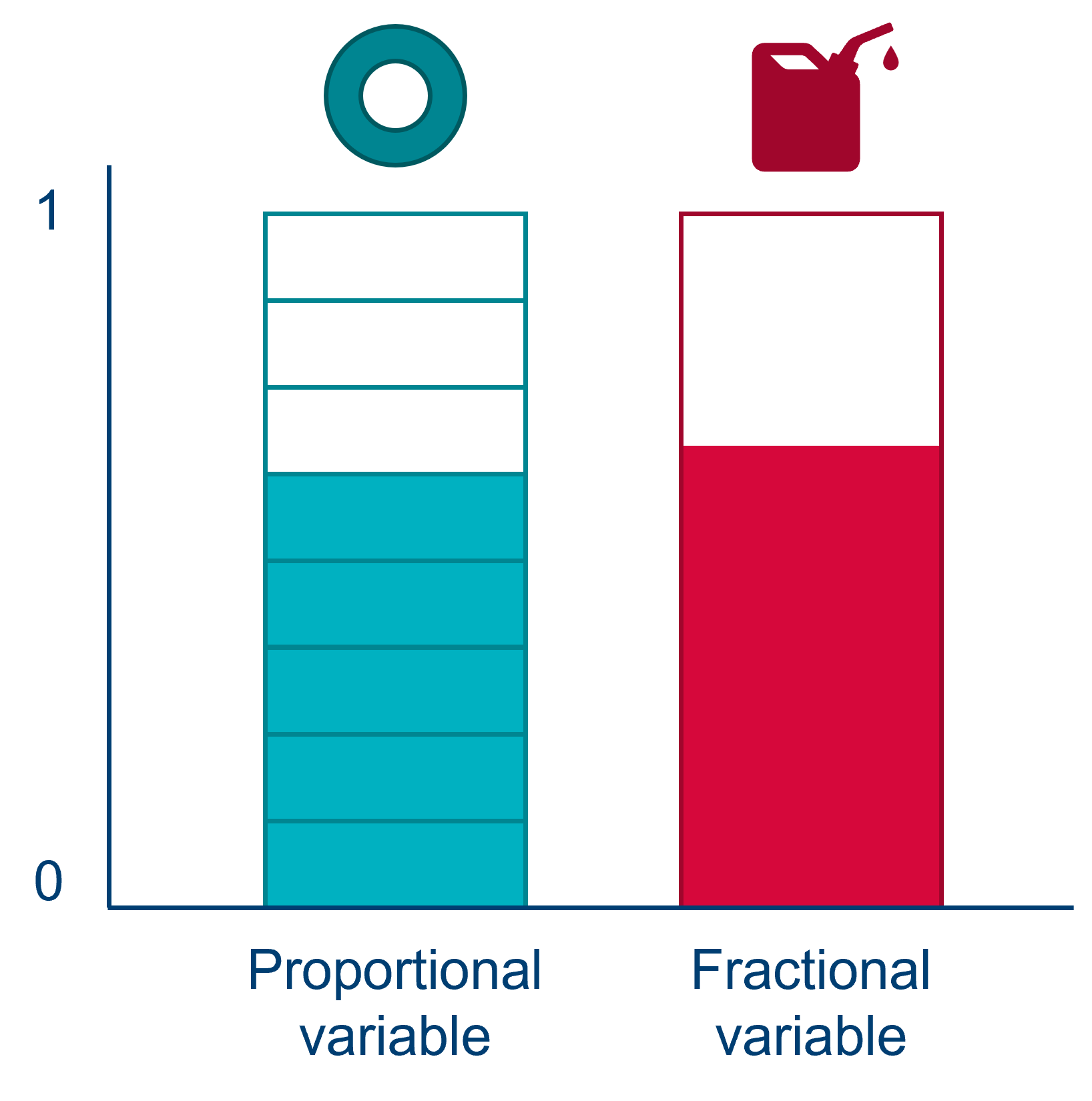
If you’re struggling to figure out which of the outcome measures capture which information, here’s a little visualisation:
8.8 Summary
Key points
- We can use a logistic model for proportional response variables, just as we did with binary variables
- Proportional response variables are made up of a number of trials (success/failure), and should not be confused with fractions/percentages
- Using the equation of a logistic model, we can predict the expected proportion of “successful” trials