# Load required R libraries
library(tidyverse)
library(broom)
library(ggResidpanel)

# Read in the required data
early_finches <- read_csv("data/finches_early.csv")
diabetes <- read_csv("data/diabetes.csv")
aphids <- read_csv("data/aphids.csv")7 Binary response
Learning outcomes
- Be able to fit an appropriate GLM binary outcome data
- Be able to make model predictions
7.1 Context
When a response variable is binary — such as success/failure, yes/no, or 0/1 — a standard linear model is not appropriate because it can produce predicted values outside the valid range of probabilities (0 to 1).
Logistic regression is a type of generalised linear model (GLM) that solves this by applying a link function. The link function transforms the probability of the outcome into a scale where a linear relationship with the predictors is appropriate.
This ensures that predictions remain valid probabilities and allows us to estimate the chance of an event occurring based on one or more explanatory variables, while respecting the structure of binary response data.
7.2 Section setup
Click to expand
We’ll use the following libraries and data:
# Load required Python libraries
import math
import pandas as pd
from plotnine import *
import statsmodels.api as sm
import statsmodels.formula.api as smf
from scipy.stats import *

# Custom function to create diagnostic plots
from dgplots import *

# Read in the required data
early_finches_py = pd.read_csv("data/finches_early.csv")
diabetes_py = pd.read_csv("data/diabetes.csv")
aphids = pd.read_csv("data/aphids.csv")
Note: you can download the dgplots script here. Ensure it’s at the same folder level of your scripts.
7.3 Finches example
The example in this section uses the finches_early data. These come from an analysis of gene flow across two finch species (Lamichhaney et al. 2020). They are slightly adapted here for illustrative purposes.
The data focus on two species, Geospiza fortis and G. scandens. The original measurements are split by a uniquely timed event: a particularly strong El Niño event in 1983. This event changed the vegetation and food supply of the finches, allowing F1 hybrids of the two species to survive, whereas before 1983 they could not. The measurements are classed as early (pre-1983) and late (1983 onwards).
Here we are looking only at the early data. We are specifically focussing on the beak shape classification, which we saw earlier in Figure 6.5. We want to predict beak shape from species and year.
7.4 Load and visualise the data
First we load the data, then we visualise it.
early_finches <- read_csv("data/finches_early.csv")early_finches_py = pd.read_csv("data/finches_early.csv")Looking at the data, we can see that the pointed_beak column contains zeros and ones. These are actually yes/no classification outcomes and not numeric representations.
We’ll have to deal with this soon. For now, we can plot the data.
ggplot(early_finches,
       aes(x = factor(pointed_beak),
          y = blength)) +
  geom_boxplot()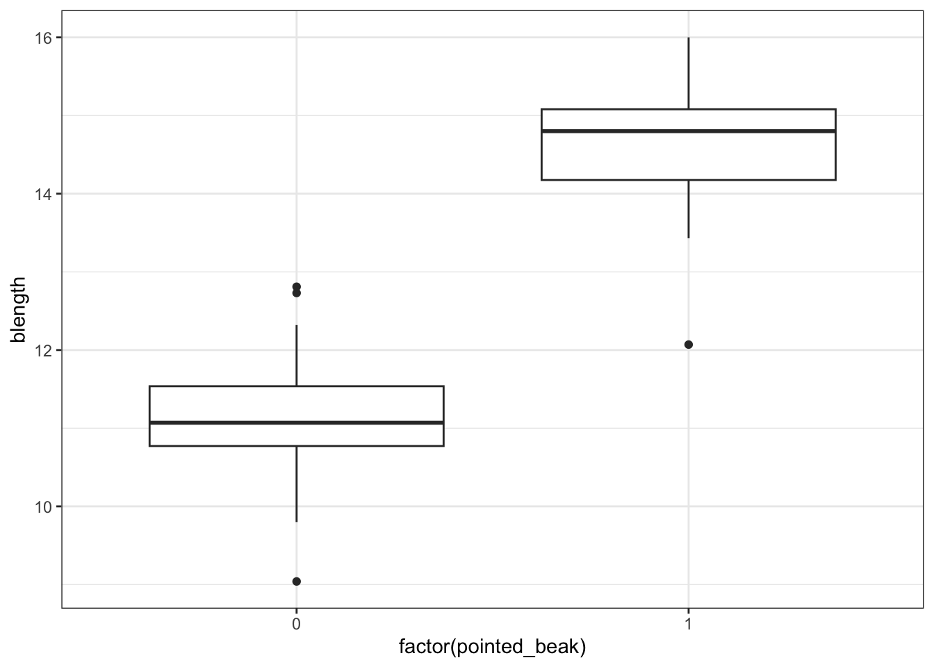
We could just give Python the pointed_beak data directly, but then it would view the values as numeric. Which doesn’t really work, because we have two groups as such: those with a pointed beak (1), and those with a blunt one (0).
We can force Python to temporarily covert the data to a factor, by making the pointed_beak column an object type. We can do this directly inside the ggplot() function.
p = (ggplot(early_finches_py,
         aes(x = early_finches_py.pointed_beak.astype(object),
             y = "blength")) +
     geom_boxplot())

p.show()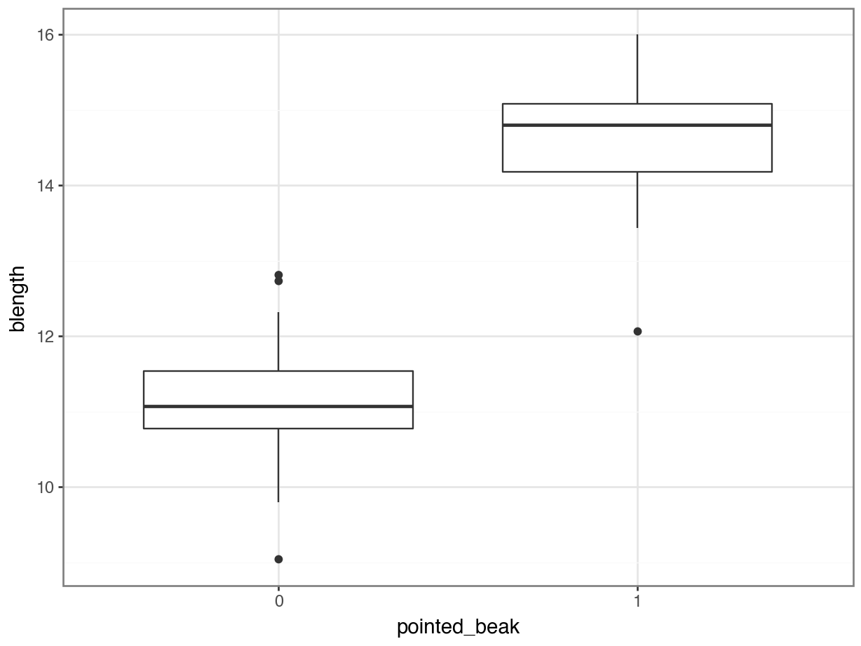
It looks as though the finches with blunt beaks generally have shorter beak lengths.
We can visualise that differently by plotting all the data points as a classic binary response plot:
ggplot(early_finches,
       aes(x = blength, y = pointed_beak)) +
  geom_point()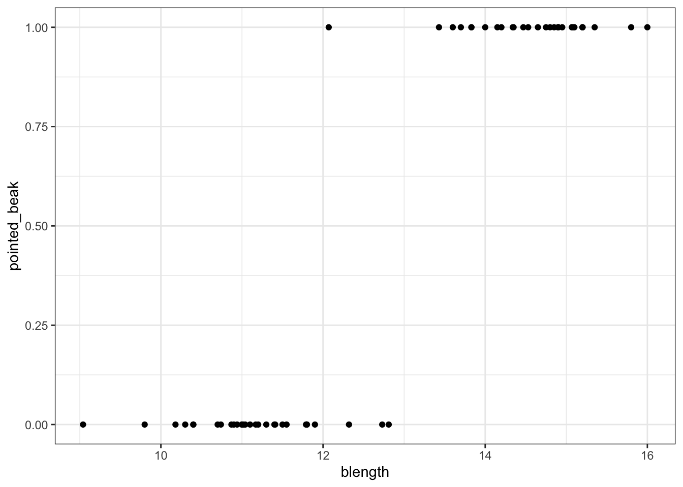
p = (ggplot(early_finches_py,
         aes(x = "blength",
             y = "pointed_beak")) +
     geom_point())

p.show()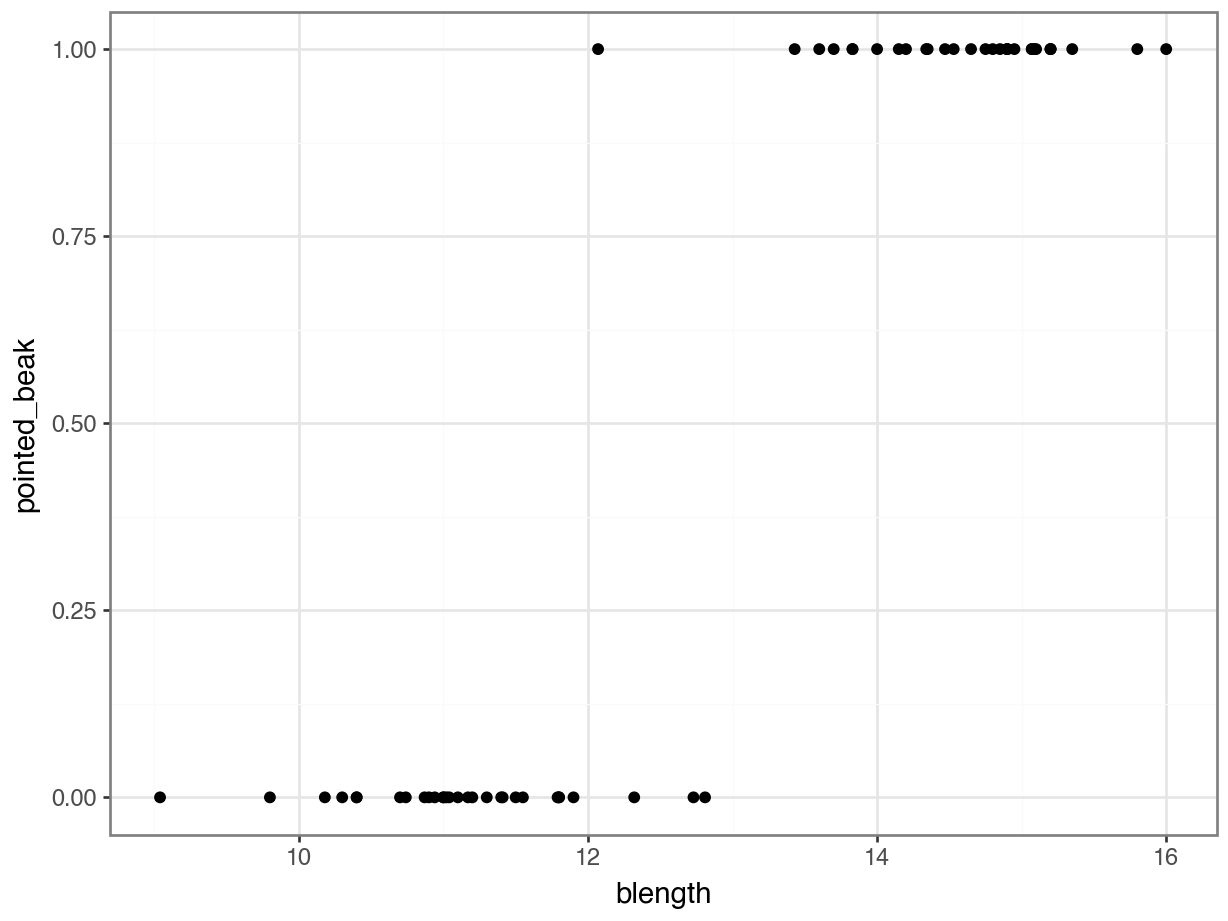
This presents us with a bit of an issue. We could fit a linear regression model to these data, although we already know that this is a bad idea…
ggplot(early_finches,
       aes(x = blength, y = pointed_beak)) +
  geom_point() +
  geom_smooth(method = "lm", se = FALSE)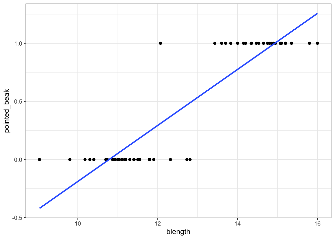
p = (ggplot(early_finches_py,
         aes(x = "blength",
             y = "pointed_beak")) +
     geom_point() +
     geom_smooth(method = "lm",
                 colour = "blue",
                 se = False))

p.show()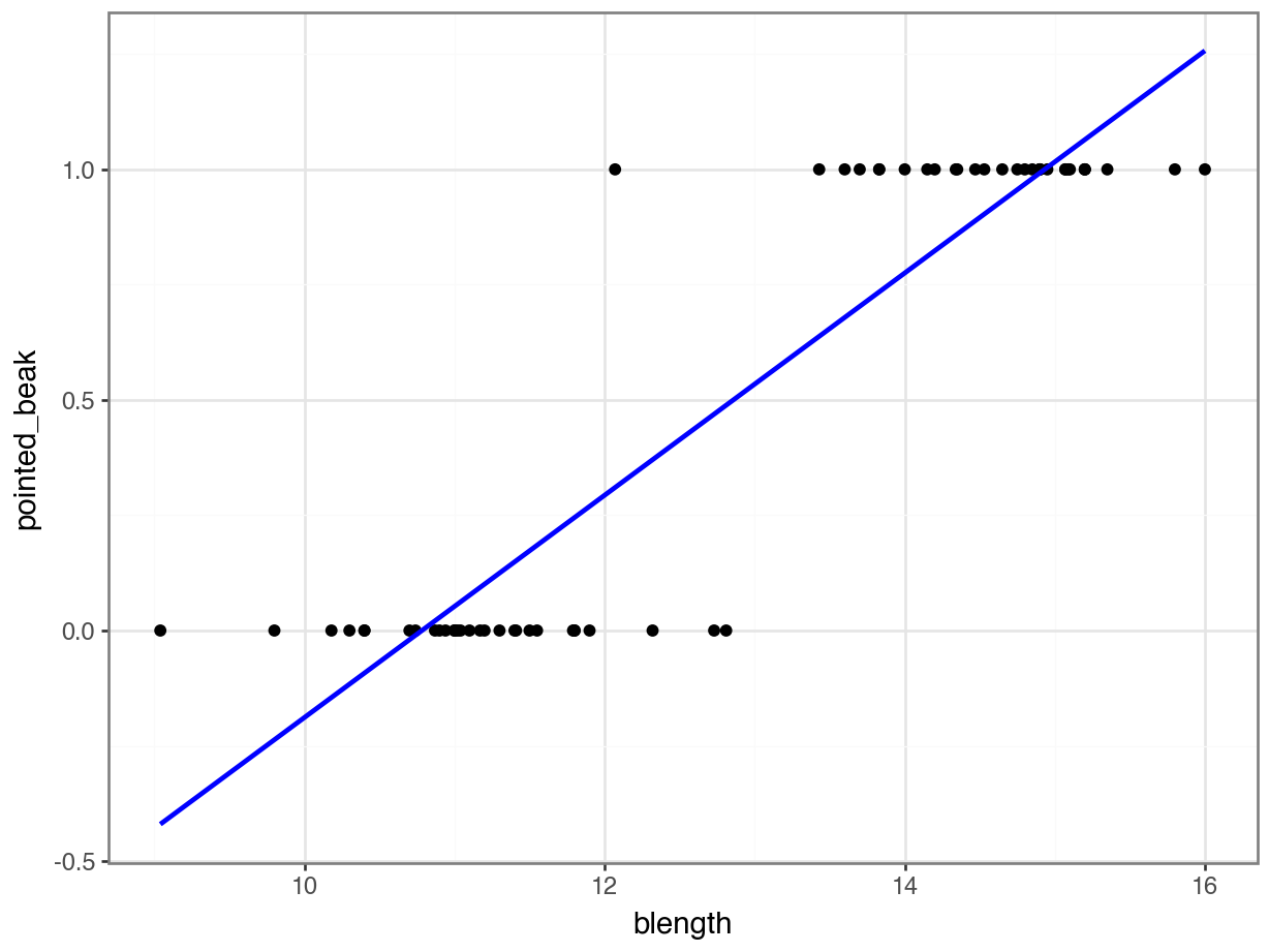
Of course this is rubbish - we can’t have a beak classification outside the range of \([0, 1]\). It’s either blunt (0) or pointed (1).
But for the sake of exploration, let’s look at the assumptions:
lm_bks <- lm(pointed_beak ~ blength,
             data = early_finches)

resid_panel(lm_bks,
            plots = c("resid", "qq", "ls", "cookd"),
            smoother = TRUE)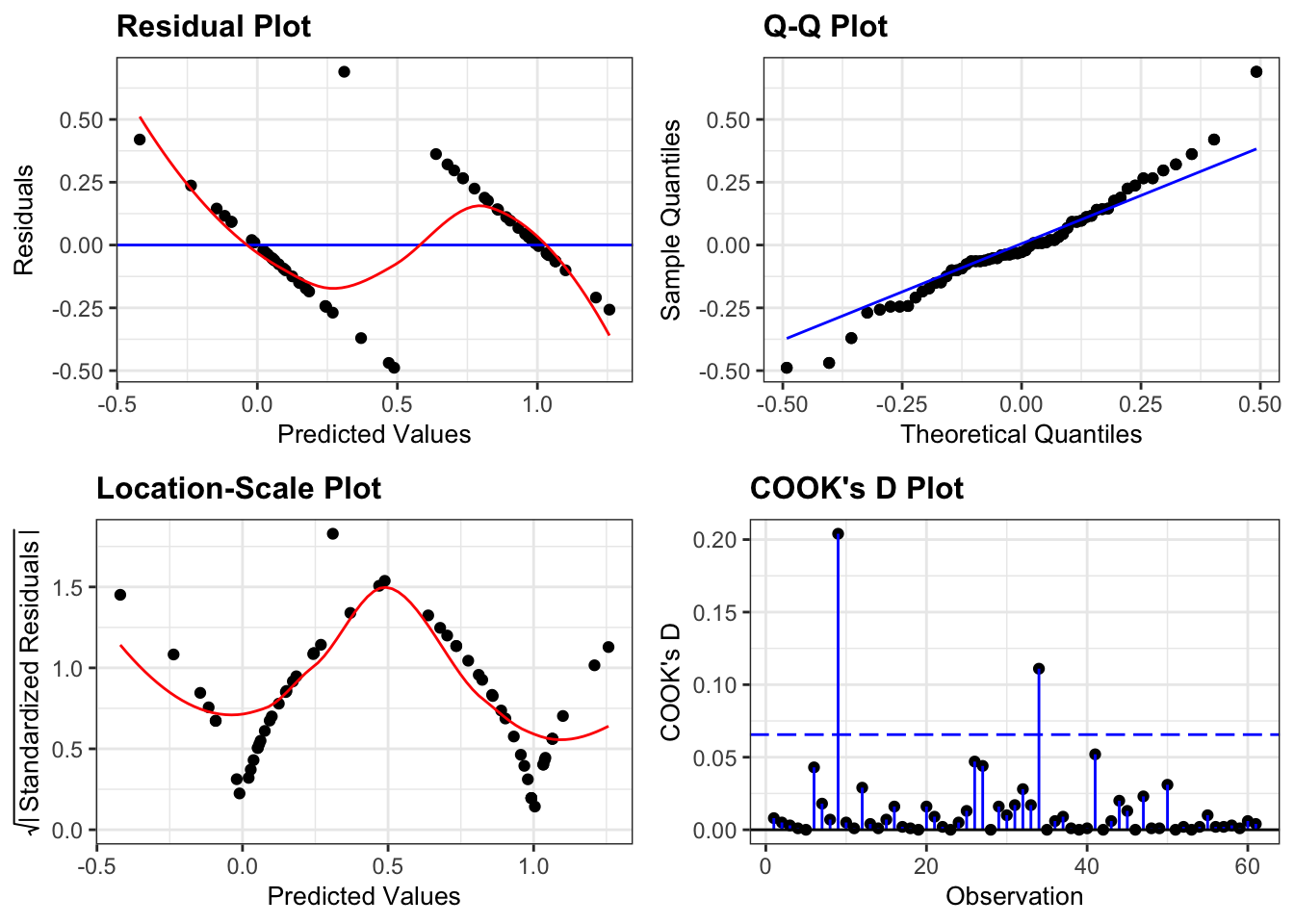
pointed_beak ~ length
First, we create a linear model:
# create a linear model
model = smf.ols(formula = "pointed_beak ~ blength",
                data = early_finches_py)
# and get the fitted parameters of the model
lm_bks_py = model.fit()
Next, we can create the diagnostic plots:
from dgplots import *dgplots(lm_bks_py)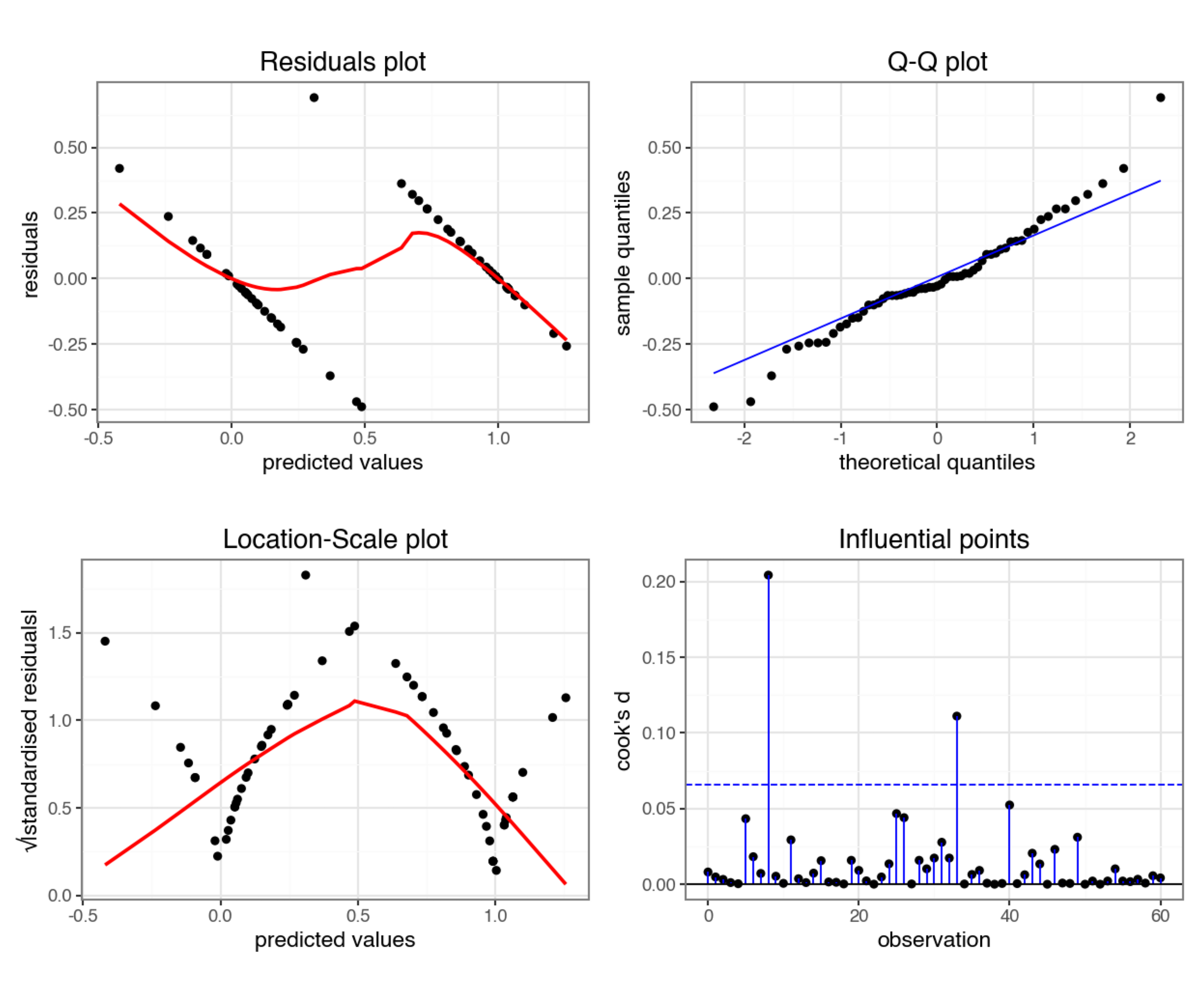
pointed_beak ~ length
They’re pretty extremely bad.
- The response is not linear (Residual Plot, binary response plot, common sense).
- The residuals do not appear to be distributed normally (Q-Q Plot)
- The variance is not homogeneous across the predicted values (Location-Scale Plot)
- But - there is always a silver lining - we don’t have influential data points.
7.5 Creating a suitable model
So far we’ve established that using a simple linear model to describe a potential relationship between beak length and the probability of having a pointed beak is not a good idea. So, what can we do?
One of the ways we can deal with binary outcome data is by performing a logistic regression. Instead of fitting a straight line to our data, and performing a regression on that, we fit a line that has an S shape. This avoids the model making predictions outside the \([0, 1]\) range.
We described our standard linear relationship as follows:
\(Y = \beta_0 + \beta_1X\)
We can now map this to our non-linear relationship via the logistic link function:
\(Y = \frac{\exp(\beta_0 + \beta_1X)}{1 + \exp(\beta_0 + \beta_1X)}\)
Note that the \(\beta_0 + \beta_1X\) part is identical to the formula of a straight line.
The rest of the function is what makes the straight line curve into its characteristic S shape.
Euler’s number (\(\exp\)): would you like to know more?
In mathematics, \(\rm e\) represents a constant of around 2.718. Another notation is \(\exp\), which is often used when notations become a bit cumbersome. Here, I exclusively use the \(\exp\) notation for consistency.
The logistic function
The shape of the logistic function is hugely influenced by the different parameters, in particular \(\beta_1\). The plots below show different situations, where \(\beta_0 = 0\) in all cases, but \(\beta_1\) varies.
The first plot shows the logistic function in its simplest form, with the others showing the effect of varying \(\beta_1\).
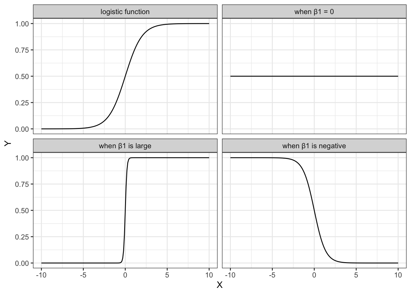
- when \(\beta_1 = 1\), this gives the simplest logistic function
- when \(\beta_1 = 0\) gives a horizontal line, with \(Y = \frac{\exp(\beta_0)}{1+\exp(\beta_0)}\)
- when \(\beta_1\) is negative flips the curve around, so it slopes down
- when \(\beta_1\) is very large then the curve becomes extremely steep
We can fit such an S-shaped curve to our early_finches data set, by creating a generalised linear model.
In R we have a few options to do this, and by far the most familiar function would be glm(). Here we save the model in an object called glm_bks:
glm_bks <- glm(pointed_beak ~ blength,
               family = binomial,
               data = early_finches)
The format of this function is similar to that used by the lm() function for linear models. The important difference is that we must specify the family of error distribution to use. For logistic regression we must set the family to binomial.
If you forget to set the family argument, then the glm() function will perform a standard linear model fit, identical to what the lm() function would do.
In Python we have a few options to do this, and by far the most familiar function would be glm(). Here we save the model in an object called glm_bks_py:
# create a linear model
model = smf.glm(formula = "pointed_beak ~ blength",
                family = sm.families.Binomial(),
                data = early_finches_py)
# and get the fitted parameters of the model
glm_bks_py = model.fit()
The format of this function is similar to that used by the ols() function for linear models. The important difference is that we must specify the family of error distribution to use. For logistic regression we must set the family to binomial. This is buried deep inside the statsmodels package and needs to be defined as sm.families.Binomial().
7.6 Model output
That’s the easy part done! The trickier part is interpreting the output. First of all, we’ll get some summary information.
summary(glm_bks)
Call:
glm(formula = pointed_beak ~ blength, family = binomial, data = early_finches)

Coefficients:
            Estimate Std. Error z value Pr(>|z|)
(Intercept)  -43.410     15.250  -2.847  0.00442 **
blength        3.387      1.193   2.839  0.00452 **
---
Signif. codes:  0 '***' 0.001 '**' 0.01 '*' 0.05 '.' 0.1 ' ' 1

(Dispersion parameter for binomial family taken to be 1)

    Null deviance: 84.5476  on 60  degrees of freedom
Residual deviance:  9.1879  on 59  degrees of freedom
AIC: 13.188

Number of Fisher Scoring iterations: 8print(glm_bks_py.summary()) Generalized Linear Model Regression Results
==============================================================================
Dep. Variable: pointed_beak No. Observations: 61
Model: GLM Df Residuals: 59
Model Family: Binomial Df Model: 1
Link Function: Logit Scale: 1.0000
Method: IRLS Log-Likelihood: -4.5939
Date: Fri, 25 Jul 2025 Deviance: 9.1879
Time: 09:06:40 Pearson chi2: 15.1
No. Iterations: 8 Pseudo R-squ. (CS): 0.7093
Covariance Type: nonrobust
==============================================================================
coef std err z P>|z| [0.025 0.975]
------------------------------------------------------------------------------
Intercept -43.4096 15.250 -2.847 0.004 -73.298 -13.521
blength 3.3866 1.193 2.839 0.005 1.049 5.724
==============================================================================There’s a lot to unpack here, but let’s start with what we’re familiar with: coefficients!
7.7 Parameter interpretation
The coefficients or parameters can be found in the Coefficients block. The main numbers to extract from the output are the two numbers underneath Estimate.Std:
Coefficients:
            Estimate Std.
(Intercept)  -43.410
blength        3.387
Right at the bottom is a table showing the model coefficients. The main numbers to extract from the output are the two numbers in the coef column:
======================
                 coef
----------------------
Intercept    -43.4096
blength        3.3866
======================
These are the coefficients of the logistic model equation and need to be placed in the correct equation if we want to be able to calculate the probability of having a pointed beak for a given beak length.
The \(p\) values at the end of each coefficient row merely show whether that particular coefficient is significantly different from zero. This is similar to the \(p\) values obtained in the summary output of a linear model. As with continuous predictors in simple models, these \(p\) values can be used to decide whether that predictor is important (so in this case beak length appears to be significant). However, these \(p\) values aren’t great to work with when we have multiple predictor variables, or when we have categorical predictors with multiple levels (since the output will give us a \(p\) value for each level rather than for the predictor as a whole).
We can use the coefficients to calculate the probability of having a pointed beak for a given beak length:
\[ P(pointed \ beak) = \frac{\exp(-43.41 + 3.39 \times blength)}{1 + \exp(-43.41 + 3.39 \times blength)} \]
Having this formula means that we can calculate the probability of having a pointed beak for any beak length. How do we work this out in practice?
Well, the probability of having a pointed beak if the beak length is large (for example 15 mm) can be calculated as follows:
exp(-43.41 + 3.39 * 15) / (1 + exp(-43.41 + 3.39 * 15))[1] 0.9994131If the beak length is small (for example 10 mm), the probability of having a pointed beak is extremely low:
exp(-43.41 + 3.39 * 10) / (1 + exp(-43.41 + 3.39 * 10))[1] 7.410155e-05Well, the probability of having a pointed beak if the beak length is large (for example 15 mm) can be calculated as follows:
# import the math library
import mathmath.exp(-43.41 + 3.39 * 15) / (1 + math.exp(-43.41 + 3.39 * 15))0.9994130595039192If the beak length is small (for example 10 mm), the probability of having a pointed beak is extremely low:
math.exp(-43.41 + 3.39 * 10) / (1 + math.exp(-43.41 + 3.39 * 10))7.410155028945912e-05We can calculate the the probabilities for all our observed values and if we do that then we can see that the larger the beak length is, the higher the probability that a beak shape would be pointed. I’m visualising this together with the logistic curve, where the blue points are the calculated probabilities:
Code available here
glm_bks |>
  augment(type.predict = "response") |>
  ggplot() +
  geom_point(aes(x = blength, y = pointed_beak)) +
  geom_line(aes(x = blength, y = .fitted),
            linetype = "dashed",
            colour = "blue") +
  geom_point(aes(x = blength, y = .fitted),
             colour = "blue", alpha = 0.5) +
  labs(x = "beak length (mm)",
       y = "Probability")
p = (ggplot(early_finches_py) +
geom_point(aes(x = "blength", y = "pointed_beak")) +
geom_line(aes(x = "blength", y = glm_bks_py.fittedvalues),
linetype = "dashed",
colour = "blue") +
geom_point(aes(x = "blength", y = glm_bks_py.fittedvalues),
colour = "blue", alpha = 0.5) +
labs(x = "beak length (mm)",
y = "Probability"))
p.show()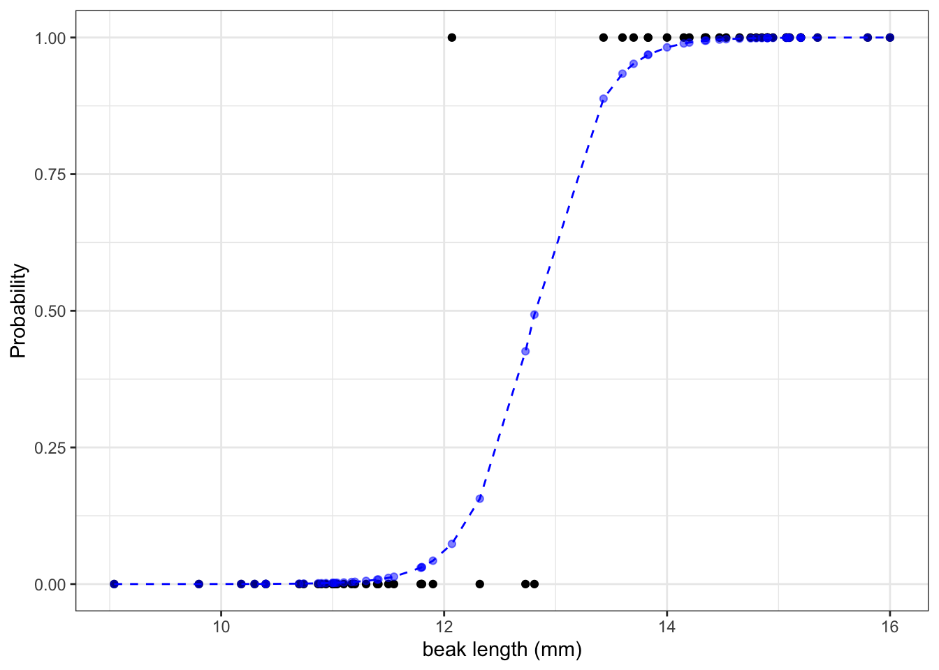
The graph shows us that, based on the data that we have and the model we used to make predictions about our response variable, the probability of seeing a pointed beak increases with beak length.
Short beaks are more closely associated with the bluntly shaped beaks, whereas long beaks are more closely associated with the pointed shape. It’s also clear that there is a range of beak lengths (around 13 mm) where the probability of getting one shape or another is much more even.
7.8 Influential observations
By this point, if we were fitting a linear model, we would want to check whether the statistical assumptions have been met.
The same is true for a generalised linear model. However, as explained in the background chapter, we can’t really use the standard diagnostic plots to assess assumptions. (And the assumptions of a GLM are not the same as a linear model.)
There will be a whole chapter later on that focuses on assumptions and how to check them.
For now, there is one thing that we can do that might be familiar: look for influential points using the Cook’s distance plot.
resid_panel(glm_bks, plots = "cookd")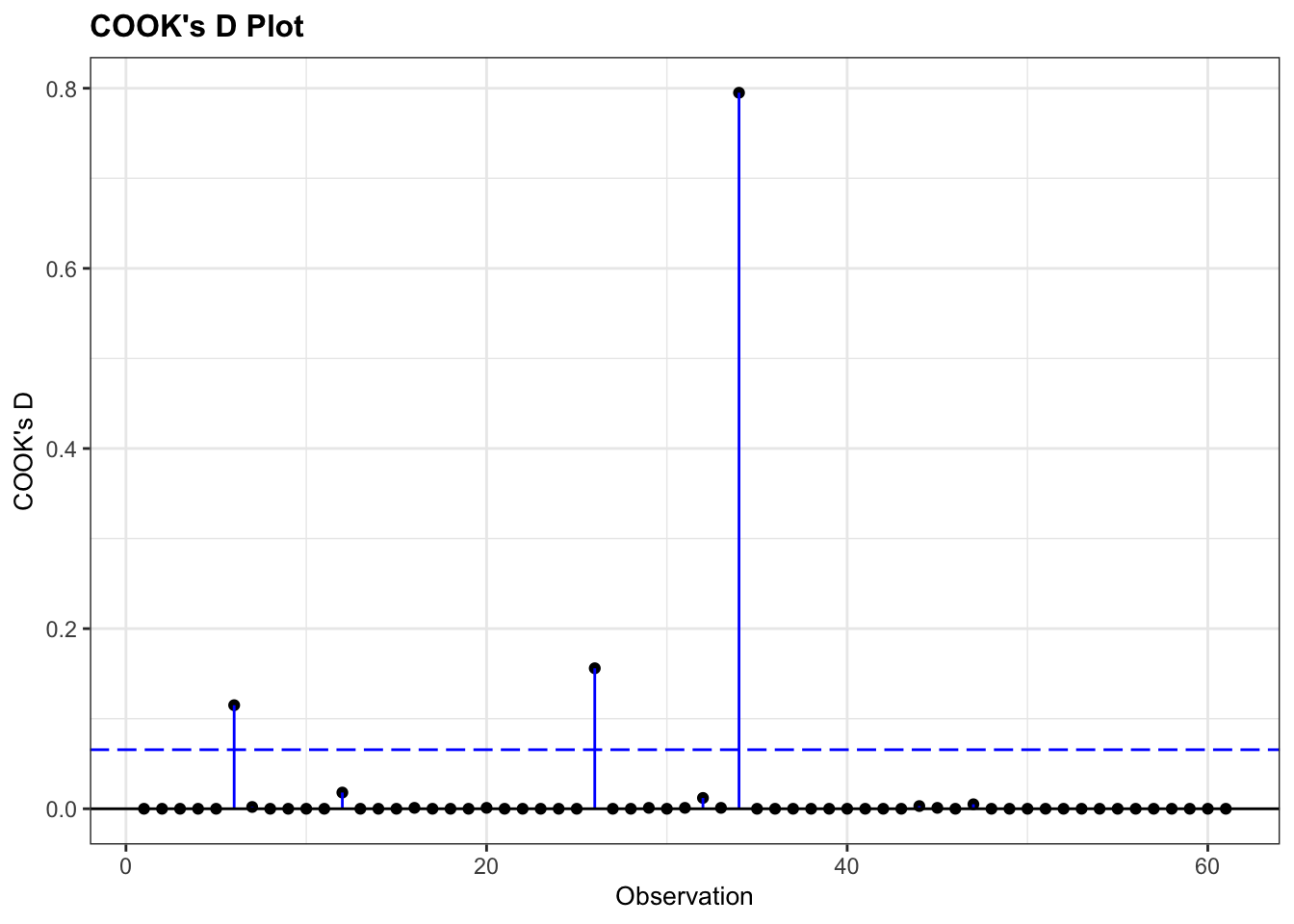
glm_bks
As always, there are different ways of doing this. Here we extract the Cook’s d values from the glm object and put them in a Pandas DataFrame. We can then use that to plot them in a lollipop or stem plot.
# extract the Cook's distances
glm_bks_py_resid = pd.DataFrame(glm_bks_py.
                                get_influence().
                                summary_frame()["cooks_d"])

# add row index
glm_bks_py_resid['obs'] = glm_bks_py_resid.reset_index().index
We now have two columns:
glm_bks_py_resid.head() cooks_d obs
0 1.854360e-07 0
1 3.388262e-07 1
2 3.217960e-05 2
3 1.194847e-05 3
4 6.643975e-06 4We can use these to create the plot:
p = (ggplot(glm_bks_py_resid,
         aes(x = "obs",
             y = "cooks_d")) +
     geom_segment(aes(x = "obs", y = "cooks_d", xend = "obs", yend = 0)) +
     geom_point())

p.show()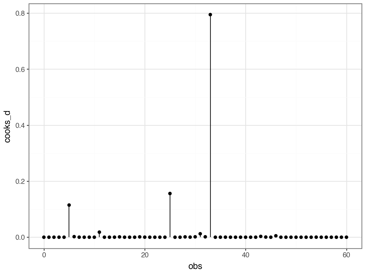
glm_bks_py
This shows that there are no very obvious influential points. You could regard point 34 as potentially influential (it’s got a Cook’s distance of around 0.8), but I’m not overly worried.
If we were worried, we’d remove the troublesome data point, re-run the analysis and see if that changes the statistical outcome. If so, then our entire (statistical) conclusion hinges on one data point, which is not a very robust bit of research. If it doesn’t change our significance, then all is well, even though that data point is influential.
7.9 Exercises
7.9.1 Diabetes
Exercise 1 - Diabetes
Level:
For this exercise we’ll be using the data from data/diabetes.csv.
This is a data set comprising 768 observations of three variables (one dependent and two predictor variables). This records the results of a diabetes test result as a binary variable (1 is a positive result, 0 is a negative result), along with the result of a glucose tolerance test and the diastolic blood pressure for each of 768 women. The variables are called test_result, glucose and diastolic.
We want to look at the relationship between glucose tolerance and diabetes test results. To investigate this, do the following:
- Load and visualise the data
- Create a suitable model
- Calculate the probability of a positive diabetes test result for a glucose tolerance test value of
glucose = 150
Answer
Load and visualise the data
First we load the data, then we visualise it.
diabetes <- read_csv("data/diabetes.csv")diabetes_py = pd.read_csv("data/diabetes.csv")Looking at the data, we can see that the test_result column contains zeros and ones. These are yes/no test result outcomes and not actually numeric representations.
We’ll have to deal with this soon. For now, we can plot the data, by outcome:
ggplot(diabetes,
       aes(x = factor(test_result),
           y = glucose)) +
  geom_boxplot()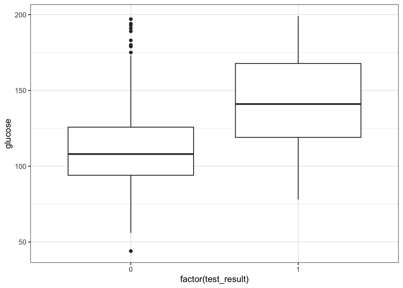
We could just give Python the test_result data directly, but then it would view the values as numeric. Which doesn’t really work, because we have two groups as such: those with a negative diabetes test result, and those with a positive one.
We can force Python to temporarily covert the data to a factor, by making the test_result column an object type. We can do this directly inside the ggplot() function.
p = (ggplot(diabetes_py,
         aes(x = diabetes_py.test_result.astype(object),
             y = "glucose")) +
     geom_boxplot())

p.show()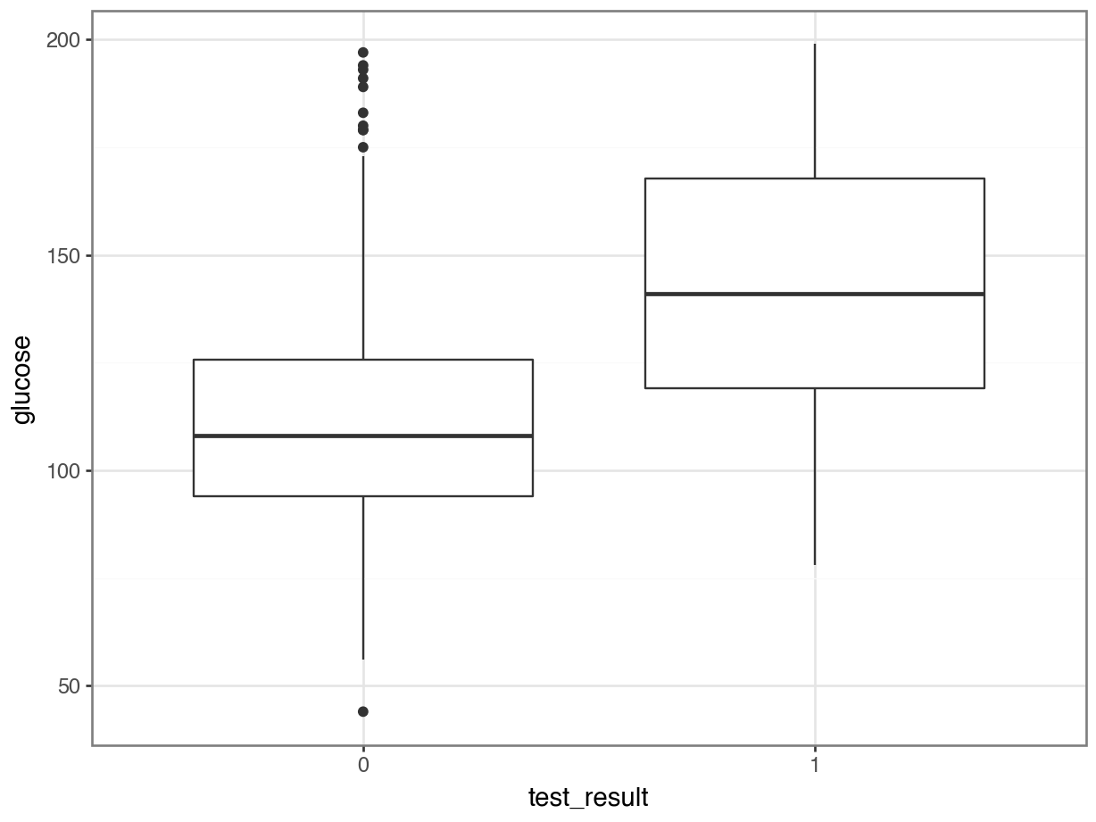
It looks as though the patients with a positive diabetes test have slightly higher glucose levels than those with a negative diabetes test.
We can visualise that differently by plotting all the data points as a classic binary response plot:
ggplot(diabetes,
       aes(x = glucose,
           y = test_result)) +
  geom_point()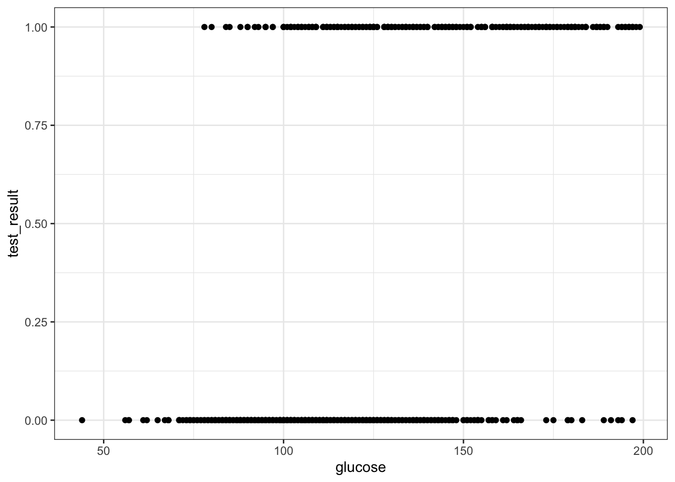
p = (ggplot(diabetes_py,
         aes(x = "glucose",
             y = "test_result")) +
     geom_point())

p.show()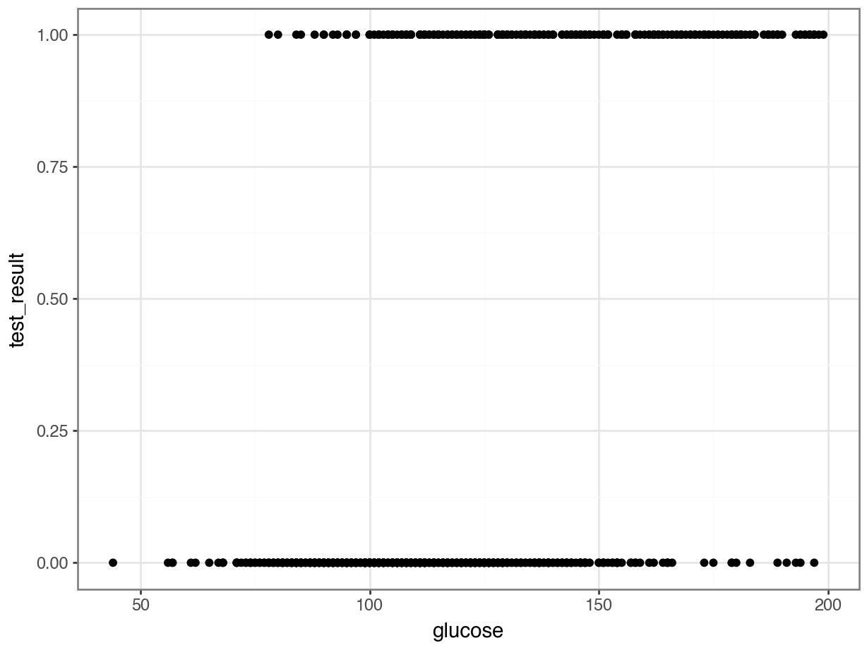
Create a suitable model
We’ll use the glm() function to create a generalised linear model. Here we save the model in an object called glm_dia:
glm_dia <- glm(test_result ~ glucose,
               family = binomial,
               data = diabetes)
The format of this function is similar to that used by the lm() function for linear models. The important difference is that we must specify the family of error distribution to use. For logistic regression we must set the family to binomial.
# create a linear model
model = smf.glm(formula = "test_result ~ glucose",
                family = sm.families.Binomial(),
                data = diabetes_py)
# and get the fitted parameters of the model
glm_dia_py = model.fit()
Let’s look at the model parameters:
summary(glm_dia)
Call:
glm(formula = test_result ~ glucose, family = binomial, data = diabetes)

Coefficients:
             Estimate Std. Error z value Pr(>|z|)
(Intercept) -5.611732   0.442289  -12.69   <2e-16 ***
glucose      0.039510   0.003398   11.63   <2e-16 ***
---
Signif. codes:  0 '***' 0.001 '**' 0.01 '*' 0.05 '.' 0.1 ' ' 1

(Dispersion parameter for binomial family taken to be 1)

    Null deviance: 936.6  on 727  degrees of freedom
Residual deviance: 752.2  on 726  degrees of freedom
AIC: 756.2

Number of Fisher Scoring iterations: 4print(glm_dia_py.summary()) Generalized Linear Model Regression Results
==============================================================================
Dep. Variable: test_result No. Observations: 728
Model: GLM Df Residuals: 726
Model Family: Binomial Df Model: 1
Link Function: Logit Scale: 1.0000
Method: IRLS Log-Likelihood: -376.10
Date: Fri, 25 Jul 2025 Deviance: 752.20
Time: 09:06:41 Pearson chi2: 713.
No. Iterations: 4 Pseudo R-squ. (CS): 0.2238
Covariance Type: nonrobust
==============================================================================
coef std err z P>|z| [0.025 0.975]
------------------------------------------------------------------------------
Intercept -5.6117 0.442 -12.688 0.000 -6.479 -4.745
glucose 0.0395 0.003 11.628 0.000 0.033 0.046
==============================================================================Right now, we’re interested in the coefficients (we’ll look at significance more in subsequent chapters).
We have an intercept of -5.61 and 0.0395 for glucose. We can use these coefficients to write a formula that describes the potential relationship between the probability of having a positive test result, dependent on the glucose tolerance level value:
\[ P(positive \ test\ result) = \frac{\exp(-5.61 + 0.04 \times glucose)}{1 + \exp(-5.61 + 0.04 \times glucose)} \]
Calculating probabilities
Using the formula above, we can now calculate the probability of having a positive test result, for a given glucose value. If we do this for glucose = 150, we get the following:
exp(-5.61 + 0.04 * 150) / (1 + exp(-5.61 + 0.04 * 150))[1] 0.5962827math.exp(-5.61 + 0.04 * 150) / (1 + math.exp(-5.61 + 0.04 * 150))0.5962826992967878This tells us that the probability of having a positive diabetes test result, given a glucose tolerance level of 150 is around 60 %.
7.9.2 Aphids
Exercise 2 - Aphids
Level:
In this exercise we’ll use the data/aphids.csv dataset.
Each row of these data represents a unique rose plant. For each plant, the researcher recorded:
- The number of unbloomed
buds - Which type of cultivated variety (
cultivar) the rose was (mozartorharmonie) - Whether or not aphids were present
You should:
- Load and visualise the data
- Fit an appropriate model
- Calculate the probability of aphids being present on a
harmonierose with 5 unbloomedbuds
Answer
Load and visualise
aphids <- read_csv("data/aphids.csv")aphids = pd.read_csv("data/aphids.csv")There are multiple ways we could visualise these data, but let’s try a scatterplot here:
ggplot(aphids,
       aes(x = factor(aphids_present),
           y = factor(buds),
           colour = cultivar)) +
  geom_jitter(width = 0.3)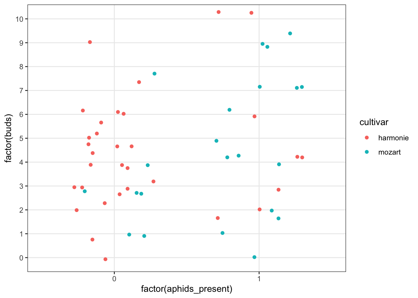
p = (ggplot(aphids, aes(x = aphids.aphids_present.astype(object),
                    y = aphids.buds.astype(object),
                    colour = "cultivar")) +
   geom_jitter(width = 0.3))

p.show()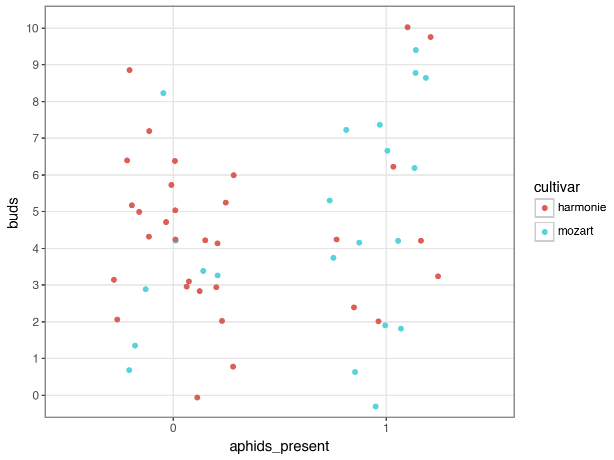
The plot gives the impression that the mozart roses have aphids present more often than the harmonie roses, but it’s hard to tell whether there’s an effect of buds from this graph.
Fit a logistic model
To quantify the relationship(s), let’s fit a logistic model.
glm_aphids <- glm(aphids_present ~ buds + cultivar,
                  family = binomial,
                  data = aphids)

summary(glm_aphids)
Call:
glm(formula = aphids_present ~ buds + cultivar, family = binomial,
    data = aphids)

Coefficients:
               Estimate Std. Error z value Pr(>|z|)
(Intercept)     -2.0687     0.7483  -2.765  0.00570 **
buds             0.2067     0.1262   1.638  0.10149
cultivarmozart   1.9621     0.6439   3.047  0.00231 **
---
Signif. codes:  0 '***' 0.001 '**' 0.01 '*' 0.05 '.' 0.1 ' ' 1

(Dispersion parameter for binomial family taken to be 1)

    Null deviance: 73.670  on 53  degrees of freedom
Residual deviance: 60.666  on 51  degrees of freedom
AIC: 66.666

Number of Fisher Scoring iterations: 4
# create the model
model = smf.glm(formula = "aphids_present ~ buds + cultivar",
family = sm.families.Binomial(),
data = aphids)
# extract fitted parameters
glm_aphids = model.fit()
# print summary of model
print(glm_aphids.summary()) Generalized Linear Model Regression Results
==============================================================================
Dep. Variable: aphids_present No. Observations: 54
Model: GLM Df Residuals: 51
Model Family: Binomial Df Model: 2
Link Function: Logit Scale: 1.0000
Method: IRLS Log-Likelihood: -30.333
Date: Fri, 25 Jul 2025 Deviance: 60.666
Time: 09:06:41 Pearson chi2: 54.8
No. Iterations: 4 Pseudo R-squ. (CS): 0.2140
Covariance Type: nonrobust
======================================================================================
coef std err z P>|z| [0.025 0.975]
--------------------------------------------------------------------------------------
Intercept -2.0687 0.748 -2.765 0.006 -3.535 -0.602
cultivar[T.mozart] 1.9621 0.644 3.047 0.002 0.700 3.224
buds 0.2067 0.126 1.638 0.101 -0.041 0.454
======================================================================================If you were paying close attention when you were learning about regular linear modelling, you might be thinking - isn’t it possible that there’s an interaction between our two predictors?
Yes, it is!
We can adapt our logistic model to include a third predictor, the buds:cultivar interaction. This works exactly like it would in a regular linear model - the syntax should be familiar already.
glm_aphids2 <- glm(aphids_present ~ buds * cultivar,
                  family = binomial,
                  data = aphids)

summary(glm_aphids2)
Call:
glm(formula = aphids_present ~ buds * cultivar, family = binomial,
    data = aphids)

Coefficients:
                    Estimate Std. Error z value Pr(>|z|)
(Intercept)         -1.86699    0.93702  -1.992   0.0463 *
buds                 0.16533    0.17365   0.952   0.3411
cultivarmozart       1.58251    1.27226   1.244   0.2136
buds:cultivarmozart  0.08758    0.25647   0.342   0.7327
---
Signif. codes:  0 '***' 0.001 '**' 0.01 '*' 0.05 '.' 0.1 ' ' 1

(Dispersion parameter for binomial family taken to be 1)

    Null deviance: 73.670  on 53  degrees of freedom
Residual deviance: 60.548  on 50  degrees of freedom
AIC: 68.548

Number of Fisher Scoring iterations: 4
# create the model
model = smf.glm(formula = "aphids_present ~ buds * cultivar",
family = sm.families.Binomial(),
data = aphids)
# extract fitted parameters
glm_aphids2 = model.fit()
# print summary of model
print(glm_aphids2.summary()) Generalized Linear Model Regression Results
==============================================================================
Dep. Variable: aphids_present No. Observations: 54
Model: GLM Df Residuals: 50
Model Family: Binomial Df Model: 3
Link Function: Logit Scale: 1.0000
Method: IRLS Log-Likelihood: -30.274
Date: Fri, 25 Jul 2025 Deviance: 60.548
Time: 09:06:41 Pearson chi2: 54.3
No. Iterations: 4 Pseudo R-squ. (CS): 0.2157
Covariance Type: nonrobust
===========================================================================================
coef std err z P>|z| [0.025 0.975]
-------------------------------------------------------------------------------------------
Intercept -1.8670 0.937 -1.992 0.046 -3.704 -0.030
cultivar[T.mozart] 1.5825 1.272 1.244 0.214 -0.911 4.076
buds 0.1653 0.174 0.952 0.341 -0.175 0.506
buds:cultivar[T.mozart] 0.0876 0.256 0.342 0.733 -0.415 0.590
===========================================================================================The question of which of these models is better is something we’ll tackle in one of the later chapters.
Calculate the probability
Finally, let’s use the coefficients from our model to calculate the probability of aphids being present under specific values of our predictors, specifically:
buds= 8cultivar=harmonie
To keep things simple, we’ll use the coefficients from our additive model, but you can easily adapt this code to include the interaction with little effort.
Since we’ve got two predictors, we’re going to be efficient and do this in two stages. First, we’ll build the “linear predictor” (the linear bit of our equation), and then we’ll embed it inside the inverse link function.
lin_pred <- -2.069 + 0.267 * 8 + 1.962 * 0

# these will give identical results
exp(lin_pred) / (1 + exp(lin_pred))
[1] 0.51674371 / (1 + exp(-lin_pred))[1] 0.5167437lin_pred = -2.069 + 0.267 * 8 + 1.962 * 0
# these will give identical results
math.exp(lin_pred) / (1 + math.exp(lin_pred))0.51674373691565021 / (1 + math.exp(-lin_pred))0.5167437369156502We write a 0 for the cultivar variable, because harmonie is the reference group (and therefore no adjustment is needed). If we had been making a prediction for the mozart rose, we would write a 1 here instead.
7.10 Summary
Key points
- We use a logistic regression to model a binary response
- This uses a logit link function
- We can feed new observations into the model and make predictions about the expected likelihood of “success”, given certain values of the predictor variable(s)