9 K-means clustering
9.1 Objectives
- Understand how k-means clustering works
- Be able to perform k-means clustering
- Be able to optimise cluster number
9.2 Libraries and functions
tidyverse
| Library | Description |
|---|---|
tidyverse |
A collection of R packages designed for data science |
broom |
Summarises key information about statistical objects in tidy tibbles |
palmerpenguins |
Contains data sets on penguins at the Palmer Station on Antarctica. |
base R
| Library | Description |
|---|---|
palmerpenguins |
Contains data sets on penguins at the Palmer Station on Antartica. |
Python
| Library | Description |
|---|---|
plotnine |
The Python equivalent of ggplot2. |
pandas |
A Python data analysis and manipulation tool. |
from plotnine import *
import pandas as pd
from datar.all import *
from pipda import options
from sklearn.cluster import KMeans
from sklearn.metrics import silhouette_score
from sklearn.preprocessing import StandardScaler
options.assume_all_piping = True9.3 Workflow
K-means clustering is an iterative process. It follows the following steps:
- Select the number of clusters to identify (e.g. K = 3)
- Create centroids
- Place centroids randomly in your data
- Assign each data point to the closest centroid
- Calculate the centroid of each new cluster
- Repeat steps 4-5 until the clusters do not change
9.4 Data
For the example, we’ll be using the penguin data set.
Penguins
The penguins data set comes from palmerpenguins package (for more information, see the GitHub page).
Darwin’s finches
The finches dataset has been adapted from the accompanying website to 40 years of evolution. Darwin’s finches on Daphne Major Island by Peter R. Grant and Rosemary B. Grant.
A really interesting lecture on the findings by the Grants can be found here (1h10min).
# load the data
finches <- read_csv("data/finch_beaks.csv")
9.5 Visualise the data
First of all, let’s have a look at the data. It is always a good idea to get a sense of how your data.
tidyverse First, we load and inspect the data:
# attach the data
data(package = 'palmerpenguins')

# inspect the data
penguins
## # A tibble: 344 × 8
## species island bill_length_mm bill_depth_mm flipper_length_mm body_mass_g
## <fct> <fct> <dbl> <dbl> <int> <int>
## 1 Adelie Torgersen 39.1 18.7 181 3750
## 2 Adelie Torgersen 39.5 17.4 186 3800
## 3 Adelie Torgersen 40.3 18 195 3250
## 4 Adelie Torgersen NA NA NA NA
## 5 Adelie Torgersen 36.7 19.3 193 3450
## 6 Adelie Torgersen 39.3 20.6 190 3650
## 7 Adelie Torgersen 38.9 17.8 181 3625
## 8 Adelie Torgersen 39.2 19.6 195 4675
## 9 Adelie Torgersen 34.1 18.1 193 3475
## 10 Adelie Torgersen 42 20.2 190 4250
## # … with 334 more rows, and 2 more variables: sex <fct>, year <int>Next, we plot the data:
ggplot(penguins, aes(x = bill_depth_mm,
                     y = bill_length_mm,
                     colour = species)) +
  geom_point()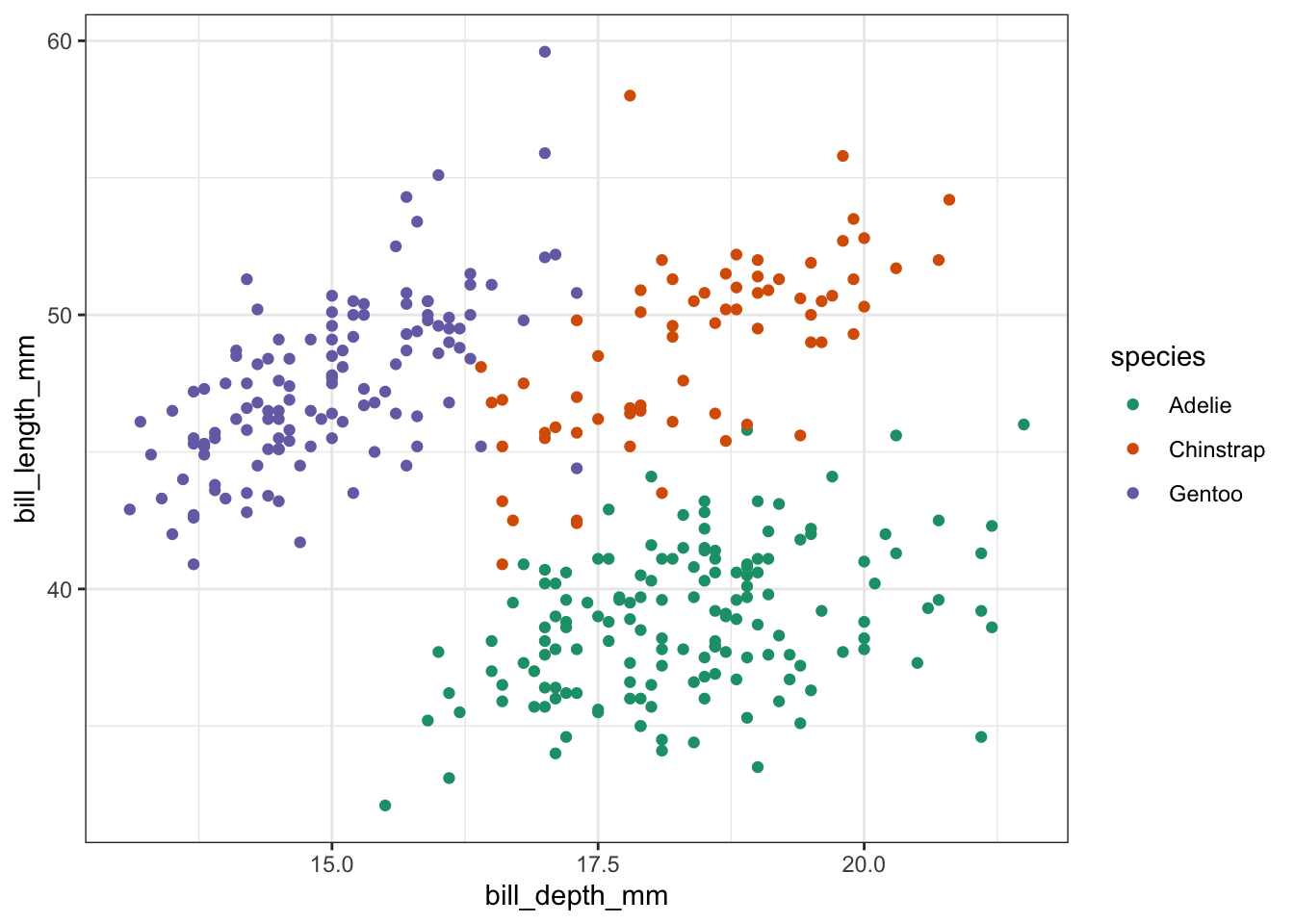
base R First, we load and inspect the data:
## # A tibble: 6 × 8
##   species island bill_length_mm bill_depth_mm flipper_length_… body_mass_g sex
##   <fct>   <fct>           <dbl>         <dbl>            <int>       <int> <fct>
## 1 Adelie  Torge…           39.1          18.7              181        3750 male
## 2 Adelie  Torge…           39.5          17.4              186        3800 fema…
## 3 Adelie  Torge…           40.3          18                195        3250 fema…
## 4 Adelie  Torge…           NA            NA                 NA          NA <NA>
## 5 Adelie  Torge…           36.7          19.3              193        3450 fema…
## 6 Adelie  Torge…           39.3          20.6              190        3650 male
## # … with 1 more variable: year <int>
Next, we plot the data:
plot(penguins$bill_depth_mm,      # scatter plot
     penguins$bill_length_mm,
     pch = 20,
     col = penguins$species)      # colour by species

legend("bottomright",             # legend
       legend = levels(penguins$species),
       pch = 20,
       col = factor(levels(penguins$species)))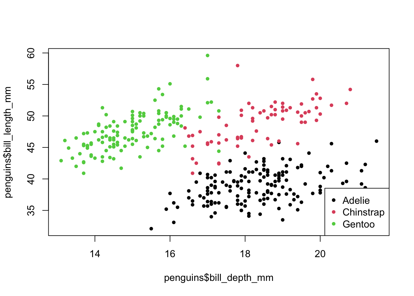
Python
The palmerpenguins package is not available in Python, so I’ve provided the data separately. To load the data into Python we do the following:
# load the data
penguins = pd.read_csv('data/penguins.csv')

# inspect the data
penguins.head()
## species island bill_length_mm ... body_mass_g sex year
## <object> <object> <float64> ... <float64> <object> <int64>
## 0 Adelie Torgersen 39.1 ... 3750.0 male 2007
## 1 Adelie Torgersen 39.5 ... 3800.0 female 2007
## 2 Adelie Torgersen 40.3 ... 3250.0 female 2007
## 3 Adelie Torgersen NaN ... NaN NaN 2007
## 4 Adelie Torgersen 36.7 3450.0 female 2007
##
## [5 rows x 8 columns]Next, we plot the data:
(
  ggplot(penguins,
    aes(x = 'bill_depth_mm',
        y = 'bill_length_mm',
        colour = 'species'))
  + geom_point()
)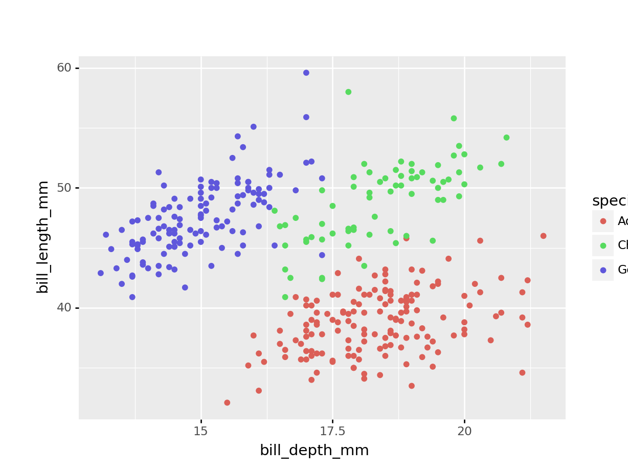
So we have different types of penguins, from different islands. Bill and flipper measurements were taken, and the penguins’ weight plus sex was recorded.
As an example, we also have a look at bill depth versus bill length.
We can already see that the data appear to cluster quite closely by species. A great example to illustrate K-means clustering (you’d almost think I chose the example on purpose!)
9.6 Exercise - Flipper and bill length
Exercise 9.1 For this exercise I’d like you to create a scatter plot of the flipper length against the bill length. We’ll be using colour to separate female/male data. Lastly, we’re creating individual panels for each island.
Most of the code is given below and I would like you to replace the <FIXME> parts with the required code.
Have a think about how many clusters you would try and divide these data in.
tidyverse
penguins %>%
  drop_na() %>%
  ggplot(aes(x = <FIXME>,
             y = bill_length_mm,
             colour = <FIXME>)) +
  geom_<FIXME>() +
  facet_wrap(facets = vars(<FIXME>))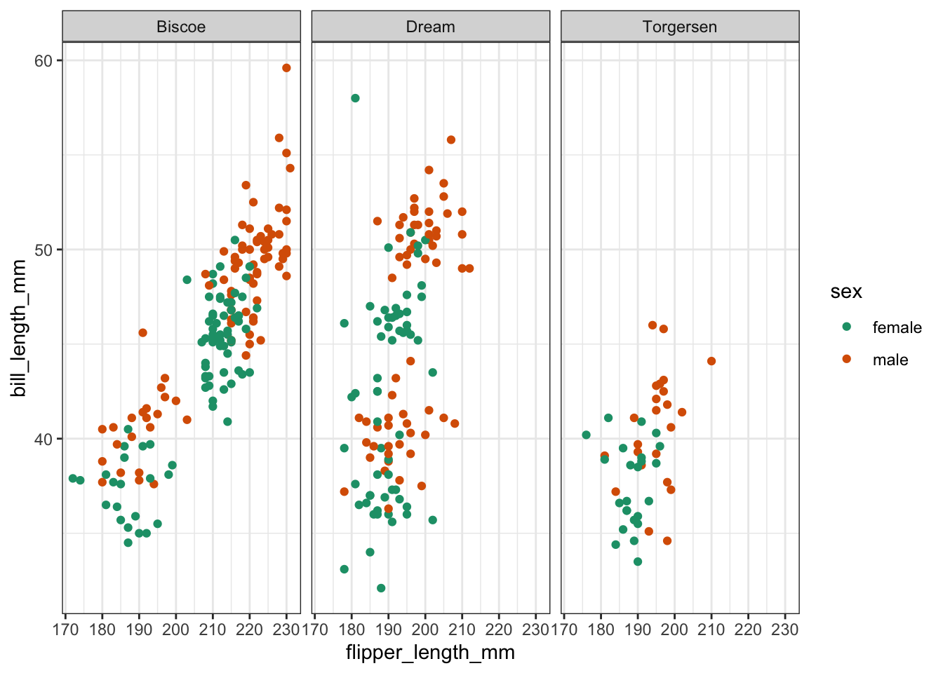
base R Things are bit more convoluted using base R, compared to tidyverse. That’s because there is no faceting equivalent as such that you can implement directly.
What you could do is split the data by island and create a loop to plot for each island. I’m loathe to go through that here, so I’ll just use Biscoe island as an example and I’m sure that you’re able to adapt things accordingly for Dream and Torgersen islands!
biscoe <-
  penguins[penguins$island == '<FIXME>', ]

plot(biscoe$<FIXME>,
     biscoe$bill_length_mm,
     pch = 20,
     col = biscoe$<FIXME>)

legend("bottomright",
       legend = levels(biscoe$sex),
       pch = 20,
       col = factor(levels(biscoe$sex)))

title(main = "Biscoe")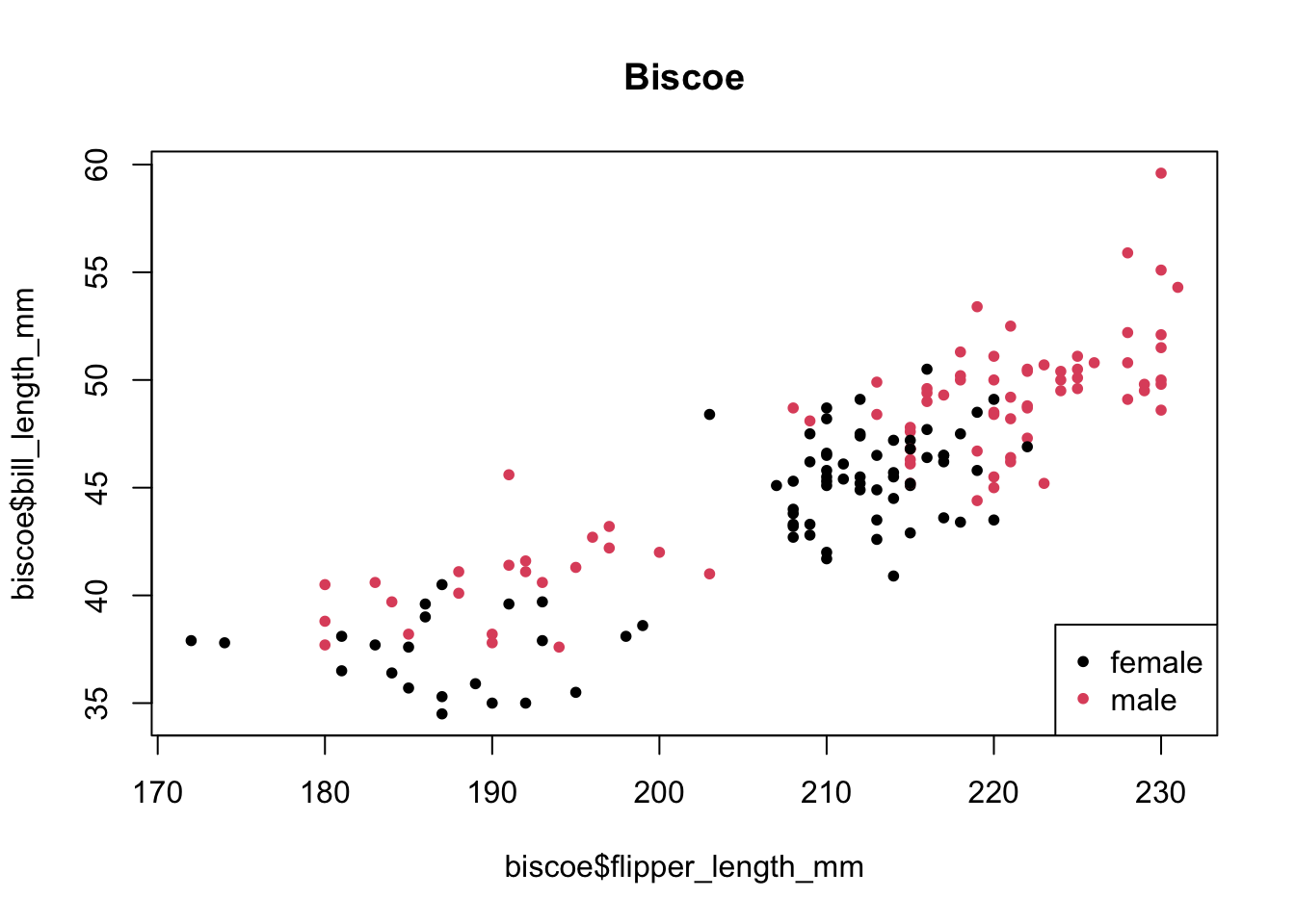
Python
(
  penguins >> \
  drop_na() >> \
  ggplot(aes(x = '<FIXME>',
             y = 'bill_length_mm',
             colour = '<FIXME>'))
         + geom_<FIXME>()
         + facet_wrap('<FIXME>')
)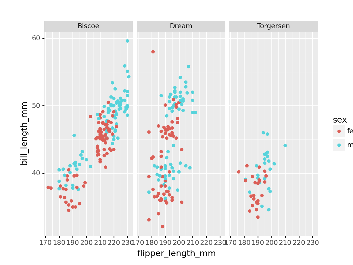
Answer
tidyverse
base R
Python
(
  penguins >> \
  drop_na() >> \
  ggplot(aes(x = 'flipper_length_mm',
             y = 'bill_length_mm',
             colour = 'sex'))
         + geom_point()
         + facet_wrap('island')
)
9.7 Clustering
Next, we’ll do the actual clustering.
tidyverse
To do the clustering, we’ll be using the kmeans() function. This function requires numeric data as its input. We are also scaling the data. Although it is not required in this case, because both variables have the same unit (millimetres) it is good practice. In other scenarios it could be that there are different units that are being compared, which could affect the clustering.
points <-
  penguins %>%
  select(bill_depth_mm,          # select data
         bill_length_mm) %>%
  drop_na() %>%                  # remove missing values
  scale() %>%                    # scale the data
  as_tibble() %>%
  rename(bill_depth_scaled = bill_depth_mm,
         bill_length_scaled = bill_length_mm)


kclust <-
  kmeans(points,                 # perform k-means clustering
         centers = 3)            # using 3 centers

summary(kclust)                  # summarise output
## Length Class Mode
## cluster 342 -none- numeric
## centers 6 -none- numeric
## totss 1 -none- numeric
## withinss 3 -none- numeric
## tot.withinss 1 -none- numeric
## betweenss 1 -none- numeric
## size 3 -none- numeric
## iter 1 -none- numeric
## ifault 1 -none- numericNote that the output is a list of vectors, with differing lengths. That’s because they contain different types of information:
-
clustercontains information about each point -
centers,withinss, andsizecontain information about each cluster -
totss,tot.withinss,betweenss, anditercontain information about the full clustering
base R
To do the clustering, we’ll be using the kmeans() function. This function requires numeric data as its input. We are also scaling the data. Although it is not required in this case, because both variables have the same unit (millimetres) it is good practice. In other scenarios it could be that there are different units that are being compared, which could affect the clustering.
points_r <-
  data.frame(
    penguins$bill_depth_mm,      # get the numeric data
    penguins$bill_length_mm) |>  # use base R pipe!
  na.omit() |>                   # remove missing data
  scale()                        # scale the data

# and rename the columns to avoid confusion
names(points_r)[1] <- 'bill_depth_scaled'
names(points_r)[2] <- 'bill_length_scaled'

kclusts_r <-
  kmeans(points_r,               # perform k-means clustering
         centers = 3)            # using 3 centers

summary(kclusts_r)                # summarise output
## Length Class Mode
## cluster 342 -none- numeric
## centers 6 -none- numeric
## totss 1 -none- numeric
## withinss 3 -none- numeric
## tot.withinss 1 -none- numeric
## betweenss 1 -none- numeric
## size 3 -none- numeric
## iter 1 -none- numeric
## ifault 1 -none- numericNote that the output is a list of vectors, with differing lengths. That’s because they contain different types of information:
-
clustercontains information about each point -
centers,withinss, andsizecontain information about each cluster -
totss,tot.withinss,betweenss, anditercontain information about the full clustering
Python
To do the clustering, we’ll be using the KMeans() function. This function requires numeric data as its input. We are also scaling the data. Although it is not required in this case, because both variables have the same unit (millimetres) it is good practice. In other scenarios it could be that there are different units that are being compared, which could affect the clustering.
scaler = StandardScaler()

points_py = \
penguins >> \
  drop_na() >> \
  select('bill_depth_mm', 'bill_length_mm')

points_py = scaler.fit_transform(points_py)

kmeans = KMeans(
init = 'random',
n_clusters = 3,
n_init = 10,
max_iter = 300,
random_state = 42
)

kmeans.fit(points_py)
KMeans(init='random', n_clusters=3, random_state=42)In a Jupyter environment, please rerun this cell to show the HTML representation or trust the notebook.
On GitHub, the HTML representation is unable to render, please try loading this page with nbviewer.org.
KMeans(init='random', n_clusters=3, random_state=42)
9.8 Visualise clusters
We can visualise the clusters that we calculated above.
tidyverse When we performed the clustering, the centers were calculated. These values give the (x, y) coordinates of the centroids.
tidy_clust <- tidy(kclust) # get centroid coordinates

tidy_clust
## # A tibble: 3 × 5
## bill_depth_scaled bill_length_scaled size withinss cluster
## <dbl> <dbl> <int> <dbl> <fct>
## 1 -1.09 0.590 125 59.4 1
## 2 0.560 -0.943 153 88.0 2
## 3 0.799 1.10 64 39.0 3The initial centroids get randomly placed in the data. This, combined with the iterative nature of the process, means that the values that you will see are going to be slightly different from the values here. That’s normal!
Next, we want to visualise to which data points belong to which cluster. We can do that as follows:
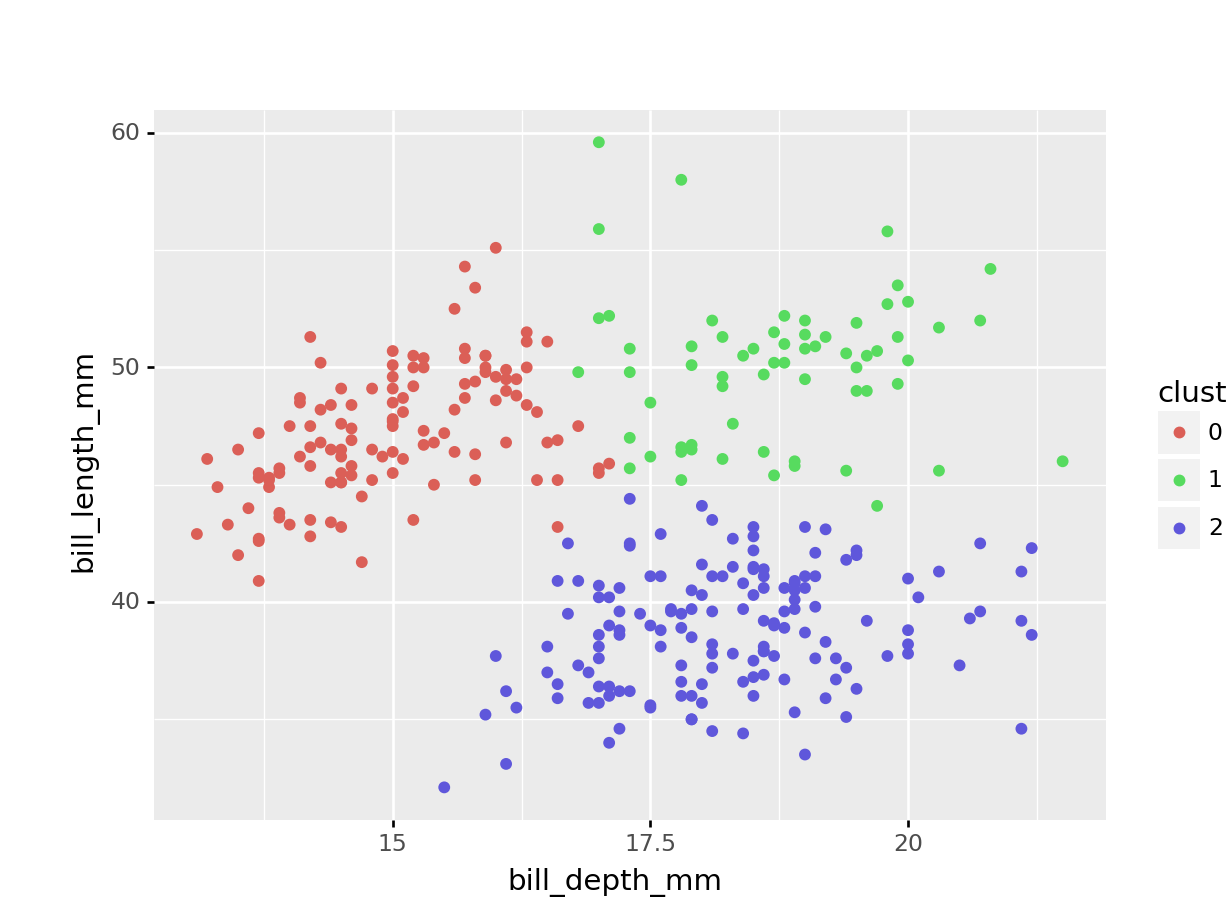
kclust %>%                              # take clustering data
  augment(points) %>%                   # combine with original data
  ggplot(aes(x = bill_depth_scaled,     # plot the scaled data
             y = bill_length_scaled)) +
  geom_point(aes(colour = .cluster)) +  # colour by classification
  geom_point(data = tidy_clust,
             size = 7, shape = 'x')     # add the cluster centers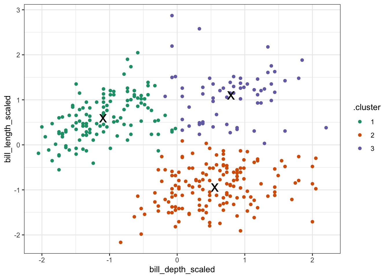
base R When we performed the clustering, the centers were calculated. These values give the (x, y) coordinates of the centroids.
kclusts_r$centers # get centroid coordinates## penguins.bill_depth_mm penguins.bill_length_mm
## 1 0.7985421 1.1018368
## 2 0.5595723 -0.9431819
## 3 -1.0937700 0.5903143The initial centroids get randomly placed in the data. This, combined with the iterative nature of the process, means that the values that you will see are going to be slightly different from the values here. That’s normal!
Next, we want to visualise to which data points belong to which cluster. We can do that as follows:
plot(points_r,                # plot scaled data
     col = kclusts_r$cluster,  # colour by cluster
     pch = 20)

points(kclusts_r$centers,      # add cluster centers
       pch = 4,
       lwd = 3)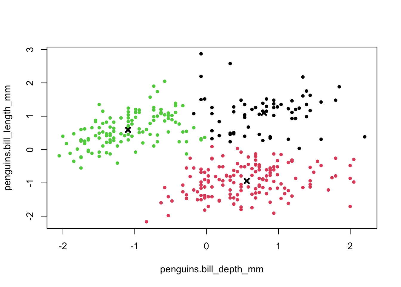
Python When we performed the clustering, the centers were calculated. These values give the (x, y) coordinates of the centroids.
# calculate the cluster centers
kclusts_py = kmeans.cluster_centers_
kclusts_py = pd.DataFrame(kclusts_py, columns = ['0', '1'])

# convert to tibble and rename columns
# use base0_ = True because indices are 0-based
kclusts_py = \
tibble(kclusts_py) >> \
rename(bill_depth_scaled = 0,
       bill_length_scaled = 1)

# and show the coordinates
kclusts_py
## bill_depth_scaled bill_length_scaled
## <float64> <float64>
## 0 -1.098055 0.586444
## 1 0.795036 1.088684
## 2 0.553935 -0.950240The initial centroids get randomly placed in the data. This, combined with the iterative nature of the process, means that the values that you will see are going to be slightly different from the values here. That’s normal!
Next, we want to visualise to which data points belong to which cluster. We can do that as follows:
# convert NumPy arrays to data frame
points_py = pd.DataFrame(points_py, columns = ['0', '1'])

points_py = \
tibble(points_py) >> \
rename(bill_depth_scaled = 0,
       bill_length_scaled = 1)

# merge with original data
# add predicted clusters
penguins_clusters = \
penguins >> \
  drop_na() >> \
  bind_cols(points_py) >> \
  mutate(cluster = factor(kmeans.fit_predict(points_py)))
(
ggplot(penguins_clusters,
aes(x = 'bill_depth_mm',
y = 'bill_length_mm',
colour = 'cluster'))
+ geom_point()
)
9.9 Optimising cluster number
In the example we set the number of clusters to 3. This made sense, because the data already visually separated in roughly three groups - one for each species.
However, it might be that the cluster number to choose is a lot less obvious. In that case it would be helpful to explore clustering your data into a range of clusters.
In short, we determine which values of k we want to explore and then loop through these values, repeating the workflow we looked at previously.
tidyverse
Reiterating over a range of k values is reasonably straightforward using tidyverse. Although we could write our own function to loop through these k values, tidyverse has a series of map() functions that can do this for you. More information on them here.
In short, the map() function spits out a list which contains the output. When we do this on our data, we can create a table that contains lists with all of the information that we need.
Here we calculate the following:
- the
kclustcolumn contains a list with all thekmeans()output, for each value of k - the
tidiedcolumn contains the information on a per-cluster basis - the
glancedcolumn contains single-row summary for each k - we’ll use thetot.withinssvalues a little bit later on - the
augmentedcolumn contains the original data, augmented with the classification that was calculated by thekmeans()function
kclusts <-
  tibble(k = 1:6) %>%                         # check for k = 1 to 6
  mutate(
    kclust = map(k, ~kmeans(points, .x)),     # perform clustering for each k
    tidied = map(kclust, tidy),               # summary at per-cluster level
    glanced = map(kclust, glance),            # get single-row summary
    augmented = map(kclust, augment, points)  # add classification to data set
  )

kclusts
## # A tibble: 6 × 5
## k kclust tidied glanced augmented
## <int> <list> <list> <list> <list>
## 1 1 <kmeans> <tibble [1 × 5]> <tibble [1 × 4]> <tibble [342 × 3]>
## 2 2 <kmeans> <tibble [2 × 5]> <tibble [1 × 4]> <tibble [342 × 3]>
## 3 3 <kmeans> <tibble [3 × 5]> <tibble [1 × 4]> <tibble [342 × 3]>
## 4 4 <kmeans> <tibble [4 × 5]> <tibble [1 × 4]> <tibble [342 × 3]>
## 5 5 <kmeans> <tibble [5 × 5]> <tibble [1 × 4]> <tibble [342 × 3]>
## 6 6 <kmeans> <tibble [6 × 5]> <tibble [1 × 4]> <tibble [342 × 3]>Lists can sometimes be a bit tricky to get your head around, so it’s worthwhile exploring the output. RStudio is particularly useful for this, since you can just left-click on the object in your Environment panel and look.
The way I see lists in this context is as containers. We have one huge table kclusts that contains all of the information that we need. Each ‘cell’ in this table has a container with the relevant data. The kclust column is a list with kmeans objects (the output of our kmeans() for each of the k values), whereas the other columns are lists of tibbles (because the tidy(), glance() and augment() functions output a tibble with the information for each value of k).
For us to use the data in the lists, it makes sense to extract them on a column-by-column basis. We’re ignoring the kclust column, because we don’t need the actual kmeans() output any more.
To extract the data from the lists we use the unnest() function.
clusters <-
  kclusts %>%
  unnest(cols = c(tidied))

assignments <-
  kclusts %>%
  unnest(cols = c(augmented))

clusterings <-
  kclusts %>%
  unnest(cols = c(glanced))
Next, we can visualise some of the data. We’ll start by plotting the scaled data and colouring the data points based on the final cluster it has been assigned to by the kmeans() function.
The (augmented) data are in assignments. Have a look at the structure of the table.
We facet the data by k, so we get a single panel for each value of k.
We also add the calculated cluster centres, which are stored in clusters.
ggplot(assignments,
       aes(x = bill_depth_scaled,     # plot data
           y = bill_length_scaled)) +
  geom_point(aes(color = .cluster),   # colour by cluster
             alpha = 0.8) +           # add transparency
  facet_wrap(~ k) +                   # facet for each k
  geom_point(data = clusters,         # add centers
             size = 7,
             shape = "x")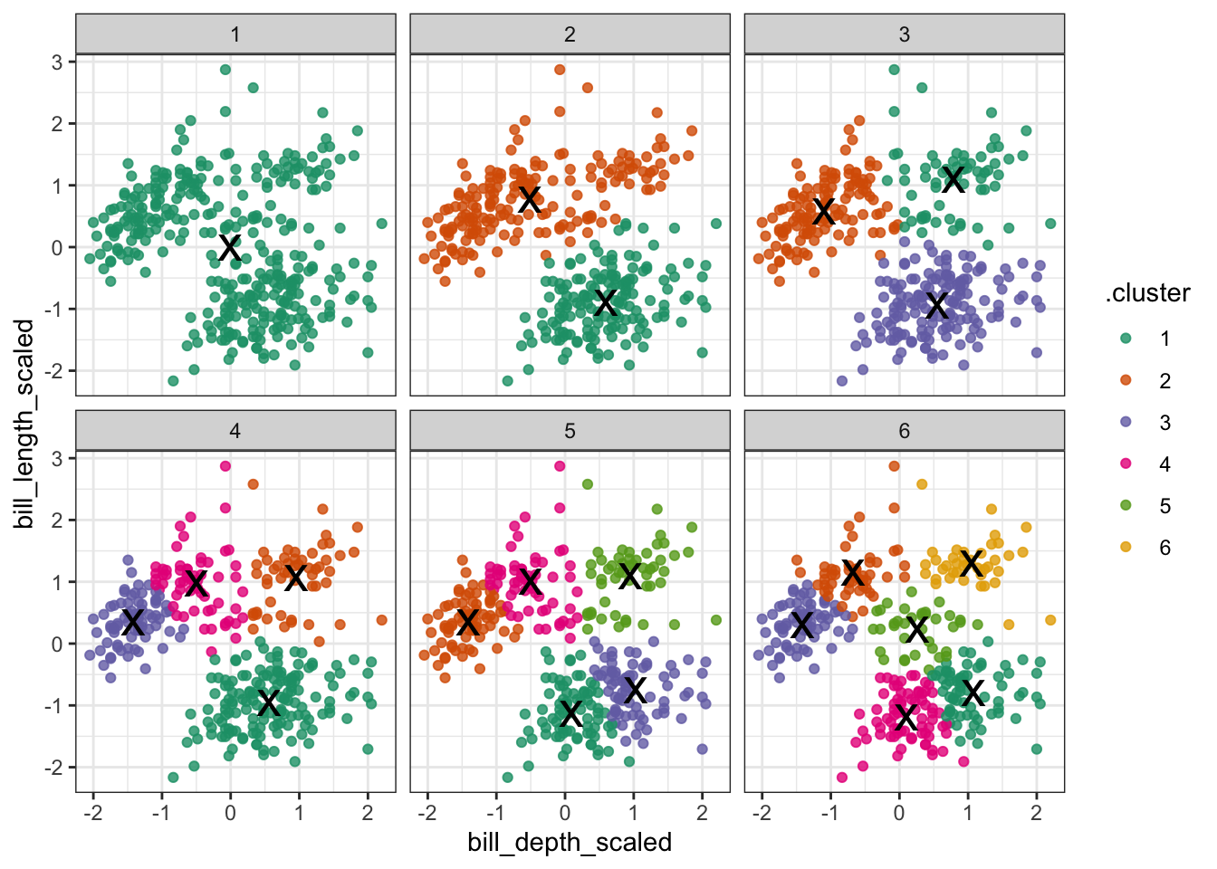
Looking at this plot shows what we already knew (if only things were this easy all the time!): three clusters is a pretty good choice for these data. Remember that you’re looking for clusters that are distinct, i.e. are separated from one another. For example, using k = 4 gives you four nice groups, but two of them are directly adjacent, suggesting that they would do equally well in a single cluster.
9.9.1 Elbow plot
Visualising the data like this can be helpful but at the same time it can also be a bit subjective (hoorah!). To find another subjective way of interpreting these clusters (remember, statistics isn’t this YES/NO magic mushroom and we should be comfortable wandering around in the murky grey areas of statistics by now), we can plot the total within-cluster variation for each value of k.
Intuitively, if you keep adding clusters then the total amount of variation that can be explained by these clusters will increase. The most extreme case would be where each data point is its own cluster and we can then explain all of the variation in the data.
Of course that is not a very sensible approach - hence us balancing the number of clusters against how much variation they can capture.
A practical approach to this is creating an “elbow” plot where the cumulative amount of variation explained is plotted against the number of clusters.
tidyverse
The output of the kmeans() function includes tot.withinss - this is the total within-cluster sum of squares.
ggplot(clusterings,
       aes(x = k,                # for each k plot...
           y = tot.withinss)) +  # total within variance
  geom_line() +
  geom_point() +
  scale_x_continuous(
    breaks = seq(1, 6, 1))       # set the x-axis breaks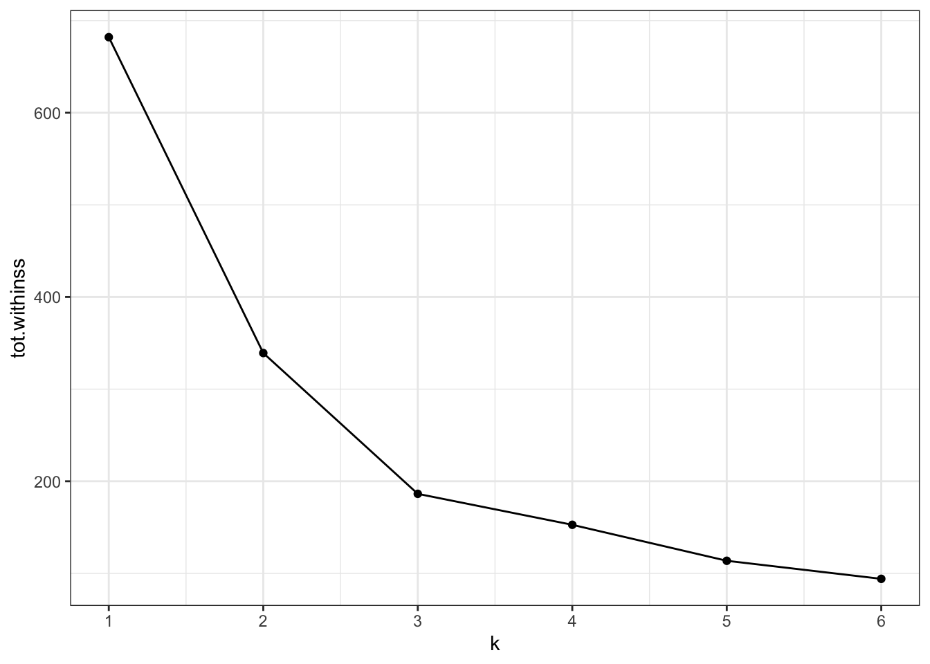
We can see that the total within-cluster sum of squares decreases as the number of clusters increases. We can also see that from k = 3 onwards the slope of the line becomes much shallower. This “elbow” or bending point is a useful gauge to find the optimum number of clusters.
From the exploration we can see that three clusters are optimal in this scenario.
9.10 Exercise
Exercise 9.2 Practice running through the clustering workflow using the finches dataset. Try doing the following:
- Read in the data
- Explore and visualise the data
- Perform the clustering with
k = 2 - Find out if using
k = 2is a reasonable choice - Try and draw some conclusions
Answer
tidyverse
Load the data
finches <- read_csv("data/finch_beaks.csv")
head(finches)## # A tibble: 6 × 5
## band species beak_length_mm beak_depth_mm year
## <dbl> <chr> <dbl> <dbl> <dbl>
## 1 2 fortis 9.4 8 1975
## 2 9 fortis 9.2 8.3 1975
## 3 12 fortis 9.5 7.5 1975
## 4 15 fortis 9.5 8 1975
## 5 305 fortis 11.5 9.9 1975
## 6 307 fortis 11.1 8.6 1975Visualise the data
Let’s have a look at the data.
ggplot(finches, aes(x = beak_depth_mm,
                     y = beak_length_mm,
                     colour = species)) +
  geom_point()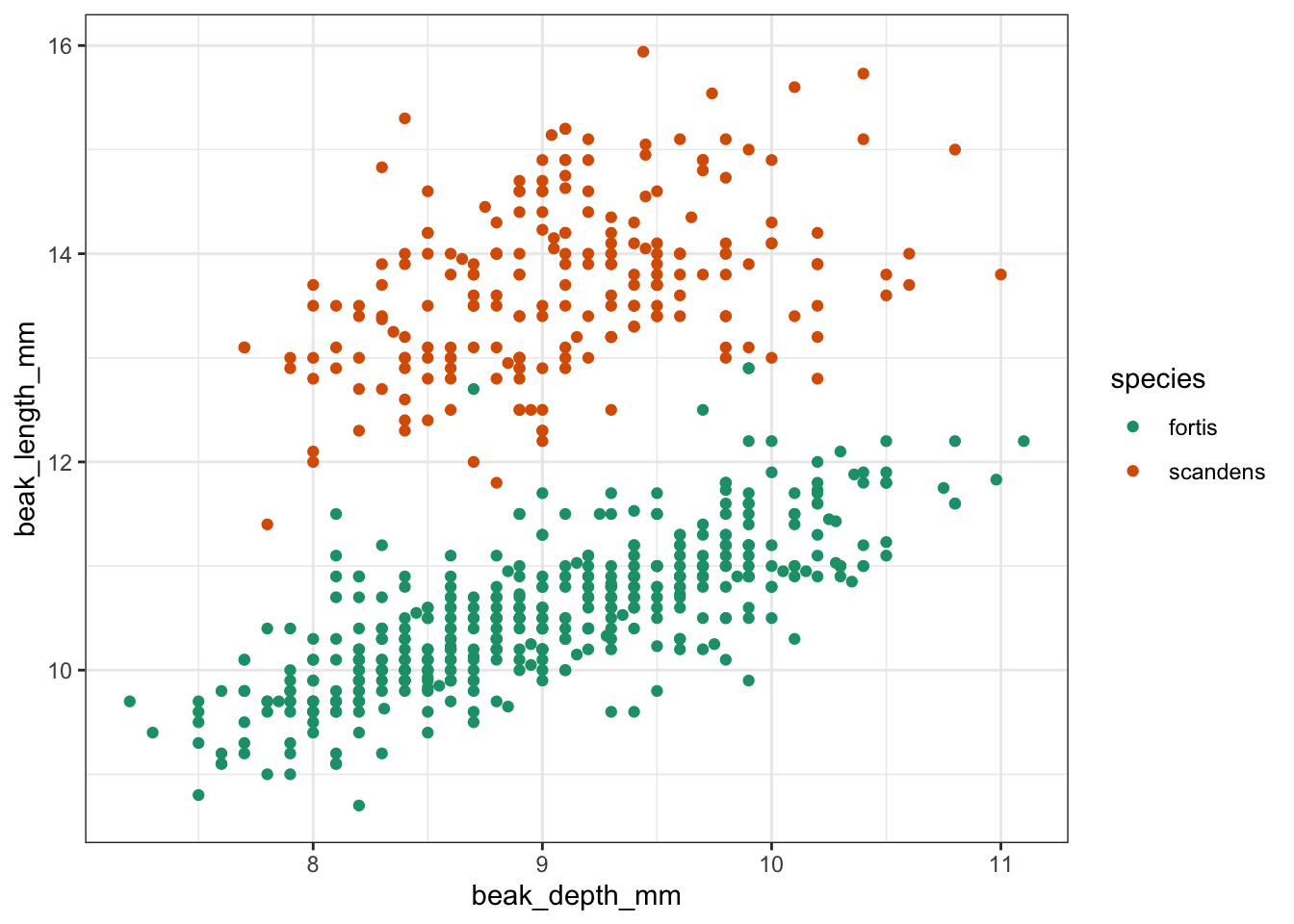
Clustering
Next, we perform the clustering.
points <-
  finches %>%
  select(beak_depth_mm,         # select data
         beak_length_mm) %>%
  drop_na()                     # remove missing values

kclust <-
  kmeans(points,                 # perform k-means clustering
         centers = 2)            # using 2 centers

summary(kclust)                  # summarise output
## Length Class Mode
## cluster 651 -none- numeric
## centers 4 -none- numeric
## totss 1 -none- numeric
## withinss 2 -none- numeric
## tot.withinss 1 -none- numeric
## betweenss 1 -none- numeric
## size 2 -none- numeric
## iter 1 -none- numeric
## ifault 1 -none- numeric
tidy_clust <- tidy(kclust) # get centroid coordinates

tidy_clust
## # A tibble: 2 × 5
## beak_depth_mm beak_length_mm size withinss cluster
## <dbl> <dbl> <int> <dbl> <fct>
## 1 8.98 10.5 431 442. 1
## 2 9.16 13.7 220 237. 2Visualise the clusters
kclust %>%                              # take clustering data
  augment(points) %>%                   # combine with original data
  ggplot(aes(x = beak_depth_mm,         # plot the original data
             y = beak_length_mm)) +
  geom_point(aes(colour = .cluster)) +  # colour by classification
  geom_point(data = tidy_clust,
             size = 7, shape = 'x')     # add the cluster centers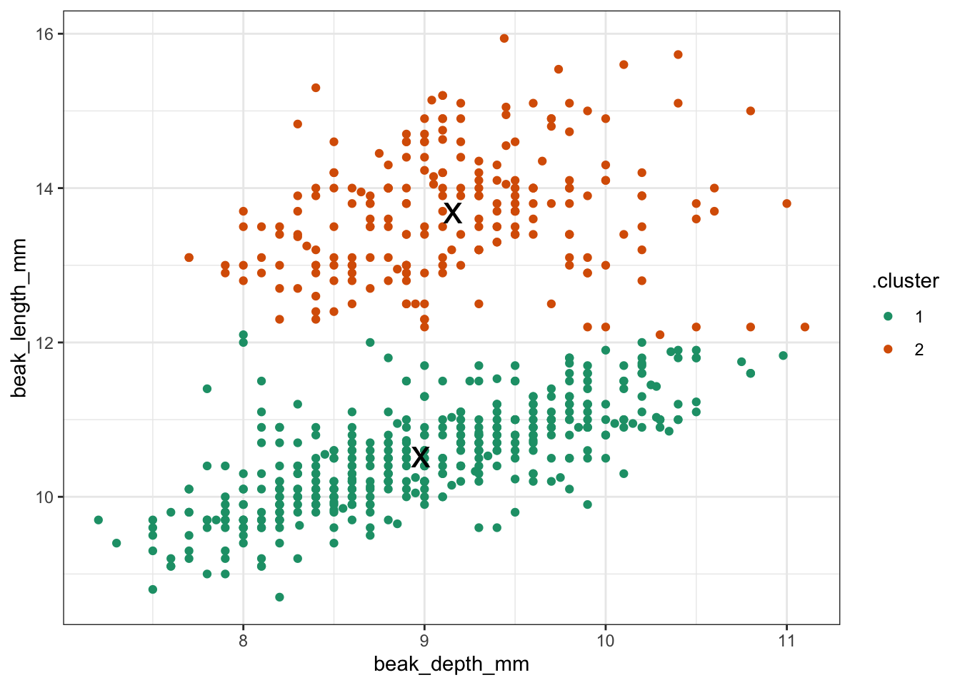
Optimise clusters
It looks like two clusters is a reasonable choice. But let’s explore this a bit more.
kclusts <-
  tibble(k = 1:6) %>%                         # check for k = 1 to 6
  mutate(
    kclust = map(k, ~kmeans(points, .x)),     # perform clustering for each k
    tidied = map(kclust, tidy),               # summary at per-cluster level
    glanced = map(kclust, glance),            # get single-row summary
    augmented = map(kclust, augment, points)  # add classification to data set
  )
Extract the relevant data.
clusters <-
  kclusts %>%
  unnest(cols = c(tidied))

assignments <-
  kclusts %>%
  unnest(cols = c(augmented))

clusterings <-
  kclusts %>%
  unnest(cols = c(glanced))
Visualise the result.
ggplot(assignments,
       aes(x = beak_depth_mm,        # plot data
           y = beak_length_mm)) +
  geom_point(aes(color = .cluster),  # colour by cluster
             alpha = 0.8) +          # add transparency
  facet_wrap(~ k) +                  # facet for each k
  geom_point(data = clusters,        # add centers
             size = 7,
             shape = 'x')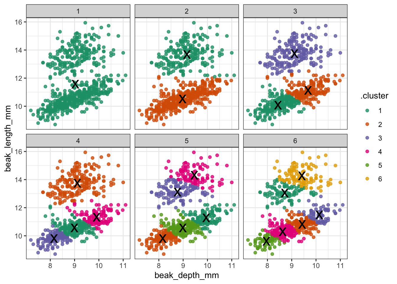
Create an elbow plot to have a closer look.
ggplot(clusterings,
       aes(x = k,                # for each k plot...
           y = tot.withinss)) +  # total within variance
  geom_line() +
  geom_point() +
  scale_x_continuous(
    breaks = seq(1, 6, 1))       # set the x-axis breaks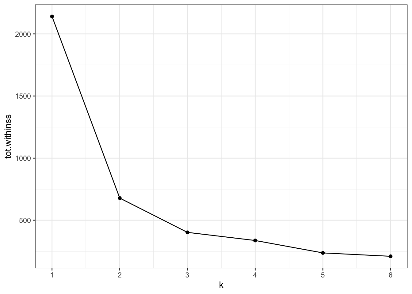
Conclusions
Our initial clustering was done using two clusters, basically capturing the two different finch species.
Redoing the analysis with different numbers of clusters seems to reasonably support that decision. The elbow plot suggests that k = 3 would not be such a terrible idea either.
Food for thought
In the example above we used data that were collected at two different time points: 1975 and 2012.
In the analysis we’ve kept these data together. However, the original premises of these data was to see if there is any indication of evolution going on in these species of finches. Think about how you would approach this question!
9.11 Key points
- k-means clustering partitions data into clusters
- the
kdefines the number of clusters - cluster centers or centroids get assigned randomly
- each data point gets assigned to the closest centroid
- the centroid of the new clusters gets calculated and the process of assignment and recalculation repeats until the cluster do no longer change
- the optimal number of clusters can be determined with an ‘elbow’ plot