10 Hierarchical clustering
10.1 Objectives
- Understand what hierarchical clustering can be used for
- Be able to calculate distance matrices
- Know about different methods to calculate distance matrices
- Perform hierarchical clustering
- Draw dendrograms
- Cut dendrograms in clusters and use the clustering information to visualise your data
10.2 Purpose and aim
Hierarchical clustering is a form of cluster analysis, with the aim to create a hierarchy of clusters. The results are commonly displayed in a dendrogram, which displays the clusters found in the analysis.
10.3 Libraries and functions
tidyverse
| Library | Description |
|---|---|
tidyverse |
A collection of R packages designed for data science |
tidymodels |
A collection of packages for modelling and machine learning using tidyverse principles |
broom |
Summarises key information about statistical objects in tidy tibbles |
palmerpenguins |
Contains data sets on penguins at the Palmer Station on Antarctica. |
ggdendro |
Designed for simple visualisation of hierarchical clusters |
10.4 Data
For the example in this session we’ll be using the yeast RNAseq data set.
Yeast RNAseq
These data are from an experiment included in the fission R/Bioconductor package. Very briefly, we have transcriptome data for:
- Two yeast strains: wild type (
wt) and atf21del mutant (mut) - Each has 6 time points of osmotic stress time (0, 15, 30, 60, 120 and 180 mins)
- Three replicates for each strain at each time point
Let’s say that you did this experiment yourself, and that a bioinformatician analysed it and provided you with four files of data:
-
sample_info.csv- information about each sample. -
counts_raw.csv- raw or unprocessed read counts for all genes, which gives a measure of the genes’ expression. (these are simply scaled to the size of each library to account for the fact that different samples have more or less total number of reads). -
counts_transformed.csv- normalised read counts for all genes, on a log scale and transformed to correct for a dependency between the mean and the variance. This is typical of count data. -
test_result.csv- results from a statistical test that assessed the probability of observed expression differences between the first and each of the other time points in WT cells, assuming a null hypothesis of no difference.
10.5 Get to know your data
Let’s load the data we need for this session (we don’t need the raw data):
trans_cts <- read_csv("data/transcriptome/counts_transformed.csv")
sample_info <- read_csv("data/transcriptome/sample_info.csv")
test_result <- read_csv("data/transcriptome/test_result.csv")
10.5.1 Transformed counts
Let’s look at the transformed count data:
trans_cts## # A tibble: 6,011 × 37
## gene wt_0_r1 wt_0_r2 wt_0_r3 wt_15_r1 wt_15_r2 wt_15_r3 wt_30_r1 wt_30_r2
## <chr> <dbl> <dbl> <dbl> <dbl> <dbl> <dbl> <dbl> <dbl>
## 1 SPAC212… 4.95 4.97 5.66 5.45 5.44 6.50 5.08 5.25
## 2 SPAC212… 5.44 6.21 6.17 5.94 6.33 6.41 6.71 7.15
## 3 SPAC212… 5.75 5.06 5.54 5.68 5.18 5.10 5.82 6.31
## 4 SPNCRNA… 5.73 4.87 4.94 5.57 5.32 4.20 5.17 4.77
## 5 SPAC977… 7.05 6.84 6.79 6.87 6.09 6.19 6.91 6.66
## 6 SPAC977… 5.34 5.34 5.31 5.32 5.99 5.30 7.61 7.48
## 7 SPAC977… 6.50 6.23 6.70 7.03 6.92 7.53 6.44 6.68
## 8 SPAC977… 7.24 7.46 7.48 7.09 7.46 7.65 6.88 7.13
## 9 SPNCRNA… 5.96 5.69 5.94 5.92 5.87 4.84 7.38 7.30
## 10 SPAC1F8… 6.64 6.65 6.78 4.62 5.61 6.15 5.66 6.50
## # … with 6,001 more rows, and 28 more variables: wt_30_r3 <dbl>,
## # wt_60_r1 <dbl>, wt_60_r2 <dbl>, wt_60_r3 <dbl>, wt_120_r1 <dbl>,
## # wt_120_r2 <dbl>, wt_120_r3 <dbl>, wt_180_r1 <dbl>, wt_180_r2 <dbl>,
## # wt_180_r3 <dbl>, mut_0_r1 <dbl>, mut_0_r2 <dbl>, mut_0_r3 <dbl>,
## # mut_15_r1 <dbl>, mut_15_r2 <dbl>, mut_15_r3 <dbl>, mut_30_r1 <dbl>,
## # mut_30_r2 <dbl>, mut_30_r3 <dbl>, mut_60_r1 <dbl>, mut_60_r2 <dbl>,
## # mut_60_r3 <dbl>, mut_120_r1 <dbl>, mut_120_r2 <dbl>, mut_120_r3 <dbl>, …Here we have a list of genes, with 37 columns. The columns encode information about the strain (wt/mut), time point (0, 15, etc) and repeat (r1, r2, r3). This is something we need to be aware of, because it’s often not helpful to have that kind of information encoded in the column name.
A quick check also tells us that there are 6,011 genes in this data set, with each gene only occurring once:
trans_cts %>%
  count(gene) %>%  # count the number of genes
  arrange(desc(n)) # arrange in descending order
## # A tibble: 6,011 × 2
## gene n
## <chr> <int>
## 1 SPAC1002.01 1
## 2 SPAC1002.02 1
## 3 SPAC1002.03c 1
## 4 SPAC1002.04c 1
## 5 SPAC1002.05c 1
## 6 SPAC1002.07c 1
## 7 SPAC1002.08c 1
## 8 SPAC1002.09c 1
## 9 SPAC1002.10c 1
## 10 SPAC1002.11 1
## # … with 6,001 more rows10.5.2 Sample info
Let’s have a look to see what is in the sample info:
sample_info## # A tibble: 36 × 4
## sample strain minute replicate
## <chr> <chr> <dbl> <chr>
## 1 wt_0_r1 wt 0 r1
## 2 wt_0_r2 wt 0 r2
## 3 wt_0_r3 wt 0 r3
## 4 wt_15_r1 wt 15 r1
## 5 wt_15_r2 wt 15 r2
## 6 wt_15_r3 wt 15 r3
## 7 wt_30_r1 wt 30 r1
## 8 wt_30_r2 wt 30 r2
## 9 wt_30_r3 wt 30 r3
## 10 wt_60_r1 wt 60 r1
## # … with 26 more rowsThis data set contains all the information of the various samples, but with the data also split by column. That’ll come in handy later on.
10.5.3 Test results
test_result## # A tibble: 30,055 × 8
## gene baseMean log2FoldChange lfcSE stat pvalue padj comparison
## <chr> <dbl> <dbl> <dbl> <dbl> <dbl> <dbl> <dbl>
## 1 SPAC212.11 8.55 1.54 0.497 1.09 0.276 1 15
## 2 SPAC212.09c 50.8 0.399 0.273 0 1 1 15
## 3 SPAC212.04c 38.3 -0.0230 0.269 0 1 1 15
## 4 SPNCRNA.601 9.47 -0.0841 0.483 0 1 1 15
## 5 SPAC977.11 70.4 -0.819 0.201 0 1 1 15
## 6 SPAC977.13c 36.7 1.19 0.344 0.552 0.581 1 15
## 7 SPAC977.15 49.1 0.600 0.208 0 1 1 15
## 8 SPAC977.16c 83.2 0.148 0.239 0 1 1 15
## 9 SPNCRNA.607 60.4 0.0638 0.268 0 1 1 15
## 10 SPAC1F8.06 74.2 -1.58 0.298 -1.94 0.0520 1 15
## # … with 30,045 more rowsThe test results give us the results of a statistical test between the first time point in the WT cells, comparing it to all the other time points. The null hypothesis is that there is no difference. The column that we’re mostly interested in is the padj, which gives us the adjusted p-values.
test_result %>%
  select(gene, padj)
## # A tibble: 30,055 × 2
## gene padj
## <chr> <dbl>
## 1 SPAC212.11 1
## 2 SPAC212.09c 1
## 3 SPAC212.04c 1
## 4 SPNCRNA.601 1
## 5 SPAC977.11 1
## 6 SPAC977.13c 1
## 7 SPAC977.15 1
## 8 SPAC977.16c 1
## 9 SPNCRNA.607 1
## 10 SPAC1F8.06 1
## # … with 30,045 more rows10.6 Clustering
There is a lot of data here (over 6,000 data points!). We might be interested in how these data group/cluster together. We could do this using k-means clustering but here we’re going to use hierarchical clustering.
What we’re looking for specifically is whether there are groups of genes that are more similar to one another. We approach this by creating an hierarchy: the genes that are most similar to each other cluster together, followed by the next groups of genes that are most similar to each other after that, and so forth.
To make things a bit more manageable for this example, we’ll only look at a subset of the 6,011 genes. We’ll select the 50 most highly differentially expressed genes to work with and store the gene names in a data frame:
Now that we’ve got a list of genes that we’re interested in, we can use these to cluster the data.
The way that his works is that the first gene is compared to all the other genes. These two genes then form a cluster. After that the second gene is compared to the cluster and the other remaining genes. It too forms a cluster with the most similar gene or cluster.
This process continues until there are no comparisons left.
The way this is quantified is by calculating a matrix of dissimilarities. This happens using distance measures - something we already learned about with the k-means clustering. Two useful distance measures are the Euclidian and Manhattan distance.
There are different ways methods to calculating these distances, with the most commonly types used:
| Name | Method | Usage |
|---|---|---|
| complete linkage | maximum distance between two clusters | tends to create compact clusters |
| single linkage | minimum distance between two clusters | tends to produce loose clusters |
| average linkage | average distance between two clusters | |
| centroid linkage | distance between cluster centroids | |
| Ward’s minimum variance | minimises total within-cluster variance |
tidyverse
The function we use to calculate the clusters is hclust(). But before we can do that, we need to calculate the dissimilarities between the clusters. We do that using the dist() function. The default method that is used is "euclidian", but there are other options. Run ?dist to have a look.
The default method used by hclust() is "complete", but just to be different I’ll be using the "average" linkage here. It’s always useful to see how which method helps you to look at your data best.
gene_hclust <- trans_cts %>%
  # filter our data for the candidate genes
  semi_join(candidate_genes, by = "gene") %>%
  # convert the gene column to row names
  # because dist() takes a matrix
  column_to_rownames(var = "gene") %>%
  # scale the data
  scale() %>%
  # calculate the Euclidian distance
  dist(method = "euclidian") %>%
  # perform the clustering
  hclust(method = "average")
Scaling is technically not necessary here, because the differential expression analysis has already done this for us. However, I’ve included the step here anyway to make you aware of it. Trying to calculate distances between values that are on different scales will result in non-sensical results!
We can look at what hclust() has produced for us:
gene_hclust##
## Call:
## hclust(d = ., method = "average")
##
## Cluster method : average
## Distance : euclidean
## Number of objects: 44The answer is a list that contains a whole bunch of data. We can see that the distance and clustering methods are as we specified them (hoorah!). Also, there appear to be 44 objects.
This in itself does not help us much, so let’s go ahead and plot it. To make this a bit more manageable we’re using the library ggdendro, which allows us to plot dendrograms using ggplot-style syntax.
If you haven’t installed/loaded it, now is a good time. You can do this as follows:
# install if needed
install.packages("ggdendro")

# and load the library
library(ggdendro)
Next, we can plot the dendrogram using the ggdendrogram() function. We give it the gene_clust object, tell it not to rotate the dendrogram (try setting it to TRUE and see what happens!), and give it a title.
ggdendrogram(gene_hclust, rotate = FALSE) +
  labs(title = "Top 50 DEG dendrogram")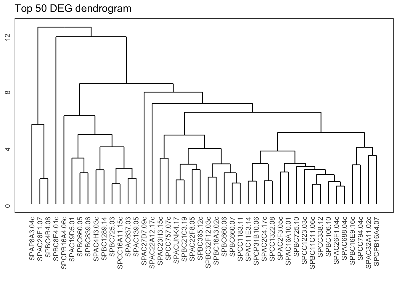
From the dendrogram we can see that there is quite a bit of structure to the data. The question is, where do we start to delve a bit deeper into this? One way of doing that is by cutting the dendrogram into different groups.
Visually, you could see this as slicing across the various clusters. This is represented here with a horizontal line, where we slice the dendrogram into four groups:
tidyverse
ggdendrogram(gene_hclust, rotate = FALSE) +
  geom_hline(yintercept = 8.2, colour = "red") +
  labs(title = "Top 50 DEG dendrogram",
       subtitle = "cutting into 4 cluster")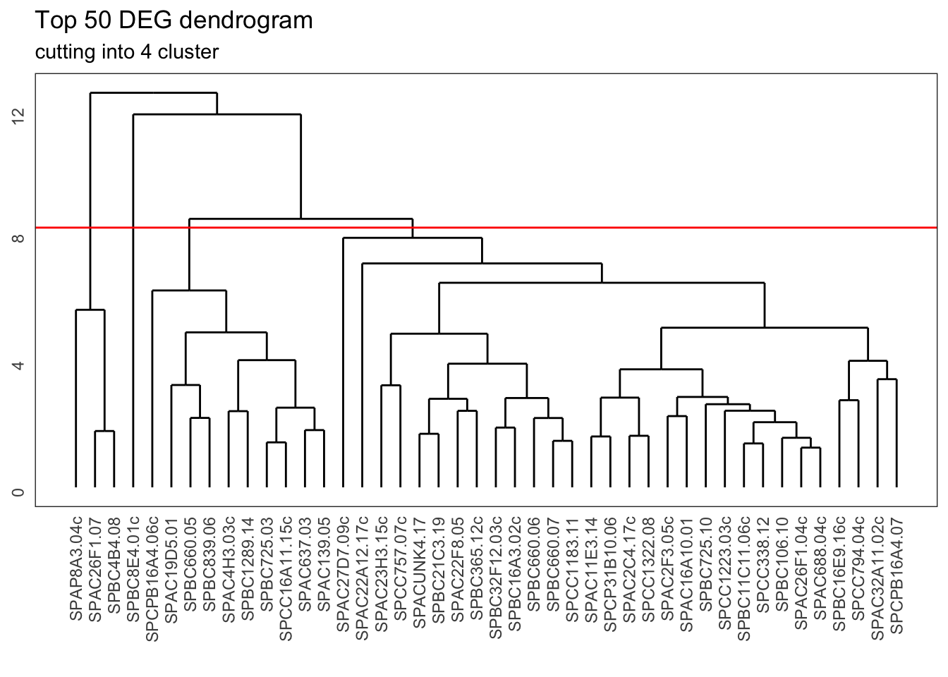
We can do this kind of slicing programmatically as well. What happens then is comparable to the k-means clustering, where we divide the data into groups (clusters) and each gene gets assigned to a specific cluster.
tidyverse
We create these clusters by cutting the dendrogram using the cutree() function. We then do a little bit of data wrangling (creating a tibble from the resulting vector, and renaming the column names) to get the following output:
gene_cluster <- cutree(gene_hclust, k = 4) %>%
  # turn the named vector into a tibble
  enframe() %>%
  # rename some of the columns
  rename(gene = name, cluster = value)

head(gene_cluster)
## # A tibble: 6 × 2
## gene cluster
## <chr> <int>
## 1 SPAC22A12.17c 1
## 2 SPACUNK4.17 1
## 3 SPAC4H3.03c 2
## 4 SPAC2F3.05c 1
## 5 SPAC637.03 2
## 6 SPAC26F1.07 3We can see that each gene in our list is now assigned a certain cluster number. We can use this information to look at our data in a bit more detail.
For example, we could see if there are any gene expression trends visible across these different clusters. It would be useful to visually follow gene expression for our candidate genes over time, by cluster and by strain.
This requires a bit of logical thinking, so let’s go through it step-by-step.
- we have three biological repeats per time point per strain, so we need to average those
- we need to make sure the data are scaled
- we need to create these scaled averages for each gene, by strain and time point
To do this, we take our transformed counts (trans_cts) data and first rejig it so that it is in a long format and we can do some grouping on it. We then merge it with the sample_info data, so we get all the relevant information regarding strain, time point and repeat. Then we filter for only our candidate genes, scale our counts, group the data and calculate the average counts.
Sounds doable, right? Hoorah for pipes, where we can go through this step-by-step:
# summarise counts
trans_cts_mean <- trans_cts %>%
  # convert to long format
  pivot_longer(cols = wt_0_r1:mut_180_r3, names_to = "sample", values_to = "cts")  %>%
  # join with sample info table
  full_join(sample_info, by = "sample") %>%
  # filter to retain only genes of interest
  semi_join(candidate_genes, by = "gene") %>%
  # for each gene
  group_by(gene) %>%
  # scale the cts column
  mutate(cts_scaled = scale(cts)) %>%
  # for each gene, strain and minute
  group_by(gene, strain, minute) %>%
  # calculate the mean (scaled) cts
  summarise(mean_cts_scaled = mean(cts_scaled),
            n_rep = n()) %>%
  ungroup()
When that’s done, we can merge the information with gene_cluster, which contains the cluster classification for each gene:
trans_cts_cluster <- trans_cts_mean %>%
  inner_join(gene_cluster, by = "gene")

head(trans_cts_cluster)
## # A tibble: 6 × 6
## gene strain minute mean_cts_scaled n_rep cluster
## <chr> <chr> <dbl> <dbl> <int> <int>
## 1 SPAC11E3.14 mut 0 -1.06 3 1
## 2 SPAC11E3.14 mut 15 0.615 3 1
## 3 SPAC11E3.14 mut 30 1.83 3 1
## 4 SPAC11E3.14 mut 60 -0.553 3 1
## 5 SPAC11E3.14 mut 120 -0.353 3 1
## 6 SPAC11E3.14 mut 180 -0.635 3 1We can see that we now have all the data we need: for each gene there is information on the type of strain, the time point, the scaled mean counts and the cluster that gene has been assigned to. We also have a bonus column containing the number of repeats that make up the mean values.
Exercise 10.1 Bonus exercise Are all the mean values are made up from three biological repeats?
Answer
There are many ways we can skin this proverbial cat, and this is one of them:
trans_cts_cluster %>%
  count(n_rep)
## # A tibble: 1 × 2
## n_rep n
## <int> <int>
## 1 3 528So yes, all the mean counts values are made up of three biological repeats. This is good to know, so that we realise the averages are comparable.
Now that we have all the data, we can finally plot the gene expression trends, separating the genes of interest by cluster.
We do this by facetting:
trans_cts_cluster %>%
  ggplot(aes(minute, mean_cts_scaled)) +
  geom_line(aes(group = gene)) +
  facet_grid(rows = vars(strain), cols = vars(cluster))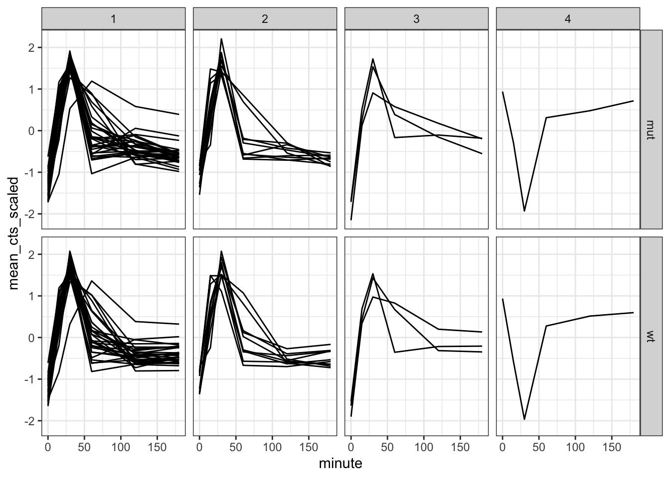
We can see that the overall trend is comparable between most of the clusters. Something different seems to be going on in cluster 4, but that is actually based on what seems like a single observation. The reason for that is our (well, my) choice to only look at the top 50 differentially expressed genes.
To get a more generalised view we can also add a median line to each facet, showing the median expression for each cluster:
trans_cts_cluster %>%
  ggplot(aes(minute, mean_cts_scaled)) +
  geom_line(aes(group = gene),
            alpha = 0.3) +
  geom_line(stat = "summary",      # create a summary stat
            fun = "median",        # and use the median
            colour = "red",
            size = 0.5,
            aes(group = 1)) +      # idiosyncratic necessity to group the line
  facet_grid(rows = vars(strain),  # plot strains in rows
             cols = vars(cluster)) # and clusters in columns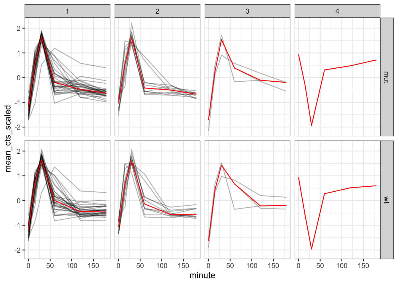
10.7 Exercise: Penguins
Exercise 10.2 If you’re still with us at this point, well done! For this exercise we’re going to practice creating a dendrogram using the penguins data set.
I would like you to do the following:
- load the
penguinsdata set, if needed - remove the missing values and add an ID column (as factor)
- scale the data (if needed)
- calculate the distance matrix using Euclidian distance
- perform the hierarchical clustering with complete linkage
- plot the dendrogram
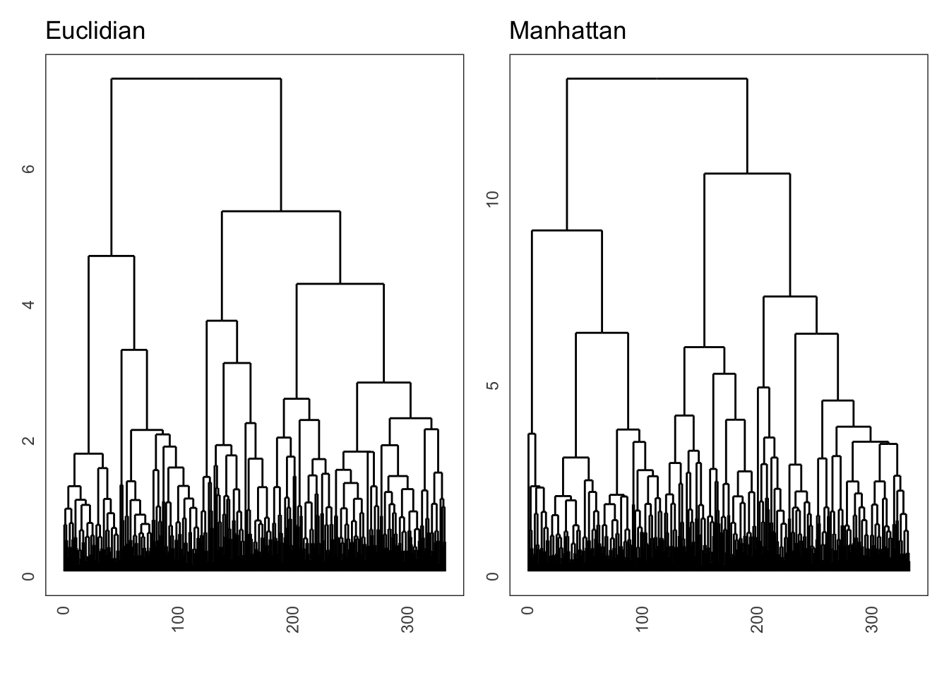
- repeat the process but now using the Manhattan distance
- see if the hierarchical structure is similar (eye-balling it)
Answer
tidyverse
First we update the penguins data set, removing the missing values and creating an ID column. We simply do this by creating a row number, which gives a unique ID to each observation. Because the number has no real numerical meaning, we set it as a factor.
penguins <- penguins %>%
  # remove missing values
  drop_na() %>%
  # create ID column
  mutate(id = 1:n(),
         id = as_factor(id))
To do the clustering, we first have to remove all the non-numerical data from our data set. We still want to retain information on our data, so we use the id column as row names.
We need to scale() the data, because the original variables are on different scales (e.g. flipper length is in milimeters, whereas body mass is in grams).
Here I show how to calculate the distance matrix using the Euclidian distance, and to do this for the Manhattan method, we simply change it to method = "manhattan". If only everything in life was that easy…
penguins_hclust <- penguins %>%
  select(-species, -island, -sex, -year) %>%
  column_to_rownames(var = "id") %>%
  scale() %>%
  dist(method = "euclidian") %>%
  hclust(method = "complete")
And that, dear viewers, allows us to create a wonderful dendrogram. Because there are so many observations, we can omit the labels using labels = FALSE.
ggdendrogram(penguins_hclust, rotate = FALSE, labels = FALSE) +
  labs(title = "Penguins dendrogram")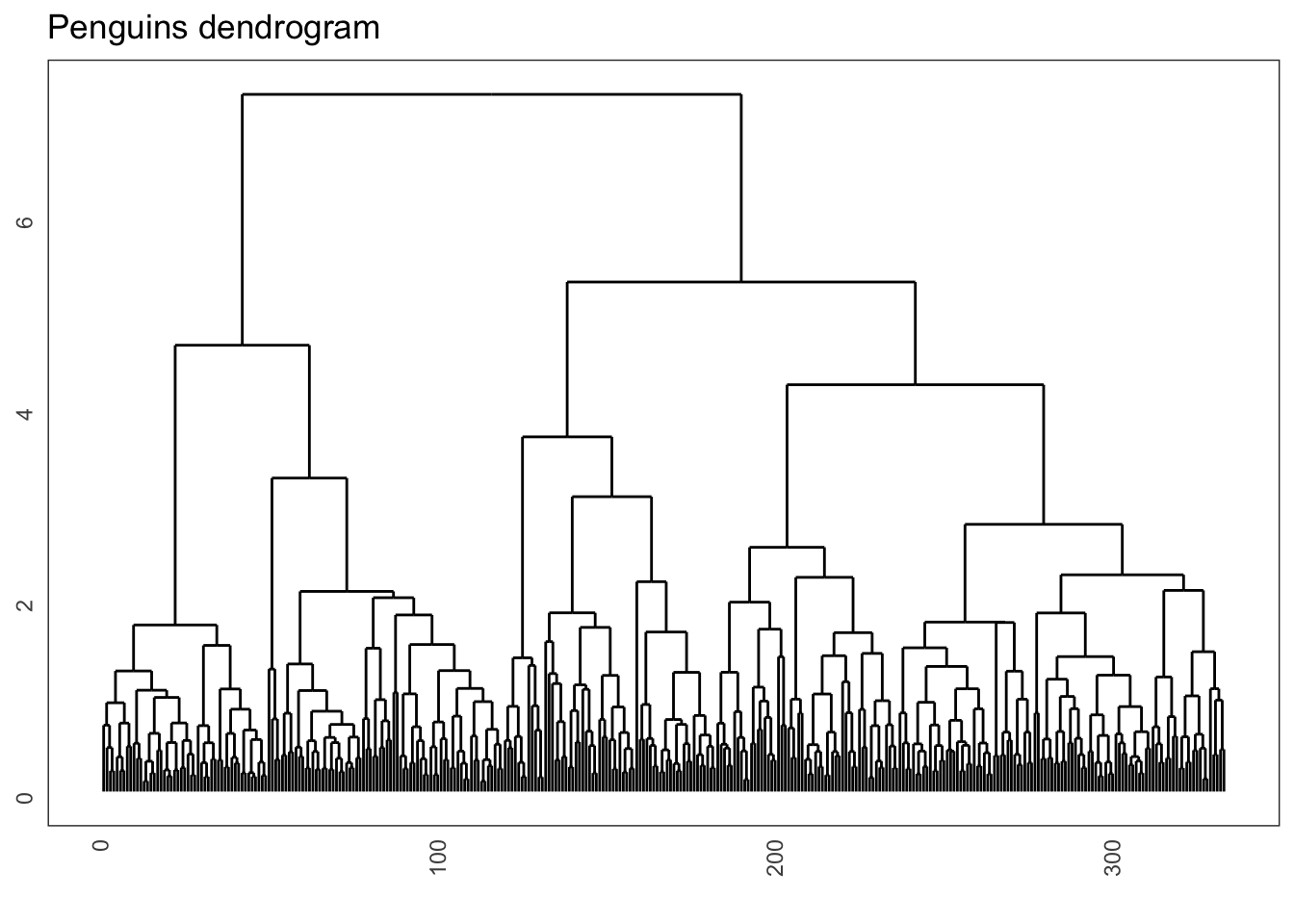
Lastly, comparing the effect of the Euclidian and Manhattan distance matrices on the final dendrogram shows some slight differences between the two methods:
10.8 Optional: Colouring clusters
Adding colour to dendrograms can be a bit tricky. There are different ways of doing so, but the simplest method I’ve found (so far) that does not require the installation of various, extensive packages is a bunch of functions written by Atrebas. See the blogpost.
Basically, all you need to do is load the script I provided and off you go!
source(file = "scripts/ggdendro_extended.R")
# cut the dendrogram, specify the number of clusters
hcdata <- dendro_data_k(gene_hclust, 4)


plot_ggdendro(hcdata,
              direction   = "lr",
              expand.y    = 0.2,
              branch.size = 0.5)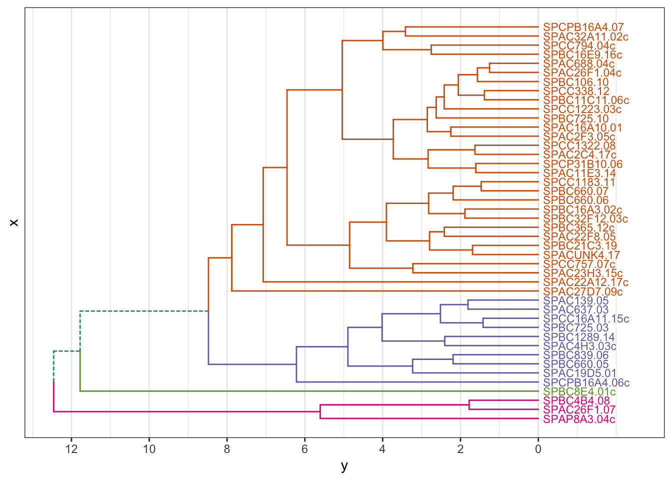
We can also plot this as a circular dendrogram:
plot_ggdendro(hcdata,
              fan         = TRUE,
              label.size  = 3,
              nudge.label = 0.02,
              expand.y    = 0.4) +
  theme_void()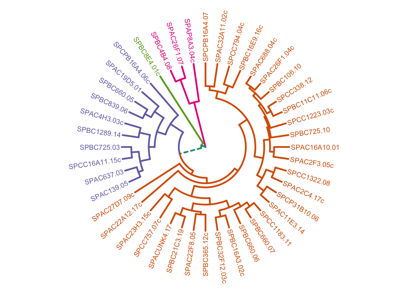
10.9 Key points
- Hierarchical clustering can be used to determine and visualise hierarchy in data
- Distance matrices can be calculated with, for example, the Euclidian distance or Manhattan distance
- Calculating dissimilarity between clusters can be done in different ways, for example using complete linkage (largest distance), single linkage (minimum distance) or average linkage
- Drawing dendrograms can visualise hierarchy and cutting the dendrograms can help to further investigate potential clusters in the data