# A collection of R packages designed for data science
library(tidyverse)

# Converts stats functions to a tidyverse-friendly format
library(rstatix)

# Creates diagnostic plots using ggplot2
library(ggResidpanel)6 Linear regression
Learning outcomes
Questions
- When should I use a linear regression?
- How do I interpret the results?
Objectives
- Be able to perform a linear regression in R or Python
- Use ANOVA to check if the slope of the regression differs from zero
- Understand the underlying assumptions for linear regression analysis
- Use diagnostic plots to check these assumptions
6.1 Libraries and functions
Click to expand
6.1.1 Libraries
6.1.2 Functions
# Creates diagnostic plots
ggResidpanel::resid_panel()

# Creates a linear model
stats::lm()

# Creates an ANOVA table for a linear model
stats::anova()
6.1.3 Libraries
# A Python data analysis and manipulation tool
import pandas as pd

# Simple yet exhaustive stats functions.
import pingouin as pg

# Python equivalent of `ggplot2`
from plotnine import *

# Statistical models, conducting tests and statistical data exploration
import statsmodels.api as sm

# Convenience interface for specifying models using formula strings and DataFrames
import statsmodels.formula.api as smf
6.1.4 Functions
# Summary statistics
pandas.DataFrame.describe()

# Plots the first few rows of a DataFrame
pandas.DataFrame.head()

# Query the columns of a DataFrame with a boolean expression
pandas.DataFrame.query()

# Reads in a .csv file
pandas.read_csv()

# Creates a model from a formula and data frame
statsmodels.formula.api.ols()

# Creates an ANOVA table for one or more fitted linear models
statsmodels.stats.anova.anova_lm()
6.2 Purpose and aim
Regression analysis not only tests for an association between two or more variables, but also allows you to investigate quantitatively the nature of any relationship which is present. This can help you determine if one variable may be used to predict values of another. Simple linear regression essentially models the dependence of a scalar dependent variable (\(y\)) on an independent (or explanatory) variable (\(x\)) according to the relationship:
\[\begin{equation*} y = \beta_0 + \beta_1 x \end{equation*}\]where \(\beta_0\) is the value of the intercept and \(\beta_1\) is the slope of the fitted line. A linear regression analysis assesses if the coefficient of the slope, \(\beta_1\), is actually different from zero. If it is different from zero then we can say that \(x\) has a significant effect on \(y\) (since changing \(x\) leads to a predicted change in \(y\)). If it isn’t significantly different from zero, then we say that there isn’t sufficient evidence of such a relationship. To assess whether the slope is significantly different from zero we first need to calculate the values of \(\beta_0\) and \(\beta_1\).
6.3 Data and hypotheses
We will perform a simple linear regression analysis on the two variables murder and assault from the USArrests data set. This rather bleak data set contains statistics on arrests per 100,000 residents for assault, murder and robbery in each of the 50 US states in 1973, alongside the proportion of the population who lived in urban areas at that time. We wish to determine whether the assault variable is a significant predictor of the murder variable. This means that we will need to find the coefficients \(\beta_0\) and \(\beta_1\) that best fit the following macabre equation:
And then will be testing the following null and alternative hypotheses:
- \(H_0\):
assaultis not a significant predictor ofmurder, \(\beta_1 = 0\) - \(H_1\):
assaultis a significant predictor ofmurder, \(\beta_1 \neq 0\)
6.4 Summarise and visualise
First, we read in the data:
USArrests <- read_csv("data/CS3-usarrests.csv")You can visualise the data with:
# create scatterplot of the data
ggplot(USArrests,
       aes(x = assault, y = murder)) +
  geom_point()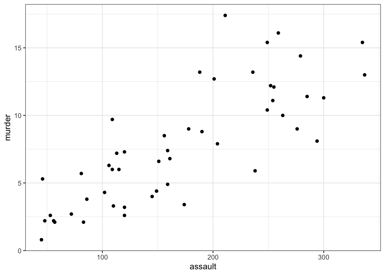
First, we read in the data:
USArrests_py = pd.read_csv("data/CS3-usarrests.csv")You can visualise the data with:
# create scatterplot of the data
(ggplot(USArrests_py,
         aes(x = "assault",
             y = "murder")) +
     geom_point())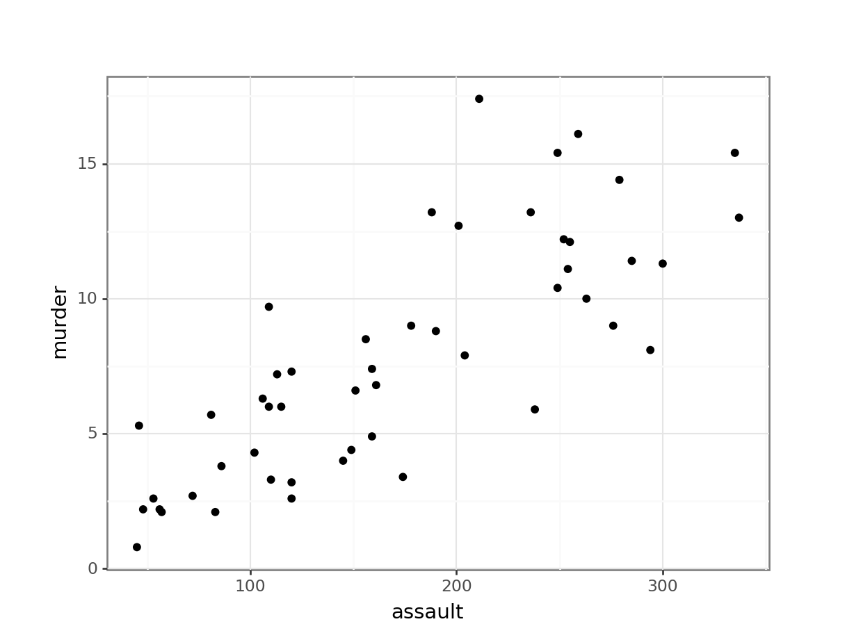
Perhaps unsurprisingly, there appears to be a relatively strong positive relationship between these two variables. Whilst there is a reasonable scatter of the points around any trend line, we would probably expect a significant result in this case.
6.5 Assumptions
In order for a linear regression analysis to be valid 4 key assumptions need to be met:
Important
- The data must be linear (it is entirely possible to calculate a straight line through data that is not straight - it doesn’t mean that you should!)
- The residuals must be normally distributed
- The residuals must not be correlated with their fitted values (i.e. they should be independent)
- The fit should not depend overly much on a single point (no point should have high leverage).
Whether these assumptions are met can easily be checked visually by producing four key diagnostic plots.
First we need to define the linear model:
lm_1 <- lm(murder ~ assault,
data = USArrests)- The first argument to
lmis a formula saying thatmurderdepends onassault. As we have seen before, the syntax is generallydependent variable~independent variable. - The second argument specifies which data to use.
Next, we can create diagnostic plots for the model:
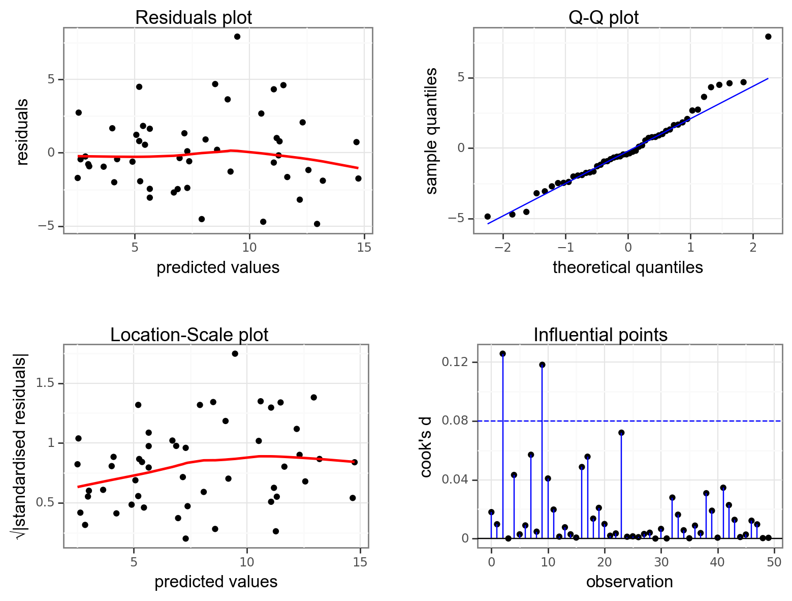
resid_panel(lm_1,
            plots = c("resid", "qq", "ls", "cookd"),
            smoother = TRUE)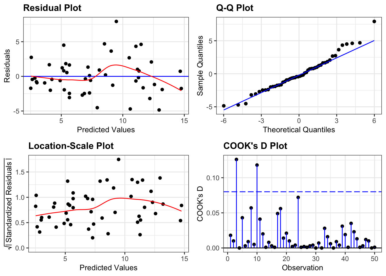
- The top left graph plots the Residuals plot. If the data are best explained by a straight line then there should be a uniform distribution of points above and below the horizontal blue line (and if there are sufficient points then the red line, which is a smoother line, should be on top of the blue line). This plot is pretty good.
- The top right graph shows the Q-Q plot which allows a visual inspection of normality. If the residuals are normally distributed, then the points should lie on the diagonal dotted line. This isn’t too bad but there is some slight snaking towards the upper end and there appears to be an outlier.
- The bottom left Location-scale graph allows us to investigate whether there is any correlation between the residuals and the predicted values and whether the variance of the residuals changes significantly. If not, then the red line should be horizontal. If there is any correlation or change in variance then the red line will not be horizontal. This plot is fine.
- The last graph shows the Cook’s distance and tests if any one point has an unnecessarily large effect on the fit. The important aspect here is to see if any points are larger than 0.5 (meaning you’d have to be careful) or 1.0 (meaning you’d definitely have to check if that point has an large effect on the model). If not, then no point has undue influence. This plot is good.
If you haven’t loaded statsmodels yet, run the following:
import statsmodels.api as sm
import statsmodels.formula.api as smf
Next, we create a linear model and get the .fit():
# create a linear model
model = smf.ols(formula= "murder ~ assault", data = USArrests_py)
# and get the fitted parameters of the model
lm_USArrests_py = model.fit()
Then we use dgplots() to create the diagnostic plots:
dgplots(lm_USArrests_py)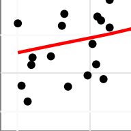
Note
Formally, if there is any concern after looking at the diagnostic plots then a linear regression is not valid. However, disappointingly, very few people ever check whether the linear regression assumptions have been met before quoting the results.
Let’s change this through leading by example!
6.6 Implement and interpret test
We have already defined the linear model, so we can have a closer look at it:
# show the linear model
lm_1
Call:
lm(formula = murder ~ assault, data = USArrests)

Coefficients:
(Intercept)      assault
    0.63168      0.04191
The lm() function returns a linear model object which is essentially a list containing everything necessary to understand and analyse a linear model. However, if we just type the model name (as we have above) then it just prints to the screen the actual coefficients of the model i.e. the intercept and the slope of the line.
The linear model object: would you like to know more?
If you wanted to know more about the lm object we created, then type in:
View(lm_1)This shows a list (a type of object in R), containing all of the information associated with the linear model. The most relevant ones at the moment are:
coefficientscontains the values of the coefficients we found earlier.residualscontains the residual associated for each individual data point.fitted.valuescontains the values that the linear model predicts for each individual data point.
print(lm_USArrests_py.summary()) OLS Regression Results
==============================================================================
Dep. Variable: murder R-squared: 0.643
Model: OLS Adj. R-squared: 0.636
Method: Least Squares F-statistic: 86.45
Date: Thu, 25 Jan 2024 Prob (F-statistic): 2.60e-12
Time: 08:33:13 Log-Likelihood: -118.26
No. Observations: 50 AIC: 240.5
Df Residuals: 48 BIC: 244.4
Df Model: 1
Covariance Type: nonrobust
==============================================================================
coef std err t P>|t| [0.025 0.975]
------------------------------------------------------------------------------
Intercept 0.6317 0.855 0.739 0.464 -1.087 2.350
assault 0.0419 0.005 9.298 0.000 0.033 0.051
==============================================================================
Omnibus: 4.799 Durbin-Watson: 1.796
Prob(Omnibus): 0.091 Jarque-Bera (JB): 3.673
Skew: 0.598 Prob(JB): 0.159
Kurtosis: 3.576 Cond. No. 436.
==============================================================================
Notes:
[1] Standard Errors assume that the covariance matrix of the errors is correctly specified.A rather large table, but the values we’re interested in can be found more or less in the middle. We are after the coef values, where the intercept is 0.6317 and the slope is 0.0419.
So here we have found that the line of best fit is given by:
\[\begin{equation*} Murder = 0.63 + 0.042 \times Assault \end{equation*}\]Next we can assess whether the slope is significantly different from zero:
anova(lm_1)Analysis of Variance Table
Response: murder
Df Sum Sq Mean Sq F value Pr(>F)
assault 1 597.70 597.70 86.454 2.596e-12 ***
Residuals 48 331.85 6.91
---
Signif. codes: 0 '***' 0.001 '**' 0.01 '*' 0.05 '.' 0.1 ' ' 1Here, we again use the anova() command to assess significance. This shouldn’t be too surprising at this stage if the introductory lectures made any sense. From a mathematical perspective, one-way ANOVA and simple linear regression are exactly the same as each other and it makes sense that we should use the same command to analyse them in R.
This is exactly the same format as the table we saw for one-way ANOVA:
- The 1st line just tells you the that this is an ANOVA test
- The 2nd line tells you what the response variable is (in this case
Murder) - The 3rd, 4th and 5th lines are an ANOVA table which contain some useful values:
- The
Dfcolumn contains the degrees of freedom values on each row, 1 and 48 - The
Fvalue column contains the F statistic, 86.454 - The p-value is 2.596e-12 and is the number directly under the
Pr(>F)on the 4th line. - The other values in the table (in the
Sum SqandMean Sq) column are used to calculate the F statistic itself and we don’t need to know these.
- The
We can perform an ANOVA on the lm_USArrests_py object using the anova_lm() function from the statsmodels package.
sm.stats.anova_lm(lm_USArrests_py, typ = 2) sum_sq df F PR(>F)
assault 597.703202 1.0 86.454086 2.595761e-12
Residual 331.849598 48.0 NaN NaNAgain, the p-value is what we’re most interested in here and shows us the probability of getting data such as ours if the null hypothesis were actually true and the slope of the line were actually zero. Since the p-value is excruciatingly tiny we can reject our null hypothesis and state that:
A simple linear regression showed that the assault rate in US states was a significant predictor of the number of murders (p = 2.59x10⁻¹²).
6.6.1 Plotting the regression line
It can be very helpful to plot the regression line with the original data to see how far the data are from the predicted linear values. We can do this as follows:
# plot the data
ggplot(USArrests,
       aes(x = assault, y = murder)) +
  geom_point() +
  geom_smooth(method = "lm", se = FALSE)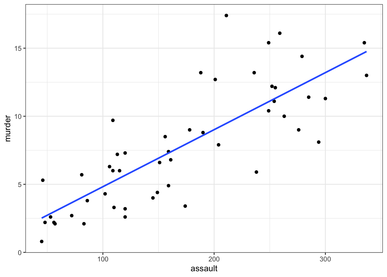
- We plot all the data using
geom_point() - Next, we add the linear model using
geom_smooth(method = "lm"), hiding the confidence intervals (se = FALSE)
(ggplot(USArrests_py,
        aes(x = "assault", y = "murder")) +
     geom_point() +
     geom_smooth(method = "lm",
                 se = False,
                 colour = "blue"))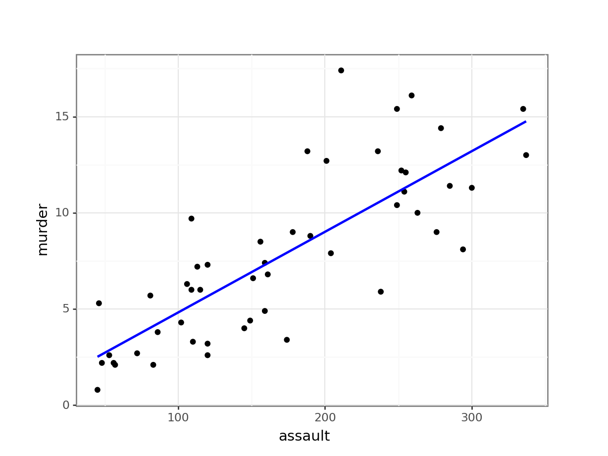
6.7 Exercises
6.7.1 State data: Life expectancy and murder
Exercise
Level:
We will use the data from the file data/CS3-statedata.csv data set for this exercise. This rather more benign data set contains information on more general properties of each US state, such as population (1975), per capita income (1974), illiteracy proportion (1970), life expectancy (1969), murder rate per 100,000 people (there’s no getting away from it), percentage of the population who are high-school graduates, average number of days where the minimum temperature is below freezing between 1931 and 1960, and the state area in square miles. The data set contains 50 rows and 8 columns, with column names: population, income, illiteracy, life_exp, murder, hs_grad, frost and area.
Perform a linear regression on the variables life_exp and murder and do the following:
- Find the value of the slope and intercept coefficients for both regressions
- Determine if the slope is significantly different from zero (i.e. is there a relationship between the two variables)
- Produce a scatter plot of the data with the line of best fit superimposed on top.
- Produce diagnostic plots and discuss with your (virtual) neighbour if you should have carried out a simple linear regression in each case
Answer
6.8 Answer
Load and visualise the data
First, we read in the data:
USAstate <- read_csv("data/CS3-statedata.csv")Next, we visualise the murder variable against the life_exp variable. We also add a regression line.
# plot the data and add the regression line
ggplot(USAstate,
       aes(x = murder, y = life_exp)) +
  geom_point() +
  geom_smooth(method = "lm", se = FALSE)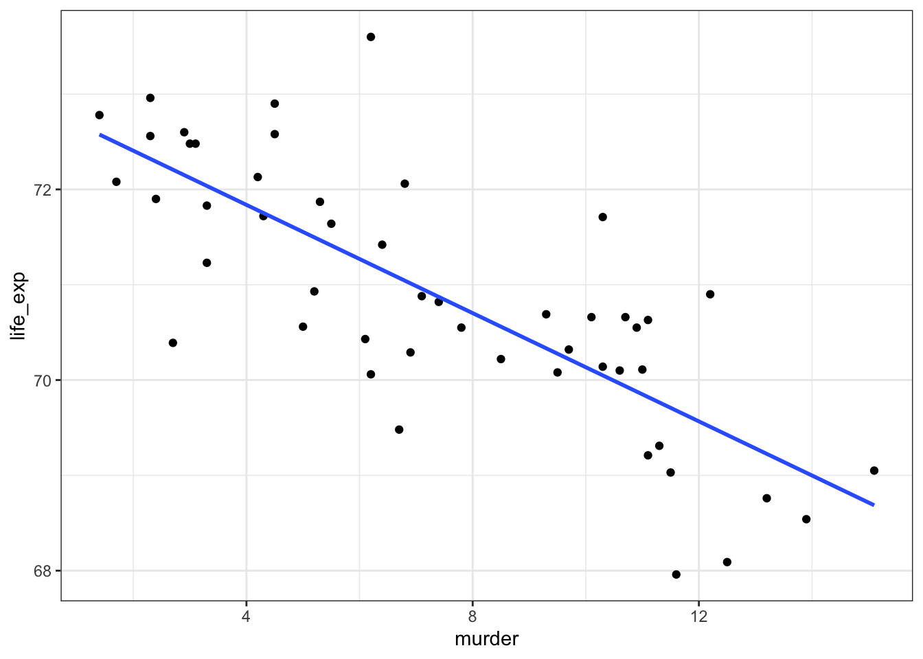
First, we read in the data:
USAstate_py = pd.read_csv("data/CS3-statedata.csv")Next, we visualise the murder variable against the life_exp variable. We also add a regression line.
(ggplot(USAstate_py,
        aes(x = "life_exp", y = "murder")) +
     geom_point() +
     geom_smooth(method = "lm",
                 se = False,
                 colour = "blue"))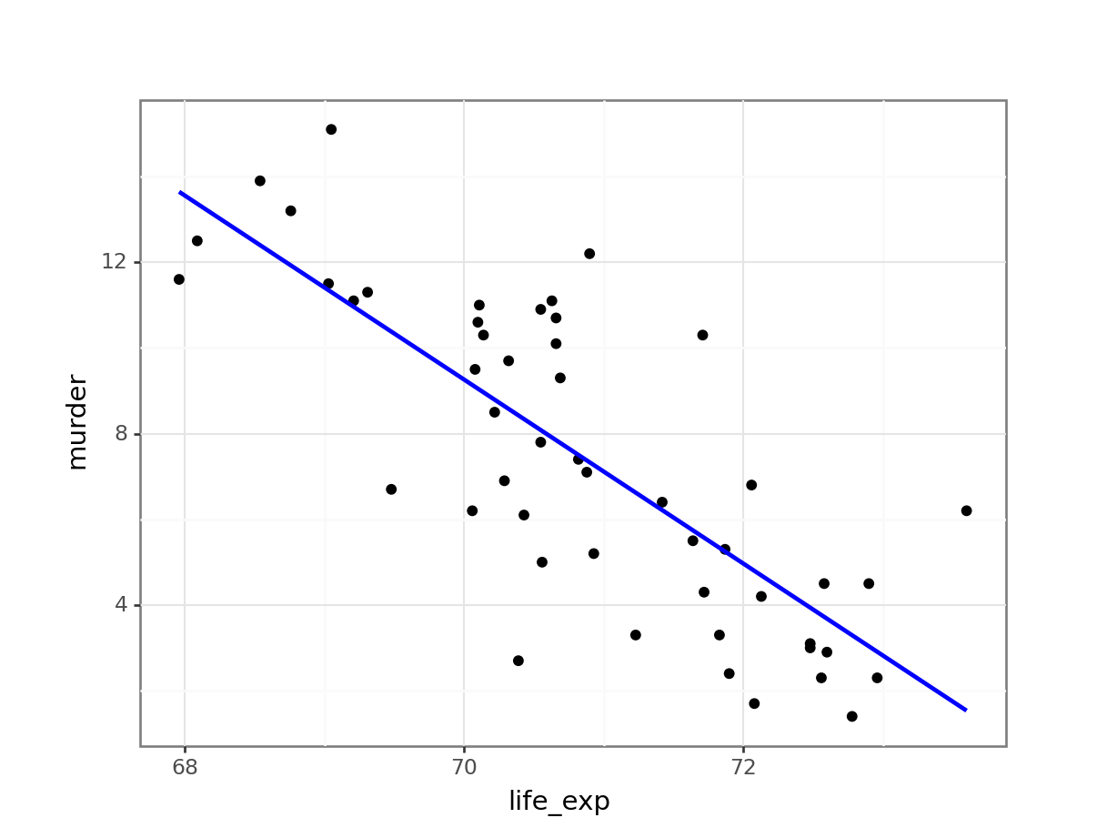
We visualise for the same reasons as before:
- We check that the data aren’t obviously wrong. Here we have sensible values for life expectancy (nothing massively large or small), and plausible values for murder rates (not that I’m that au fait with US murder rates in 1973 but small positive numbers seem plausible).
- We check to see what we would expect from the statistical analysis. Here there does appear to be a reasonable downward trend to the data. I would be surprised if we didn’t get a significant result given the amount of data and the spread of the data about the line
- We check the assumptions (only roughly though as we’ll be doing this properly in a minute). Nothing immediately gives me cause for concern; the data appear linear, the spread of the data around the line appears homogeneous and symmetrical. No outliers either.
Check assumptions
Now, let’s check the assumptions with the diagnostic plots.
# create a linear model
lm_murder <- lm(life_exp ~ murder,
           data = USAstate)

# create the diagnostic plots
resid_panel(lm_murder,
            plots = c("resid", "qq", "ls", "cookd"),
            smoother = TRUE)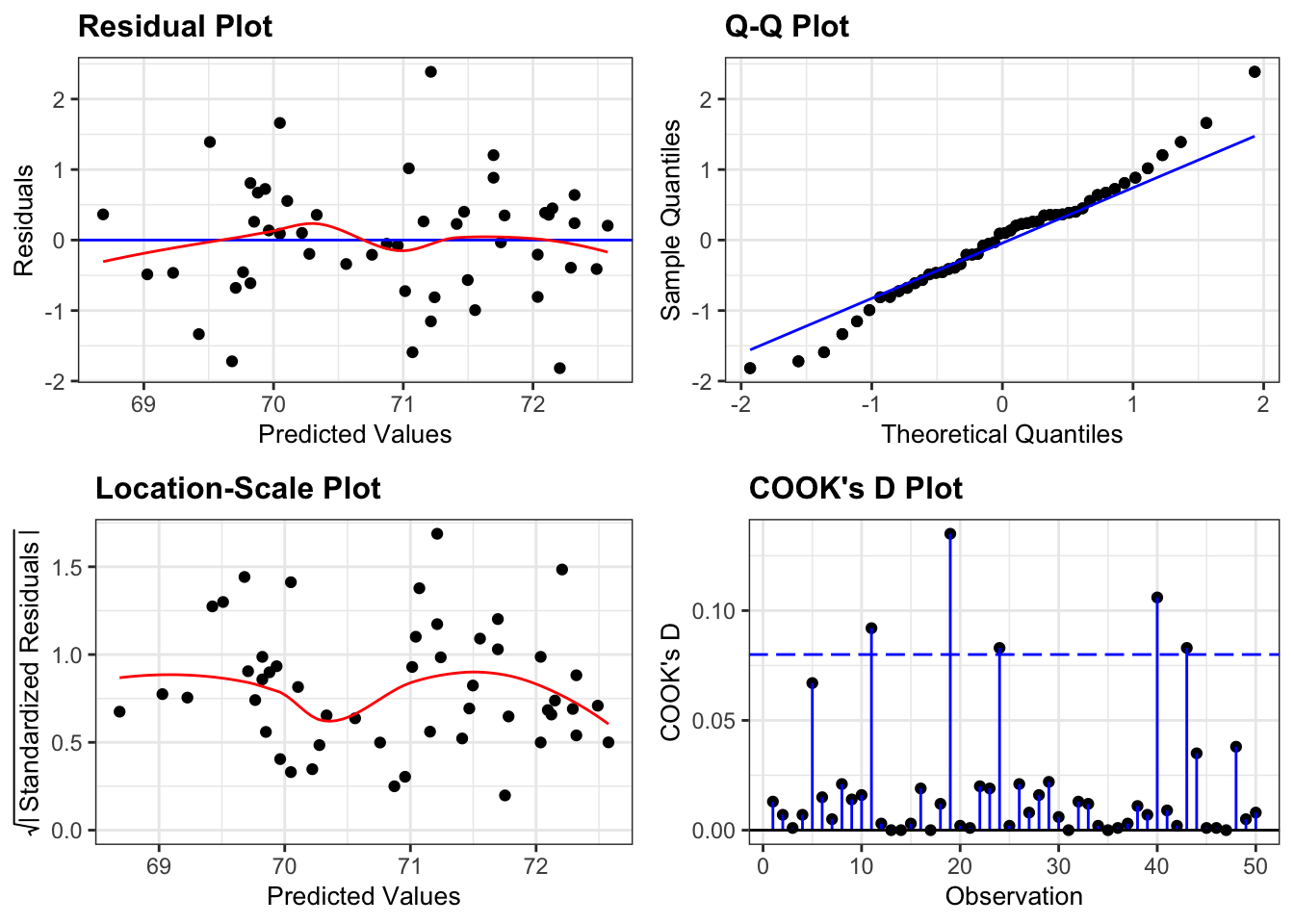
The Residuals plot appears symmetric enough (similar distribution of points above and below the horizontal blue line) for me to happy with linearity. Similarly the red line in the Location-Scale plot looks horizontal enough for me to be happy with homogeneity of variance. There aren’t any influential points in the Cook’s distance plot. The only plot that does give me a bit of concern is the Q-Q plot. Here we see clear evidence of snaking, although the degree of snaking isn’t actually that bad. This just means that we can be pretty certain that the distribution of residuals isn’t normal, but also that it isn’t very non-normal.
First, we create a linear model:
# create a linear model
model = smf.ols(formula= "life_exp ~ murder", data = USAstate_py)
# and get the fitted parameters of the model
lm_USAstate_py = model.fit()
Next, we can create the diagnostic plots:
dgplots(lm_USAstate_py)
The Residuals plot appears symmetric enough (similar distribution of points above and below the horizontal blue line) for me to happy with linearity. Similarly the red line in the Location-Scale plot looks horizontal enough for me to be happy with homogeneity of variance. There aren’t any influential points in the Influential points plot. The only plot that does give me a bit of concern is the Q-Q plot. Here we see clear evidence of snaking, although the degree of snaking isn’t actually that bad. This just means that we can be pretty certain that the distribution of residuals isn’t normal, but also that it isn’t very non-normal.
What do we do in this situation? Well, there are three possible options:
- Appeal to the Central Limit Theorem. This states that if we have a large enough sample size we don’t have to worry about whether the distribution of the residuals are normally distributed. Large enough is a bit of a moving target here and to be honest it depends on how non-normal the underlying data are. If the data are only a little bit non-normal then we can get away with using a smaller sample than if the data are massively skewed (for example). This is not an exact science, but anything over 30 data points is considered a lot for mild to moderate non-normality (as we have in this case). If the data were very skewed then we would be looking for more data points (50-100). So, for this example we can legitimately just carry on with our analysis without worrying.
- Try transforming the data. Here we would try applying some mathematical functions to the response variable (
life_exp) in the hope that repeating the analysis with this transformed variable would make things better. To be honest with you it might not work and we won’t know until we try. Dealing with transformed variables is legitimate as an approach but it can make interpreting the model a bit more challenging. In this particular example none of the traditional transformations (log, square-root, reciprocal) do anything to fix the slight lack of normality. - Go with permutation methods / bootstrapping. This approach would definitely work. I don’t have time to explain it here (it’s the subject of an entire other practical). This approach also requires us to have a reasonably large sample size to work well as we have to assume that the distribution of the sample is a good approximation for the distribution of the entire data set.
So in this case, because we have a large enough sample size and our deviation from normality isn’t too bad, we can just crack on with the standard analysis.
Implement and interpret test
So, let’s actually do the analysis:
anova(lm_murder)Analysis of Variance Table
Response: life_exp
Df Sum Sq Mean Sq F value Pr(>F)
murder 1 53.838 53.838 74.989 2.26e-11 ***
Residuals 48 34.461 0.718
---
Signif. codes: 0 '***' 0.001 '**' 0.01 '*' 0.05 '.' 0.1 ' ' 1sm.stats.anova_lm(lm_USAstate_py, typ = 2) sum_sq df F PR(>F)
murder 53.837675 1.0 74.988652 2.260070e-11
Residual 34.461327 48.0 NaN NaNAnd after all of that we find that the murder rate is a statistically significant predictor of life expectancy in US states. Woohoo!
6.8.1 State data: Graduation and frost days
Exercise
Level:
Now let’s investigate the relationship between the proportion of High School Graduates a state has (hs_grad) and the mean number of days below freezing (frost) within each state.
Answer
6.9 Answer
We’ll run through this a bit quicker:
# plot the data
ggplot(USAstate,
       aes(x = frost, y = hs_grad)) +
  geom_point() +
  geom_smooth(method = "lm", se = FALSE)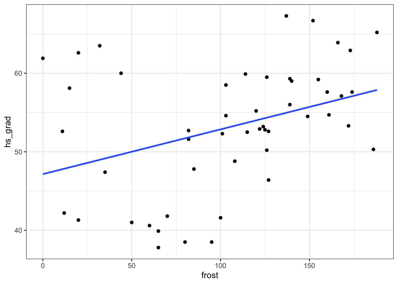
(ggplot(USAstate_py,
        aes(x = "hs_grad", y = "frost")) +
     geom_point() +
     geom_smooth(method = "lm",
                 se = False,
                 colour = "blue"))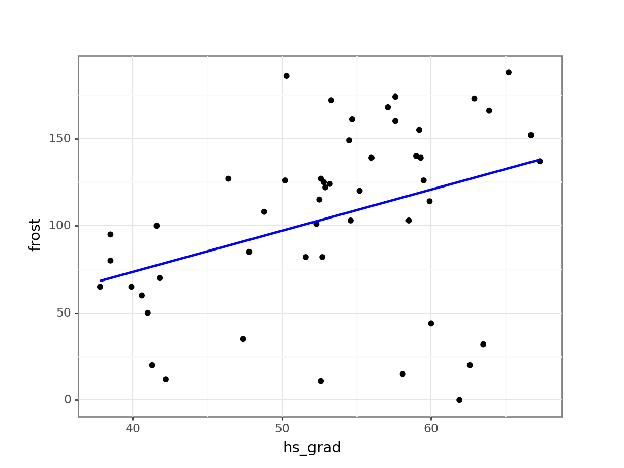
Once again, we look at the data.
- There doesn’t appear to be any ridiculous errors with the data; High School graduation proportions are in the 0-100% range and the mean number of sub-zero days for each state are between 0 and 365, so these numbers are plausible.
- Whilst there is a trend upwards, which wouldn’t surprise me if it came back as being significant, I’m a bit concerned about…
- The assumptions. I’m mainly concerned that the data aren’t very linear. There appears to be a noticeable pattern to the data with some sort of minimum around 50-60 Frost days. This means that it’s hard to assess the other assumptions.
Let’s check these out properly
Now, let’s check the assumptions with the diagnostic plots.
# create a linear model
lm_frost <- lm(hs_grad ~ frost,
               data = USAstate)

# create the diagnostic plots
resid_panel(lm_frost,
            plots = c("resid", "qq", "ls", "cookd"),
            smoother = TRUE)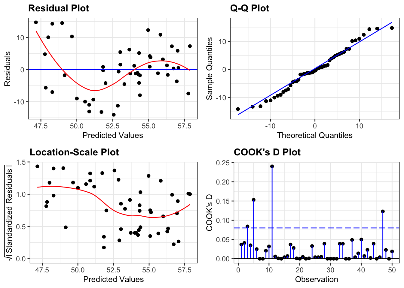
First, we create a linear model:
# create a linear model
model = smf.ols(formula= "hs_grad ~ frost", data = USAstate_py)
# and get the fitted parameters of the model
lm_frost_py = model.fit()
Next, we can create the diagnostic plots:
dgplots(lm_frost_py)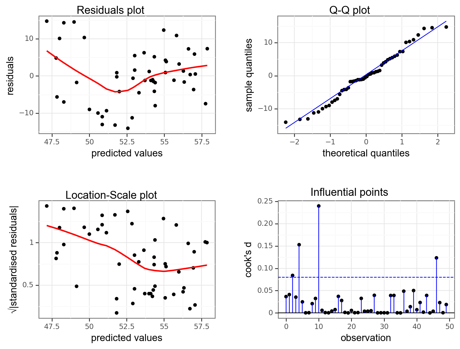
We can see that what we suspected from before is backed up by the residuals plot. The data aren’t linear and there appears to be some sort of odd down-up pattern here. Given the lack of linearity it just isn’t worth worrying about the other plots because our model is misspecified: a straight line just doesn’t represent our data at all.
Just for reference, and as practice for looking at diagnostic plots, if we ignore the lack of linearity then we can say that
- Normality is pretty good from the Q-Q plot
- Homogeneity of variance isn’t very good and there appears to be a noticeable drop in variance as we go from left to right (from consideration of the Location-Scale plot)
- There don’t appear to be any influential points (by looking at the Cook’s distance plot)
However, none of that is relevant in this particular case since the data aren’t linear and a straight line would be the wrong model to fit.
So what do we do in this situation?
Well actually, this is a bit tricky as there aren’t any easy fixes here. There are two broad solutions for dealing with a misspecified model.
- The most common solution is that we need more predictor variables in the model. Here we’re trying to explain/predict high school graduation only using the number of frost days. Obviously there are many more things that would affect the proportion of high school graduates than just how cold it is in a State (which is a weird potential predictor when you think about it) and so what we would need is a statistical approach that allows us to look at multiple predictor variables. We’ll cover that approach in the next two sessions.
- The other potential solution is to say that high school graduation can in fact be predicted only by the number of frost days but that the relationship between them isn’t linear. We would then need to specify a relationship (a curve basically) and then try to fit the data to the new, non-linear, curve. This process is called, unsurprisingly, non-linear regression and we don’t cover that in this course. This process is best used when there is already a strong theoretical reason for a non-linear relationship between two variables (such as sigmoidal dose-response curves in pharmacology or exponential relationships in cell growth). In this case we don’t have any such preconceived notions and so it wouldn’t really be appropriate in this case.
Neither of these solutions can be tackled with the knowledge that we have so far in the course but we can definitely say that based upon this data set, there isn’t a linear relationship (significant or otherwise) between frosty days and high school graduation rates.
6.10 Summary
Key points
- Linear regression tests if a linear relationship exists between two or more variables
- If so, we can use one variable to predict another
- A linear model has an intercept and slope and we test if the slope differs from zero
- We create linear models and perform an ANOVA to assess the slope coefficient
- We can only use a linear regression if these four assumptions are met:
- The data are linear
- Residuals are normally distributed
- Residuals are not correlated with their fitted values
- No single point should have a large influence on the linear model
- We can use diagnostic plots to evaluate these assumptions