# load the required packages for fitting & visualising
library(tidyverse)
library(survival)
library(survminer)5 Comparing two curves
In this chapter, we’ll look into how, when and why to use the log rank test to compare stratified (grouped) survival curves to one another.
5.1 Libraries and functions
Click to expand
import numpy as np
import pandas as pd
from lifelines import *
import matplotlib.pyplot as plt
5.2 The log-rank (Mantel-Cox) test
We use this test in situations where we have a single categorical predictor in our dataset, and would like to find out whether two survival curves are significantly different from each other.
You might find it useful to think of the log-rank test as an analogue of a two-sample t-test, but for time-to-event data specifically.
The log-rank test is a null hypothesis significance test:
Our null hypothesis is that our two groups don’t differ in how likely they are to experience the event over time
Or, in other words: in the underlying population, the true survival curves are identical
So, if our p-value falls under the significance threshold, our data are very unlikely to have occurred just by chance, giving some evidence that a difference does exist
5.3 Assumptions of a log-rank test
Like all statistical tests, before we jump in and start calculating things, we need to consider some key statistical assumptions first.
If these aren’t met, the log-rank test won’t actually help us answer our research question.
5.3.1 Assumption 1: Independent observations
An “observation” = a unique row in the raw dataset, representing a unique individual in the study.
“Independent” means that none of the individuals are affected by any other individuals in the study, or artificially similar to them.
Common sources of non-independence would include:
- Repeated measures (recording multiple rows/events of interest per individual)
- Matched/paired designs
- Natural “clusters” or “nesting”, e.g.,: patients within hospitals, or students within schools
- Genetic relatedness, e.g., using animals from the same litter
5.3.2 Assumption 2: Non-informative censoring
The likelihood of censoring should not be related to the likelihood of experiencing the event of interest.
Phrased another way: the individuals who are censored are assumed to have had the same underlying time-to-event distribution as those who weren’t censored, if they had remained in the study.
5.3.3 Desirable: Proportional hazards
The hazard ratio - i.e., the increased risk of experiencing the event in group 1 versus group 2 - should ideally stay consistent over time.
In our hospital_stays dataset, proportional hazards would mean that if non-surgical patients are 2x more likely than surgical patients to be discharged on day 3, they would also be 2x more likely to get discharged on day 30 (and every day in between).
5.4 Running a log-rank test
To practice implementing the test, let’s return to the hospital_stays dataset, which we plotted survival curves for in the last chapter.
Specifically, let’s focus on the sex and surgery predictors from the dataset.
hospital_stays <- read_csv("data/hospital_stays.csv")Rows: 200 Columns: 6
── Column specification ────────────────────────────────────────────────────────
Delimiter: ","
dbl (6): time, discharged, age, sex, surgery, weekend_admission
ℹ Use `spec()` to retrieve the full column specification for this data.
ℹ Specify the column types or set `show_col_types = FALSE` to quiet this message.head(hospital_stays)# A tibble: 6 × 6
time discharged age sex surgery weekend_admission
<dbl> <dbl> <dbl> <dbl> <dbl> <dbl>
1 5 1 43 1 0 0
2 0.5 1 48 0 0 0
3 19 1 77 0 0 0
4 4.5 1 50 0 0 0
5 7 1 79 1 0 1
6 1 1 73 1 0 0hospital_stays = pd.read_csv("data/hospital_stays.csv")
hospital_stays.head() time discharged age sex surgery weekend_admission
0 5.0 1 43 1 0 0
1 0.5 1 48 0 0 0
2 19.0 1 77 0 0 0
3 4.5 1 50 0 0 0
4 7.0 1 79 1 0 1Log-rank test by surgery
When we stratified by surgery in the previous chapter, we got curves that looked like this:
Warning in geom_segment(aes(x = 0, y = max(y2), xend = max(x1), yend = max(y2)), : All aesthetics have length 1, but the data has 2 rows.
ℹ Please consider using `annotate()` or provide this layer with data containing
  a single row.
All aesthetics have length 1, but the data has 2 rows.
ℹ Please consider using `annotate()` or provide this layer with data containing
  a single row.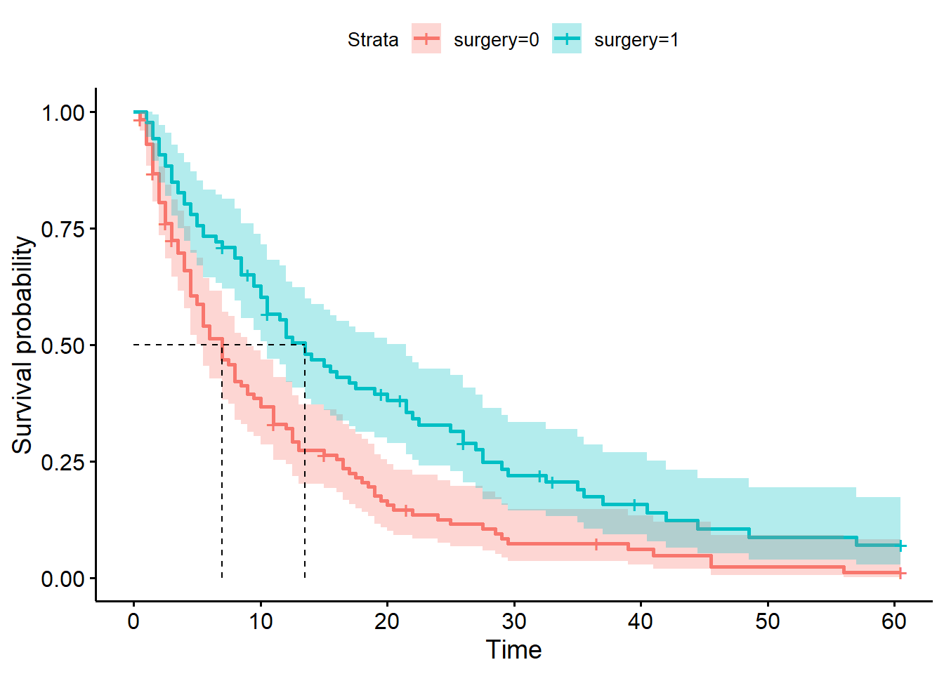
<lifelines.KaplanMeierFitter:"Surgical patients", fitted with 86 total observations, 13 right-censored observations><lifelines.KaplanMeierFitter:"Non-surgical patients", fitted with 114 total observations, 9 right-censored observations>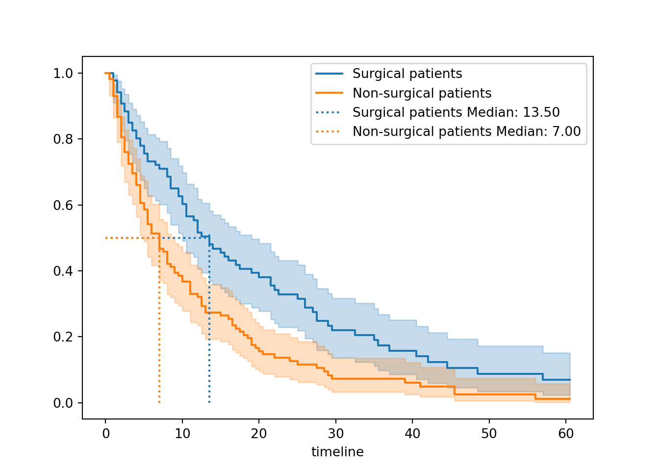

We determined that the median survival times for surgical (13.5 days) and non-surgical (7 days) patients were different. This indicates that surgical patients spend longer in hospital on average.
Now, let’s add a p-value to our weight of evidence, to see whether that difference is significant.
In the survival package, this process is as simple as changing the function from survfit to survdiff.
None of the rest of the syntax changes. We still use a survival object Surv(time, discharged) as our response, and the ~ surgery formula to make our predictor variable clear.
survdiff(Surv(time, discharged) ~ surgery, data = hospital_stays)Call:
survdiff(formula = Surv(time, discharged) ~ surgery, data = hospital_stays)
N Observed Expected (O-E)^2/E (O-E)^2/V
surgery=0 114 105 81.4 6.85 13.4
surgery=1 86 73 96.6 5.77 13.4
Chisq= 13.4 on 1 degrees of freedom, p= 3e-04 In the output, alongside the statistic and p-value, we are shown:
- the
nsample size in each group - the observed number of events (discharges from hospital) in each group
- what the expected number of events would be, if there were no effect of
surgery
There is a dedicated logrank_test function in the lifelines package.
We have to provide the following arguments:
- The set of times
Tfor thesurgery = 1group - The set of times
Tfor thesurgery = 0group - The events (versus censoring)
Efor thesurgery = 1group - The events
Efor thesurgery = 0group
from lifelines.statistics import logrank_test

T = hospital_stays["time"]
E = hospital_stays["discharged"]

# Subset of the dataset that received surgery
surg = (hospital_stays["surgery"] == 1)

# Run the log-rank test
results = logrank_test(T[surg], T[~surg], E[surg], E[~surg])

results.print_summary()
<lifelines.StatisticalResult: logrank_test>
t_0 = -1
null_distribution = chi squared
degrees_of_freedom = 1
test_name = logrank_test
---
test_statistic p -log2(p)
13.35 <0.005 11.92You can access the exact p-value with results.p_value.
A chi-square (\(\chi^2\)) statistic has been calculated to summarise the difference between the two groups.
The associated p-value, in this case, tells us that the likelihood of observing two curves that are this (or more) different from each other, if surgery really had no effect on time-to-discharge in the hospital, is very low.
This is additional evidence for us that surgery probably does affect how quickly a patient can expect to be discharged.
For a final step, let’s add those p-values onto our plot:
There are two additional arguments in ggsurvplot that you can make use of.
The pval argument tells the function to compute and add a p-value. The pval.method argument adds a text label to clarify what type of test was performed to get the p-value.
ggsurvplot(hosp_curve_surgery,
           conf.int = TRUE,
           surv.median.line = "hv",
           pval = TRUE, pval.method = TRUE)
Warning in geom_segment(aes(x = 0, y = max(y2), xend = max(x1), yend = max(y2)), : All aesthetics have length 1, but the data has 2 rows.
ℹ Please consider using `annotate()` or provide this layer with data containing
a single row.
All aesthetics have length 1, but the data has 2 rows.
ℹ Please consider using `annotate()` or provide this layer with data containing
a single row.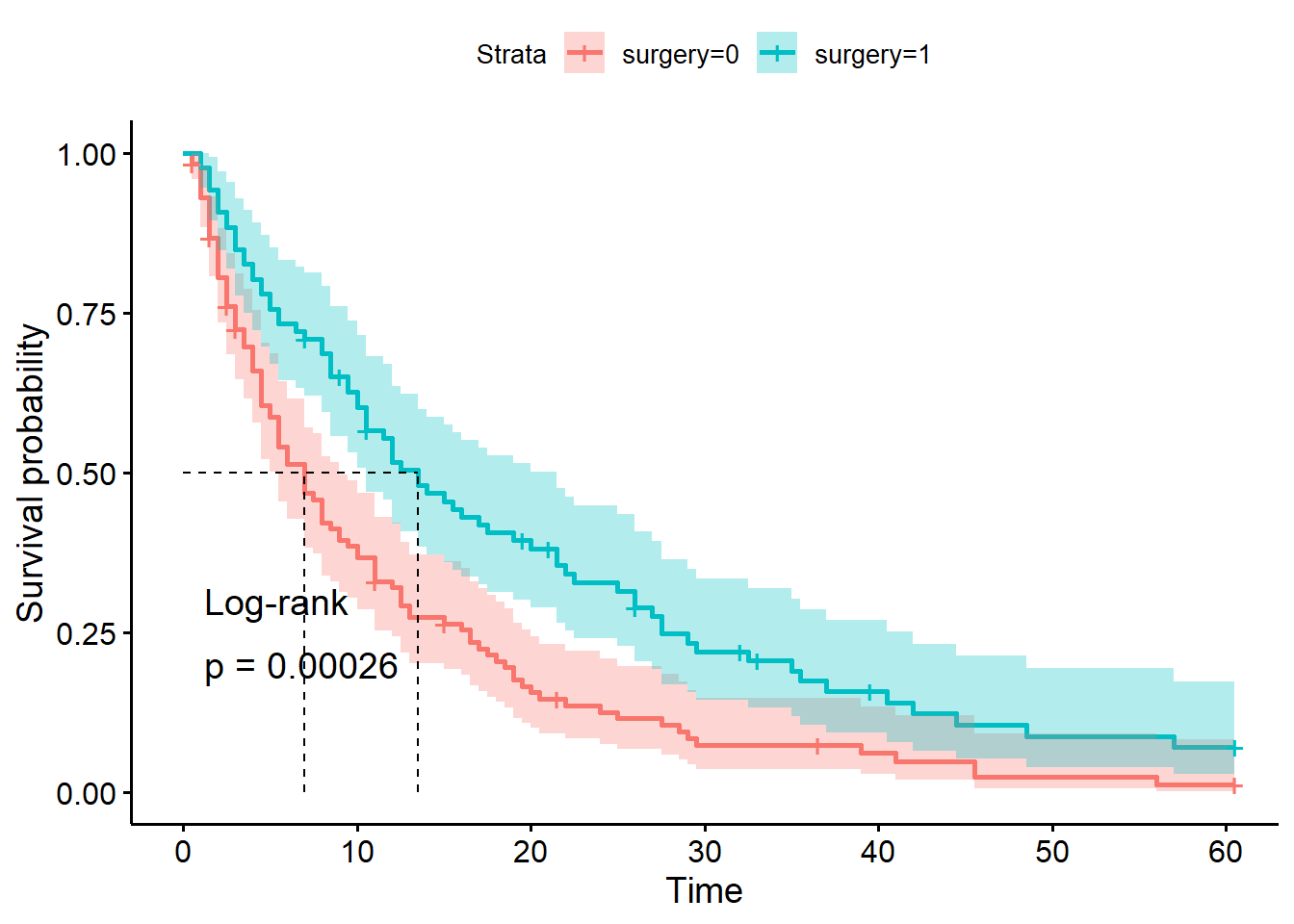
You have to add the p-value manually in lifelines.
First, save the p-value from the results output of the log-rank test. Then, annotate the plot with text.
You might need to adjust the x/y positions, depending on the exact shape of your curve(s).
# Kaplan Meier fit for surgical data subset
surg_hosp = KaplanMeierFitter()
surg_hosp.fit(T[surg], event_observed=E[surg], label="Surgical patients")
<lifelines.KaplanMeierFitter:"Surgical patients", fitted with 86 total observations, 13 right-censored observations># Kaplan Meier fit for non-surgical data subset
ns_hosp = KaplanMeierFitter()
ns_hosp.fit(T[~surg], event_observed=E[~surg], label="Non-surgical patients")<lifelines.KaplanMeierFitter:"Non-surgical patients", fitted with 114 total observations, 9 right-censored observations># Initialise a plot to capture both of the curves
plt.clf()
fig, ax = plt.subplots()
# Add the two curves, one at a time
surg_hosp.plot_survival_function(ax = ax)
ns_hosp.plot_survival_function(ax = ax)
# Add the median markers for both curves
add_median_markers([surg_hosp, ns_hosp], ax = ax)
# Add the p-value
pval = results.p_value
ax.text(0.6, 0.6, f"Log-rank p = {pval:.3g}", transform=ax.transAxes)
plt.show()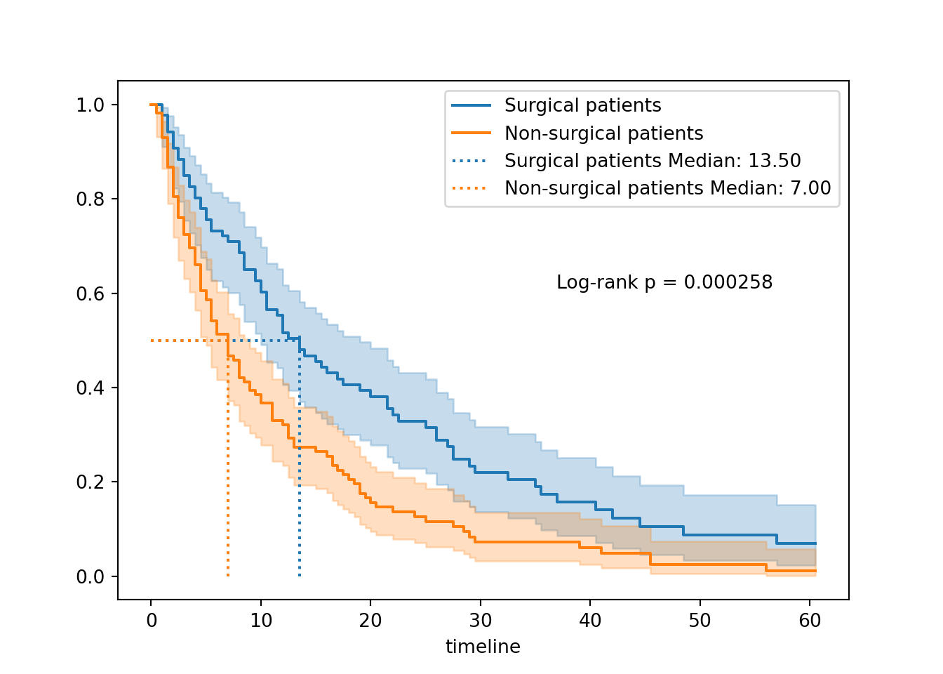

How is the log-rank statistic calculated?
Observed vs expected for each time point
Log-rank test by sex
In contrast, let’s run a log-rank test for a predictor variable where we didn’t see much visual difference in the curves: biological sex of the patient.
survdiff(Surv(time, discharged) ~ sex, data = hospital_stays)Call:
survdiff(formula = Surv(time, discharged) ~ sex, data = hospital_stays)
N Observed Expected (O-E)^2/E (O-E)^2/V
sex=0 92 84 77 0.638 1.17
sex=1 108 94 101 0.486 1.17
Chisq= 1.2 on 1 degrees of freedom, p= 0.3 # Subset of the dataset that are female
fem = (hospital_stays["sex"] == 0)
# Run the log-rank test
results = logrank_test(T[fem], T[~fem], E[fem], E[~fem])
results.print_summary()<lifelines.StatisticalResult: logrank_test>
t_0 = -1
null_distribution = chi squared
degrees_of_freedom = 1
test_name = logrank_test
---
test_statistic p -log2(p)
1.17 0.28 1.84We see now that the chi-square statistic is much smaller, and the p-value much larger.
This suggests that the likelihood of seeing curves with this much difference (or greater), if there really was no difference between male and female patients, is actually quite high.
In other words: the small difference we’re observing is quite likely to have happened by chance.
Last but not least, let’s visualise the curves to help us contexualise the p-value a little better:
hosp_curve_sex <- survfit(Surv(time, discharged) ~ sex, data = hospital_stays)

ggsurvplot(hosp_curve_sex,
           conf.int = TRUE,
           surv.median.line = "hv",
           pval = TRUE, pval.method = TRUE)
Warning in geom_segment(aes(x = 0, y = max(y2), xend = max(x1), yend = max(y2)), : All aesthetics have length 1, but the data has 2 rows.
ℹ Please consider using `annotate()` or provide this layer with data containing
a single row.
All aesthetics have length 1, but the data has 2 rows.
ℹ Please consider using `annotate()` or provide this layer with data containing
a single row.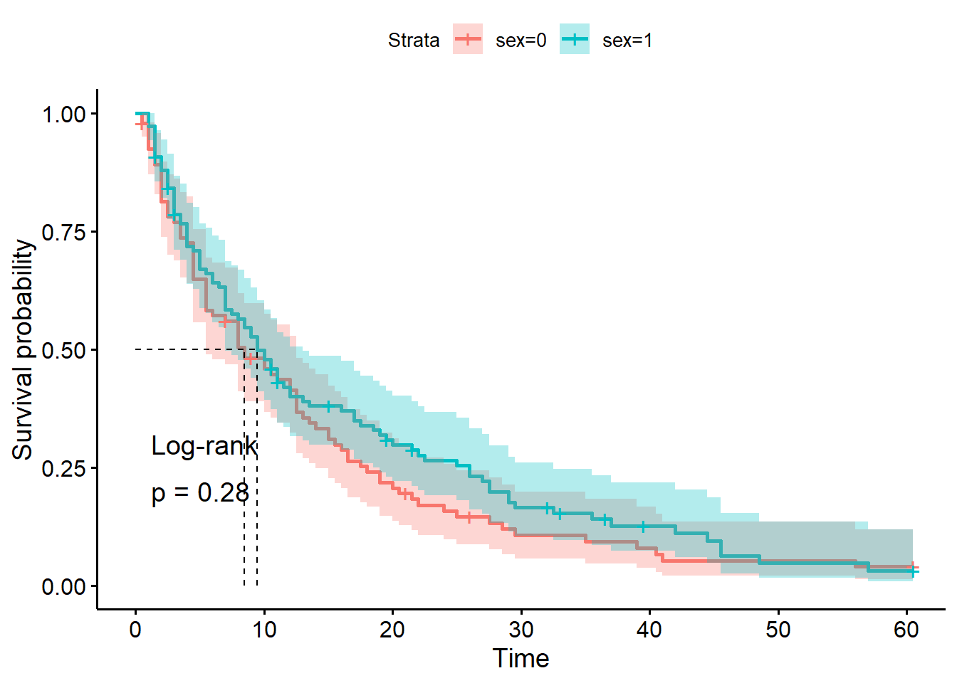
# Kaplan Meier fit for surgical data subset
fem_hosp = KaplanMeierFitter()
fem_hosp.fit(T[fem], event_observed=E[fem], label="Female patients")
<lifelines.KaplanMeierFitter:"Female patients", fitted with 92 total observations, 8 right-censored observations># Kaplan Meier fit for non-surgical data subset
male_hosp = KaplanMeierFitter()
male_hosp.fit(T[~fem], event_observed=E[~fem], label="Male patients")<lifelines.KaplanMeierFitter:"Male patients", fitted with 108 total observations, 14 right-censored observations># Initialise a plot to capture both of the curves
plt.clf()
fig, ax = plt.subplots()
# Add the two curves, one at a time
fem_hosp.plot_survival_function(ax = ax)
male_hosp.plot_survival_function(ax = ax)
# Add the median markers for both curves
add_median_markers([fem_hosp, male_hosp], ax = ax)
# Add the p-value
pval = results.p_value
ax.text(0.6, 0.6, f"Log-rank p = {pval:.3g}", transform=ax.transAxes)
plt.show()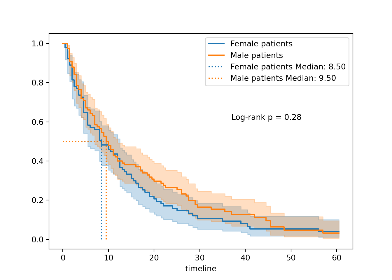

5.5 Best practices for reporting
Chances are that if you’re running a log-rank test, you’ll likely want to report it. Here are some general guidelines to follow when you do.
| ✓ | Visualise the survival curves |
A single significance test by itself tells a reader very little. It doesn’t capture important details like sample size or direction of effect (e.g., which group is more at risk than the other). If a log-rank test is important enough to your central thesis that you’re choosing to include it in your writing, then it’s also important enough to visualise the survival curves that you compared. |
|
| ✓ | Comment on assumption-checking |
You don’t have to describe or show a full set of diagnostic plots in-text - that’s probably overkill (if you’re a very thorough person, you can put them in supplementary materials). But, you should at least state the assumptions of the test, the fact that you checked them, and how well you believe they are met. There are a few reasons why:
|
|
| ✓ | Consider the problem of multiple comparisons/false positives |
If you are doing a large number of log-rank tests, remember that the overall probability that at least one of them will give you a false positive result is higher than if you only did one log-rank test. In situations where you need to run loads of tests, consider whether correcting for multiple comparisons might be needed, to increase confidence in your conclusions. |
|
| ✓ | Don’t run/report log-rank tests unless they address your hypotheses |
This is maybe the most important “best practice” of them all! Never do statistical analyses for the sake of sprinkling in some extra p-values. At best, this makes your overall point less clear. At worst, it’s p-hacking. Only run tests that will actually address the research questions you had in mind when you designed the study in the first place. |
5.6 Summary
The most common method for comparing two curves is known as the log rank test (or more formally, the Mantel-Cox test).
It’s analogous to a two-sample t-test in regular linear modelling. It tests the null hypothesis that, in the underlying population, the two groups have an identical survival curve.
Key Points
- The null hypothesis of a log-rank test is that two groups share the same survival curve in the underlying population
- A significant log-rank test means that our data are unlikely to occur by chance (but does not “prove” a difference!)
- The log-rank test makes two key assumptions: independent observations and non-informative censoring
- It is also a more powerful (sensitive) test when the hazards are proportional between groups